Stacks of red postcard and square business card displaying CLLA logomark sitting on blocks of stone

CLLA Branding + Website

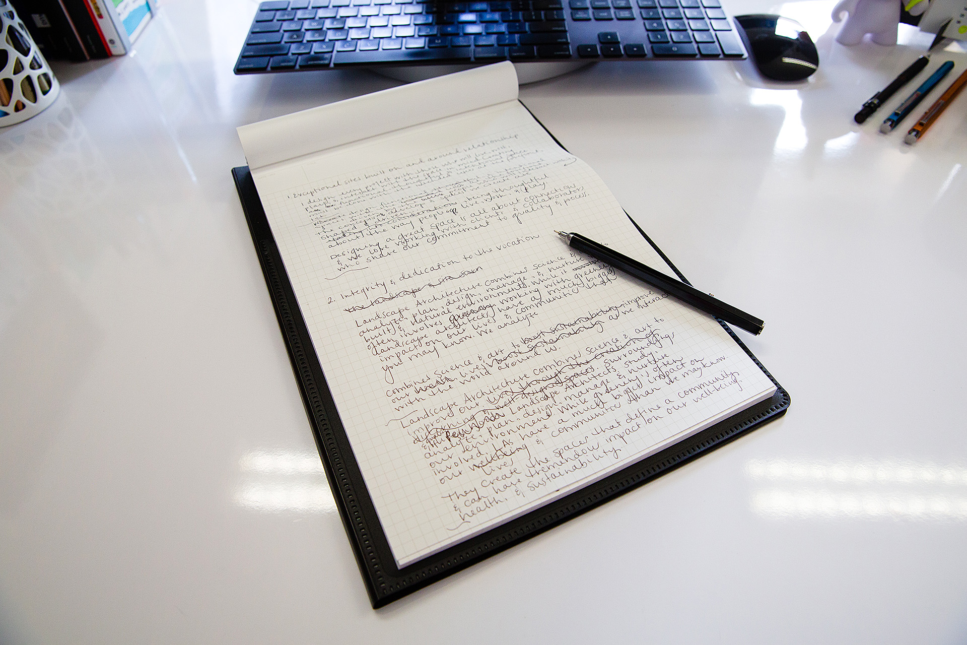
While Craig of Craig Landscape Architects (CLLA) has been practicing landscape architecture for decades, his brand, messaging, and efforts to market himself were in need of growth.

We worked with Craig to define and articulate his mission, values, and messaging—developing copy for his new website and accompanying collateral materials. In a series of conversations, we discovered the aspects of Craig’s work and approach that make him stand out in his field. The messaging we wrote and curated grew out of his focus on relationship building, out-of-the-box thinking, and dedication to the vocation.

Pen and notepad displaying written content for website copy on white desk
Close-up of notepad displaying site structure for CLLA website
Presentation of logomark options for CLLA laid out in a grid formation

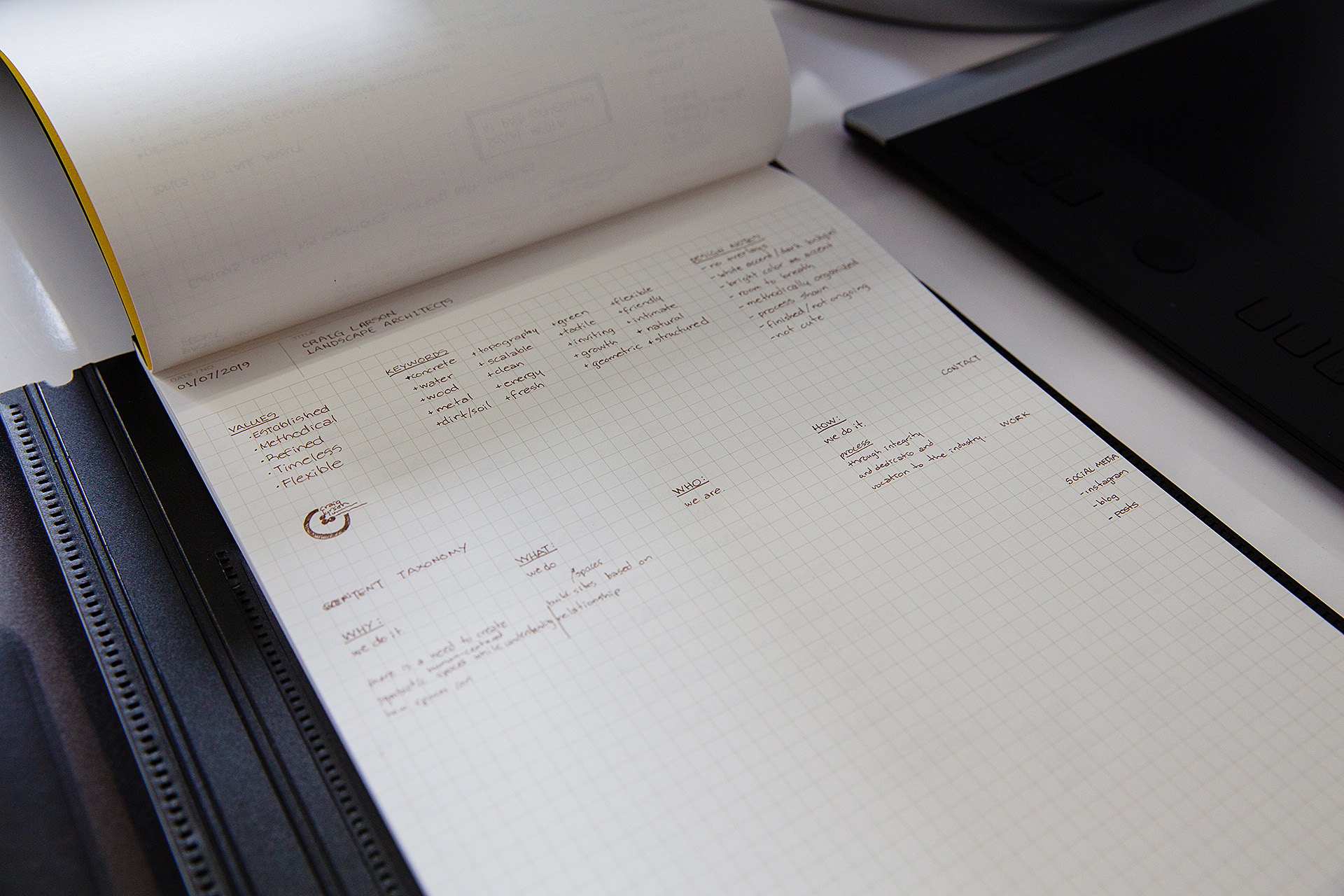
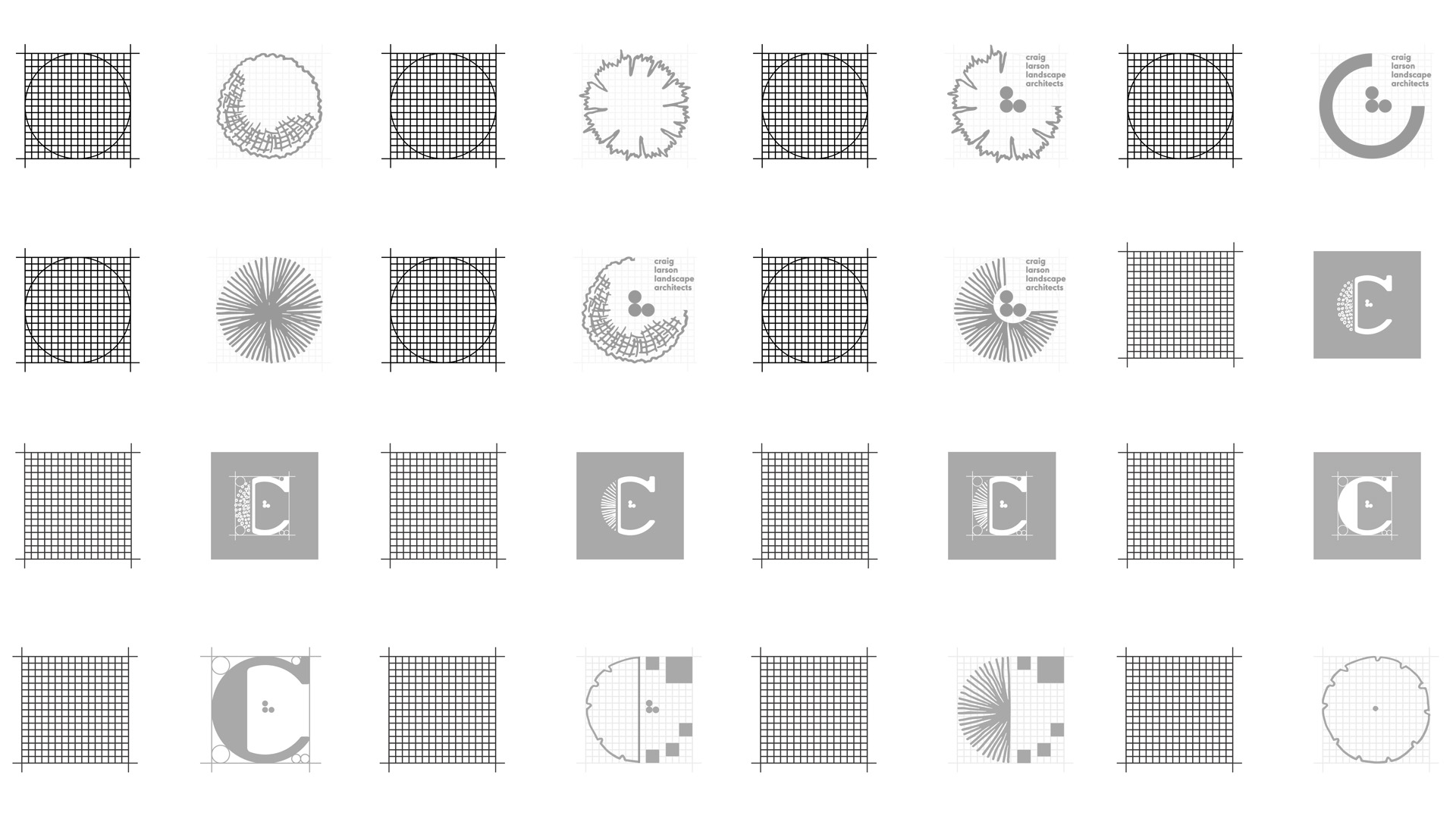
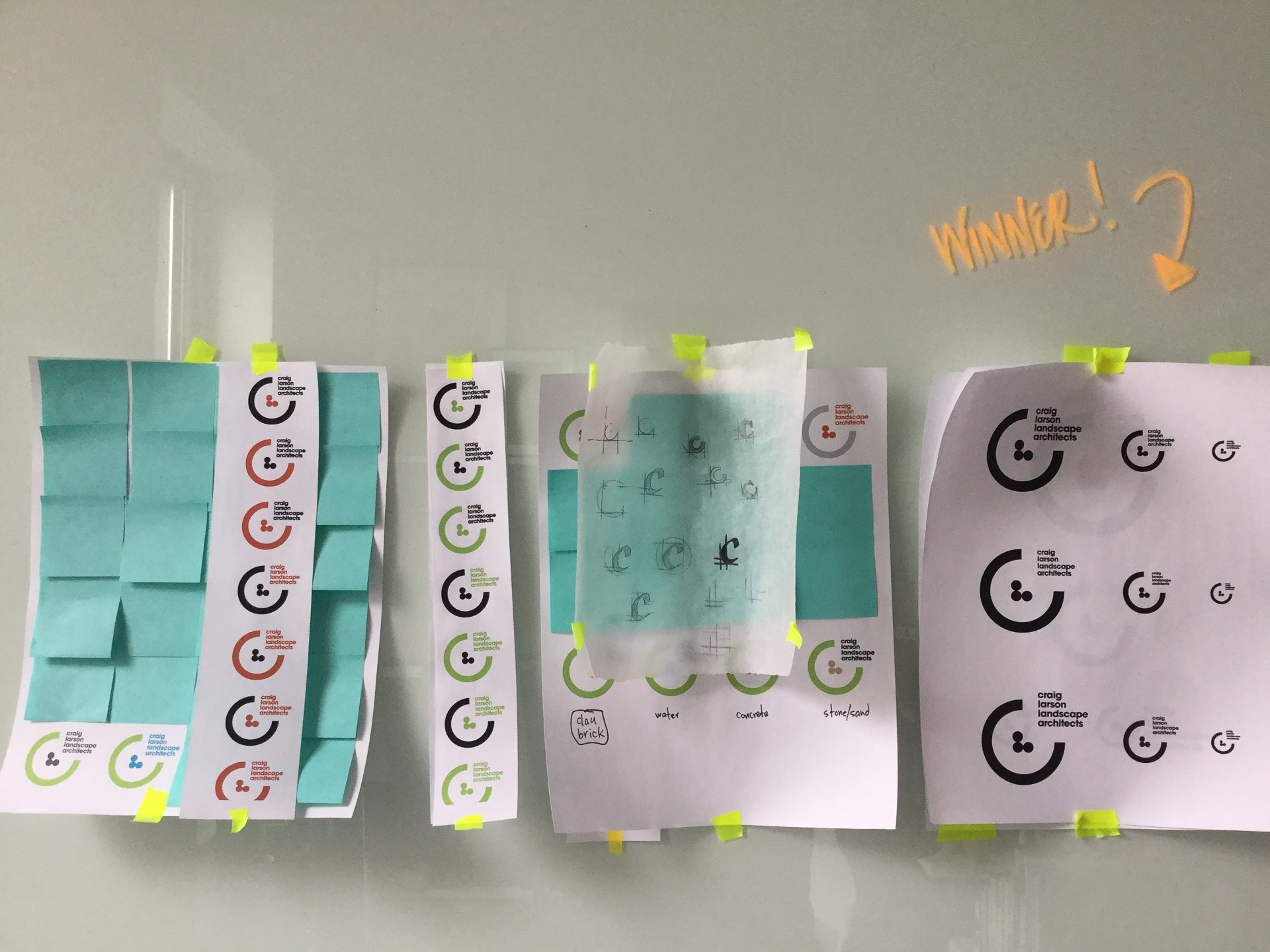
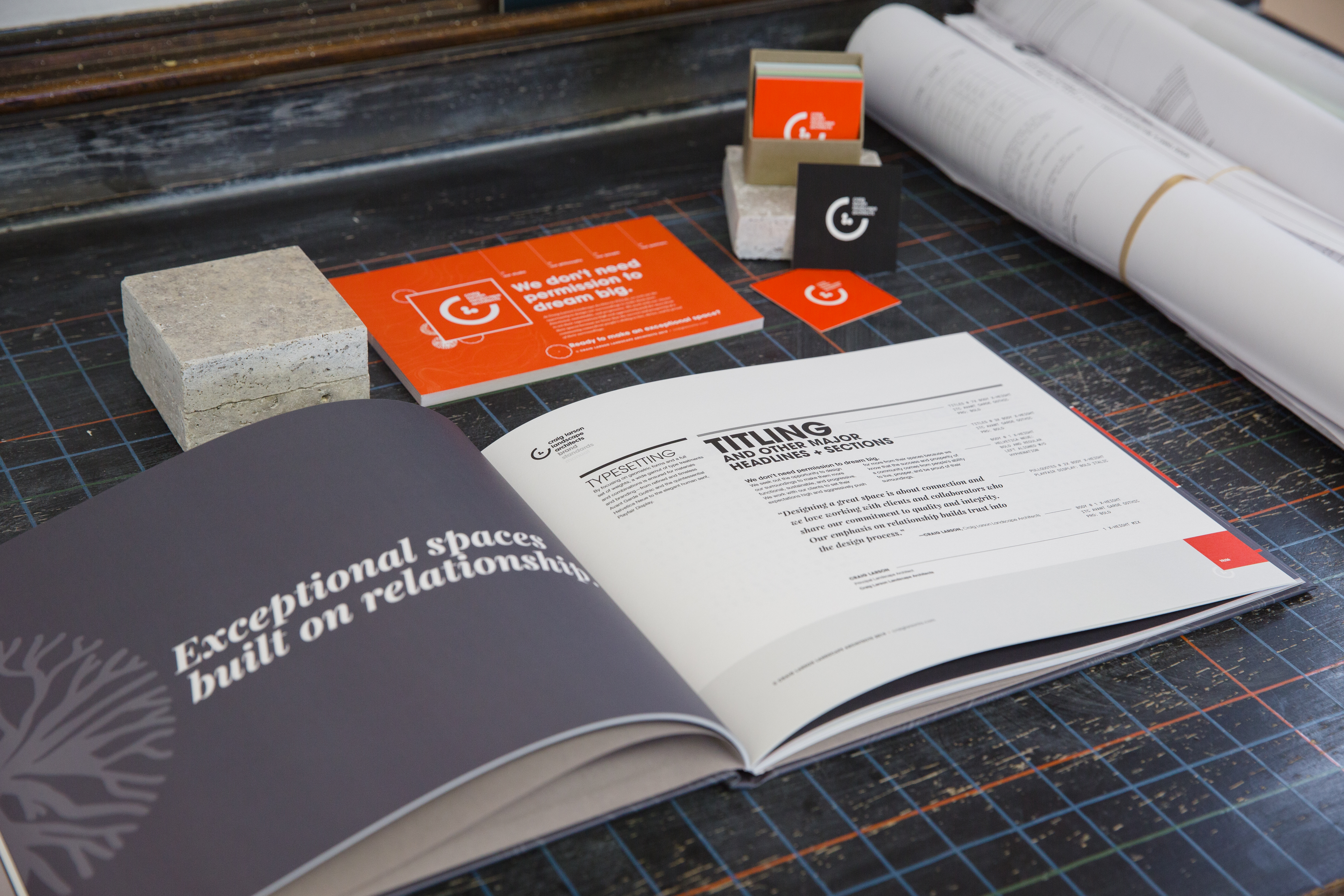
Craig came to us initially with a recycled logo from employment at a previous firm, wanting to take his brand in a more modern and flexible direction while maintaining the familiar “C” element. After exploration into his organization’s ethos, we created an atomic design system with as much flexibility and character as Craig brings to his work.

Animation of elements that make up CLLA logomark
White board covered in printed logo concepts and colorful post-it notes used in ideation
Logo concepts printed on letter paper and taped to a white board with blue post-its stuck on the papers
Post-it notes on a whiteboard listing keywords, attributes, and values gathered in the discovery phase
Brand manual page displaying logo laid out on a grid
Red, black, tan, gray, blue, and green square business cards displaying CLLA logomark leaning up against stacks of stone
Box of red, branded, square business cards displaying the CLLA logomark sitting atop a stack of stone tiles
Mockup of red-orange, gray, tan, green, and blue square CLLA branded business cards displaying the logomark

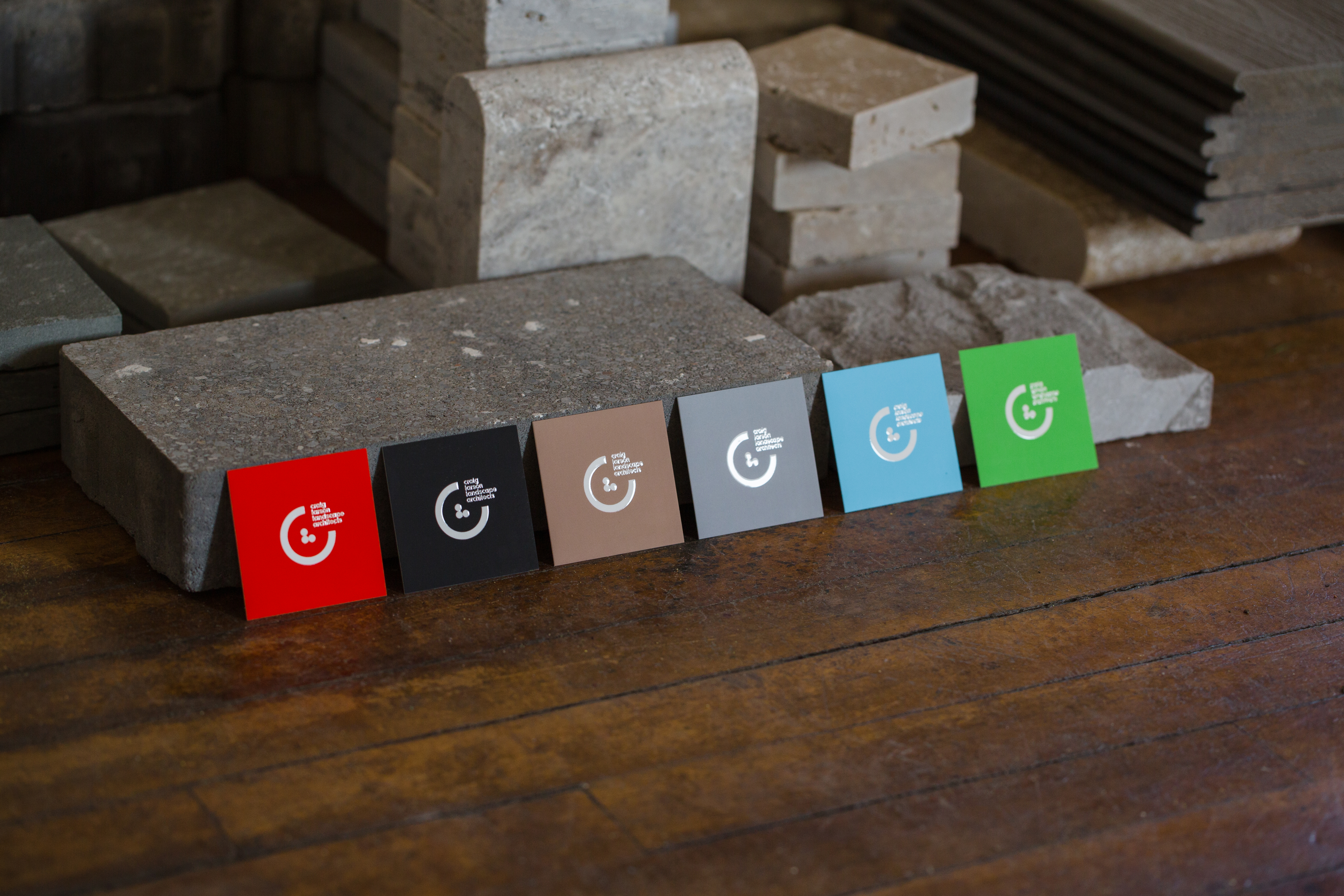
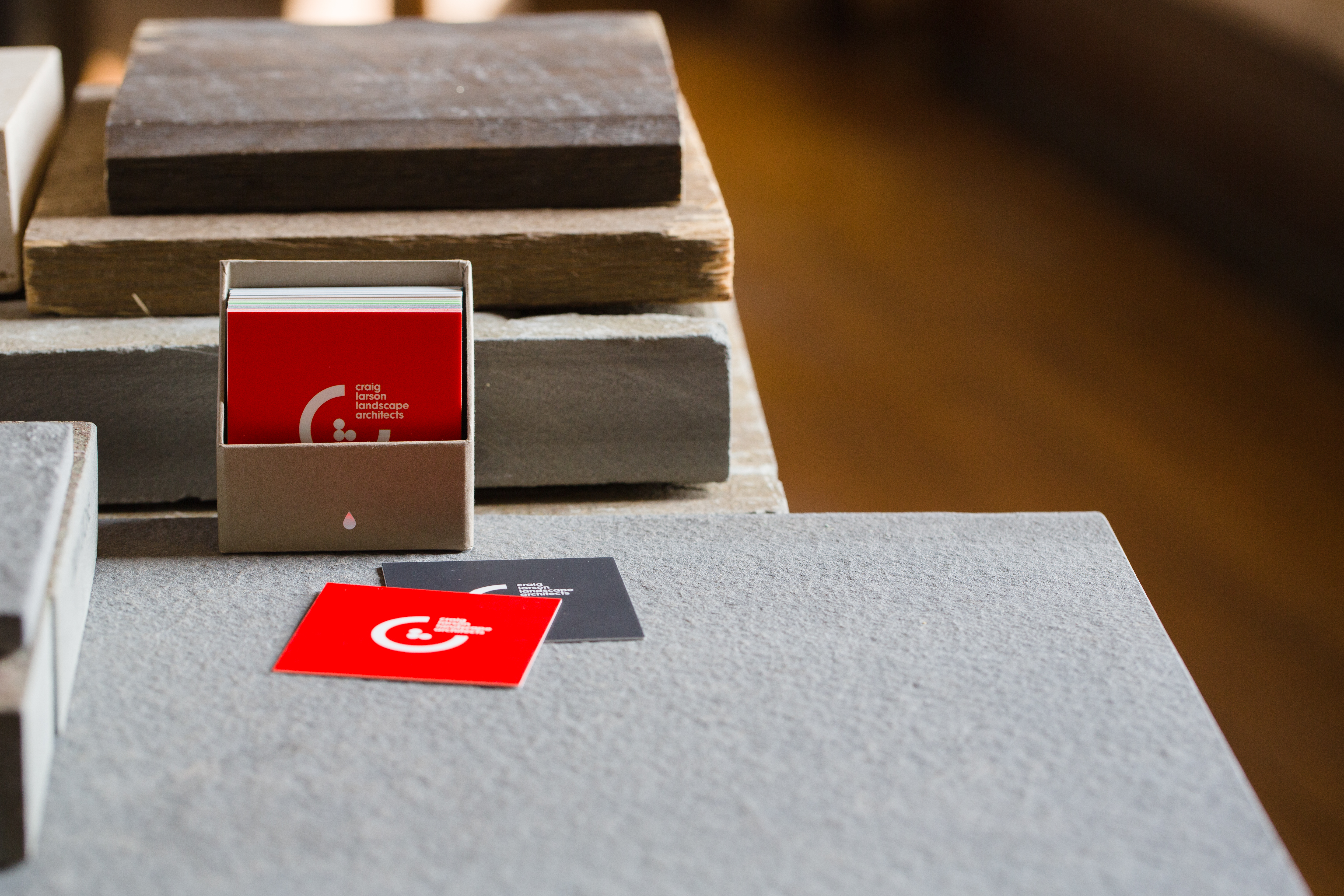
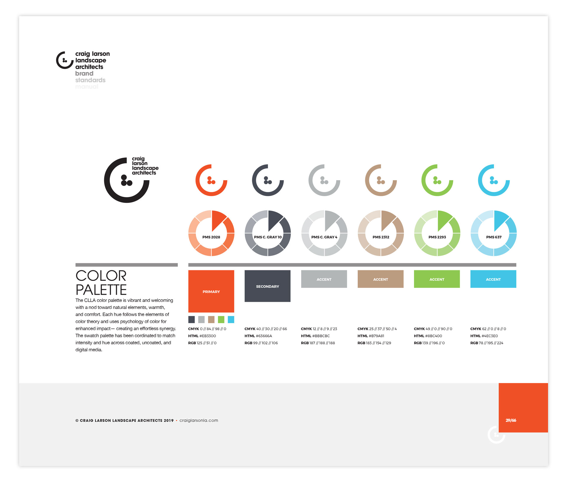
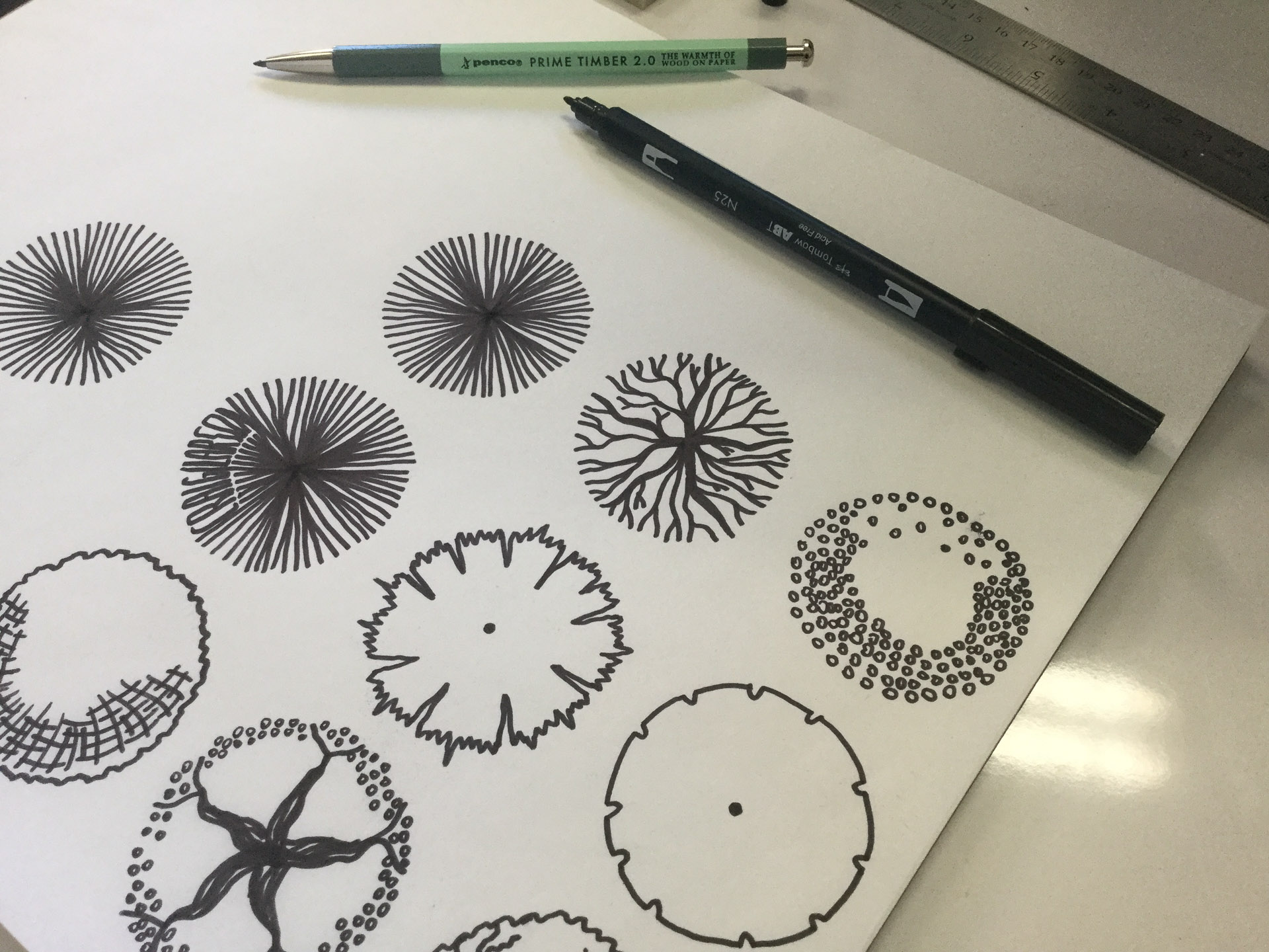
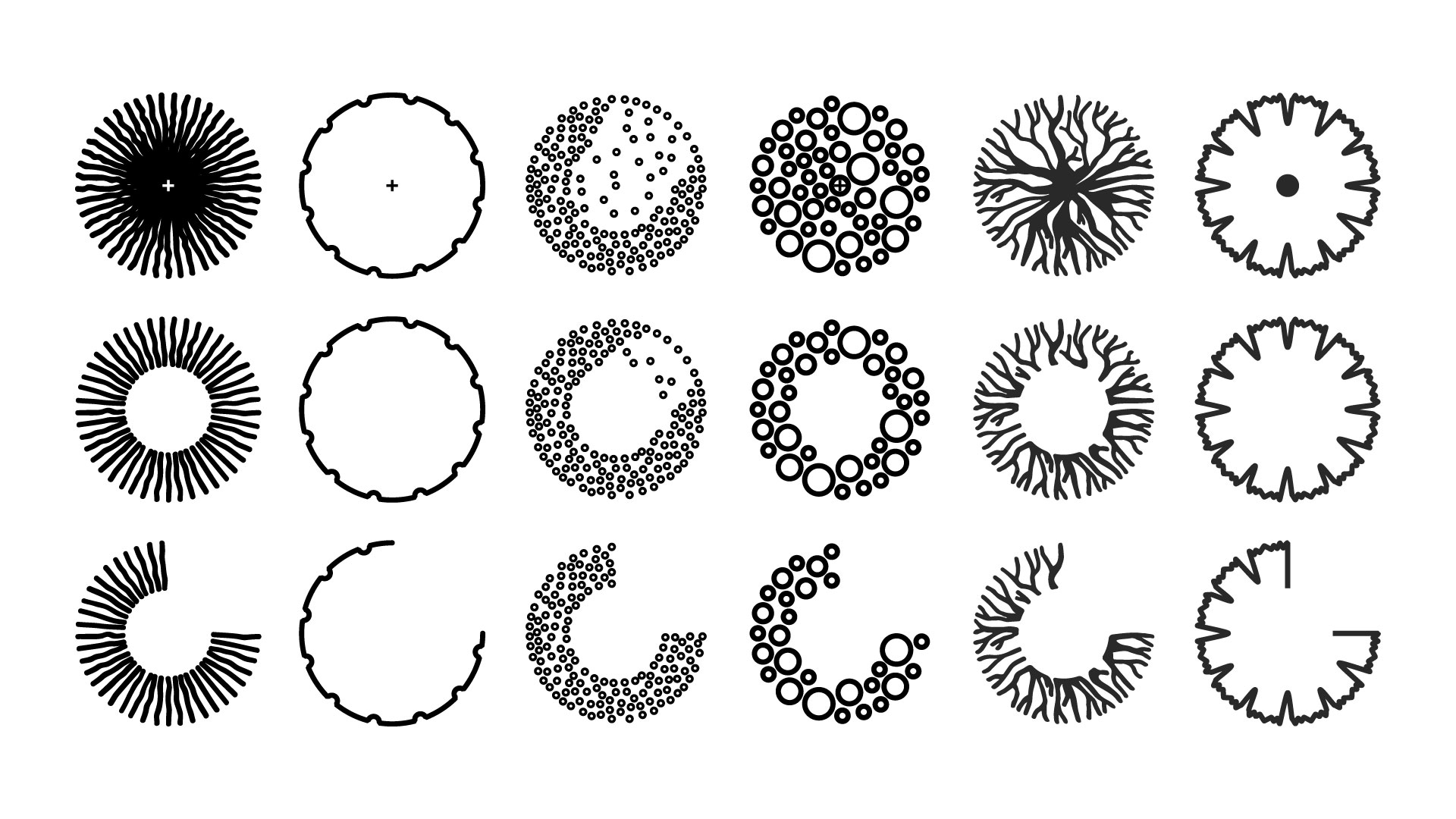
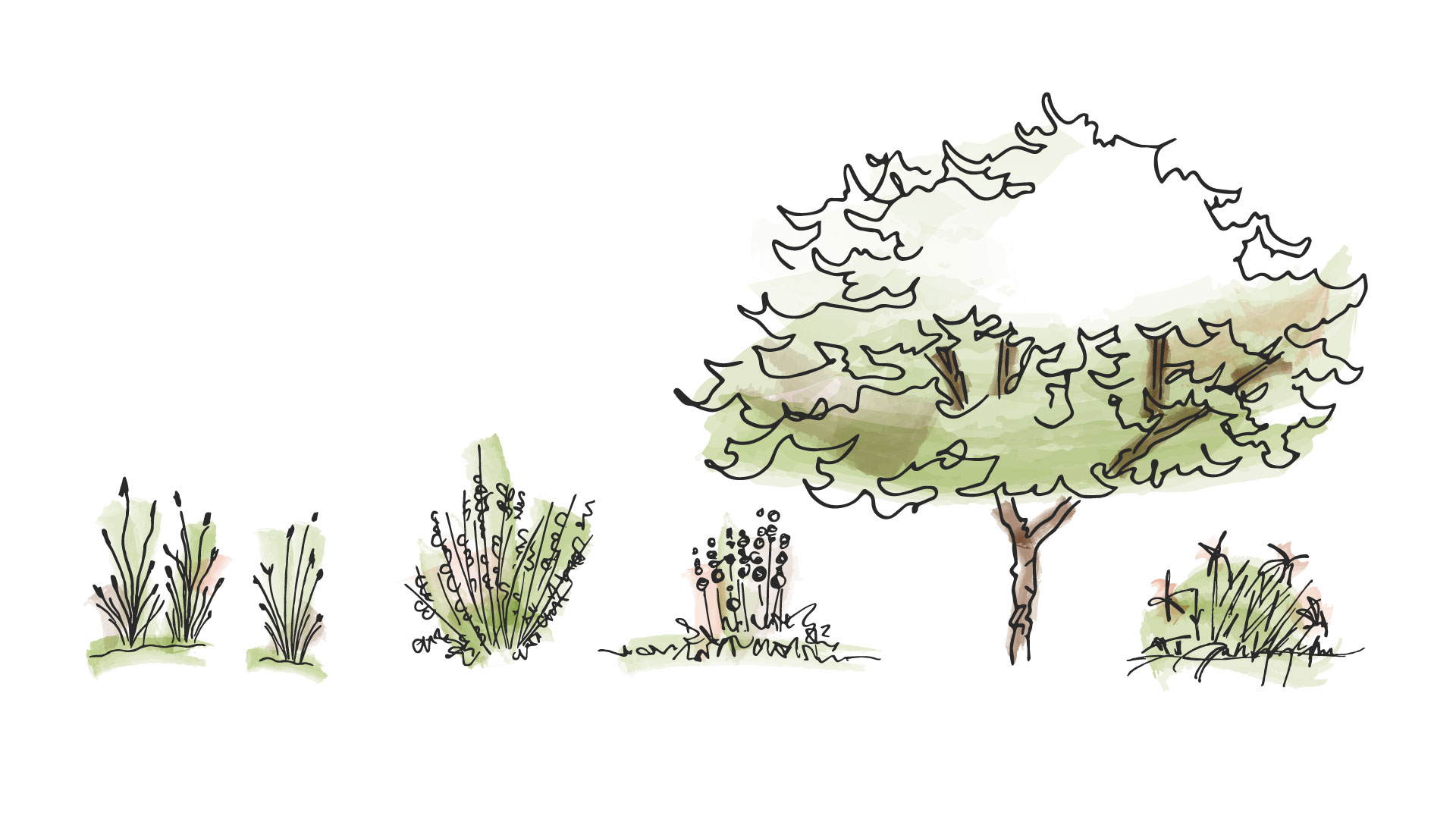
We built a color palette that pays homage to natural elements used in landscape architecture. The system also includes custom illustrations based on some of Craig’s drawings and plans.

Woman working on the computer looking at the CLLA color scheme on the screen with Pantone color swatch books on her desk
Man's hands drawing shrubs in architectural style and two boxes of markers on the table
A single page of the brand identity manual displaying the CLLA color scheme
Paper showing sketches of bushes with a pen and pencil nearby
Iconography of six different styles of shrubs designed as part of CLLA's atomic design system
Sketches of greenery, trees, and shrubs with touches of green and tan to resemble architectural shading

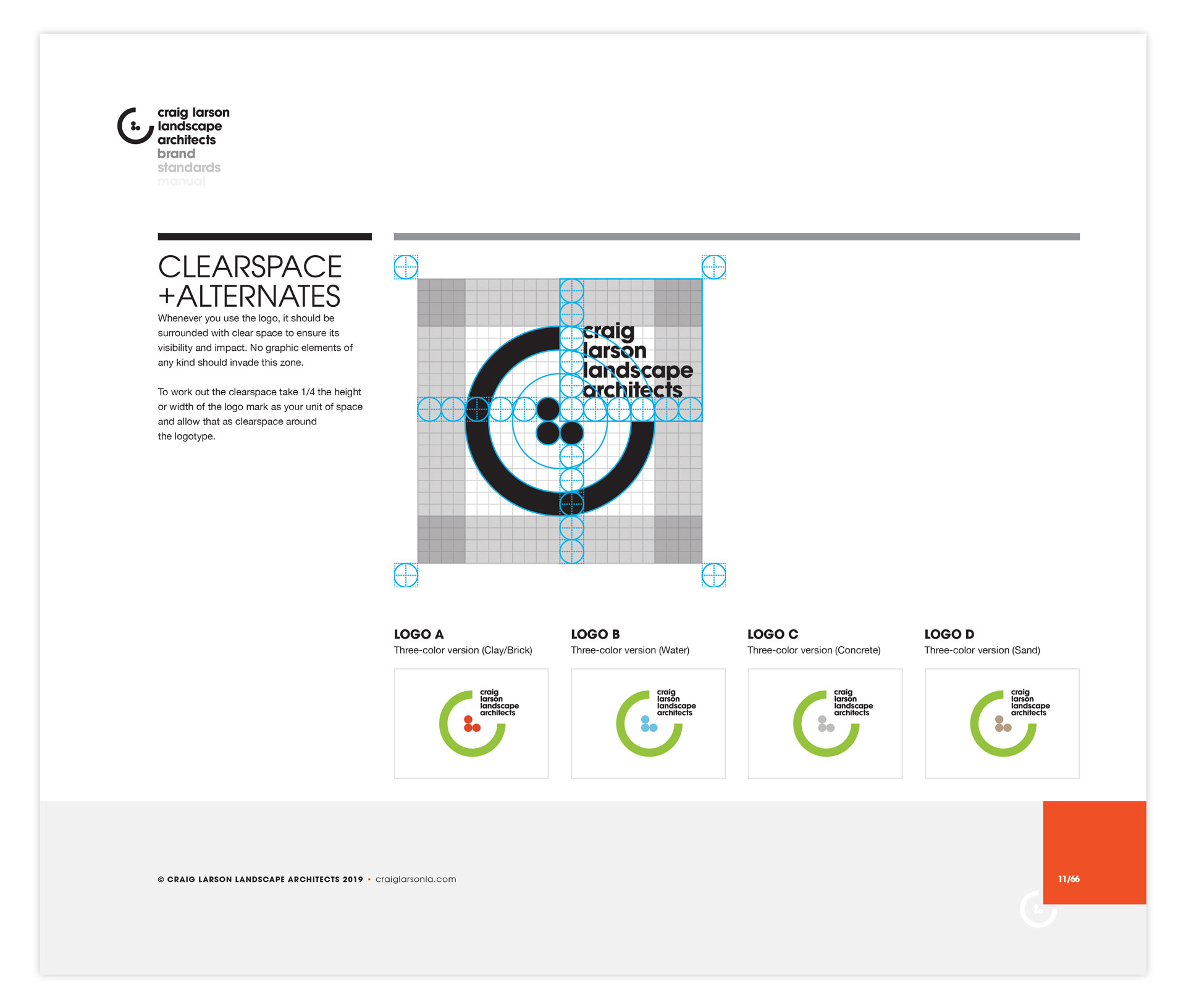
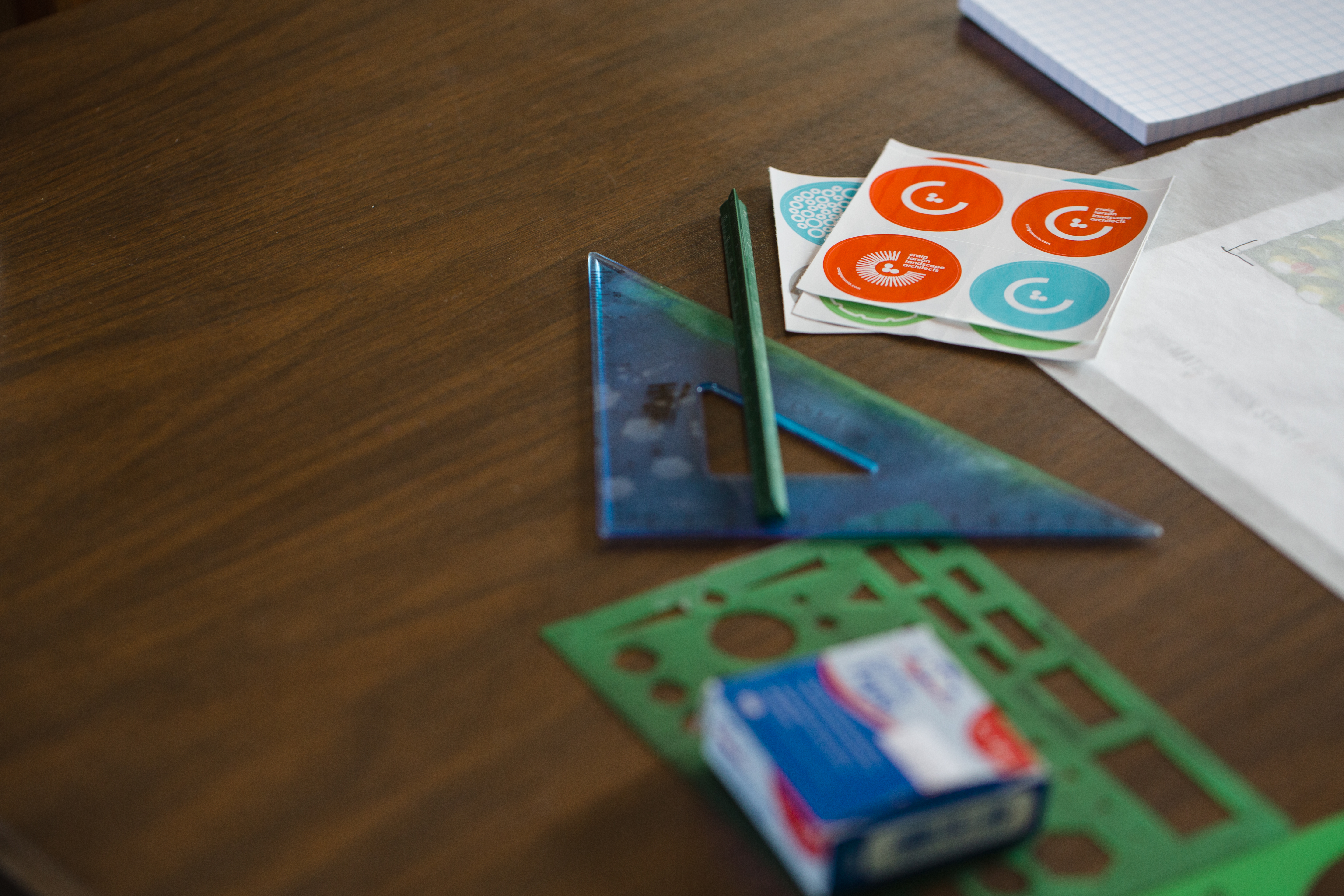
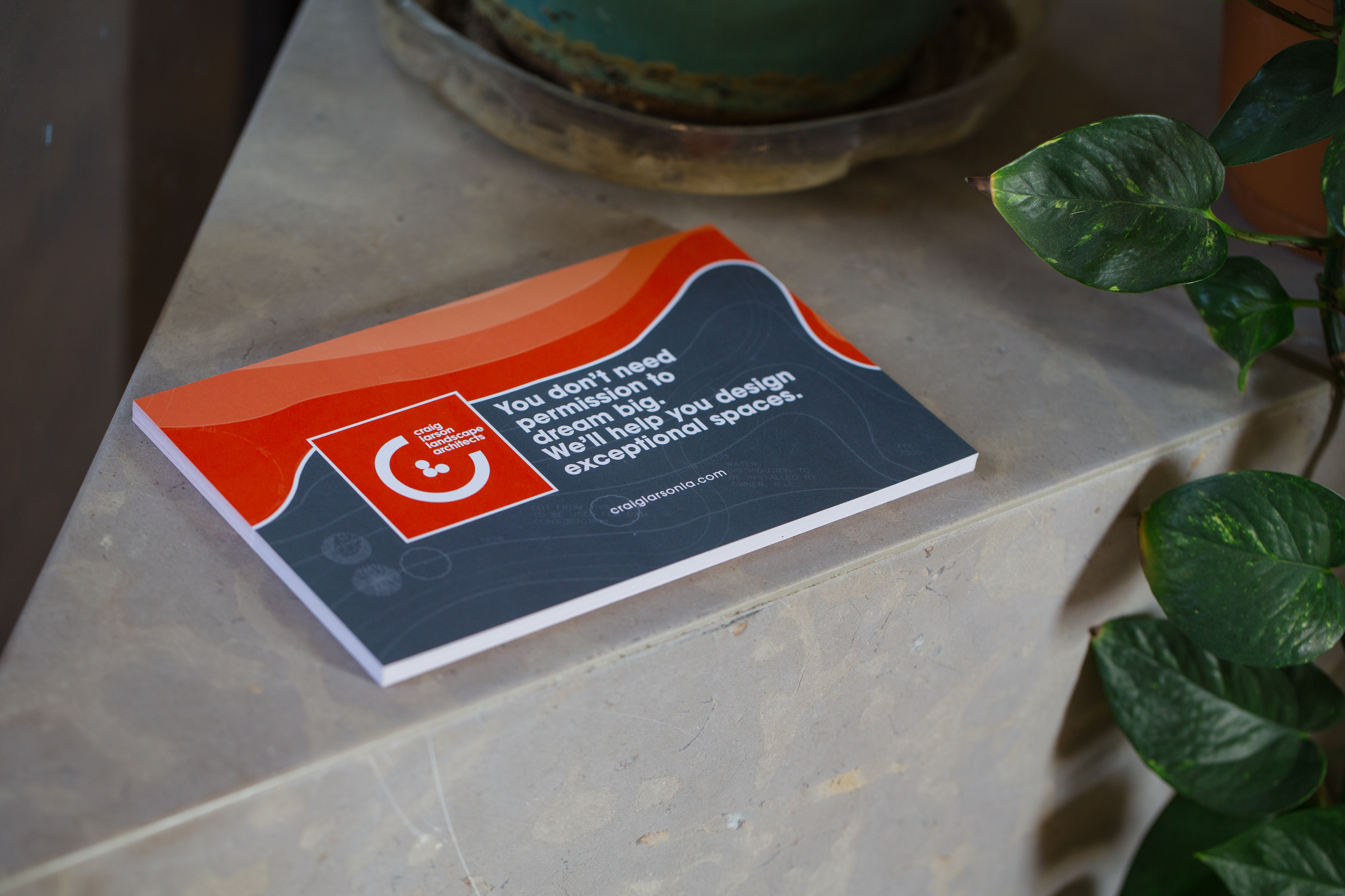
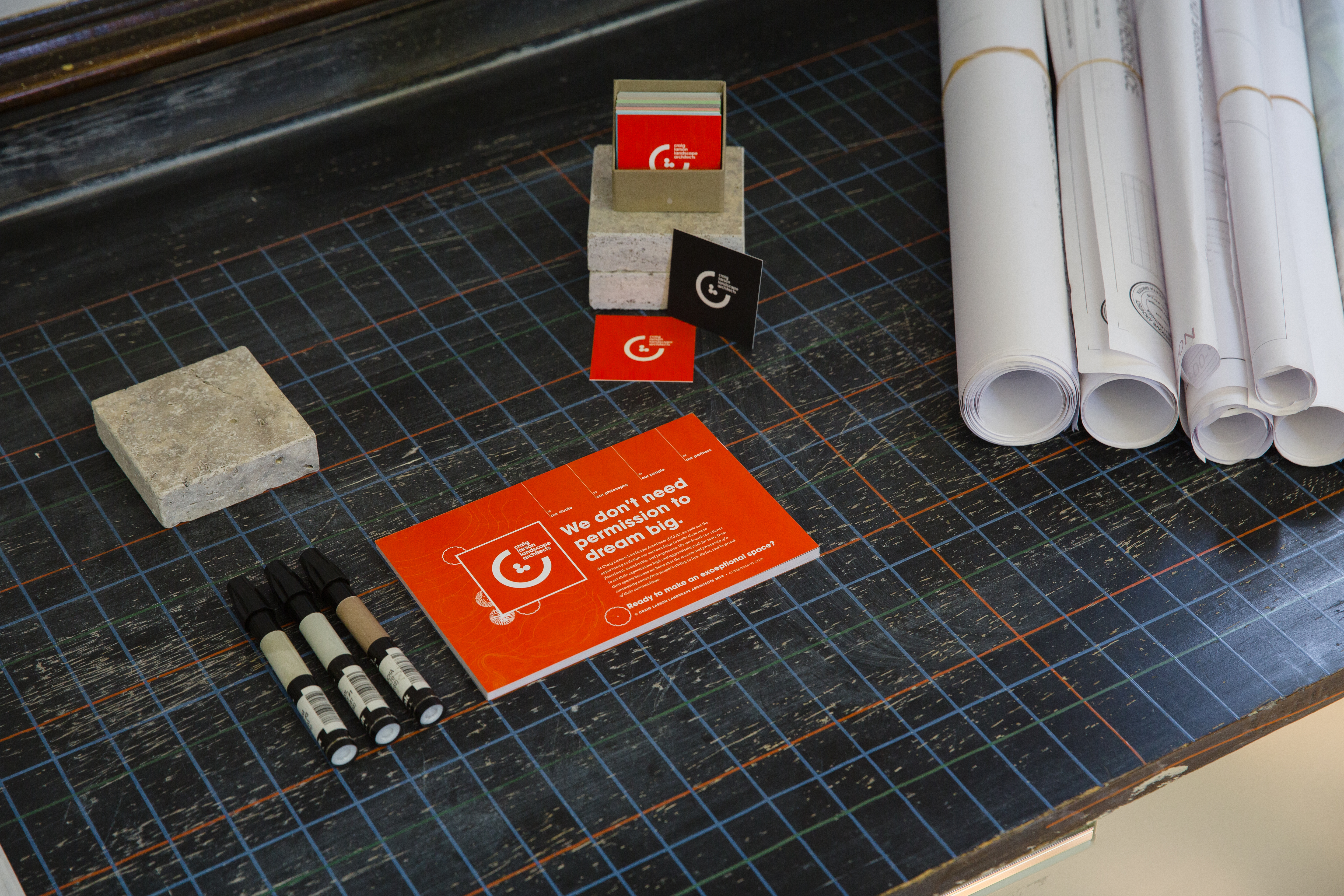
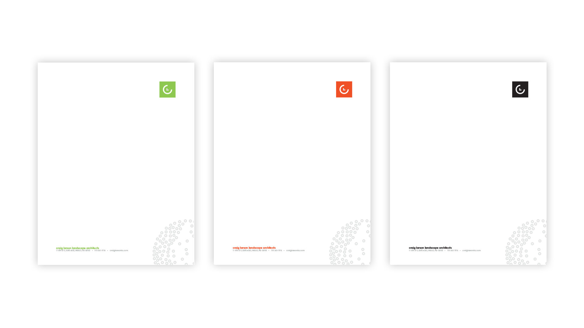
The CLLA logomark is designed for adaptation based on its usage - utilizing different colors and styles depending on the application and presentation. Collateral for promotion and custom stationery uses atoms of the CLLA design system to display a cohesive message.

A brand identity manual page displaying two postcard designs and round stickers bearing variations of the CLLA logomark
Branded CLLA logomark round stickers and assorted drawing tools on wood table
Stack of designed postcards displaying CLLA logomark and brief description of company sitting on stone near plant
Red, CLLA-branded and box of square business cards next to rolled blueprints on a black gridded mat
Red postcard displaying CLLA logomark nestled in a green, potted fern
Brand manual displaying typography for CLLA brand identity system next to rolled blueprints on a black gridded mat
Green, red-orange, and black versions of CLLA branded letterhead

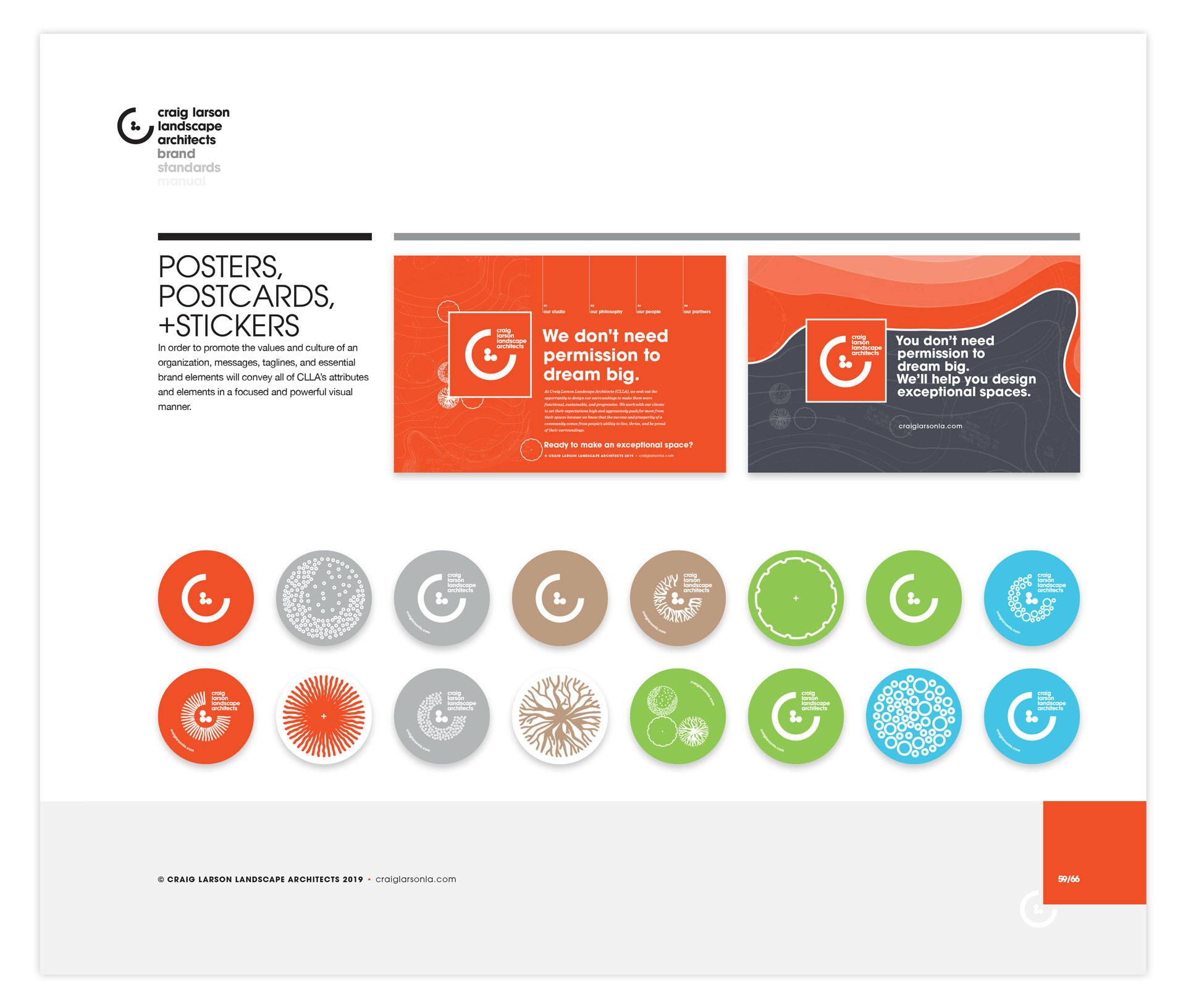
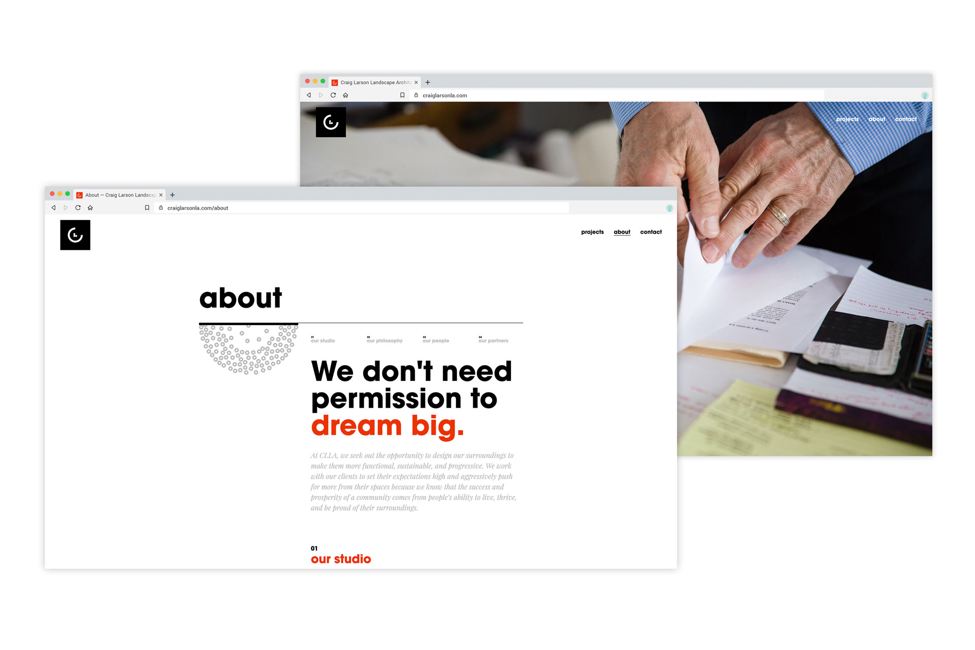
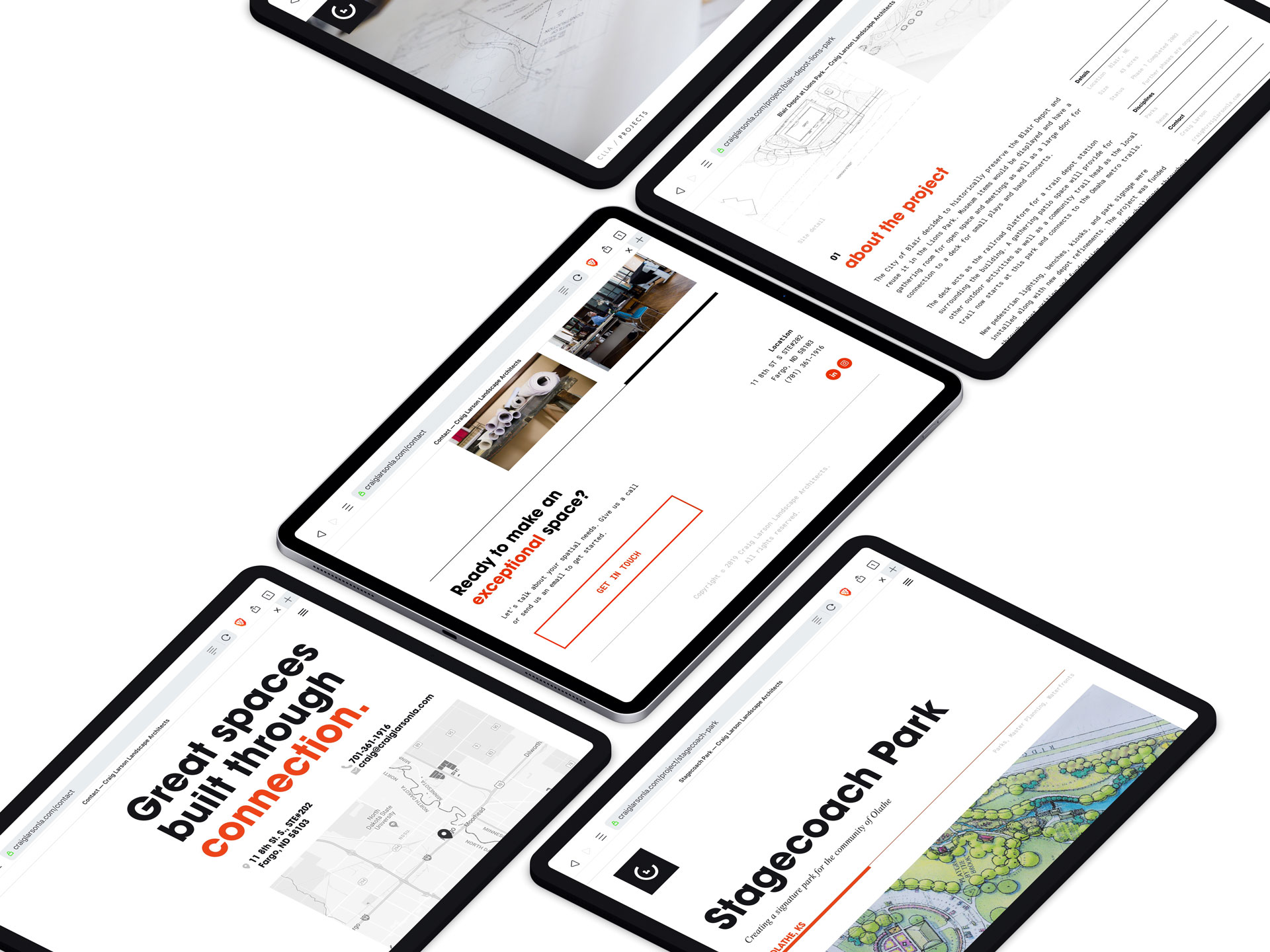
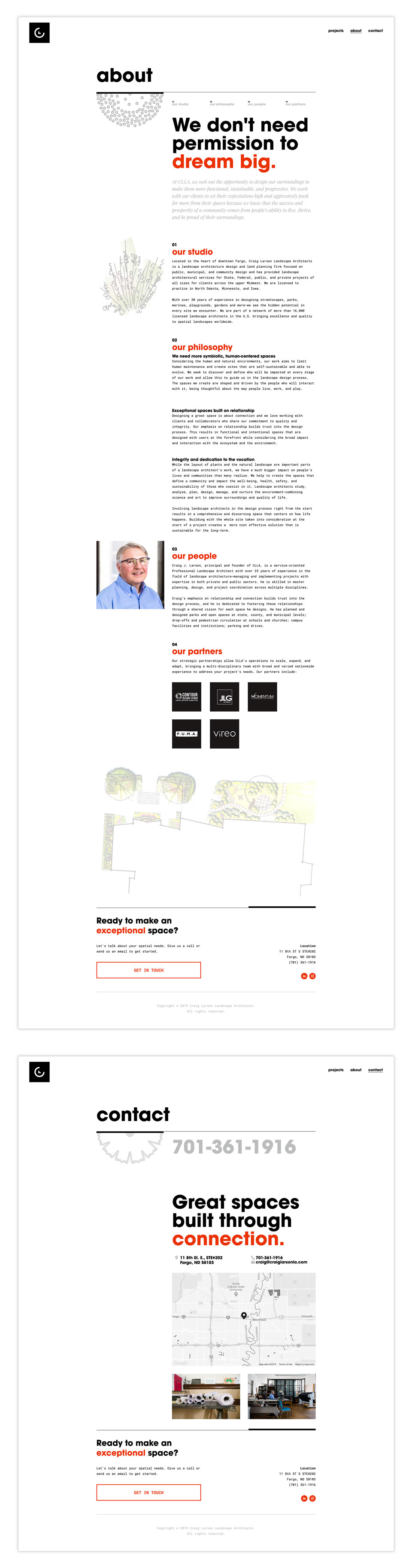
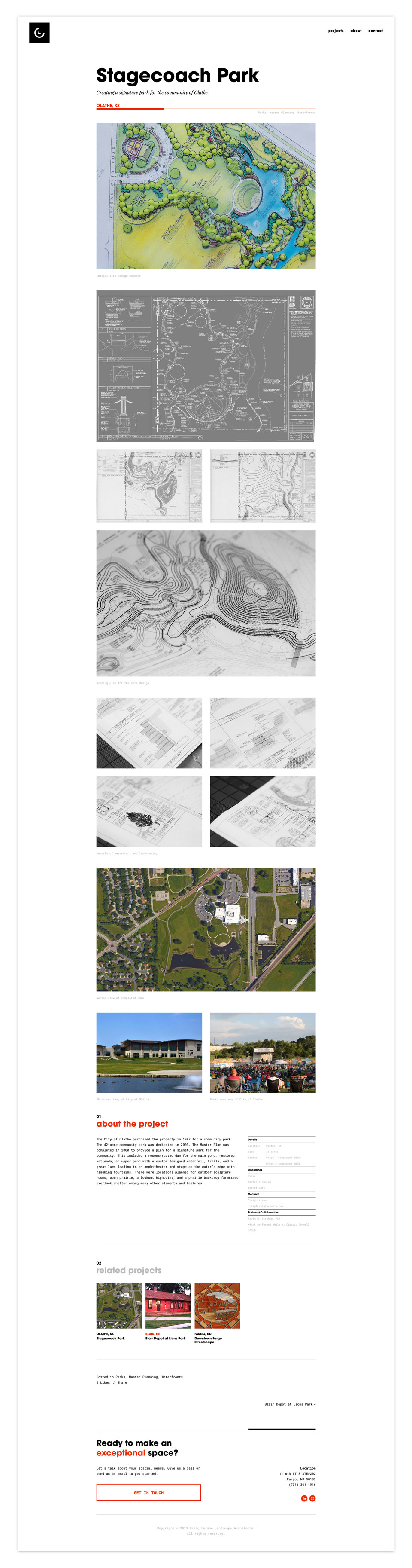
With no existing web presence, the CLLA website was created to give Craig a digital platform for information and promotion, highlighting some of his past projects and informing current and potential clients about his values and philosophy.

Mockup of two browser windows displaying the first screen of the CLLA website homepage and about page
Isometric view of iPad screens showing various screenshots of the CLLA website
Screenshot of About and Contact pages on CLLA website displaying illustrations and information about the company
Screenshot of a single project page on CLLA website displaying details about the design of the Stagecoach Park
Photo grid of of blueprint rolls, markers, office plants, and a man sitting at a desk working on a computer
Five clear acrylic panels with white vinyl lettering hanging in the window of a brick building

Dakota Business College Signage

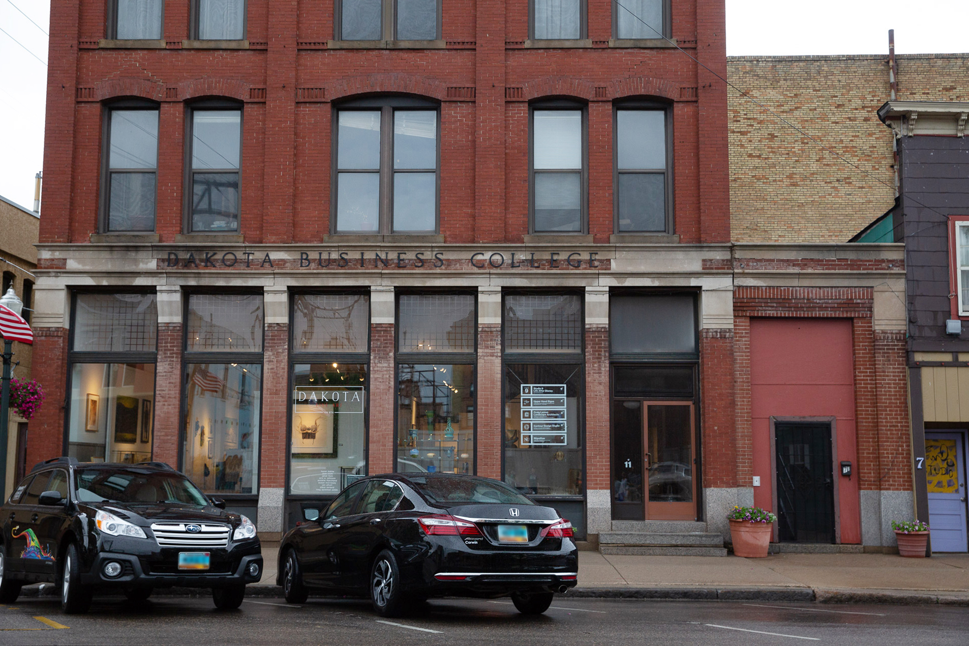
In June of 2018, we collaborated with our studio neighbors to design new environmental signage for the former Dakota Business College. After a few days of playful creativity, we collected the necessary materials and Upper Hand Signs offered their space and hands to help with the mounting. Installation was done in partnership with Upper Hand Signs and Contour Design Studio.

Acrylic window panels being hung in front window of historic Dakota Business College
Five clear acrylic panels with white vinyl lettering hanging in the window of a brick building

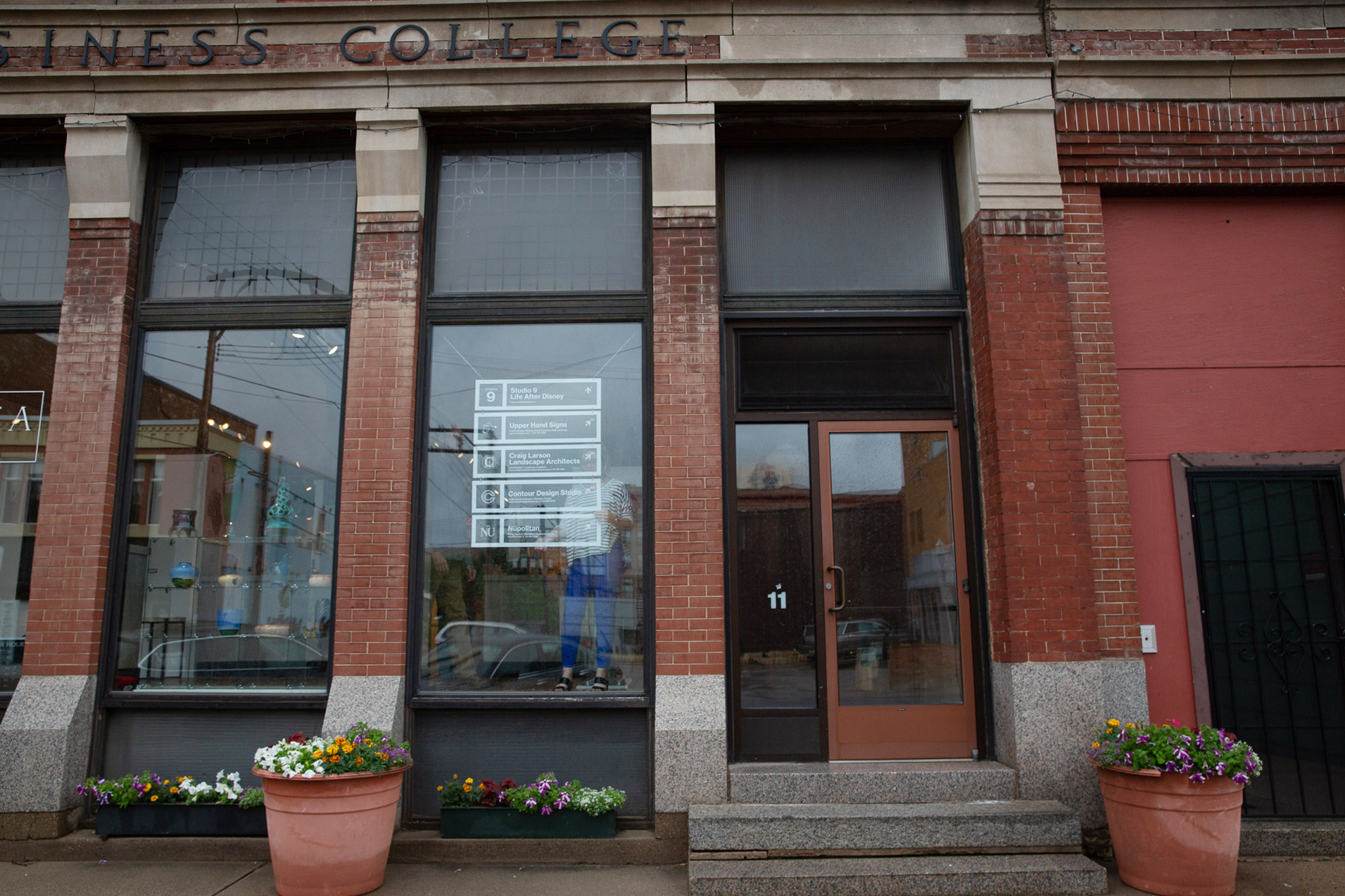
The signs were constructed from white vinyl mounted on clear acrylic to be visible from the street without blocking light and sight-lines into the first-floor art gallery.

White vinyl for Nüpolitan window sign before application
White vinyl for Upper Hand Signs being applied to acrylic with blue backing
Woman applying white vinyl to rectangle of clear acrylic with kraft backing
Rectangular acrylic panel with white vinyl for Nüpolitan's window sign
Close-up of white vinyl arrow, room number 203, and border on clear acrylic

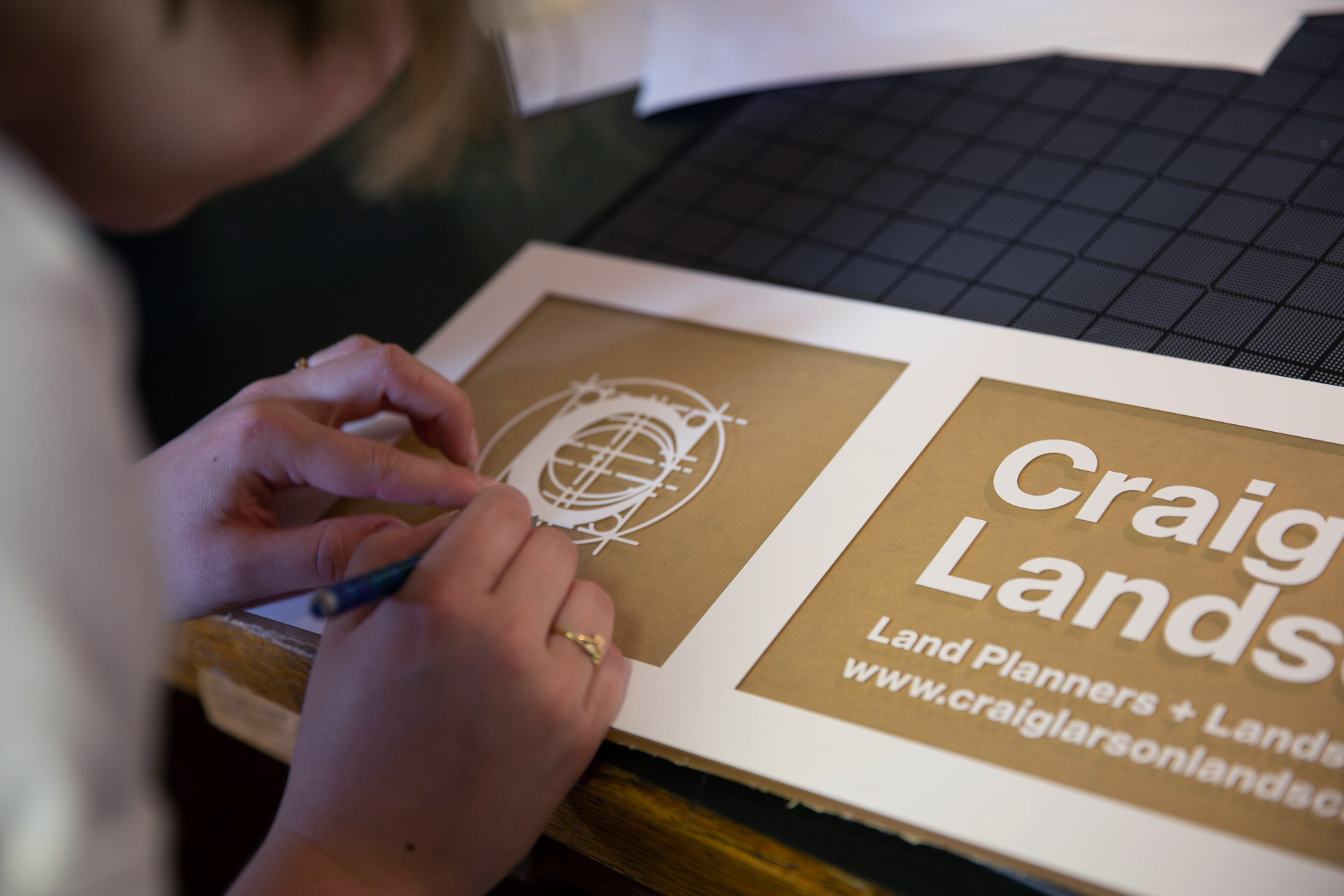
Each sign is designed using a grid system featuring a single-color version of the business’s logo as well as contact information laid out in Neue Haas Grotesk. The ability to remove and rearrange the signs allows for this cohesive system to be flexible as tenants may change over time.

Acrylic window panels being hung in front window of historic Dakota Business College
View of the front of the historic Dakota Business College with clear acrylic and white vinyl hanging signs
Five men and one woman standing in front of brick building displaying new acrylic and white vinyl signs

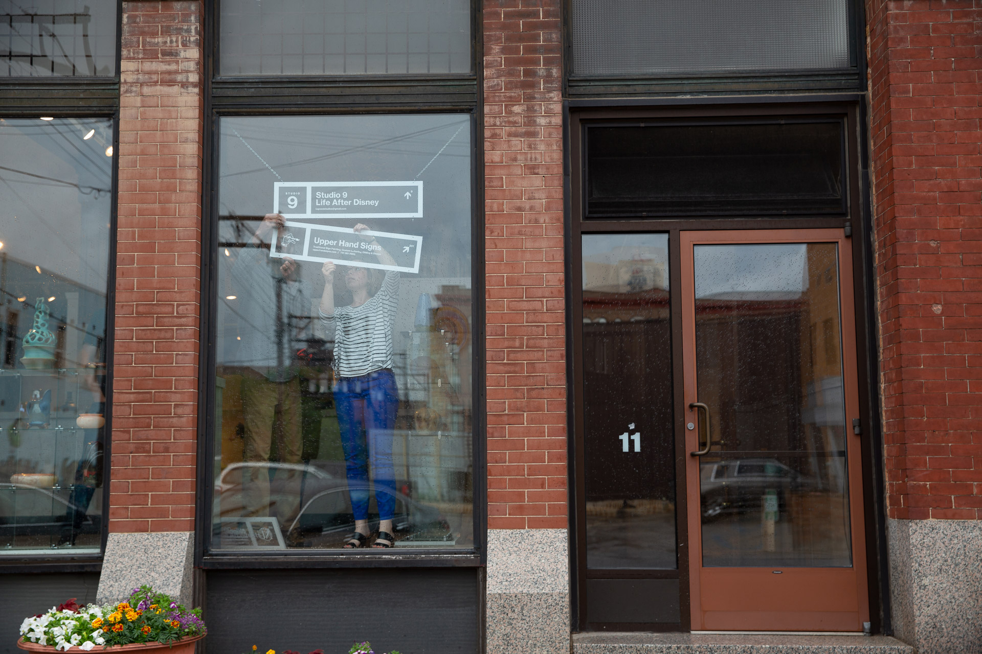
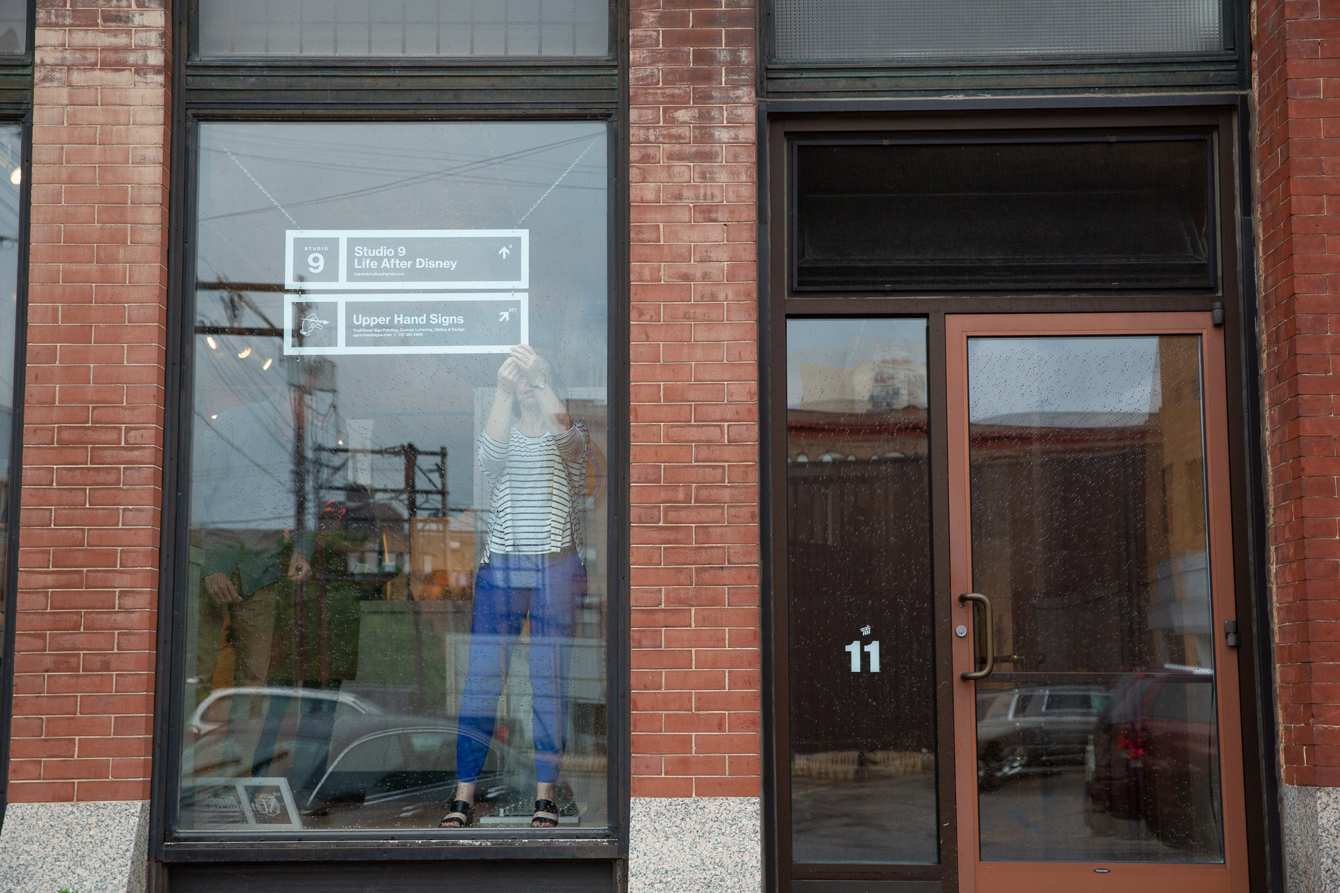
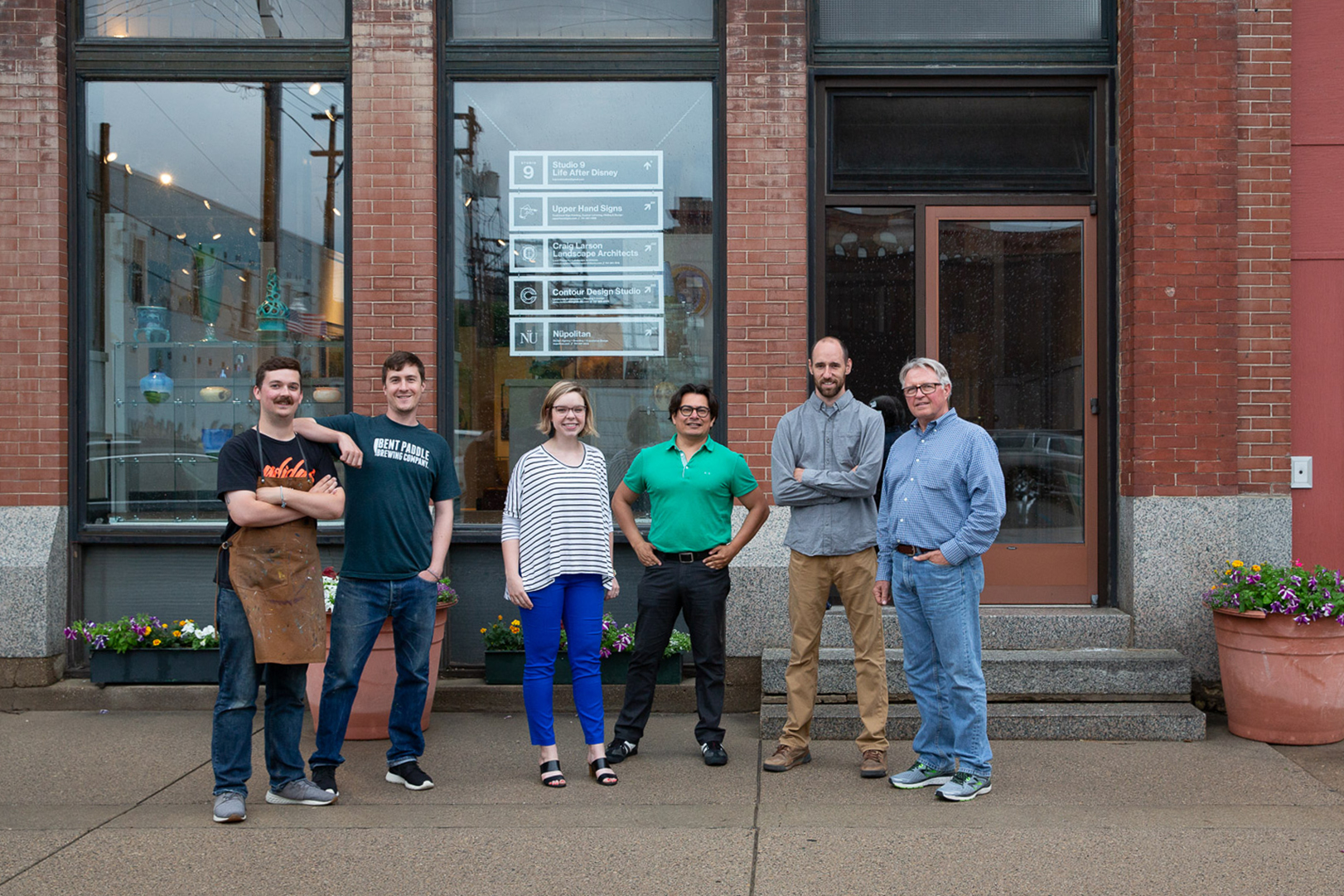
Pictured from left: Cory & Jared from Upper Hand Signs, Allison & Ludvik from Nüpolitan, Brian from Contour Design Studio, and Craig from Craig Anderson Landscape Architects

Close-up of two printed booklets and a red pen

Go BIG Booklet

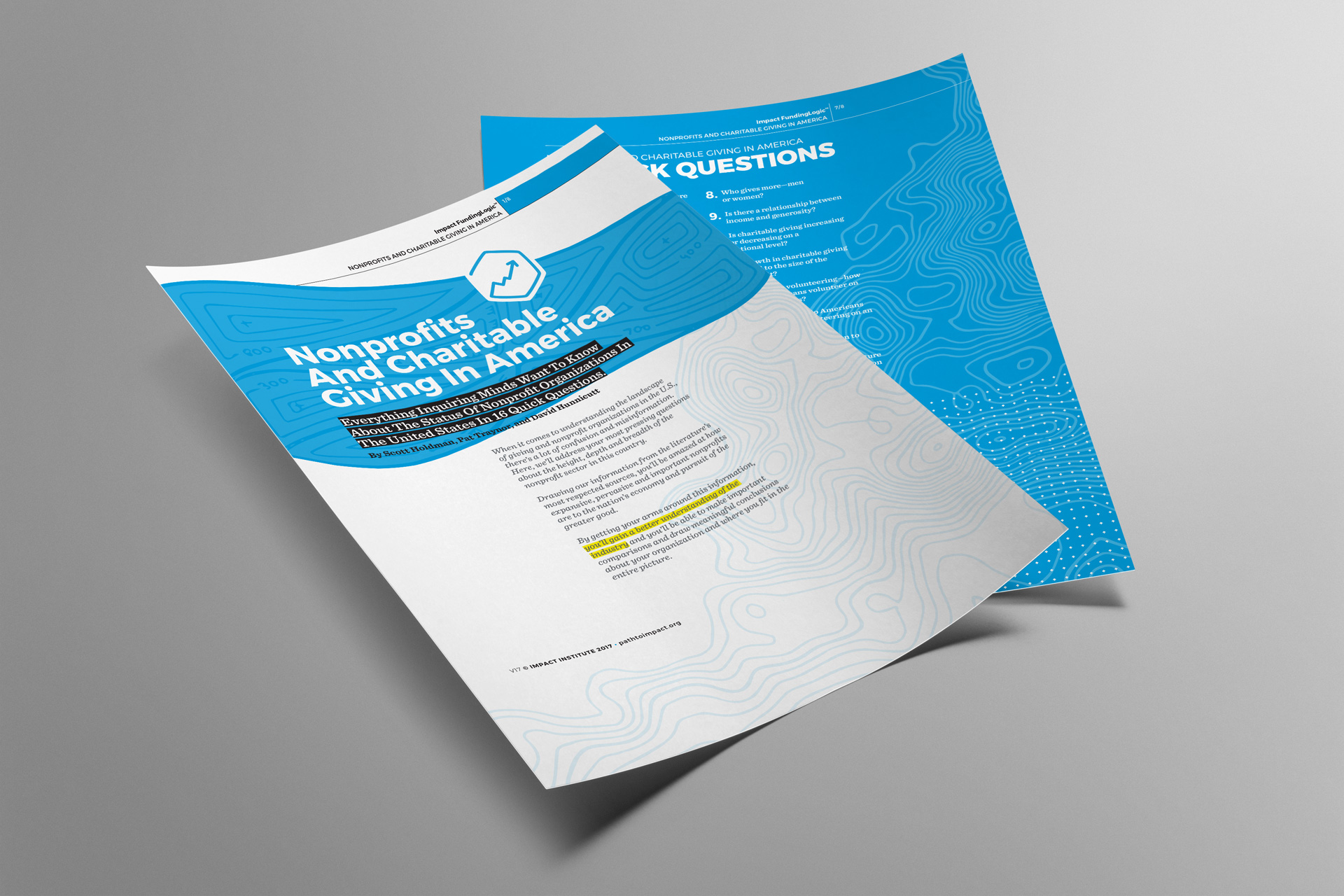
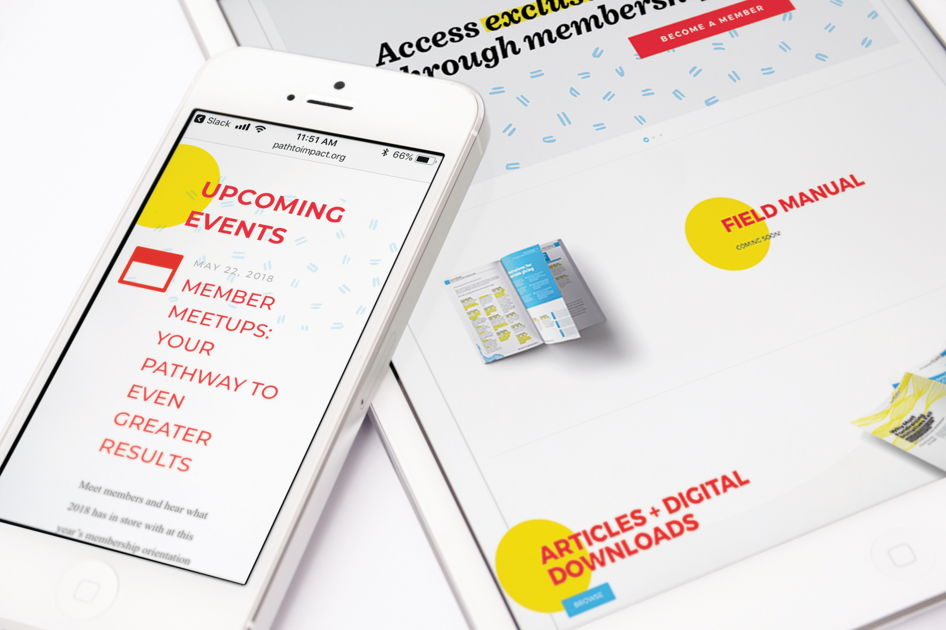
The Go Big Booklet was created as an integration of previously designed articles and materials (done by Nüpolitan at an earlier date for Impact Institute, an initiative of Dakota Medical Foundation) into new, event-specific material for a large fundraising event called Giving Hearts Day, hosted by Dakota Medical Foundation, its Impact Institute initiative, and the Alex Stern Family Foundation.

We merged a friendly illustration style created to highlight the event with the more structured style of the previously designed articles for a document that is both energetic and functional. A dot grid and yellow highlighting carried over from the articles are integrated to tie this new packet to existing materials and add a sense of cohesion throughout.

Two printed booklets laying on red background next to a black journal, red journal, and colored pens
Close-up of two printed booklets and a red pen
Red line and heart pattern
Red hand-drawn arch pattern
Red dashed pattern
Red line pattern

Based on the organization’s ethos and the project’s objectives, this solution was designed to be:

  • Fun
  • Modern
  • Big
  • Loud
  • Established
  • Structured
  • Vibrant
  • Welcoming

And NOT

  • Static
  • Calm
  • Formal
  • Small
  • Quiet
  • Conservative
  • Exclusive
  • Serious
  • Cautious
Mockup of two pages of a printed article with blue highlights

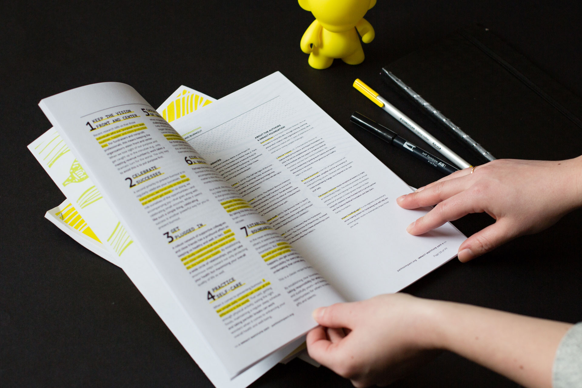
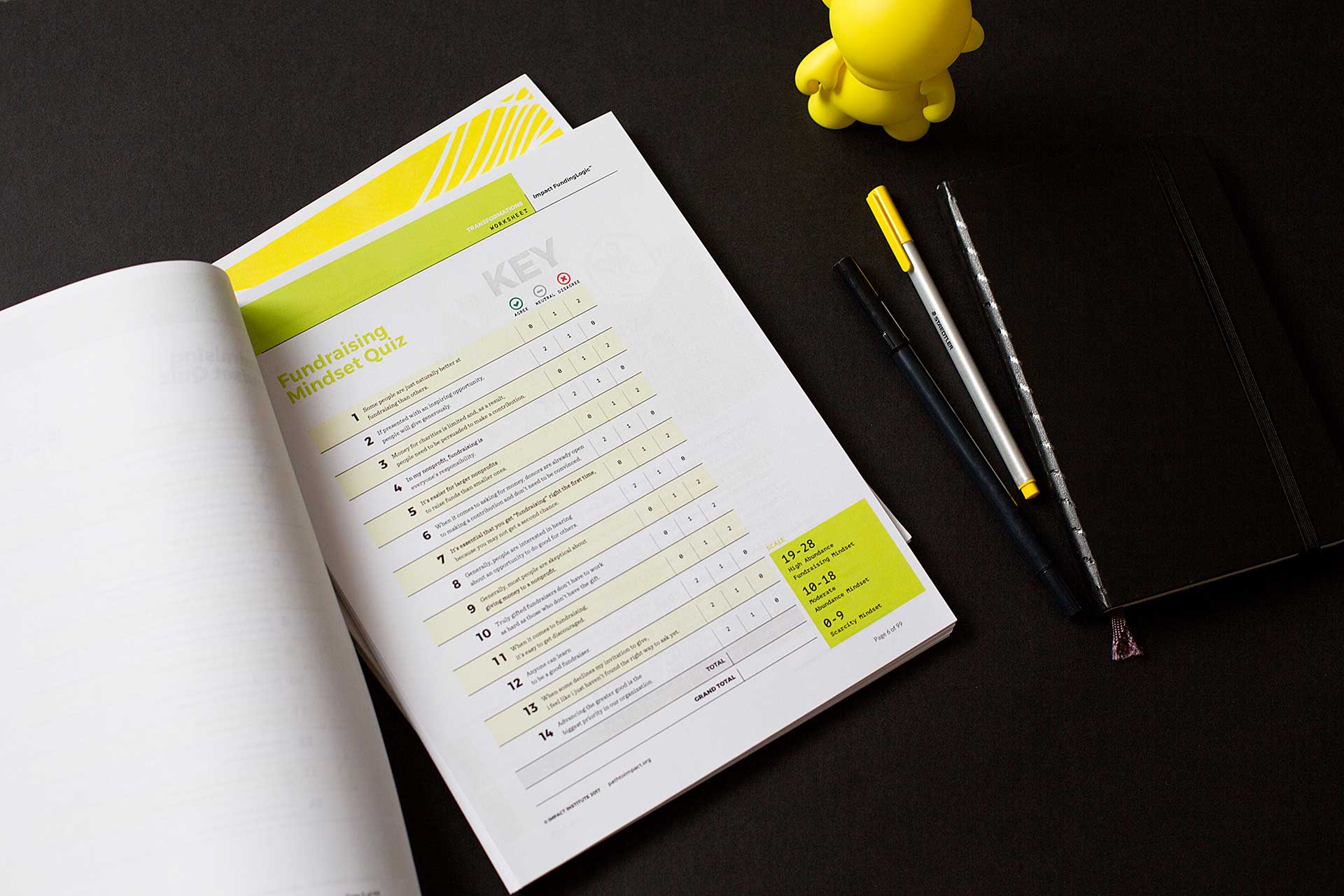
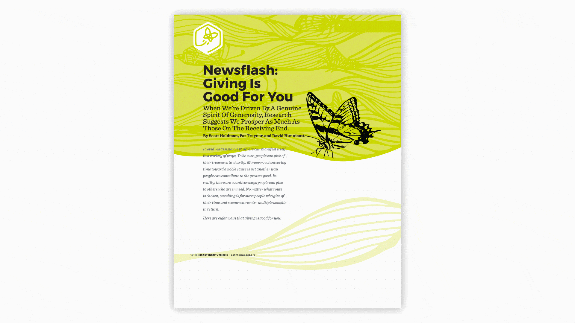
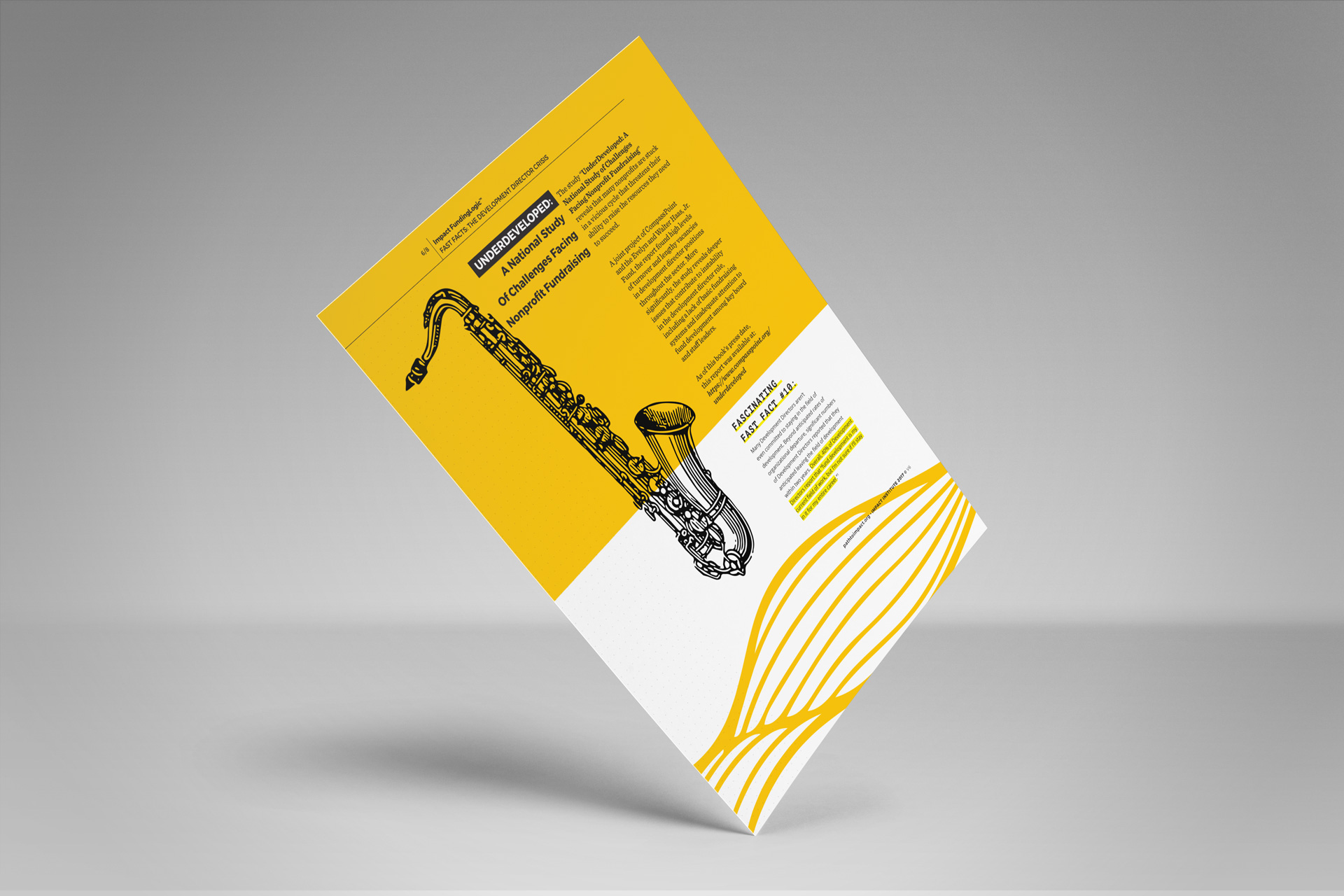
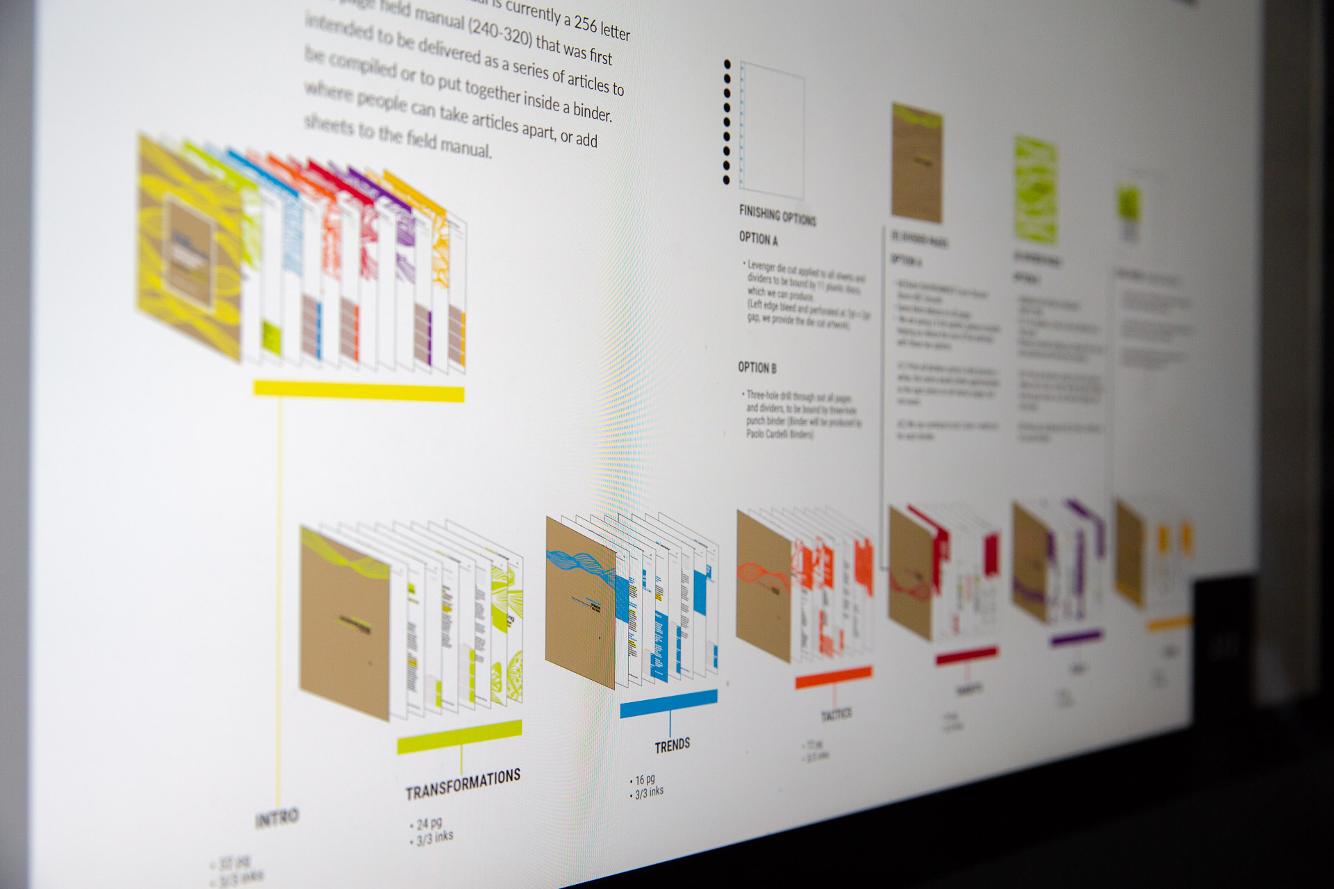
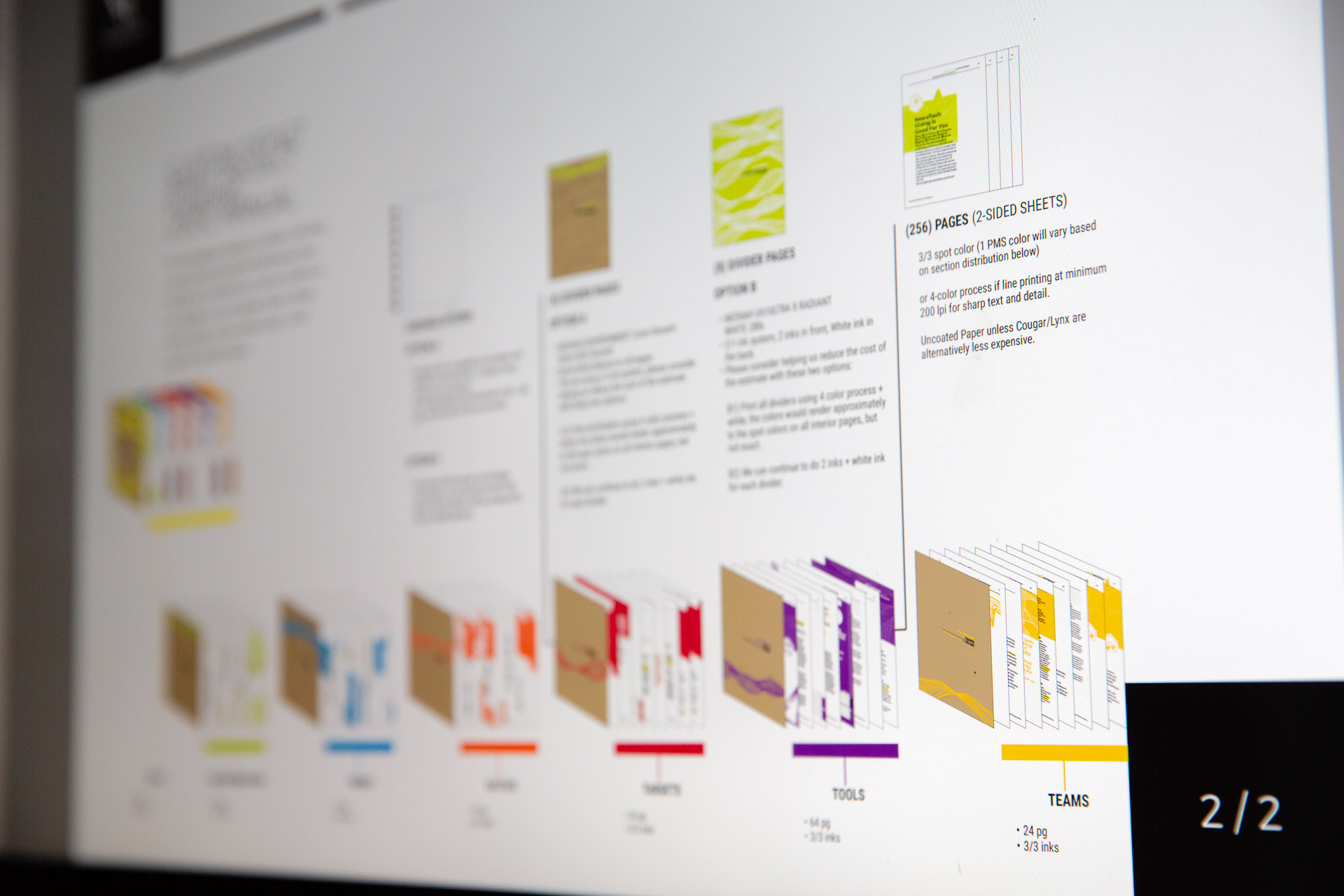
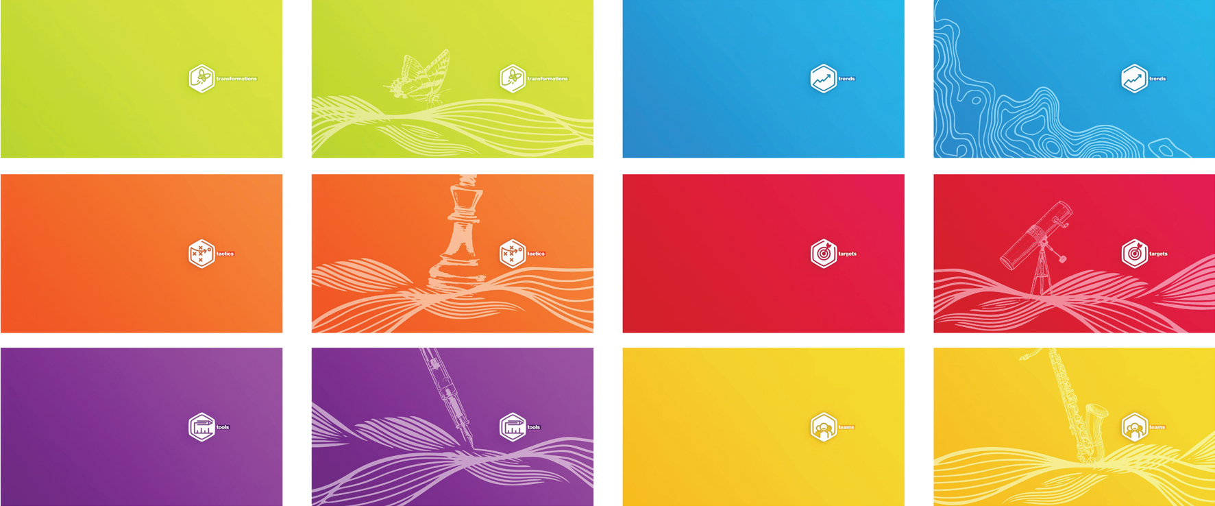
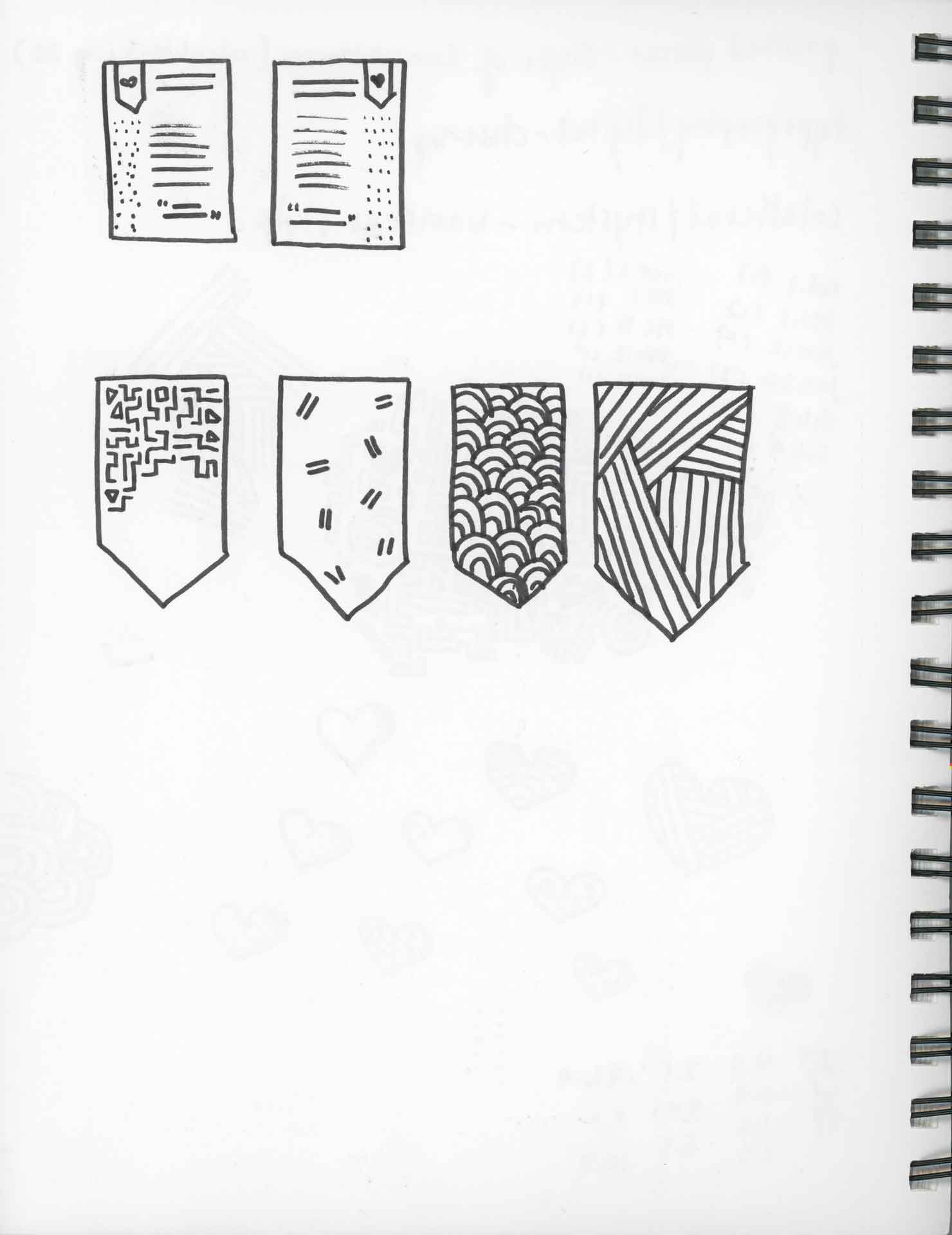
Tasked to bring energy to a series of articles and integrate them into a cohesive field manual, we used a mixture of structured grids and hand-drawn elements to create nearly 40 unique article layouts built on an atomic design system.

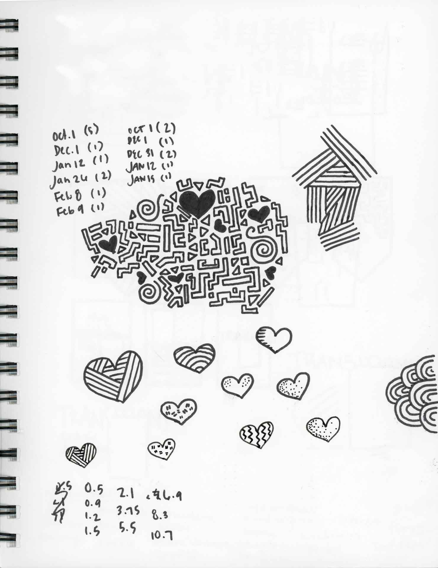
Giving each category of articles its own set of elements and tools allowed us to make articles heavy with text come alive and entice readers to keep reading. An integration of dot grids throughout encourages readers to scribble notes in the margins. Colorful, accented key messages prompt further highlighting by the reader.

Woman drawing with pieces of tracing paper displaying illustrations of telescopes stacked beside her on a desk
Telescopes and binoculars hand-drawn on a sheet of tracing paper
A man drawing waves and butterflies on a piece of tracing paper atop a black gridded mat
Sheets of tracing paper displaying illustrations of musical instruments
A wavy pattern hand-drawn on a sheet of tracing paper next to pens and notebooks atop a black gridded mat

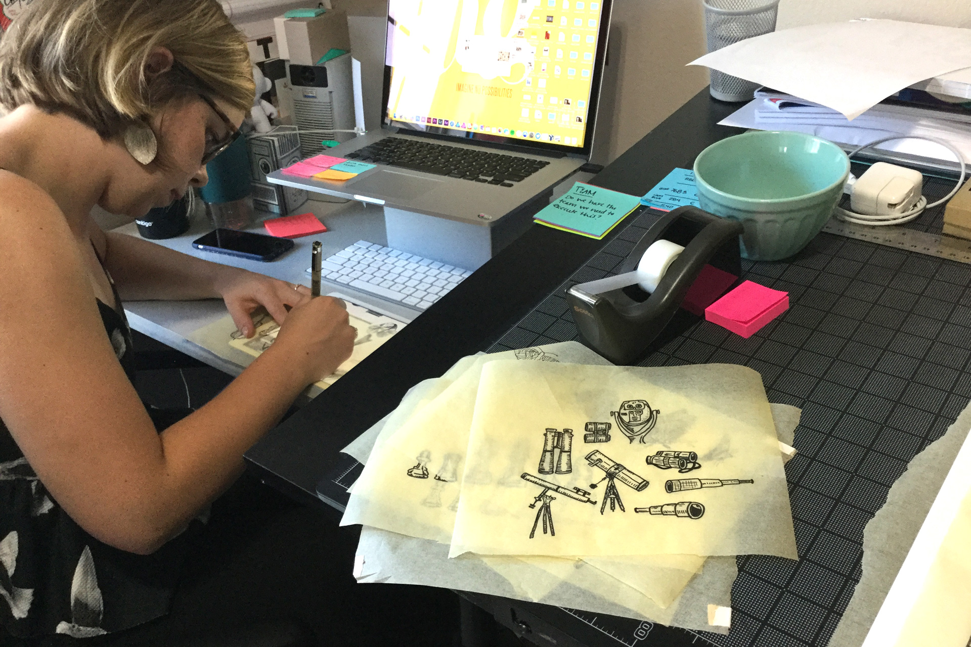
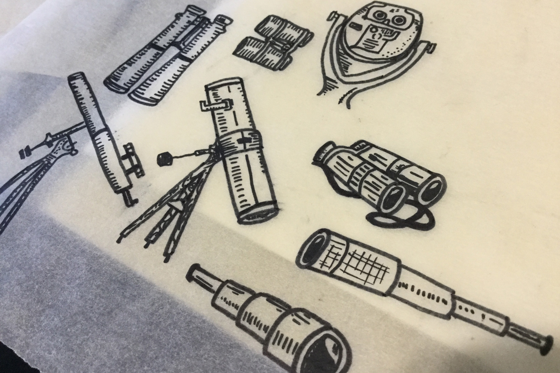
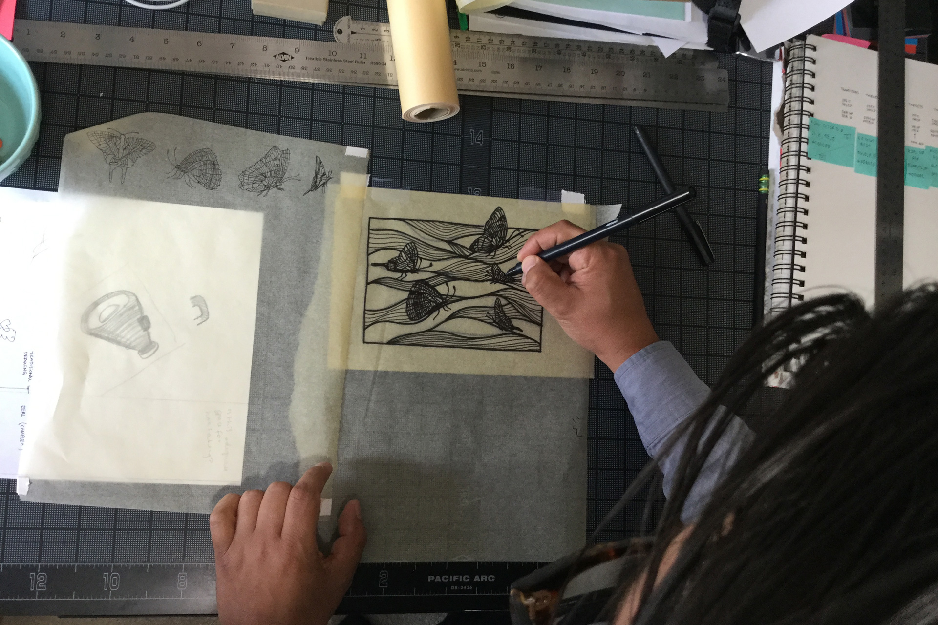
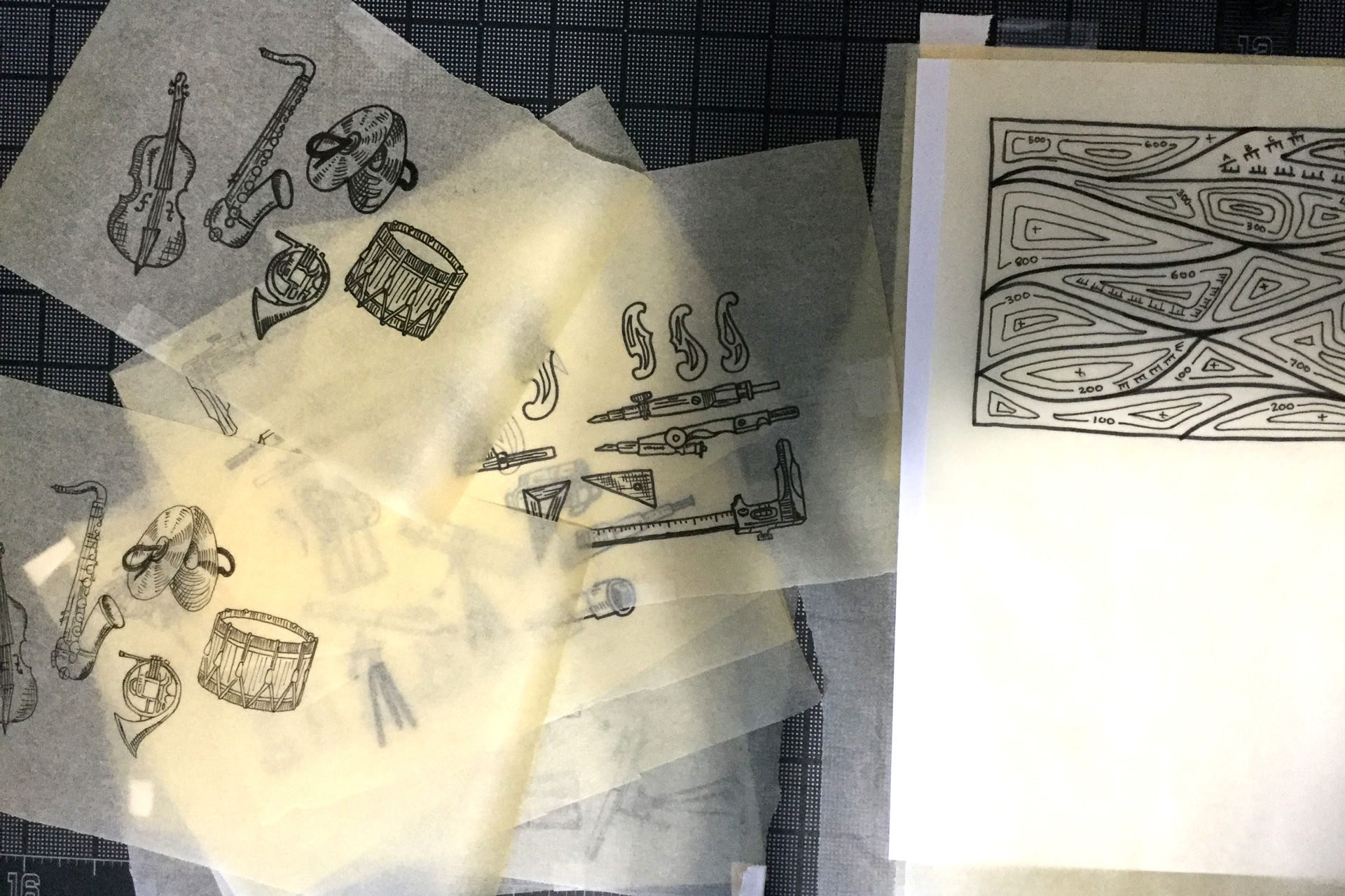
Hand-drawn illustrations accompany each category of article

Pieces of white paper with typography samples on a black desk

Iterations of typography layouts

Impact brand guideline manual open to FundingLogic icon detail page
Green butterfly Transformations icon on white page of Impact brand guideline manual
Impact brand guideline manual open to FundingLogic color scheme page
Single page from brand identity manual displaying green, hexagonal transformation icon
Single page from brand identity manual displaying blue, hexagonal trends icon
Single page from brand identity manual displaying orange, hexagonal tactics icon
Single page from brand identity manual displaying red, hexagonal target icon
Single page from brand identity manual displaying purple, hexagonal tools icon
Single page from brand identity manual displaying yellow, hexagonal team icon

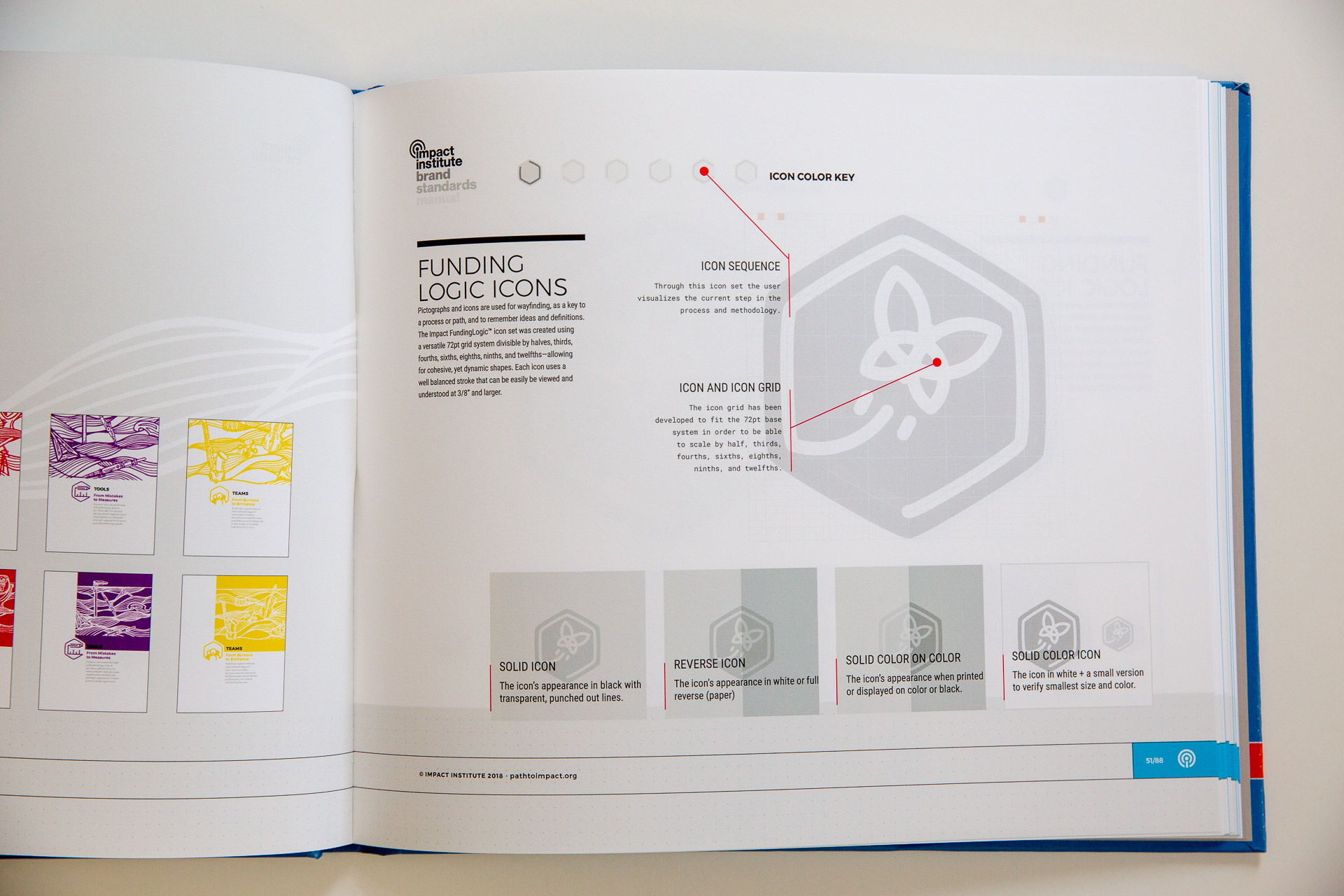
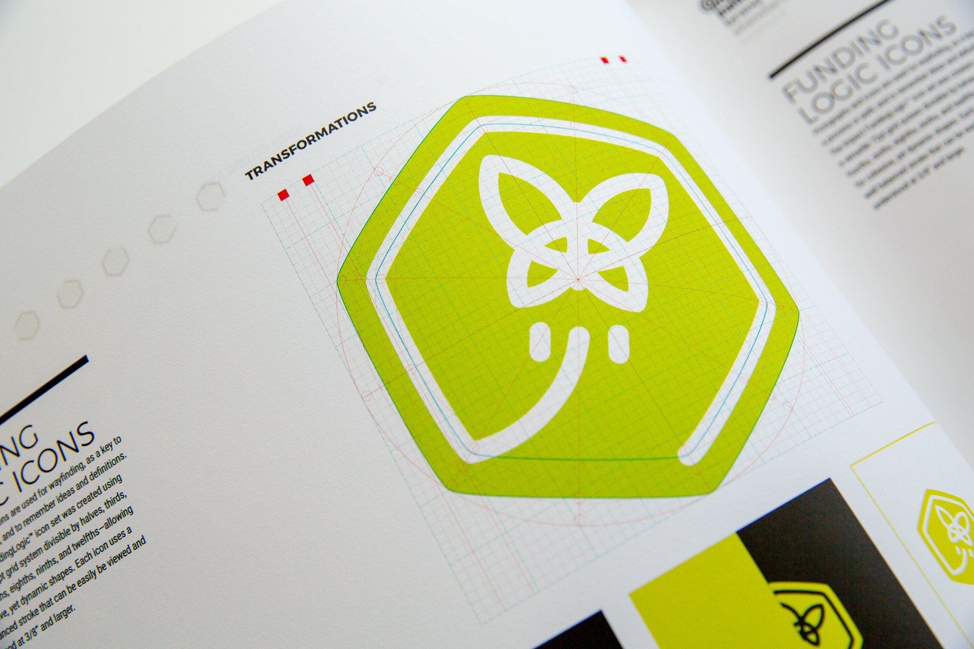
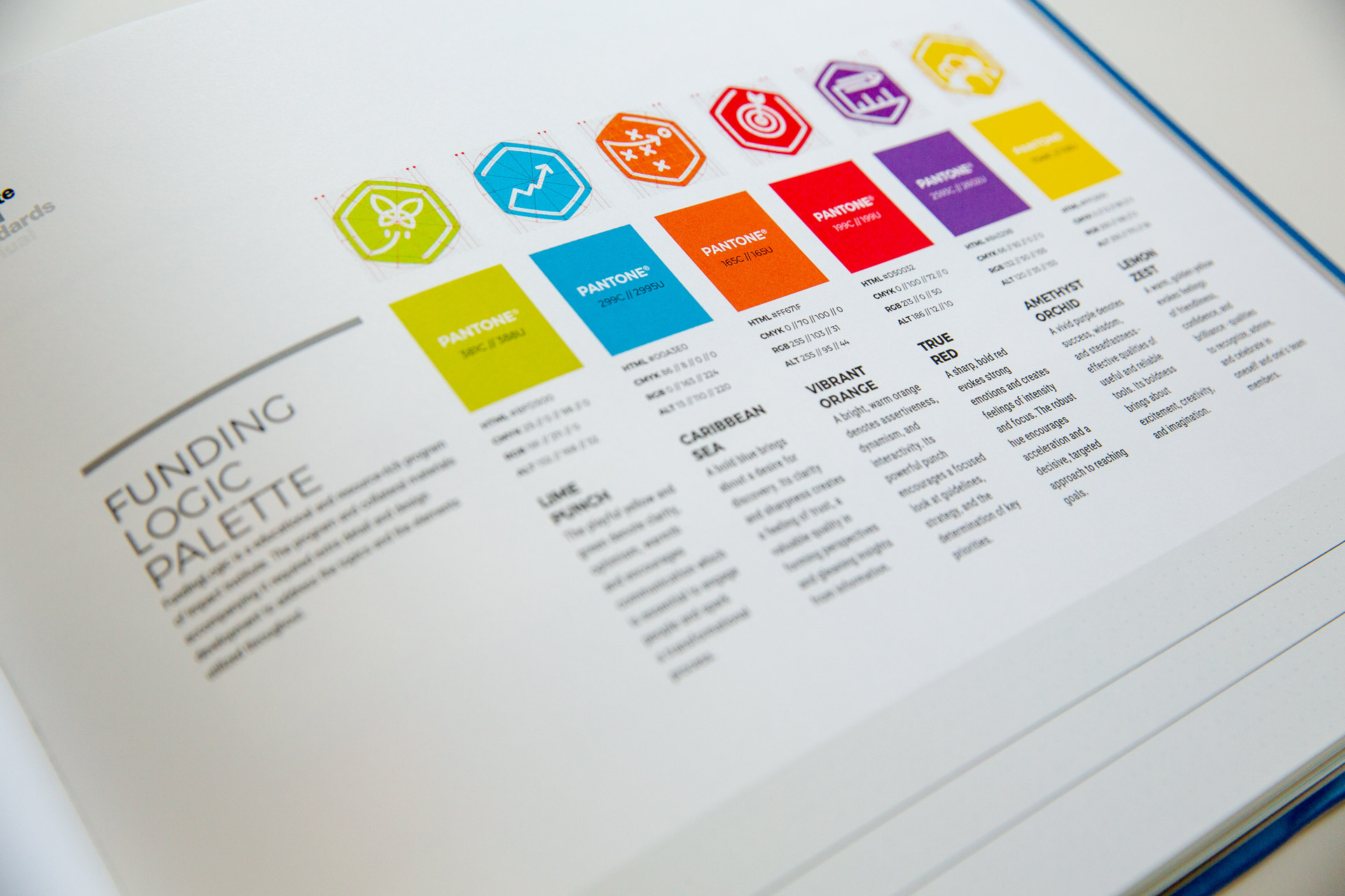
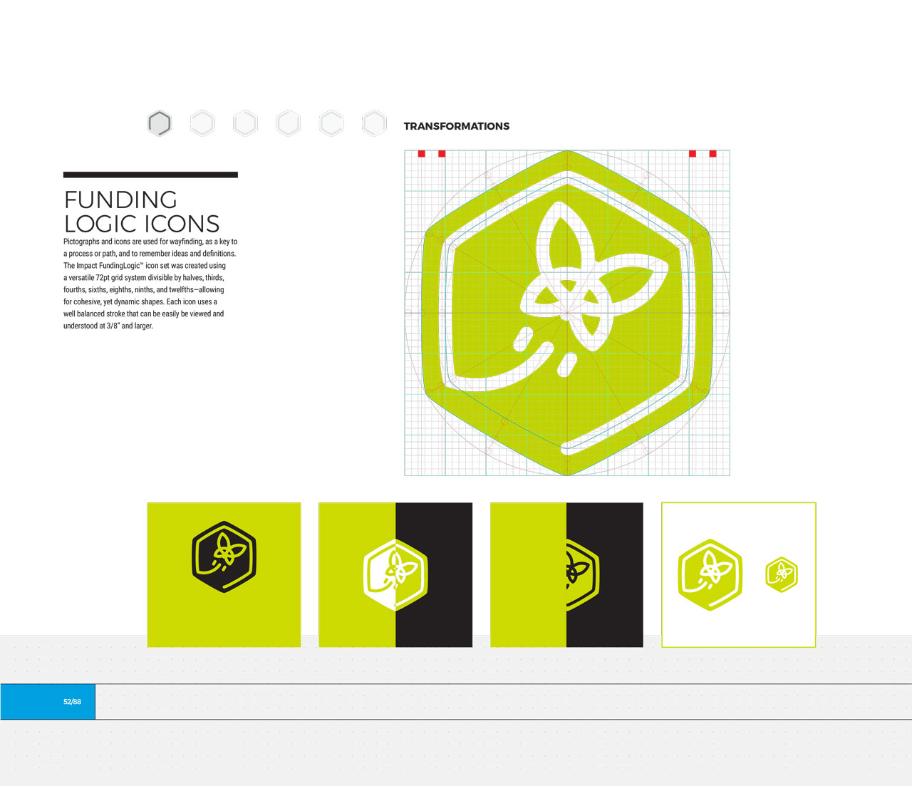
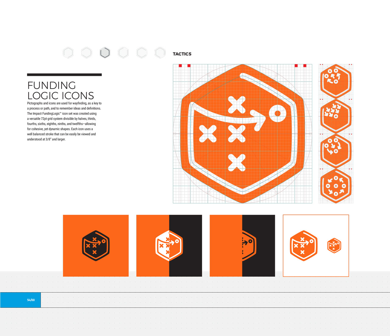
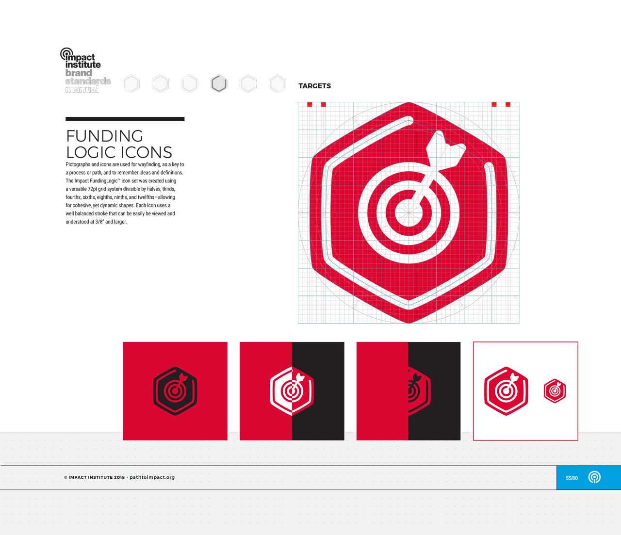
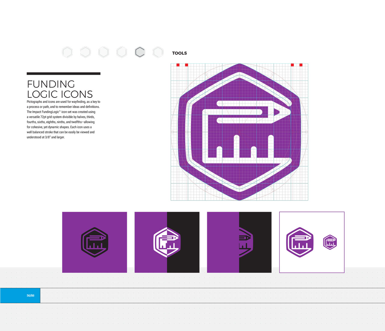
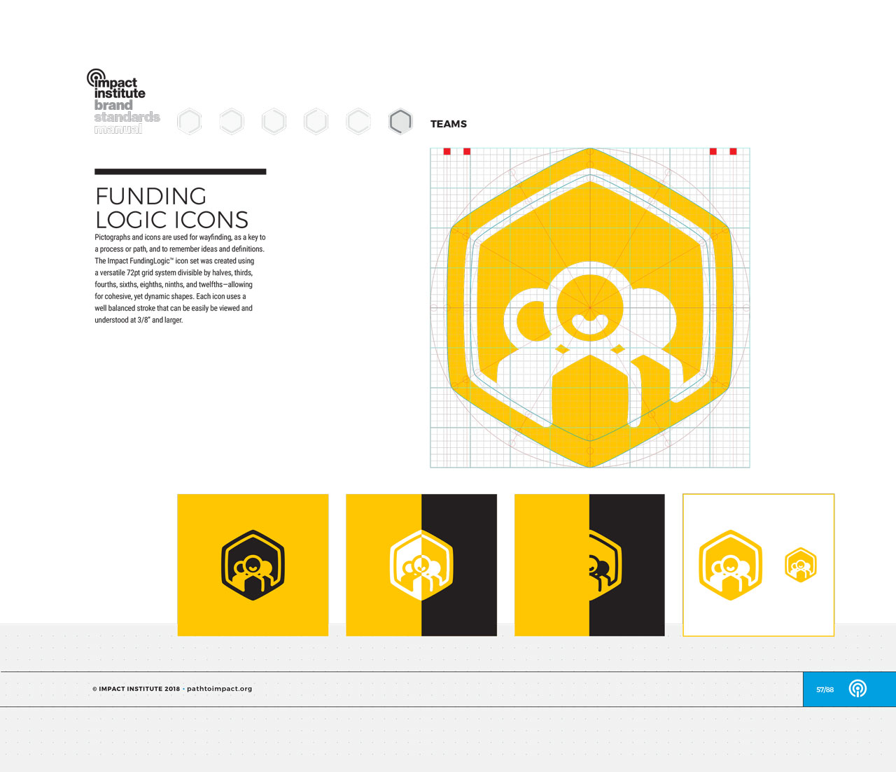
Custom icons and color-scheme for each step in the FundingLogic methodology

Printed Impact FundingLogic packet with yellow cover next to pens and a yellow munny figurine on a black background
Two hands holding printed materials open next to pens and a yellow munny figurine on a black background
FundingLogic printed booklet open to a worksheet page next to pens and a yellow munny figurine on a black background

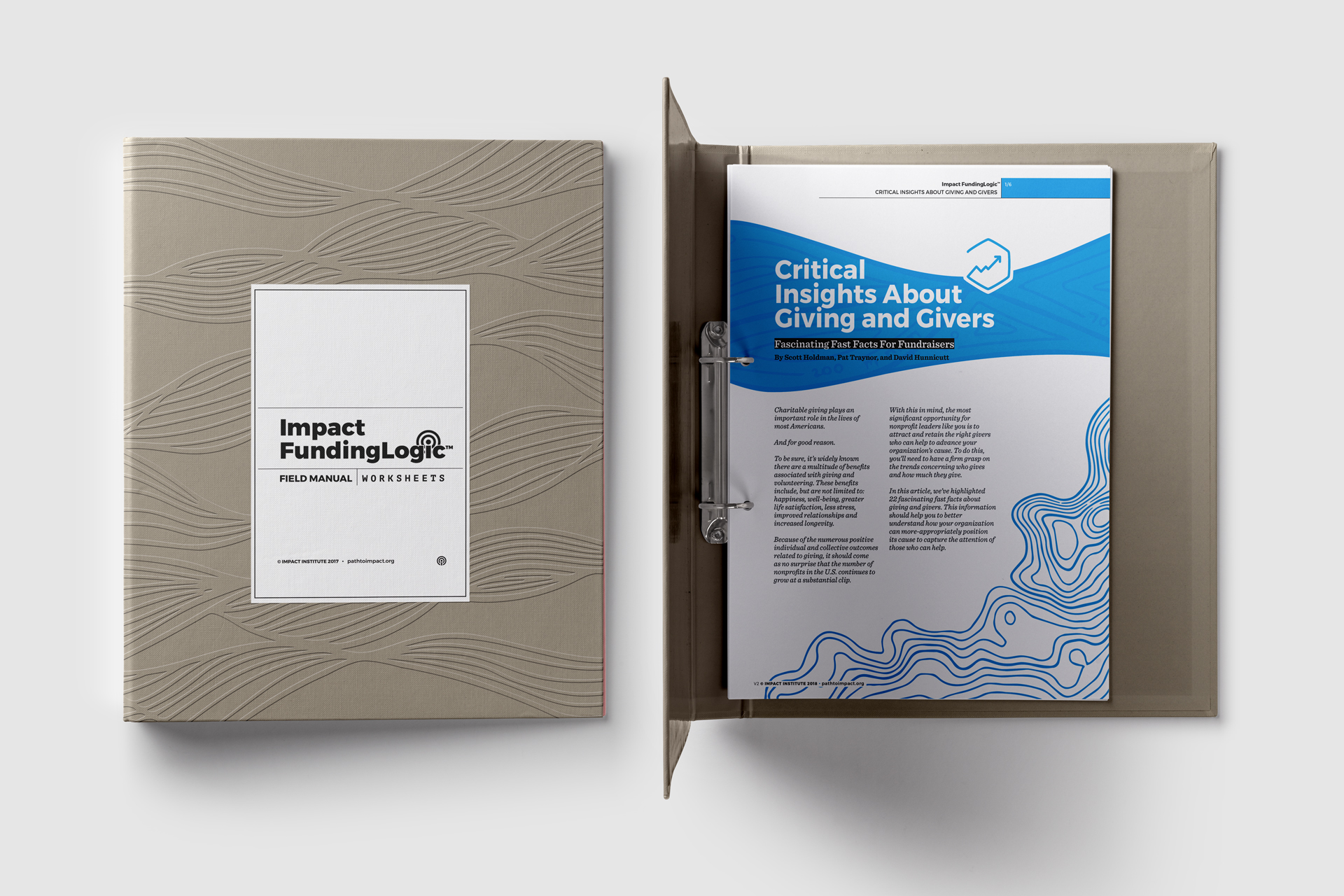
A printed booklet of a selection of articles from the manual was used at FundingLogic trainings for nonprofits

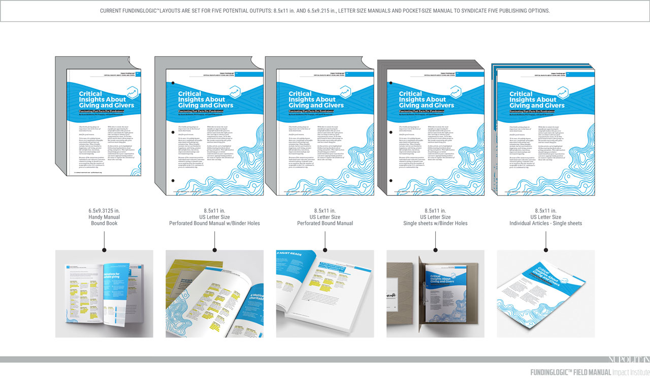
We knew the articles and subsequent handbook needed to be adaptable, flexible, and responsive. Designing each article with expandable margins allowed for a single page to adapt to the size needed, depending on the intended use of the materials at any given time. Each article is designed to fit a 9” x 6” field manual printed magazine style with an expanded version for articles printed individually at home or for use in workshops.

Mockup of single page of green, transformations article with a hand-drawn black butterfly
Examples of different page sizes the manual could be printed at
Mockup of two pages of a printed article with blue highlights
Mockup of a single page of a printed article with yellow accents and a black, hand-drawn saxophone on it
Man looking at computer with plan for binder assembly displayed on screen
Plan for binder assembly
Mockup of closed binder next to binder open to first page of a printed article

A mockup of the proposed field guide

Attributes chosen by the client drove the illustration style and font choices incorporated into the final design of the articles individually and as a system. The client described themselves as modern, refined, energetic, innovative, and welcoming. Based on the organization’s ethos and the project’s objectives, the articles and field guide were designed to be:

  • Big
  • Futuristic
  • Vibrant
  • Refined
  • Simple
  • Flexible
  • Modern
  • Methodical
  • Elegant
  • Timeless

And NOT

  • Formal
  • Traditional
  • Serious
Mockup of iPad displaying Giving Hearts Day donation UI

Giving Hearts Day: Donation UI/UX

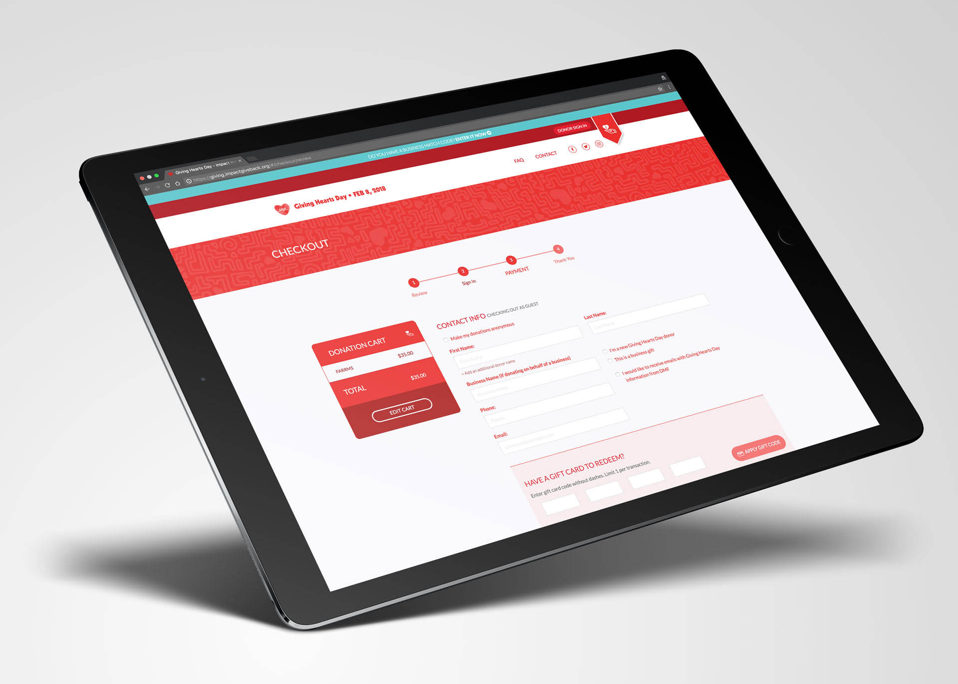
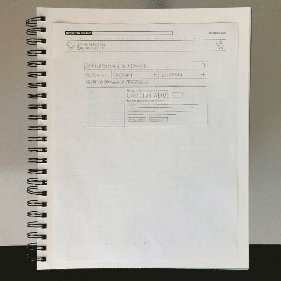
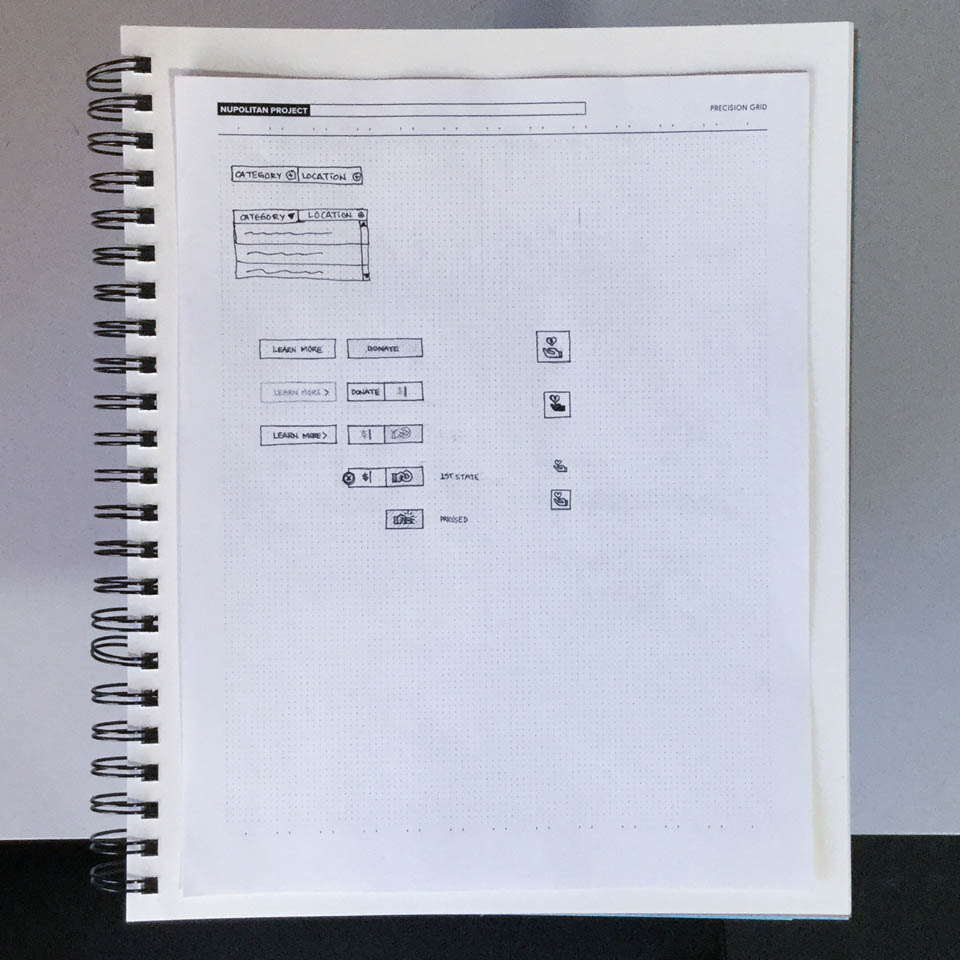
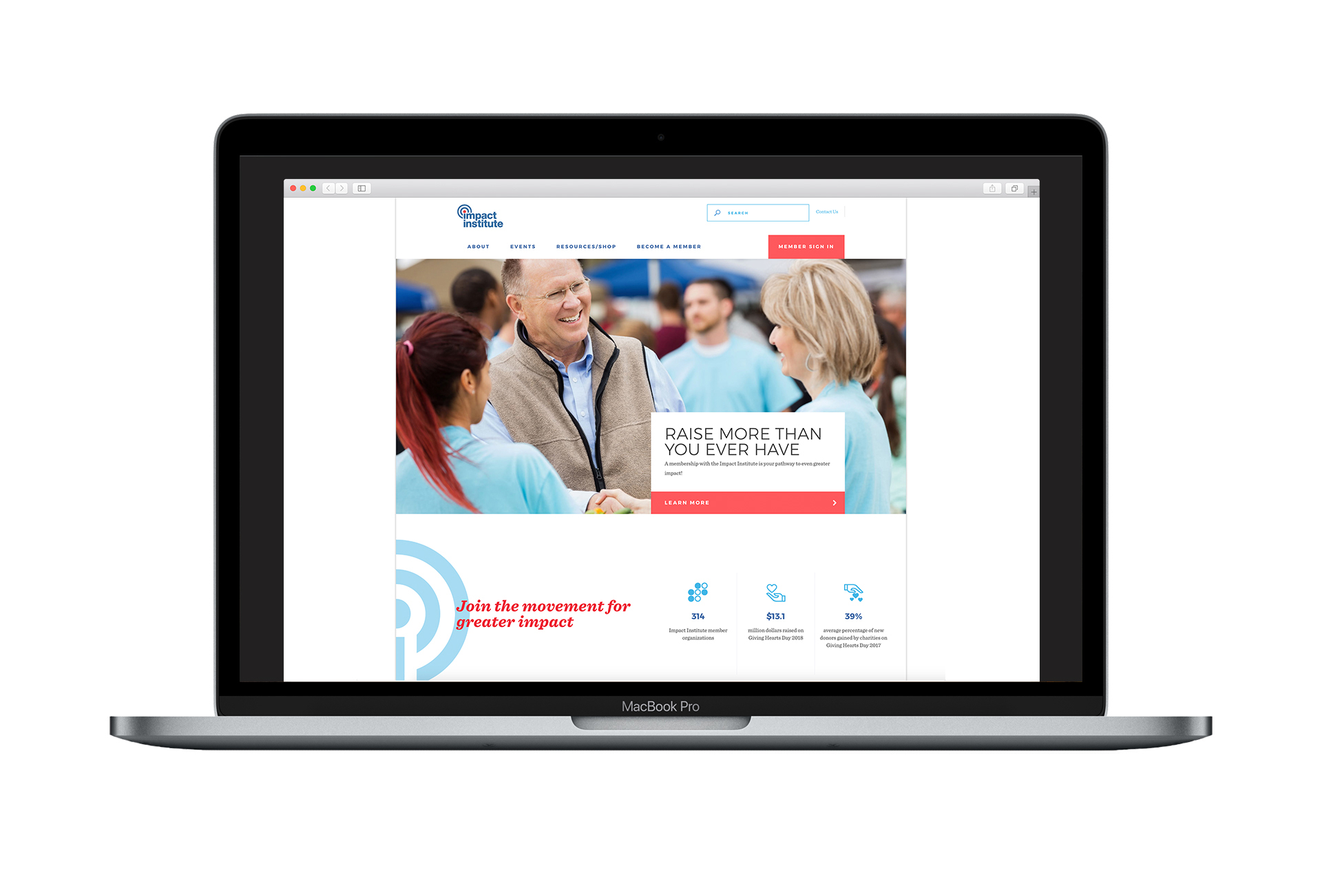
We collaborated with Object Partners, Inc. to revise and improve the UI/UX of DMF's existing donation platform used on Giving Hearts Day. Through exploration with the client, we discovered areas of the site that needed to be more intuitive and designed solutions to make the donation process easier for those interacting with the platform during the day of giving.

We redesigned interfaces to visually connect the existing platform to the newly created one-page site as well as reconfigured said interfaces to reflect industry standards and best practices for UI/UX.

Orange, pink, and yellow post-it notes on a tan paper pad outlining user experience flow

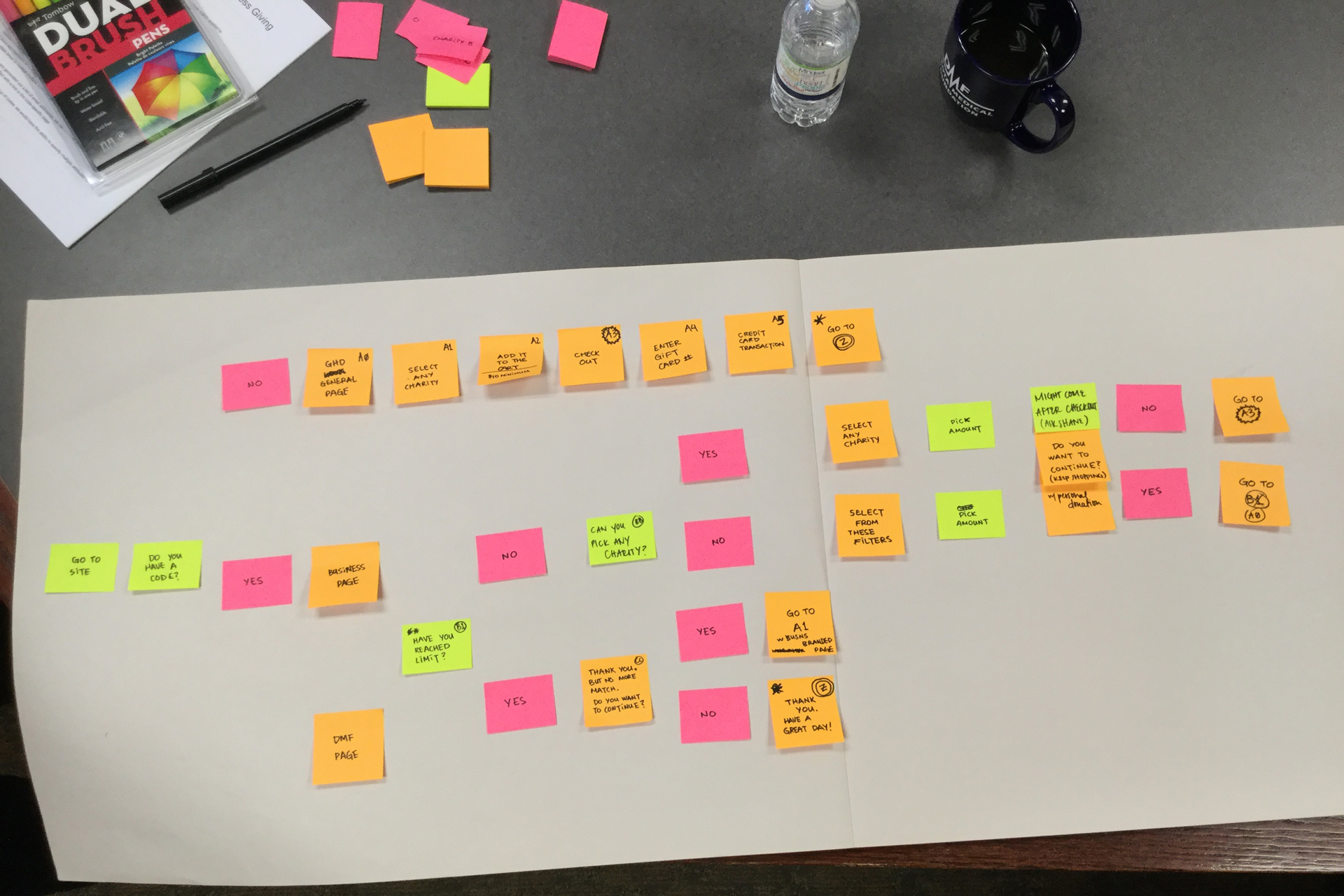
Mapping the user journey

Animation of project listing UI
Animation of pop-up window UI
Sketch of buttons and UI elements for Giving Hearts Day donation site
Animation of pop-up window UI on Giving Hearts Day donation site homepage
Screen captures of each step of donation process

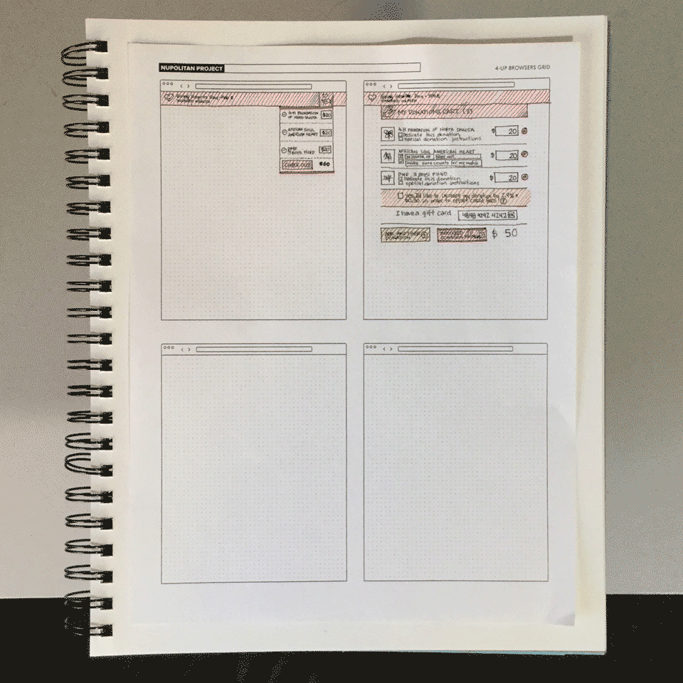
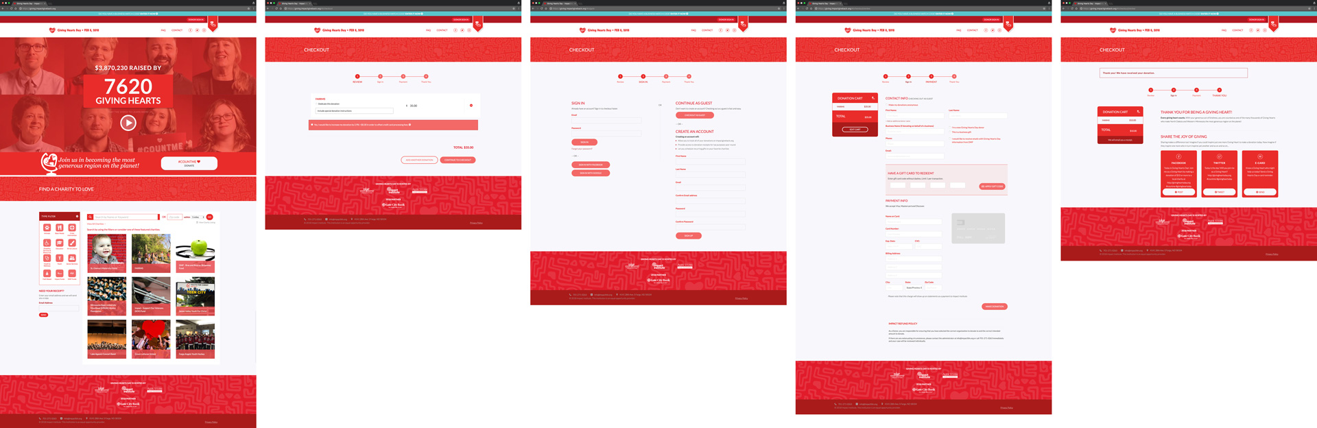
The donation process from start to finish

Close-up of laptop screen displaying live counter of donors on Giving Hearts Day

A real-time counter displayed the running total of donors throughout the day of giving.

Mockup of old Giving Hearts Day donation site UI on iMac
Mockup of revised, newly-designed Giving Hearts Day donation site UI on iMac

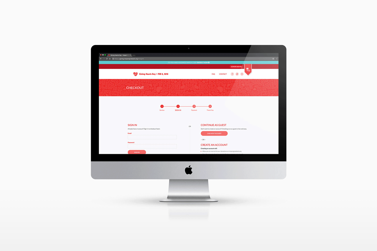
Comparison: Before & After

NÜ in acrylic letters, a white camera, and purple, blue, and red business cards on a black gridded surface

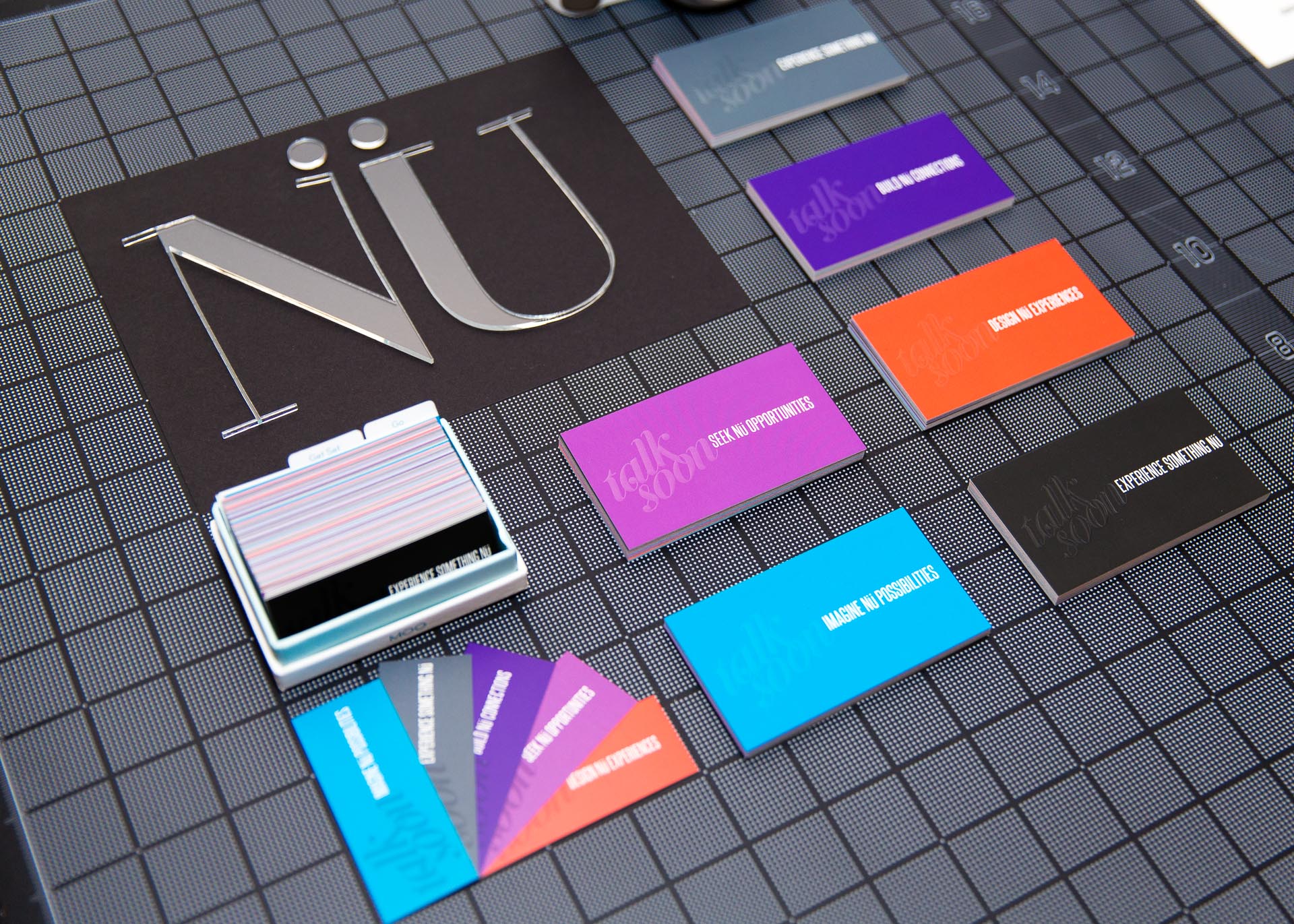
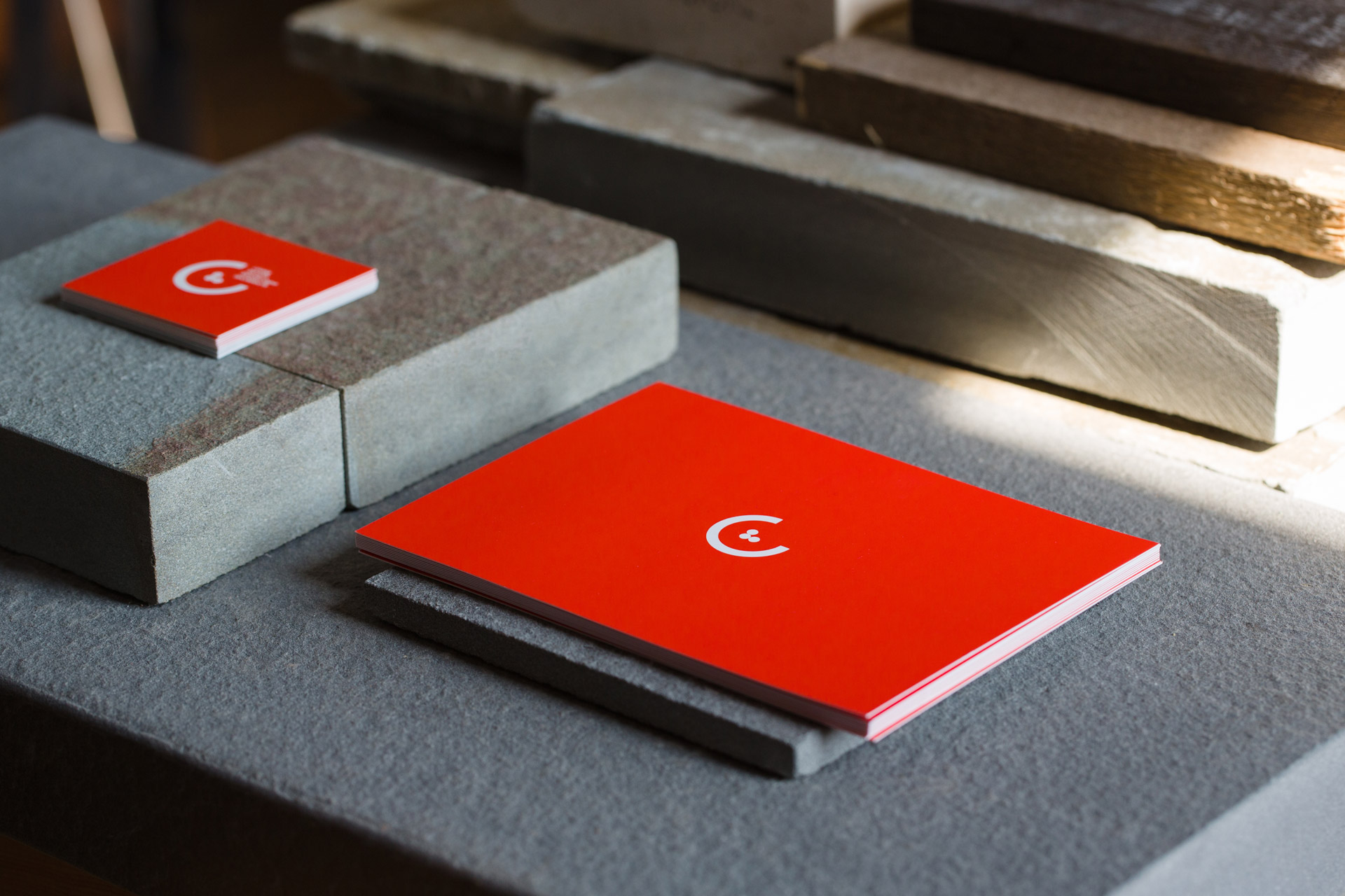
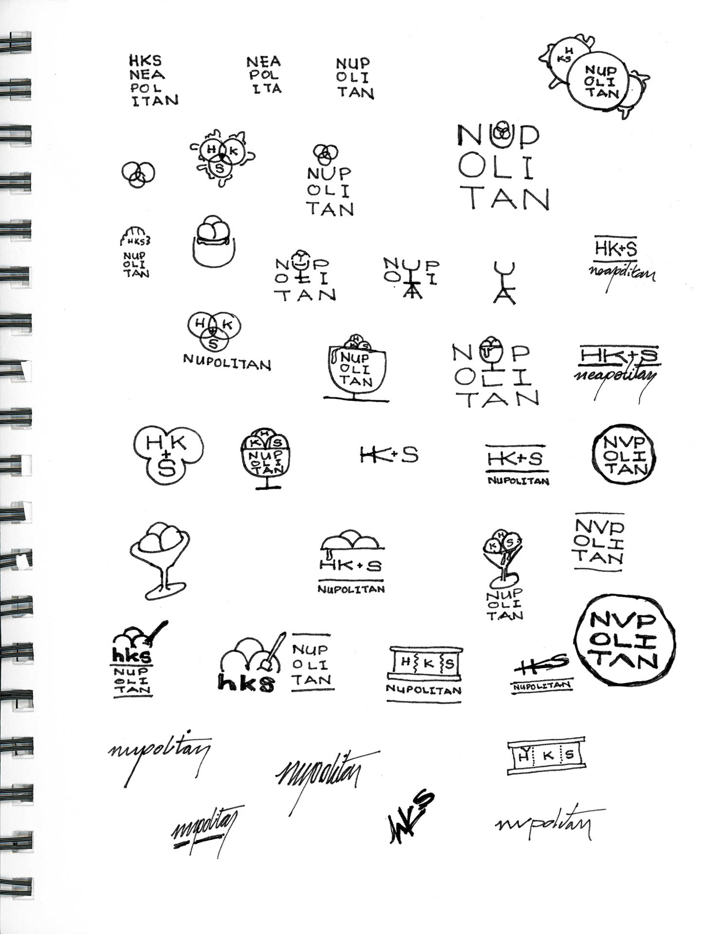
While the Nüpolitan name has been around since the agency's inception in 2013, the summer of 2016 and the official launch of our full-time work in Nüpolitan, brought about a design audit to make sure we were expressing ourselves consistently and cohesively across all channels.

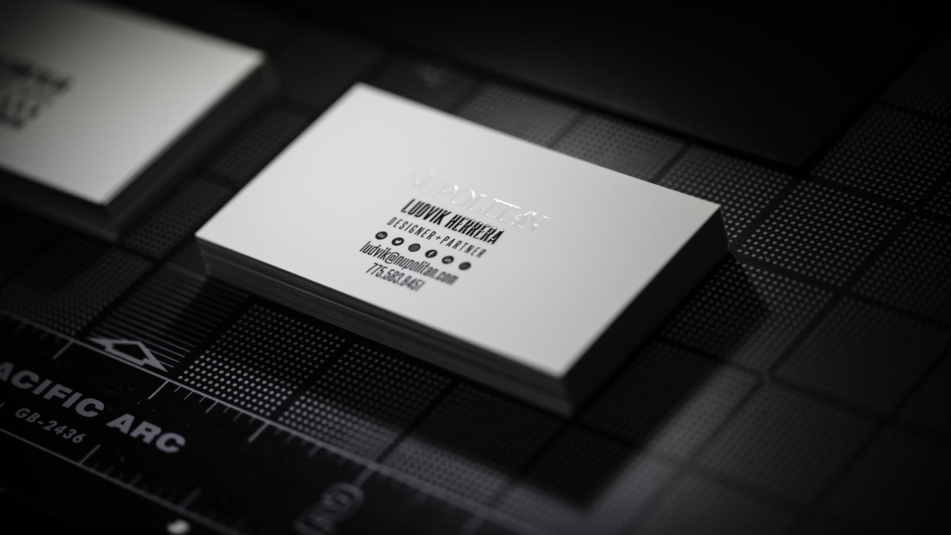
We explored many options and generated hundreds of iterations ranging from fun and friendly to simple and modern before honing into the version that would become the mark you see today. We selected the classic Didot typeface as our typography base. Its timeless and discerning shapes and architecture reflect a well-crafted and refined design experience. The strong, clear forms display objective and rational characteristics and are used by numerous other fashionable brands - a testament to the flexibility and durability of this modern style.

Samples of Nüpolitan logos on white paper
Scan of sketchbook page with iterations for Nüpolitan icons
Scan of sketchbook page with iterations for Nüpolitan logo
Screen capture of Illustrator window with iterations of Nüpolitan logo
NÜ Nüpolitan in white on alternating colored backgrounds
Woman in green cardigan holding stickers over a black desk with silver rulers and a tape dispenser on it
Woman in green cardigan holding sticker sheet over black desk
NÜ in acrylic letters, black and white round stickers, business cards, and a large black envelope on a black gridded surface
Stack of white business cards with black text and Nüpolitan printed in spot gloss
Black and white round stickers, business cards, and a large black envelope on a black gridded surface

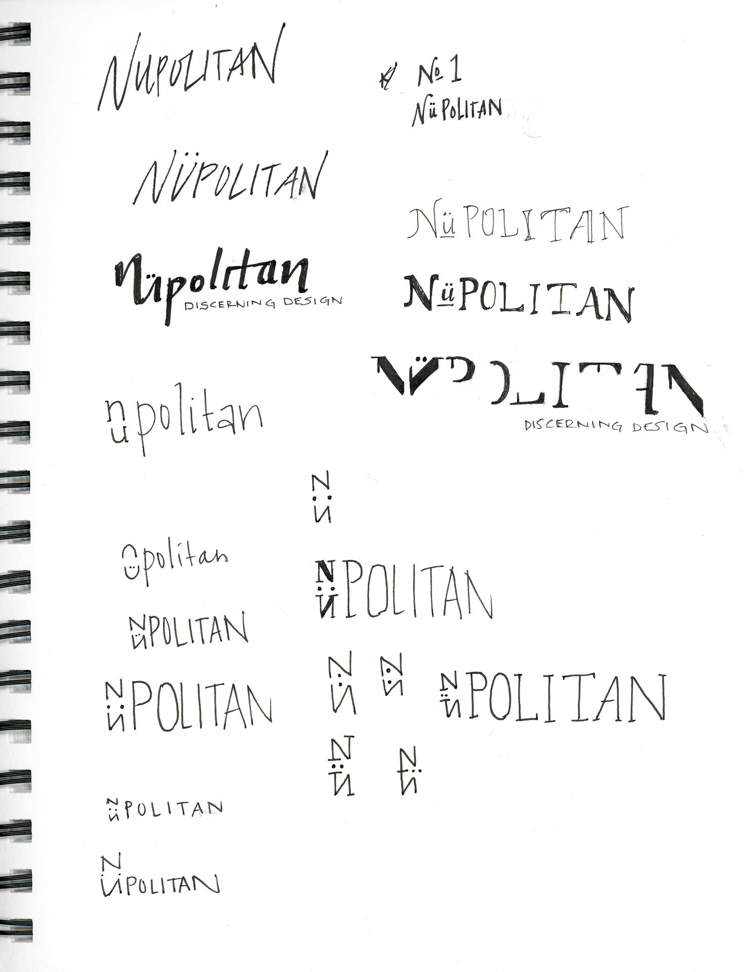
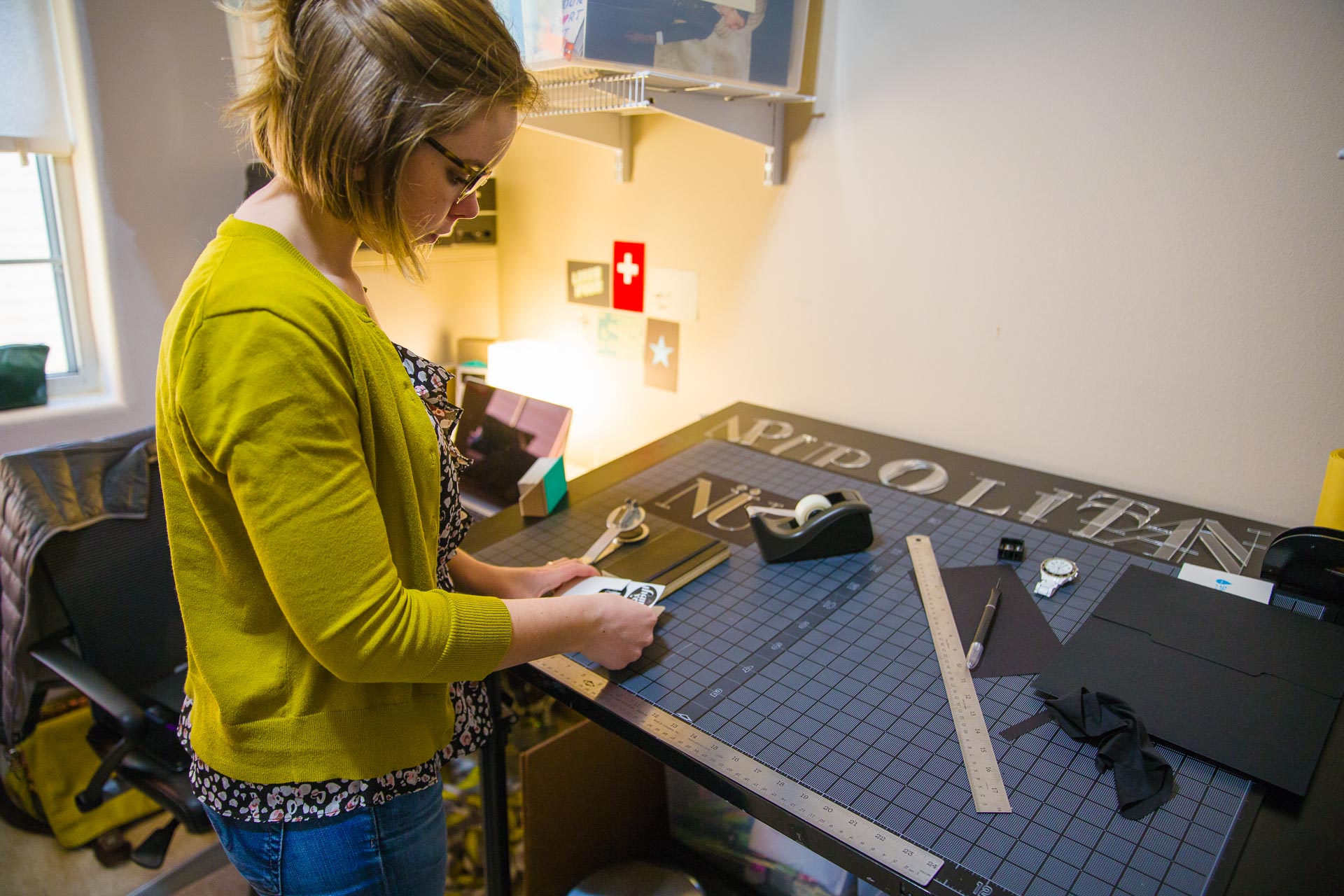
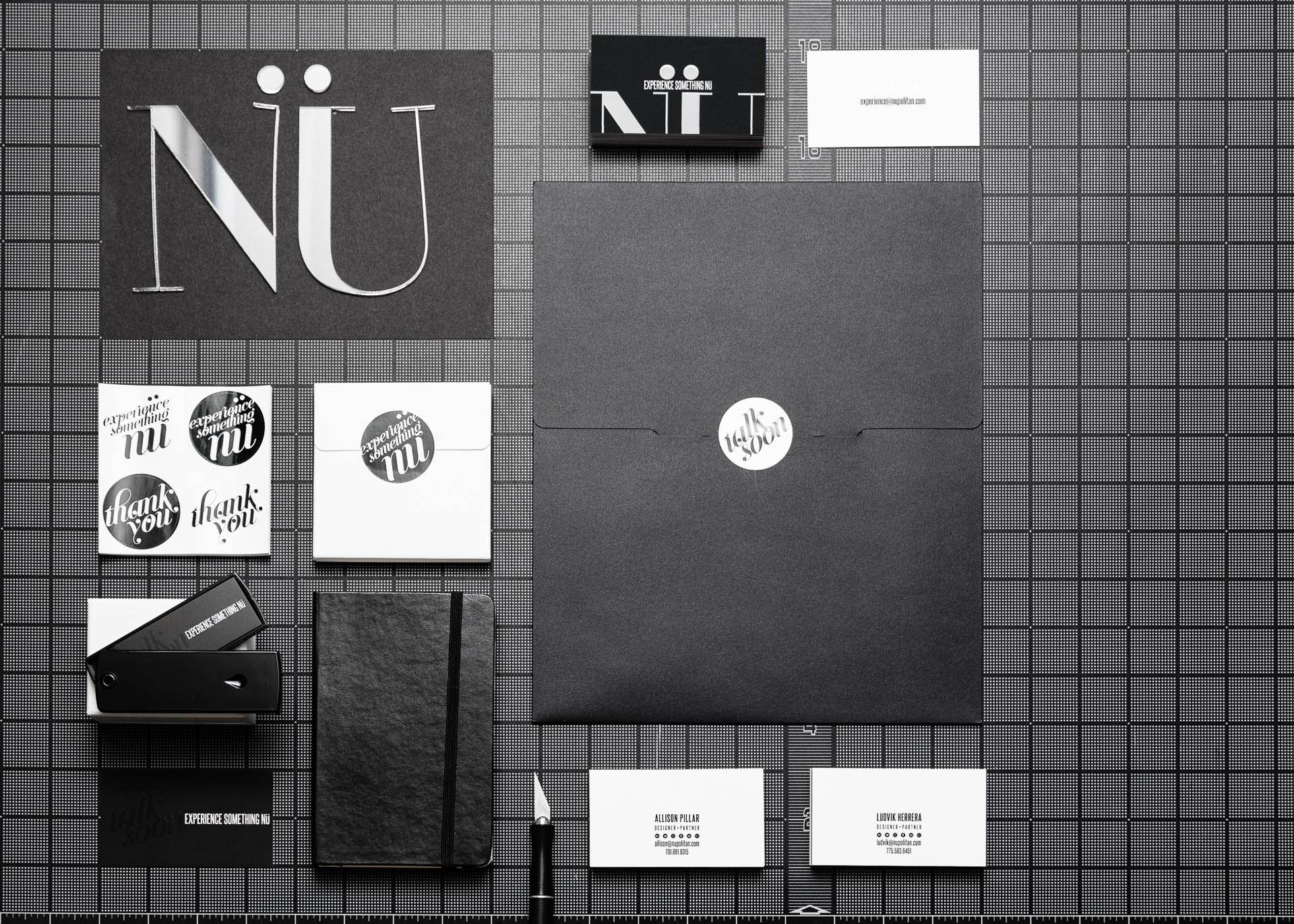
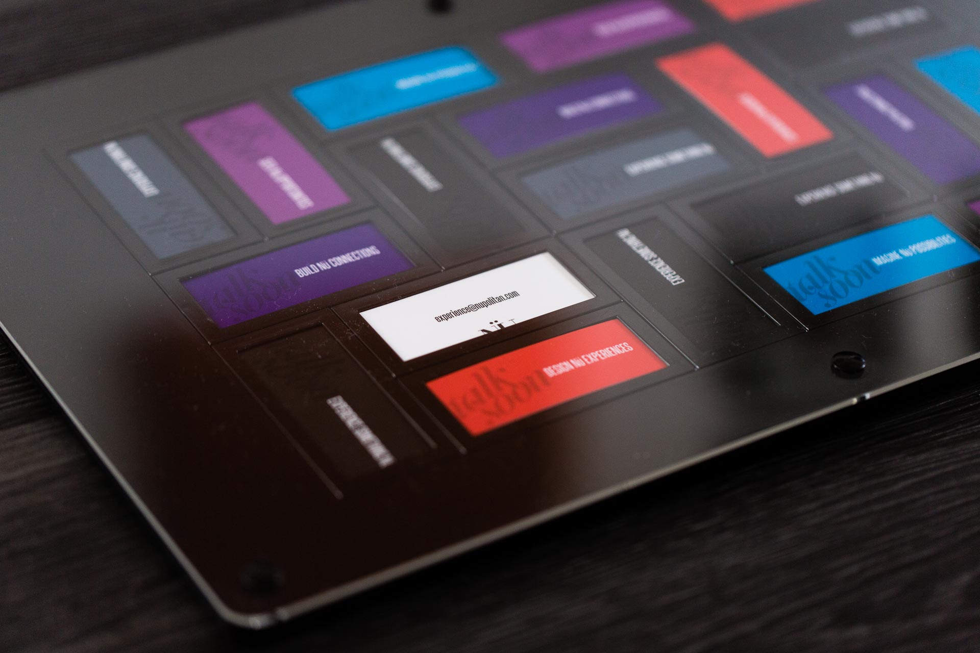
Highlighting and emphasizing the first part of our brand name, Nü, allows us to play with powerful and intentional language as we strive to provide our clients and collaborators with experiences entirely “nü” to them - like nothing they’ve experienced before.

NÜ in acrylic letters, a white camera, and purple, blue, and red business cards on a black gridded surface
Colorful Nupolitan Moo mini cards in black frame
NÜ in acrylic letters, a white camera, and purple, blue, and red business cards on a black gridded surface

Considering all the senses, we wanted our cards to be a tactile experience and conversation piece - often leading to a piqued curiosity and desire to learn more about our process and work.

Close-up of black business card with spot gloss with colored cards in the background
Black circle with the words talk soon in a decorative font punched out in the center
White Impact Institute icon over blue topography lines on a white background

Impact Institute

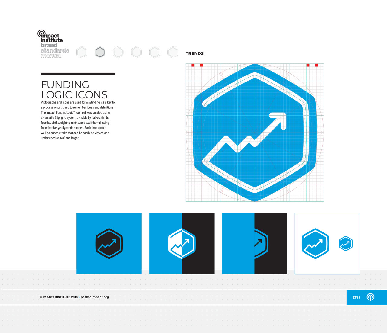
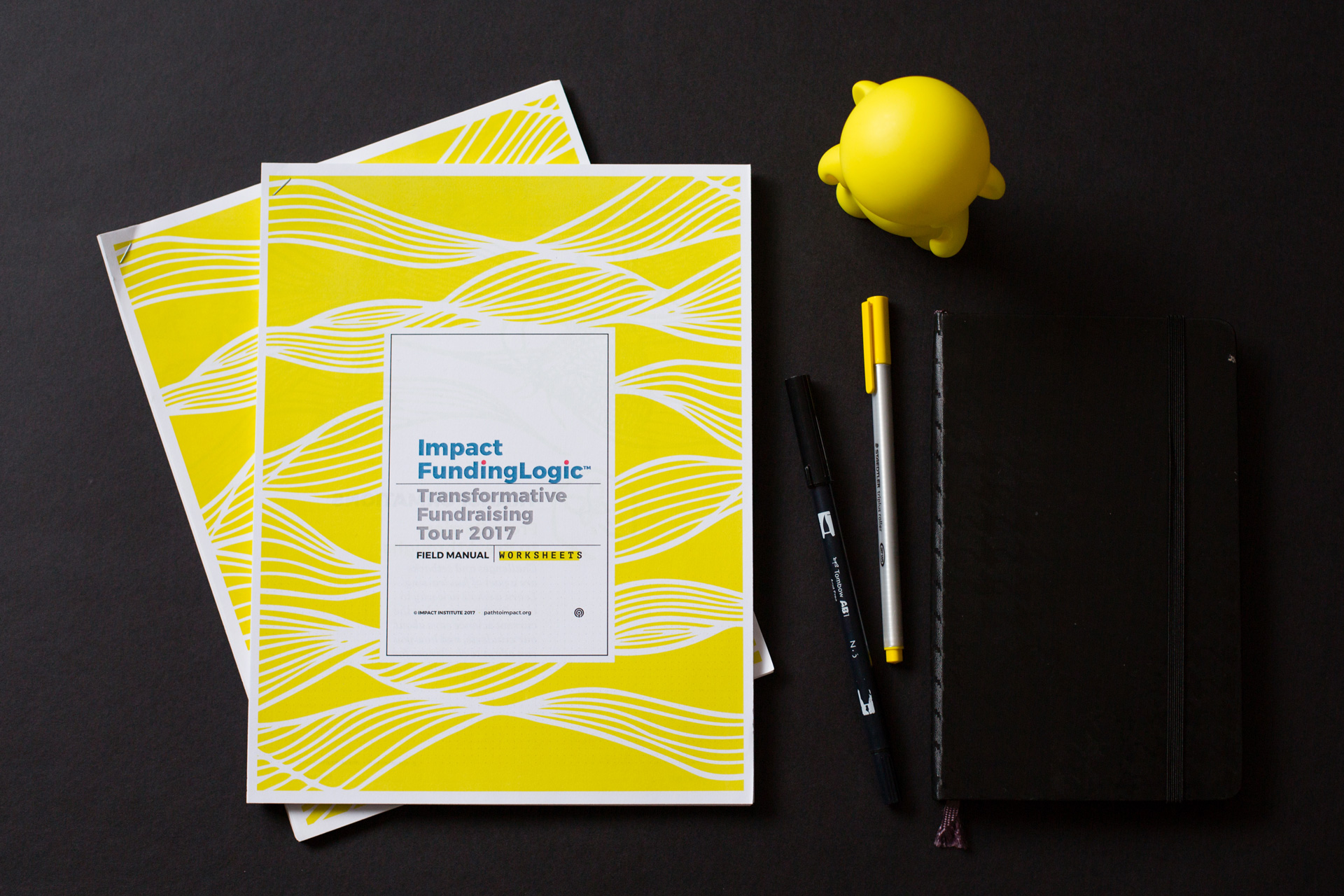
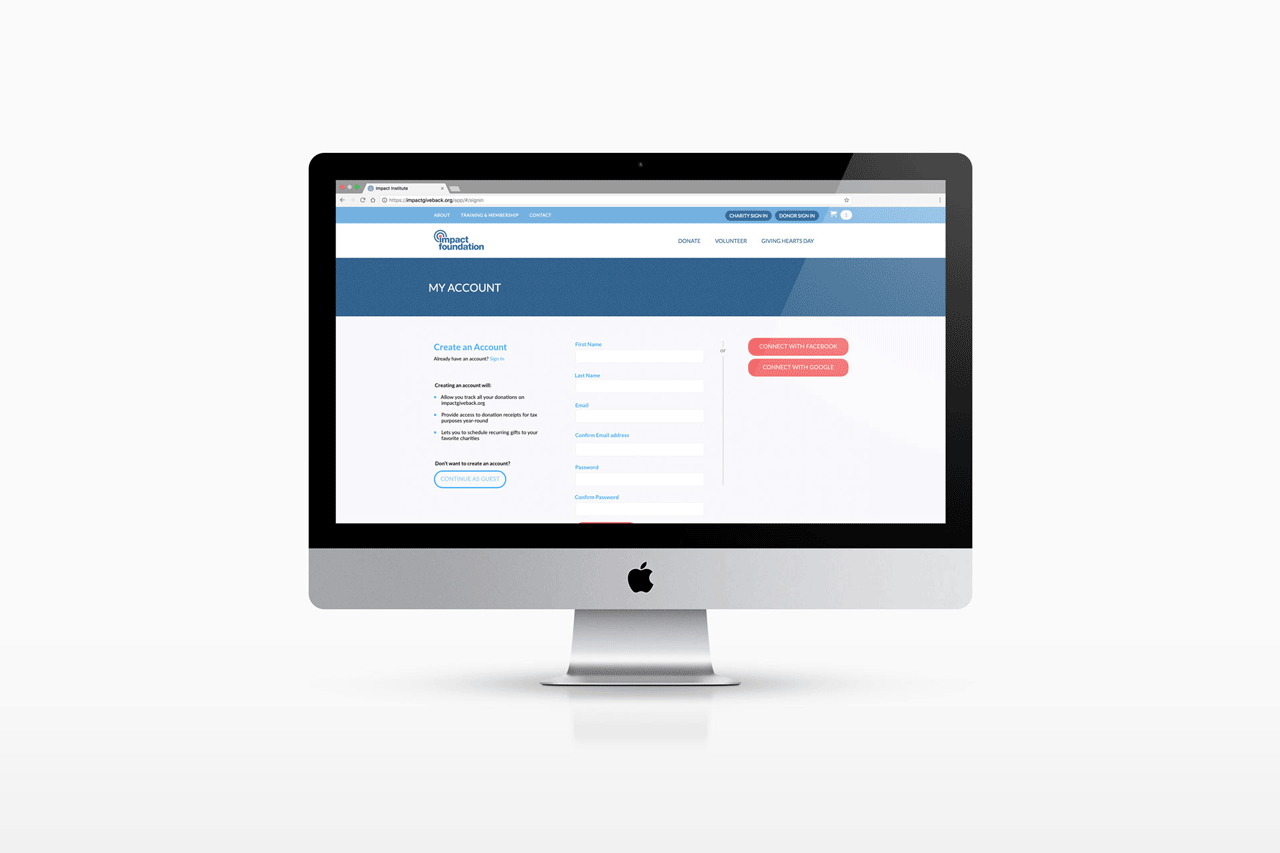
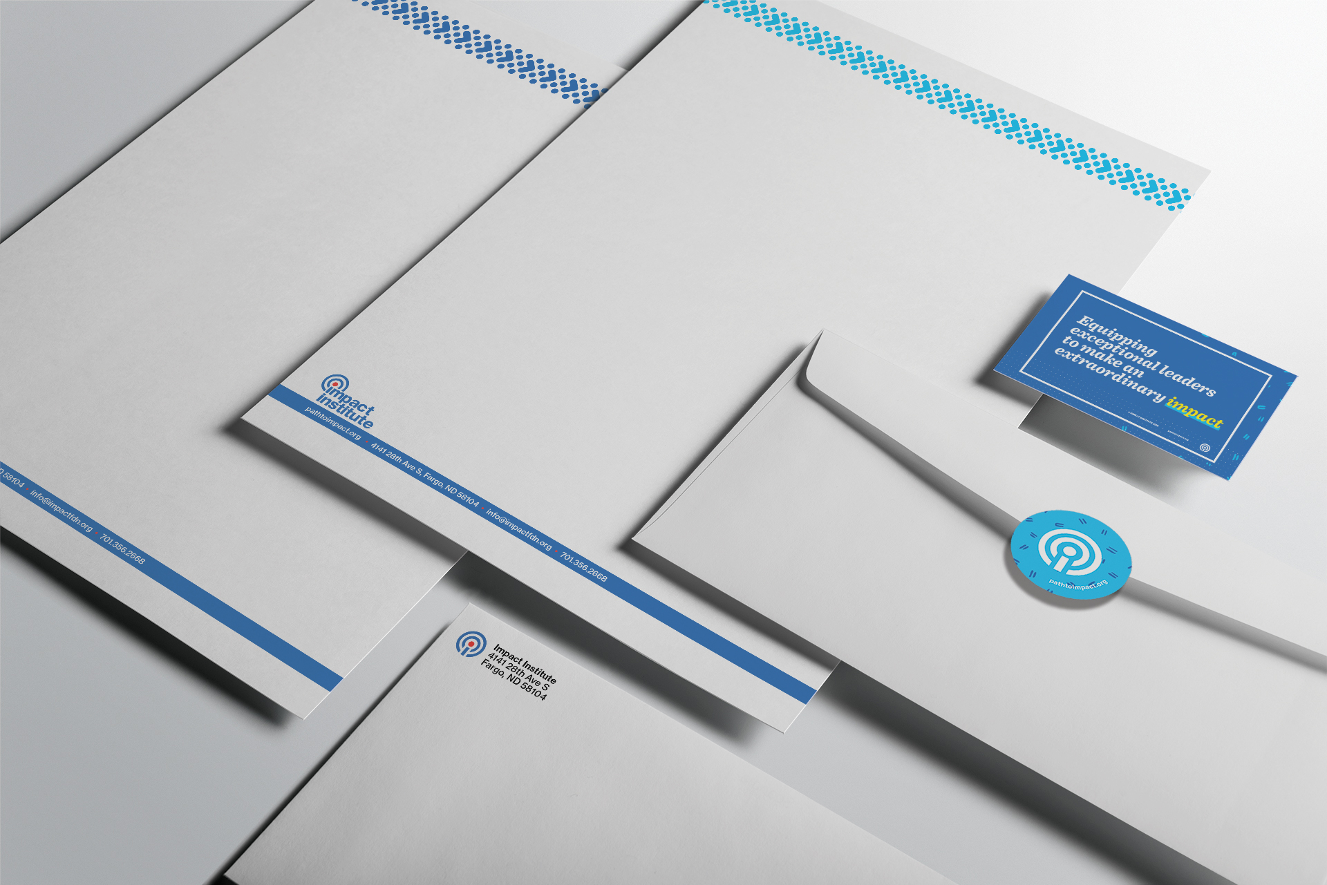
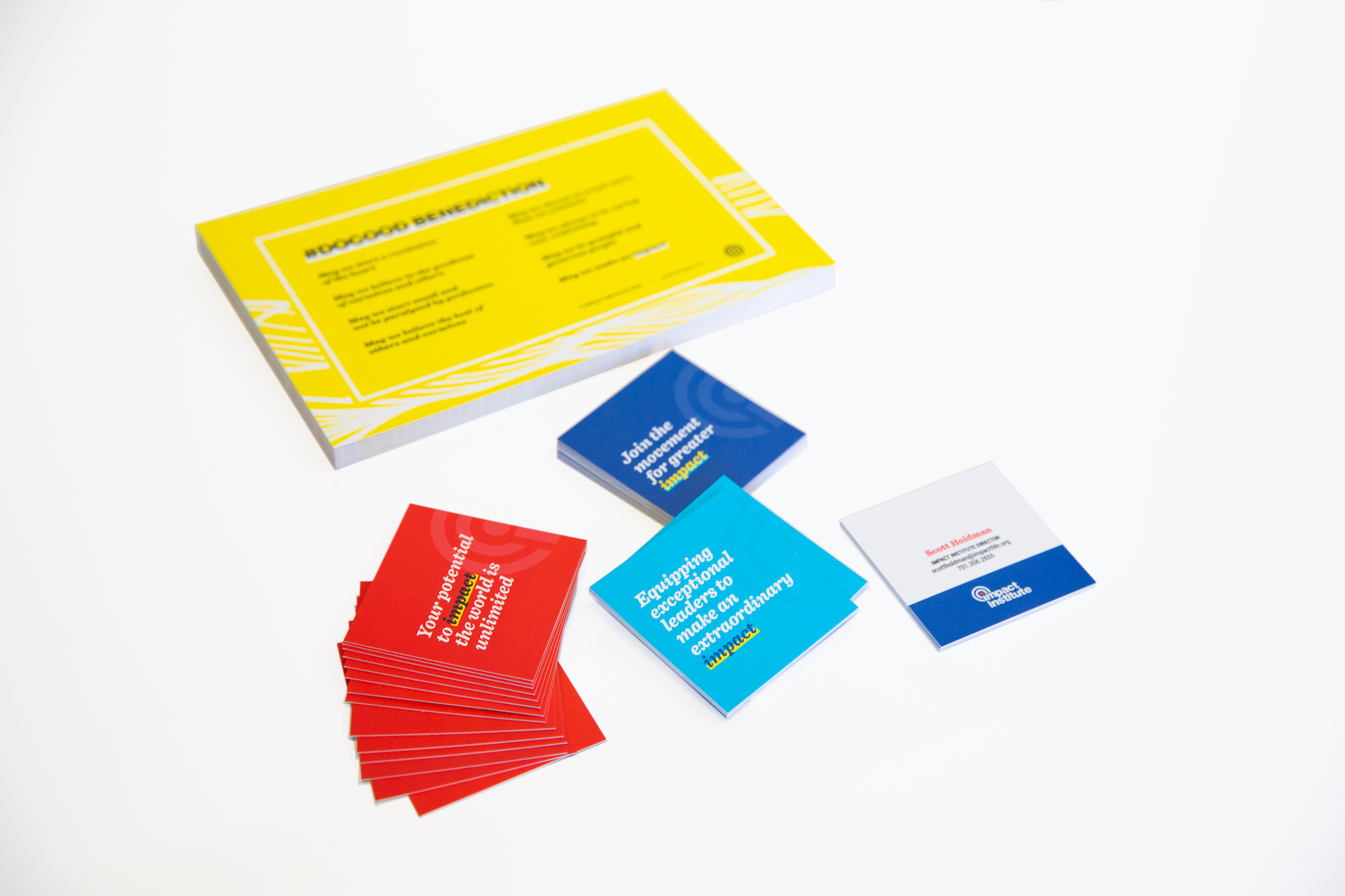
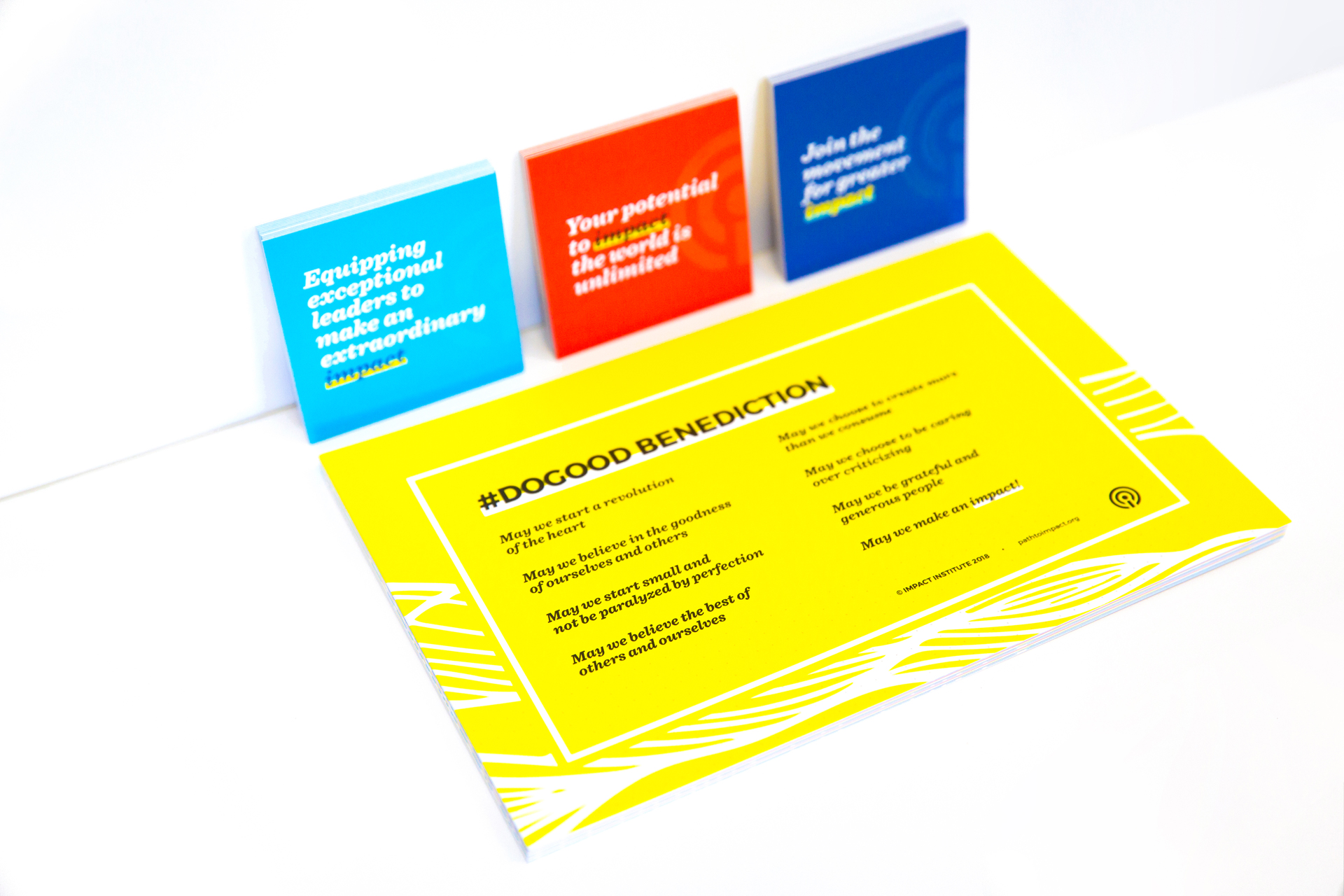
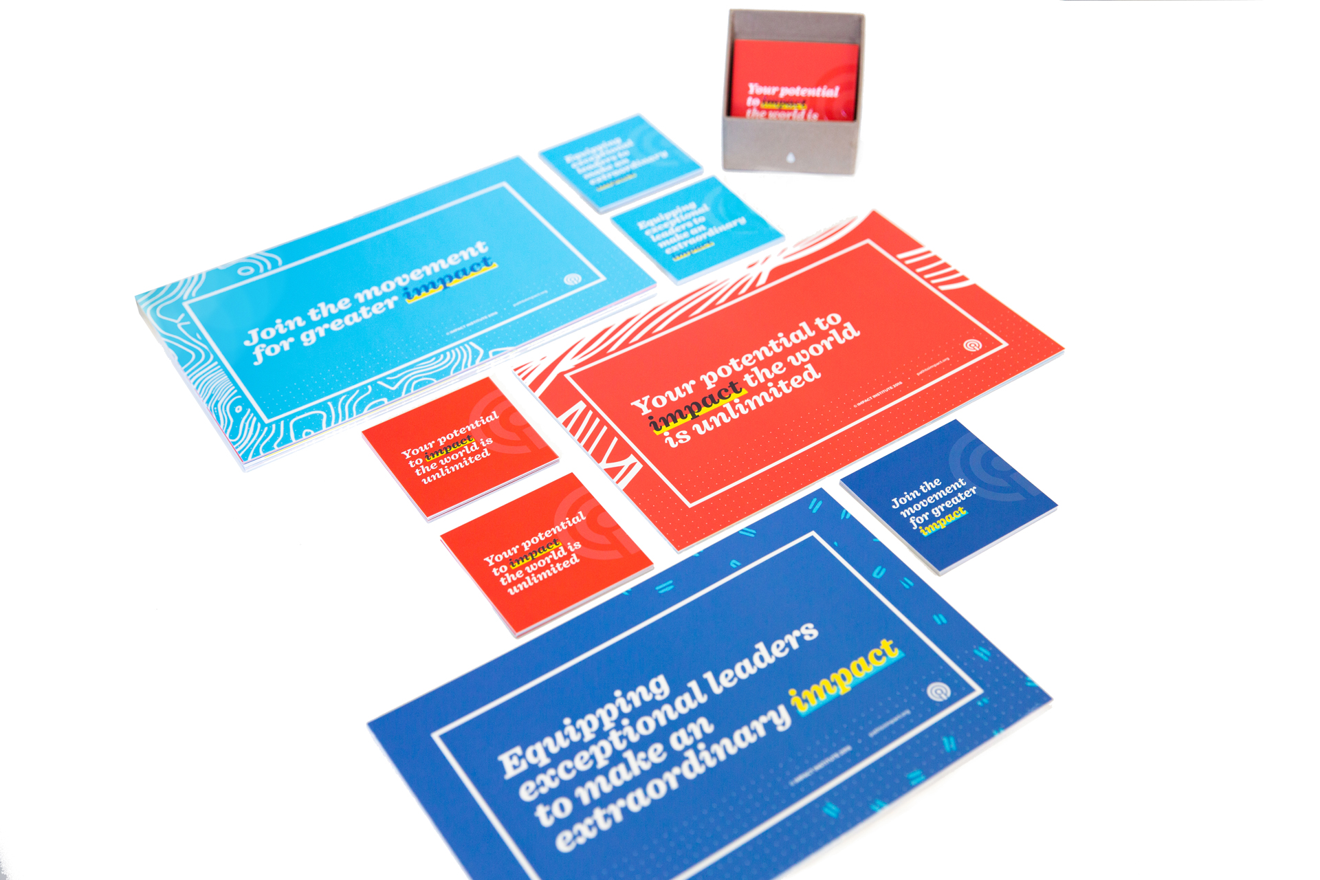
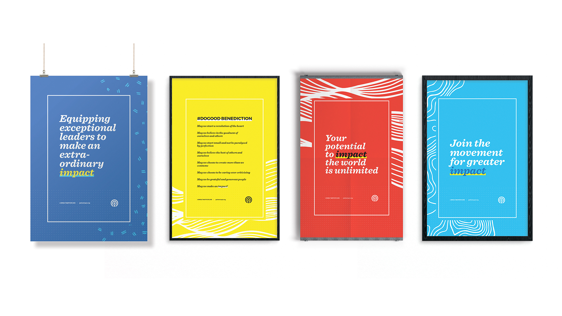
Over the course of 12 months of working with Impact Institute on a variety of projects spanning design for print and web, we built a robust design system and guidelines for the organization to utilize and to guide the future of the organization.

We refined their existing logo mark and more thoroughly defined rules for its usage. Although the organization had a loose color palette when we began working with them, we solidified the organization’s color scheme and strategy, expanding it to be comprehensive of print and web color codes.

Impact Institute logo laid out on a grid and displayed in different variations of red and blue color arrangements
Impact brand guideline manual open to FundingLogic color scheme page
Impact Institute brand guideline manual stacked on bookcase next to small, colorful magazines and white bins
Close-up of Impact Institute brand guideline manual stacked on bookcase next to small, colorful magazines and white bins

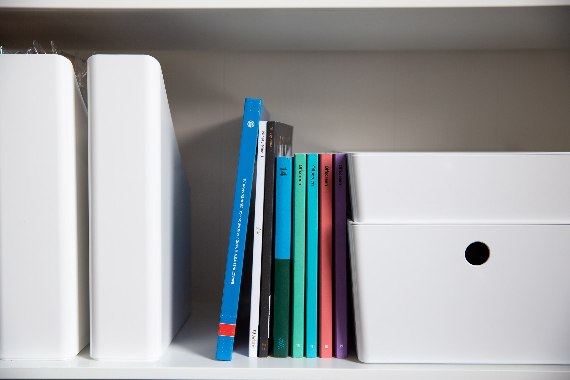
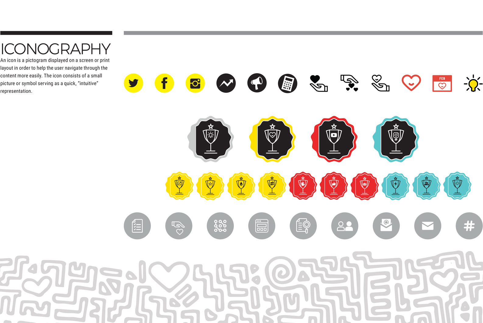
We designed a type strategy and layout grids for greater cohesion across all printed materials created for and distributed to Impact’s member organizations. Throughout the creation of various worksheets, articles, and printed packets, a library of iconography was created to reflect the organization’s activities and goals.

Hand-drawn illustrations and patterns bring a lightness and fun to the more traditional nature of their existing color palette.

Impact Institute brand guideline manual open to spread with large white quote on the left page and typography on the right
Page from Impact Institute brand guideline manual outlining iconography designed for worksheets and materials

We designed bright and engaging business cards and letterhead as well as a series of postcards and posters featuring impactful and inspiring messaging written by the Institute.

Isometric view of letterhead, envelopes, and business card for Impact Institute
Stack of yellow postcards and scattered red, aqua, and dark blue square business cards on a white surface
Stack of yellow postcards sitting on and red, aqua, and dark blue square leaning up against a white surface
Aqua, red, and dark blue postcards and square business cards arranged on a white surface
Dark blue, yellow, red, and aqua posters with quotes hanging in frames on a white wall

Illustrations and floods of color were integrated into a series of images and banners for use on social media and in a refresh of the organization’s existing Wordpress site.

Social media banners with illustrated patterns and the Impact Institute icon on them
Social media banners in green, orange, purple, blue, and yellow for Impact FundingLogic
Mockup of iPhone and iPad displaying Impact Institute FundingLogic Shopify site
Macbook mockup displaying homepage of pathtoimpact.org

The client described themselves as modern, refined, energetic, innovative, and welcoming. Based on the organization’s ethos and the project’s objectives, the supplementary materials, colors, typography choices, and stationery to accompany their existing logotype were created to be:

  • Big
  • Futuristic
  • Vibrant
  • Refined
  • Simple
  • Flexible
  • Modern
  • Methodical
  • Elegant
  • Timeless

And NOT

  • Formal
  • Traditional
  • Serious
Grid of white postcards with purple illustration and lettering on a yellow background

RRWC 20th Anniversary Invitations

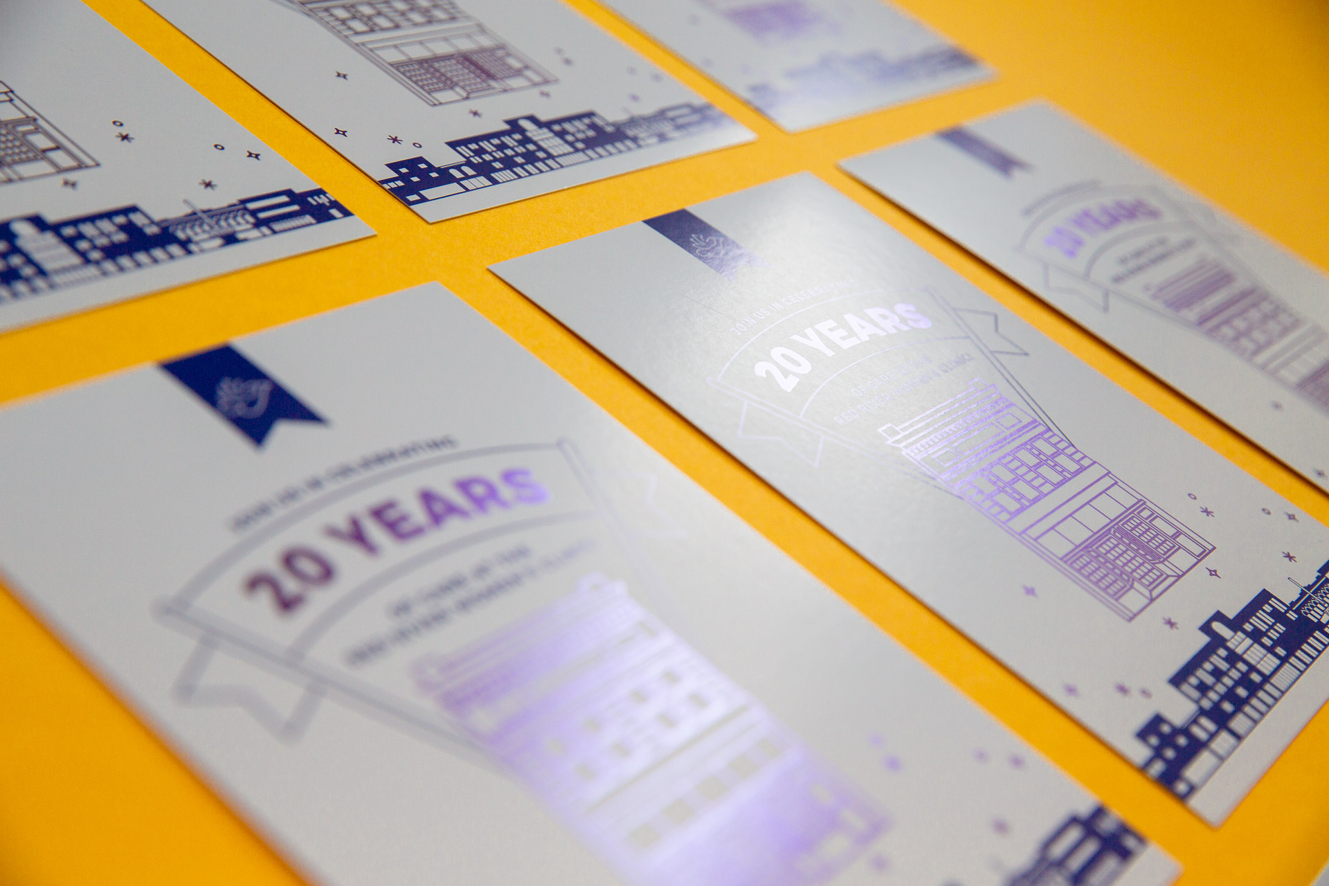
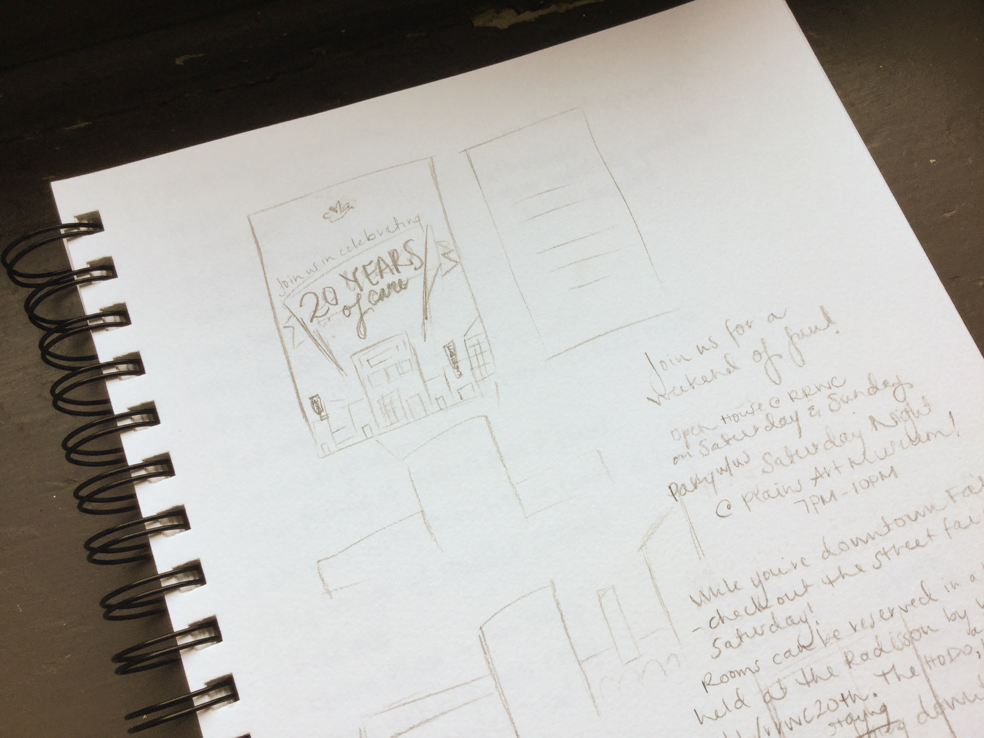
The Red River Women’s Clinic hosted its 20th-anniversary party in Fargo in July 2018 and reached out to us to design a simple, yet flashy invitation to mail out to friends of the clinic.

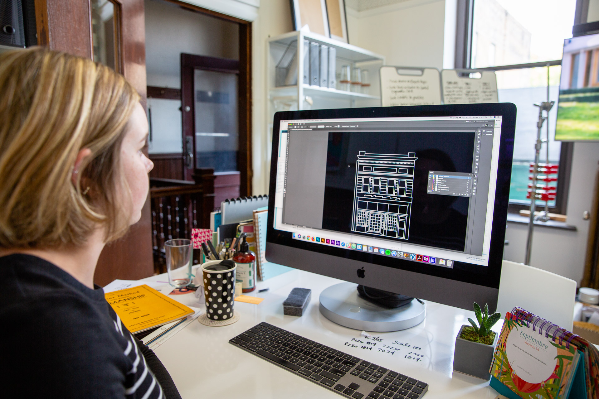
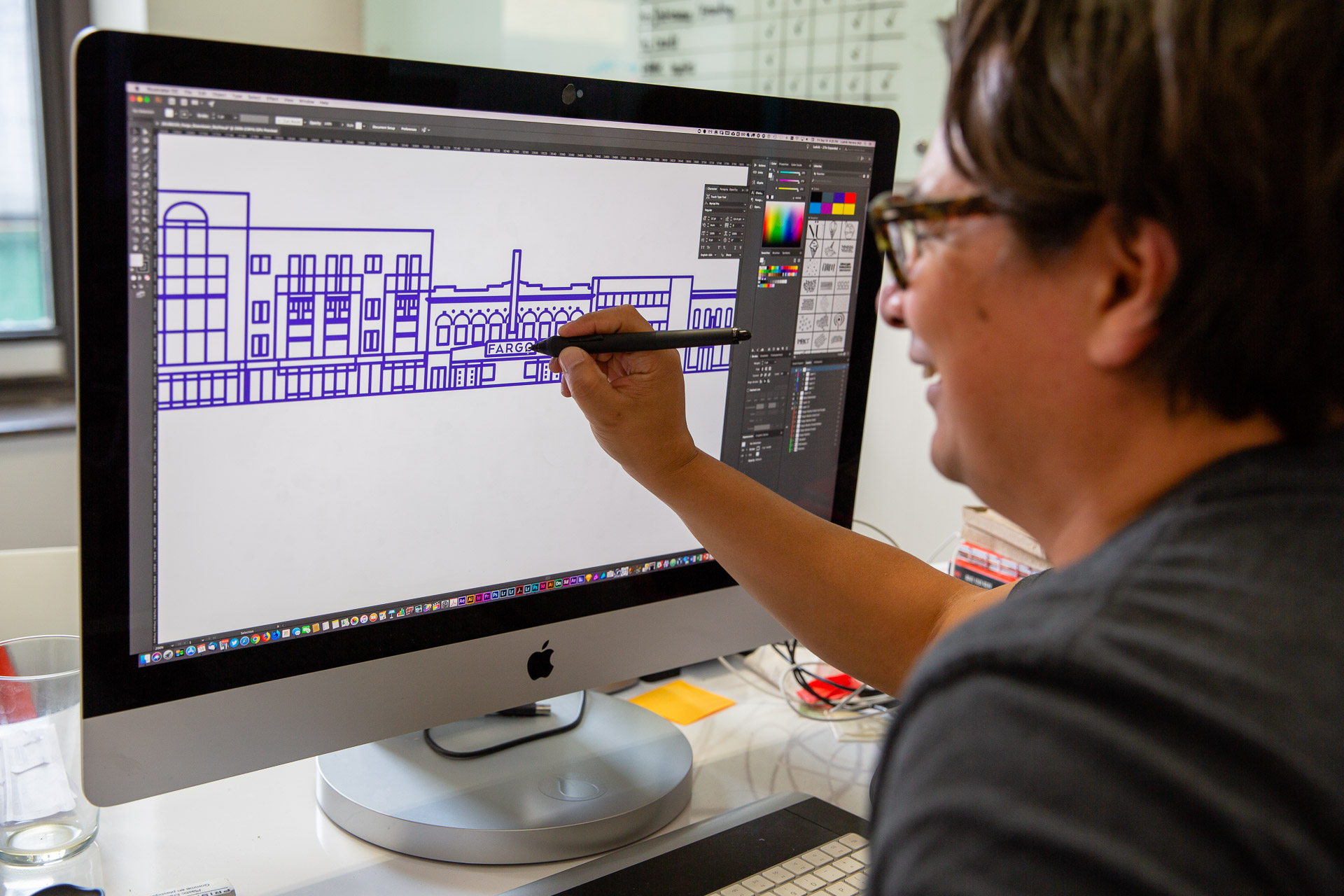
The clinic’s proximity to downtown is something it’s proud of so we chose to incorporate the storefronts of Broadway, highlighting the clinic through a prominent metallic line drawing. Emphasizing the building itself symbolizes the importance of the clinic’s physical presence in the community as a cornerstone of reproductive care in North Dakota.

Sketchbook page containing concepts for postcard design
Woman working on a computer at a white desk
Man drawing on a computer screen at a white desk
Front and back of a white purple postcard on a yellow background
Grid of white postcards with purple illustration and lettering on a yellow background

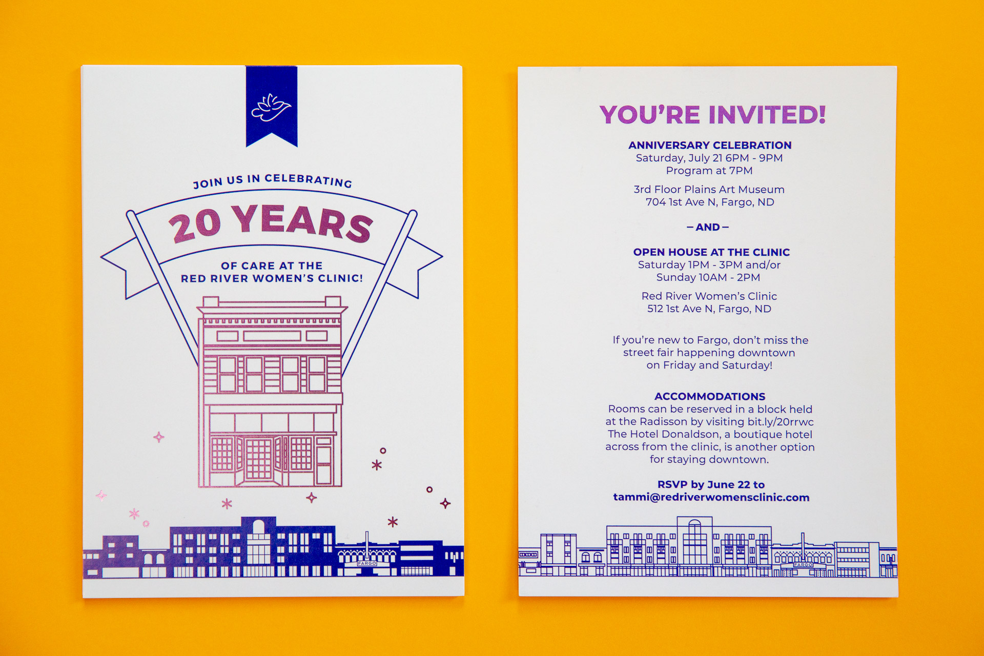
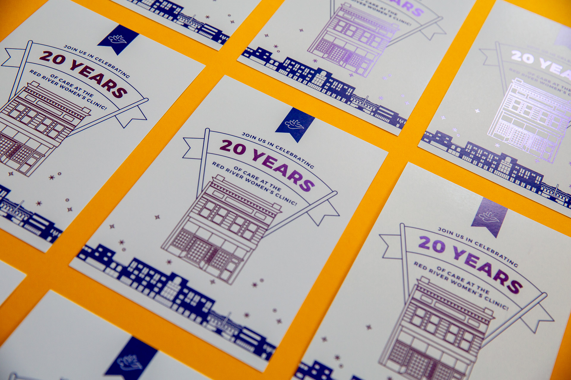
We used two shades of purple throughout the invitation as a way to subtly highlight the brand’s primary color. The use of metallic foil added some excitement and flair to the invitation without diminishing the simplicity of the clean and modern design.

Mockup of Giving Hearts Day one-page site on iMac

Giving Hearts Day: One-Page Site

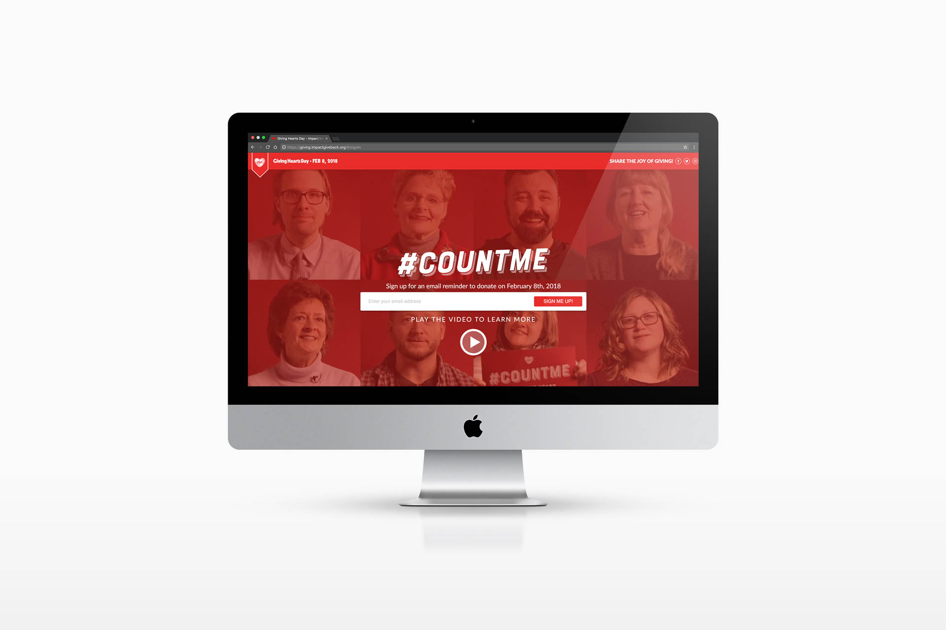
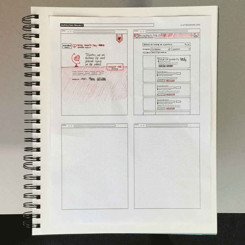
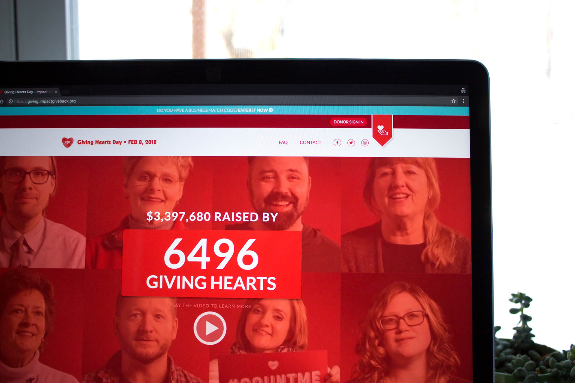
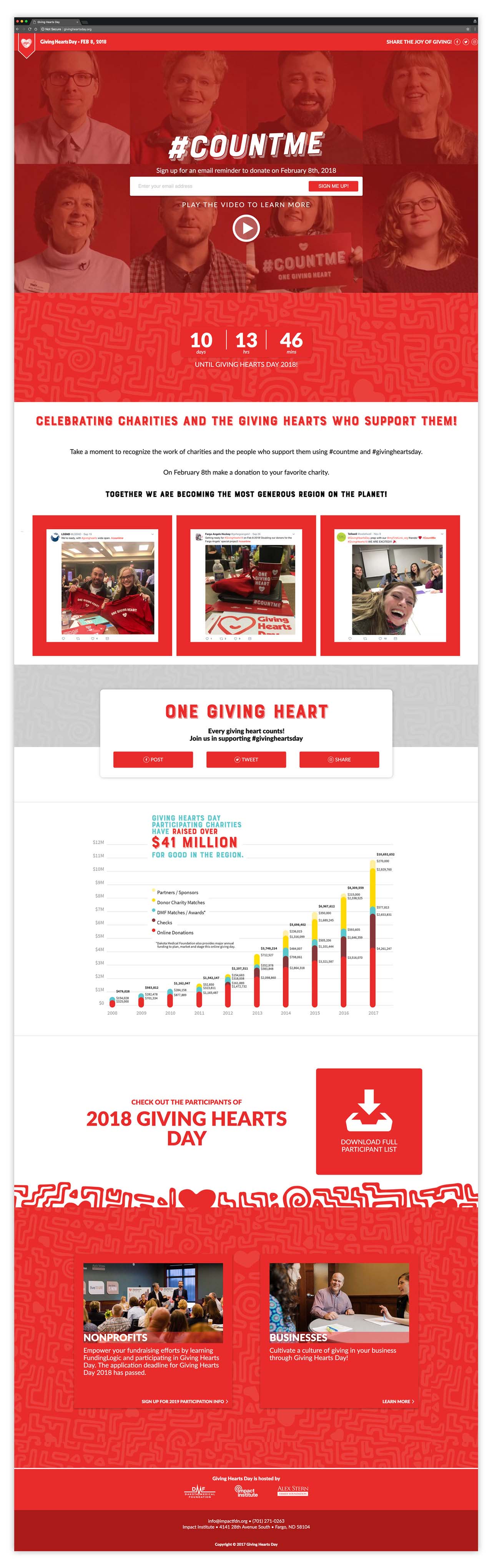
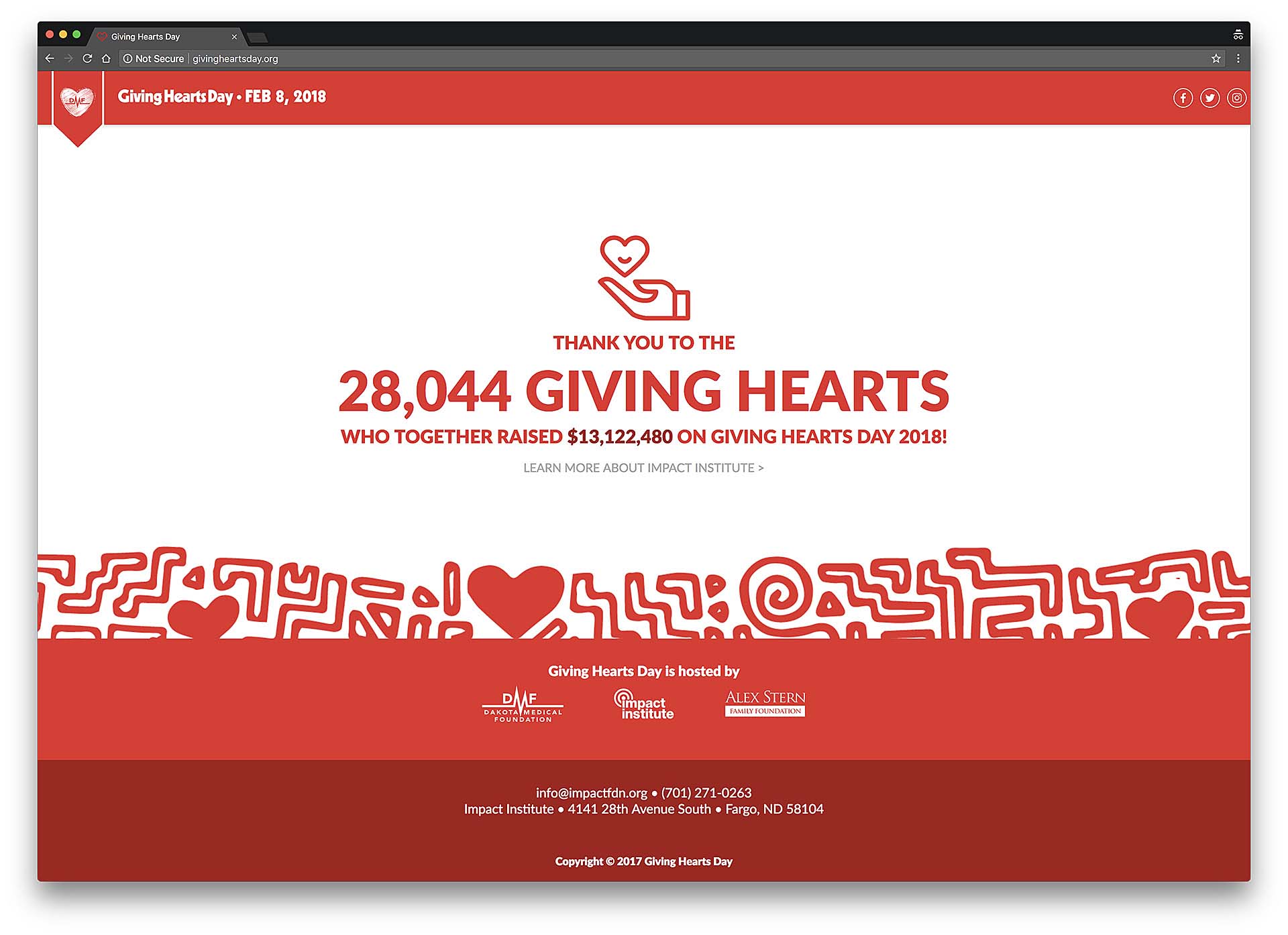
Giving Hearts Day, one of the region’s largest fundraising events has existed as a program of Dakota Medical Foundation (DMF) since 2008. Until its 11th year, however, all online information regarding the event was housed in multiple locations spanning both DMF’s and it’s initiative, Impact Institute’s, websites. We were tasked with bringing all Giving Hearts Day content to one place in a simple and engaging one-page site.

The site’s use of happy and vibrant illustrations and colors was designed to get all who visited the site excited to participate and give back to the community. Based on the organization’s ethos and the project’s objectives, this solution was designed to be:

  • Fun
  • Modern
  • Big
  • Loud
  • Established
  • Structured
  • Vibrant
  • Welcoming

And NOT

  • Static
  • Calm
  • Formal
  • Small
  • Quiet
  • Conservative
  • Exclusive
  • Serious
  • Cautious
Sketchbook displaying sketches of website wireframes
Sketches of wireframe UI
Single page of sketch book with sketches of patterned banners
Single page of sketch book with sketches of patterns and hearts

The site had the goal of informing three target audiences of how they could participate in Giving Hearts Day. These audiences were:

  1. Individuals looking to give to their favorite charities,
  2. Nonprofit organizations looking to set up a donation page and share their message with the hope of receiving donations, and
  3. Businesses involved with a matching program allowing them to match donations made by their employees.

The site also featured a promotional video shot by a third party, a list of previous year participant charities, and prompts for users to promote Giving Hearts Day in the months leading up to the event. The upward trend of giving over the course of the event’s existence was highlighted with the use of a colorful chart previously created by Nüpolitan and used in other Giving Hearts Day materials.

Final Giving Hearts Day one-page site
Screen capture of Giving Hearts Day one page site with final count of 28,044 Giving Hearts
Dark, cloudy background with ballerina in short blue costume and Cinderella written in gold ribbon in foreground

Cinderella

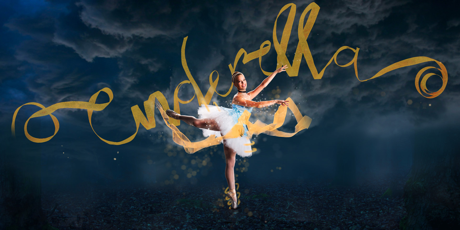
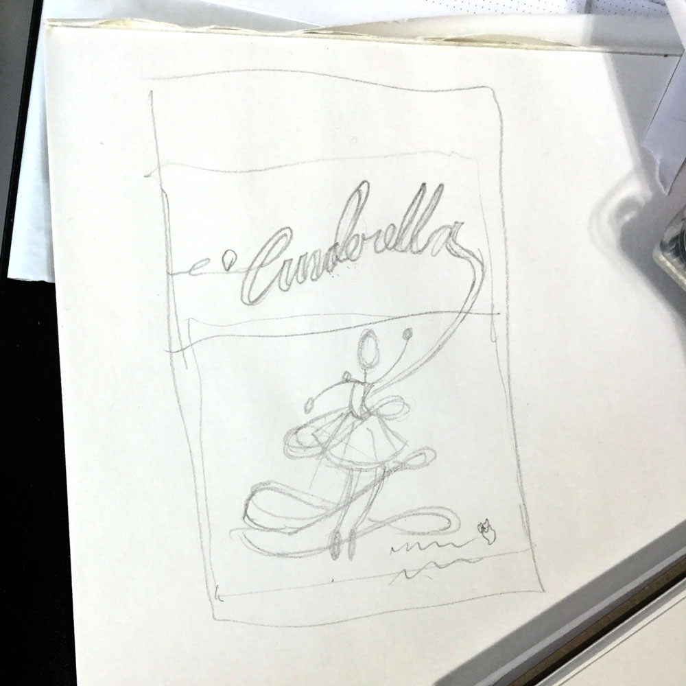
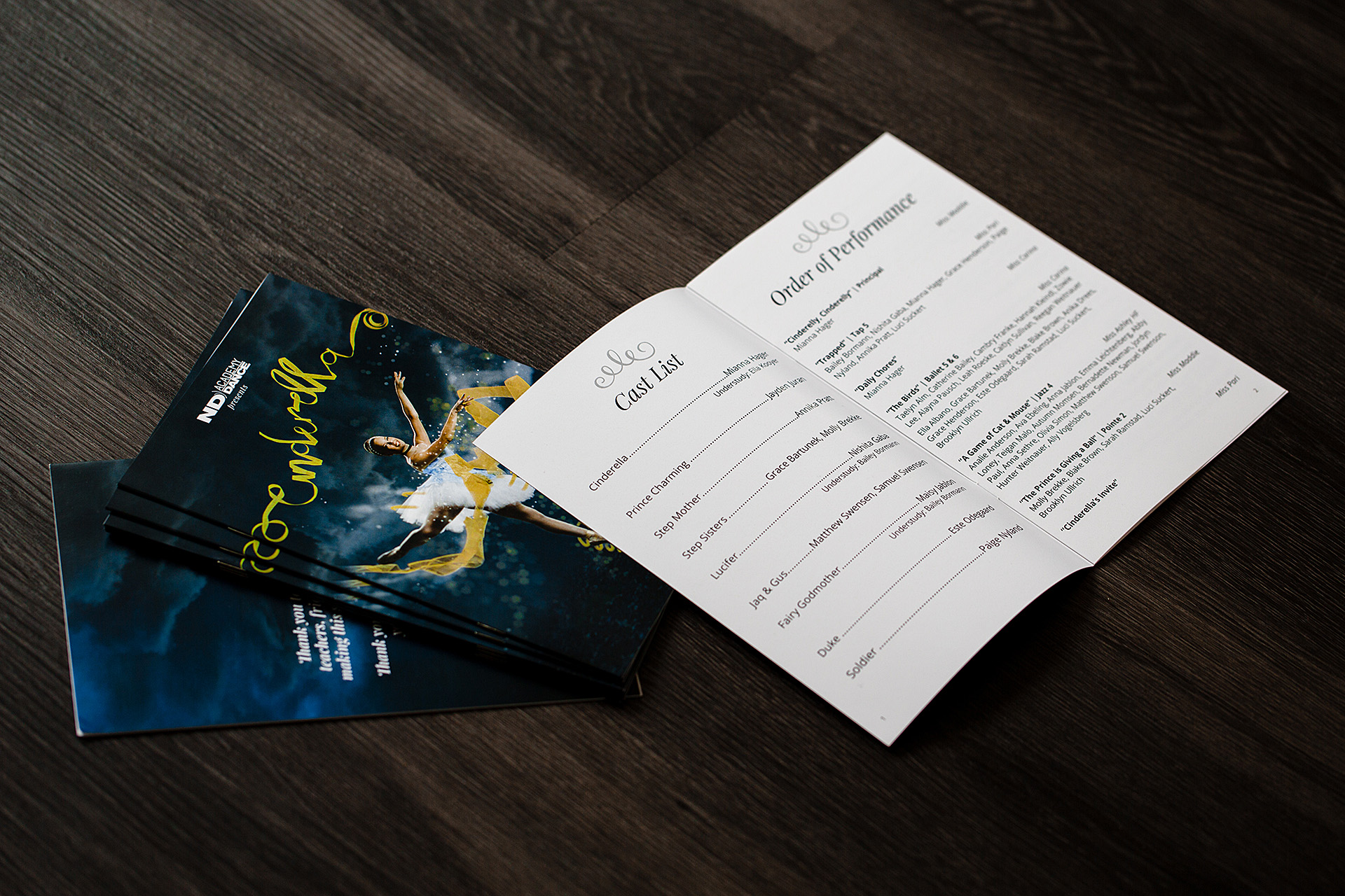
North Dakota Academy of Dance's winter recital for the 2017-2018 season was an all-genres production of Cinderella. The studio hired Nüpolitan to help promote the show through printed and digital materials. We directed a photo shoot with the show's lead dancer - adding elements made of ribbon for dimension and to elude to the dressmaking portion of the well-known fairytale. We constructed the title text out of the same ribbon for a whimsical feel. The resulting design was magical, eye-catching, and sure to appeal to audiences of all ages.

A hand sketching layouts for Cinderella poster in a sketchbook
Sketchbook page displaying pencil drawing of Cinderella poster layout
Woman draping tulle around the feet of ballerina dressed in Cinderella tutu in front of photo backdrop
Woman draping tulle and ballerina dressed in Cinderella tutu assisting in front of photo backdrop
Woman draping tulle around the feet of ballerina dressed in Cinderella tutu in front of photo backdrop
Ballerina dressed in Cinderella tutu in front of photo backdrop while tulle is being draped around her
Ballerina dressed in Cinderella tutu poses in front of photo backdrop while two women hold her hand and foot
The word Cinderella made from ribbon on floor of dance studio with women in background preparing set

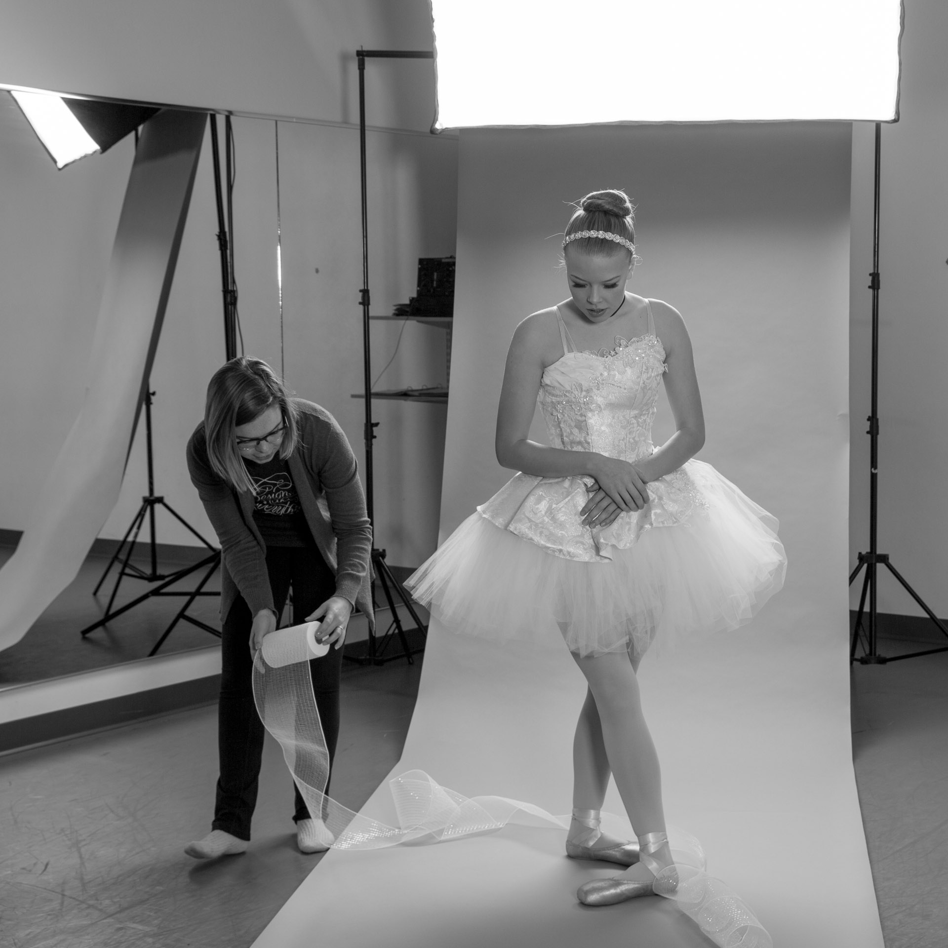
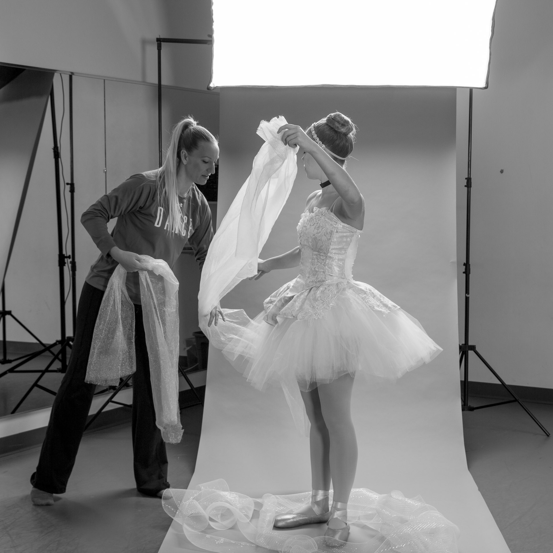
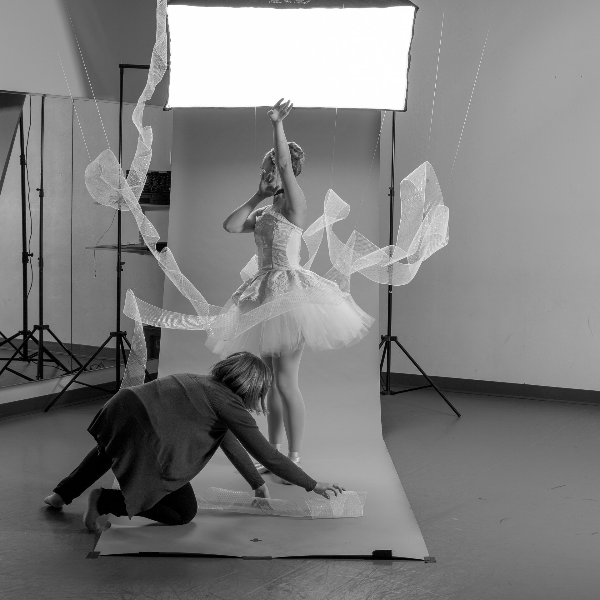
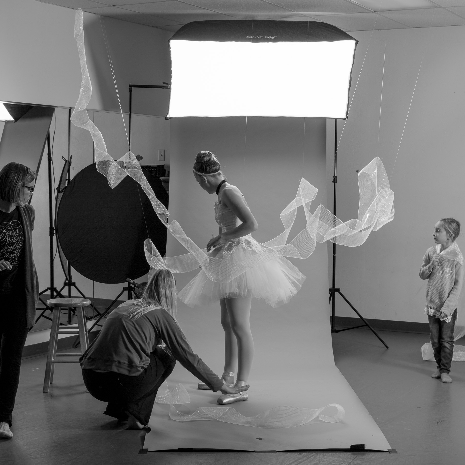
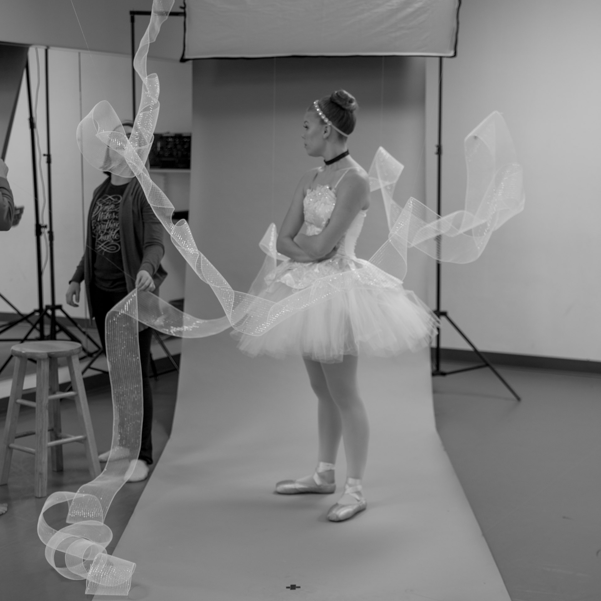
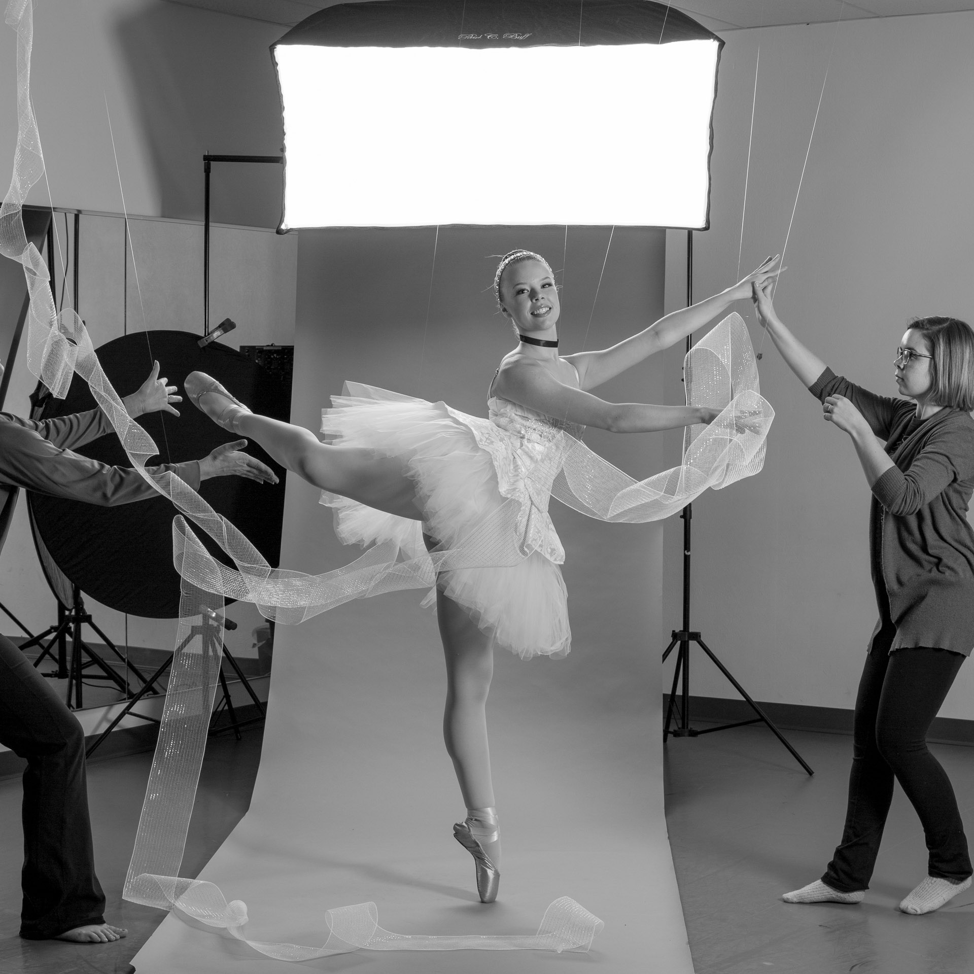
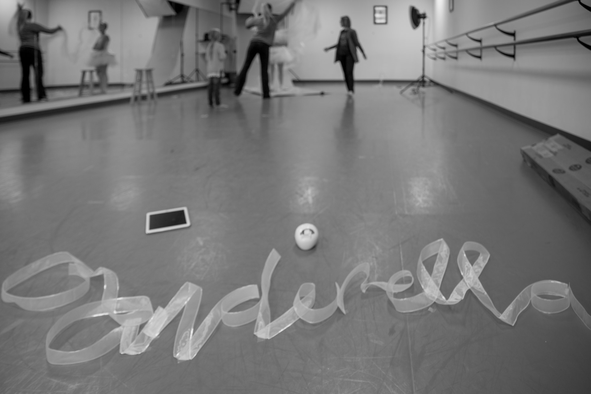
A close up of the ribbon lettering
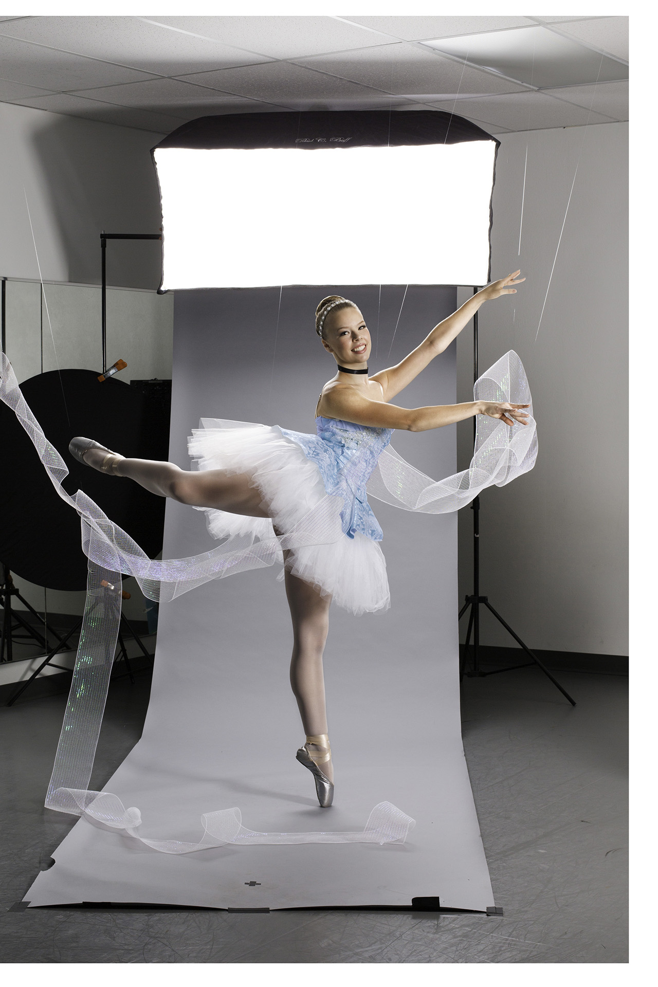
Ballerina dressed in Cinderella tutu poses in front of photo backdrop with tulle draped around her
Dark, cloudy background with ballerina in short blue costume and Cinderella written in gold ribbon in foreground

Before and after

Blue background with poster of ballerina in short blue costume and Cinderella written in gold ribbon in foreground
A stack of Cinderella recital programs with an open program displaying order of performance laying on a wood floor
iMac with open browser window displaying Eventbrite event for Cinderella recital
Close-up of iPhone displaying cover photo for Cinderella recital Facebook event

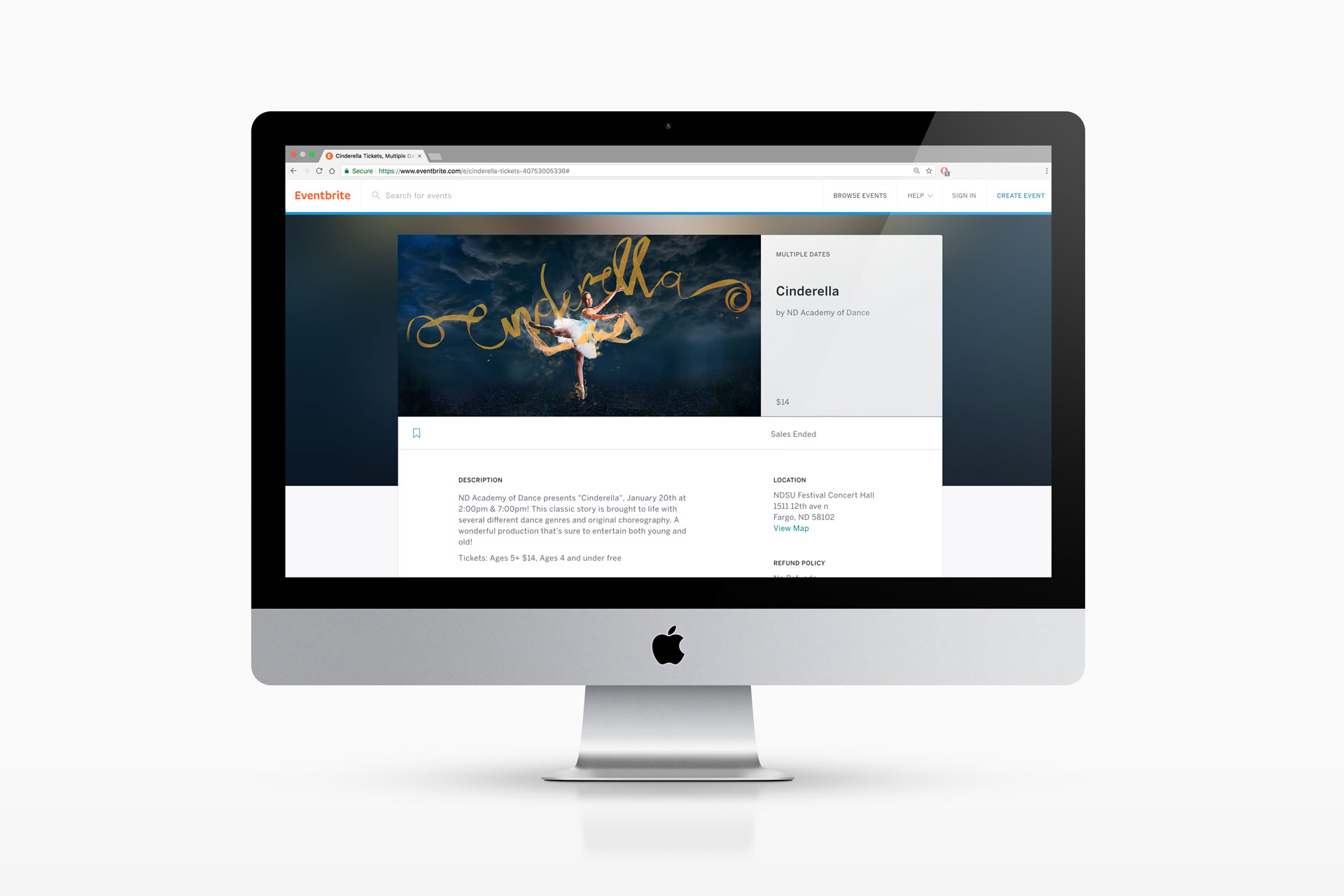
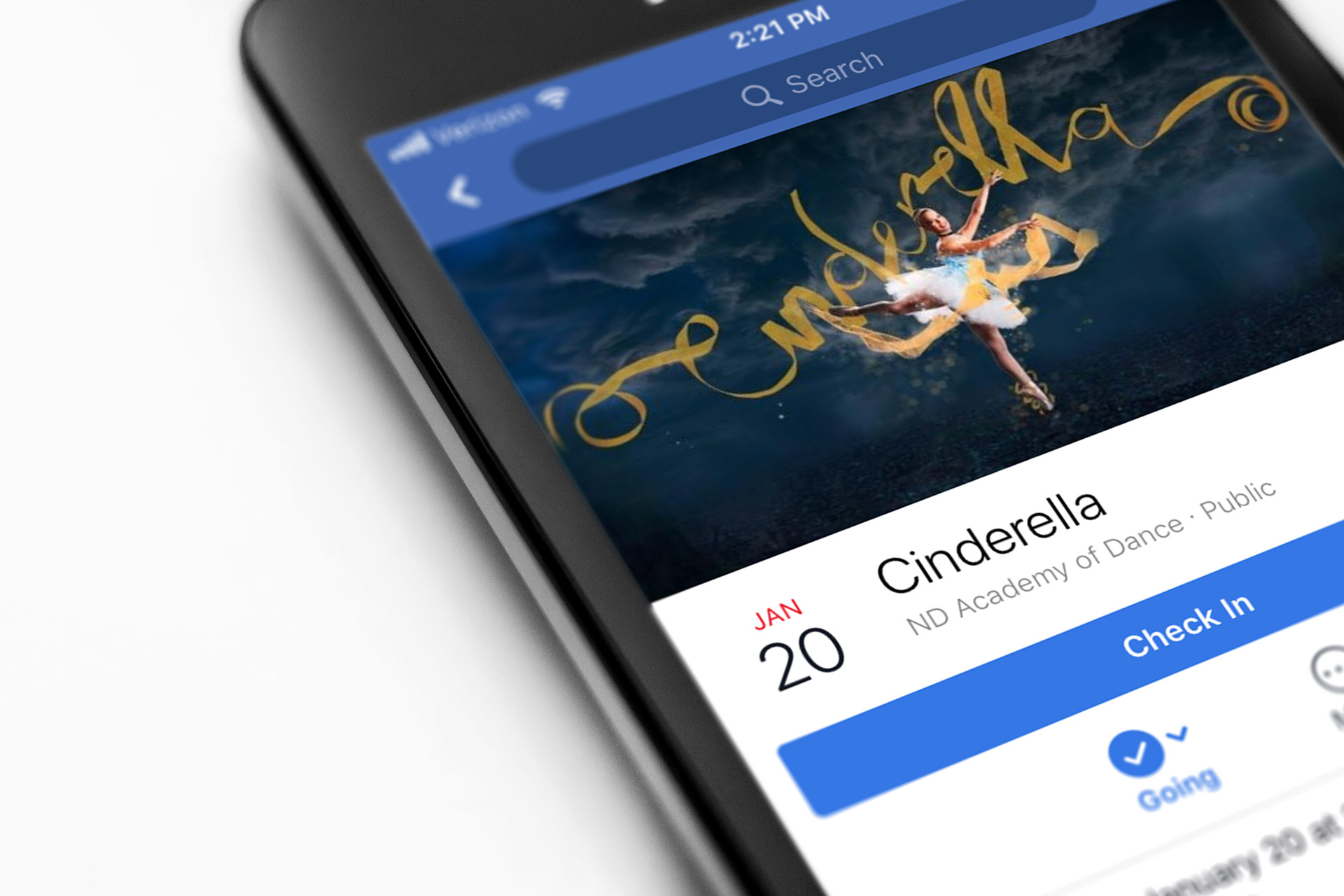
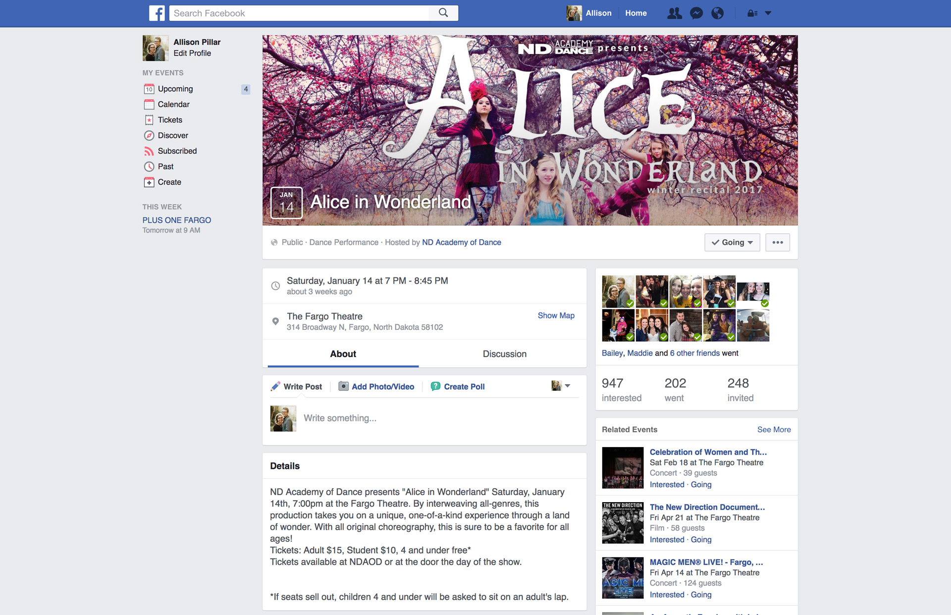
Tickets for the performance were sold through Eventbrite and linked to a Facebook event.

Close-up of Giving Hearts Day 2018 Essentials Guidebook printed laying on a dark background next to red journals and markers

GHD Guidebook 2018

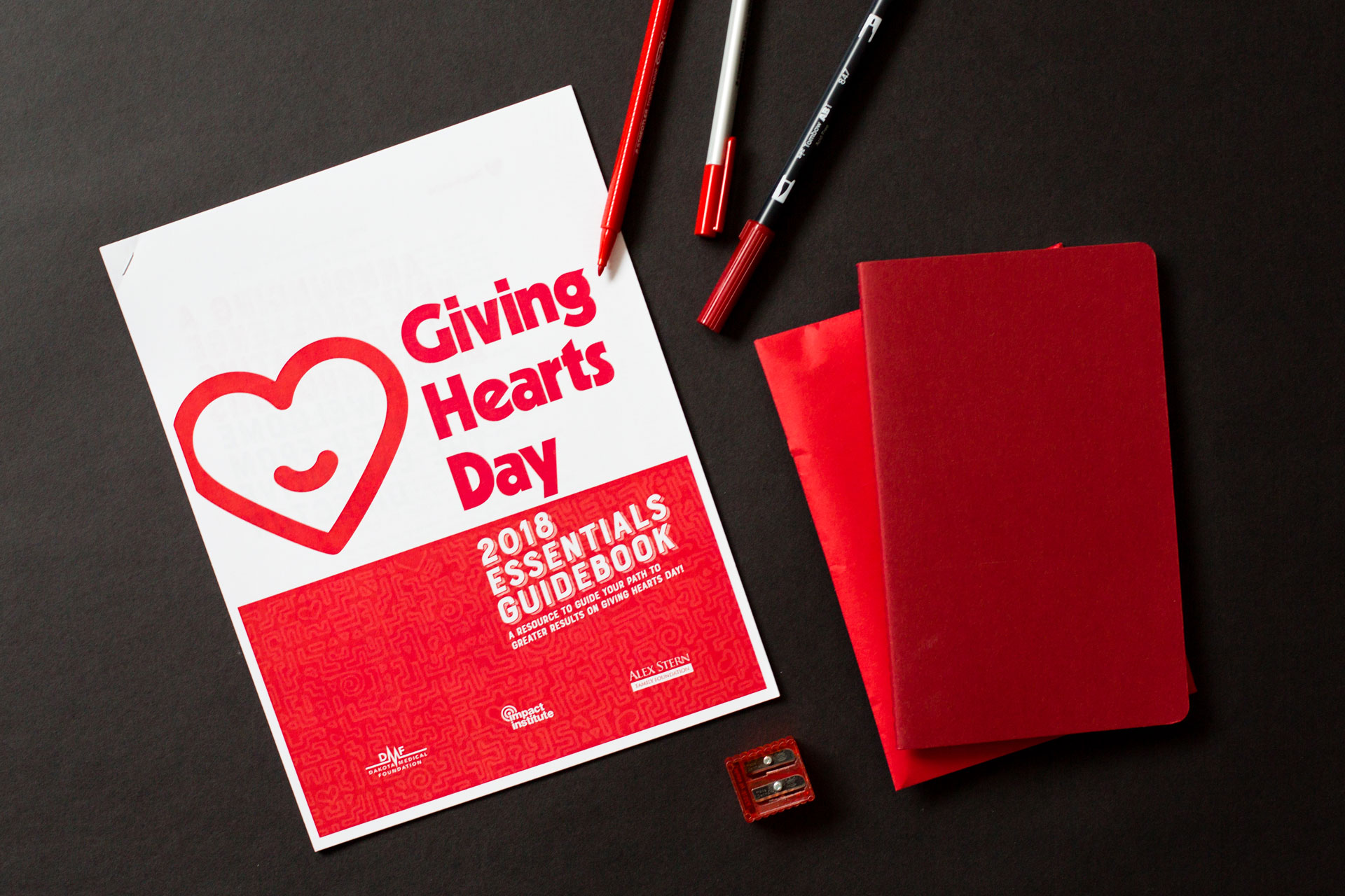
This guidebook redesign was an exciting update to recycled content to be used as a guide for Giving Hearts Day, one of the region’s largest fundraising events.

After conversations with the client, we determined the solution needed to be informational and easy-to-use, yet bright and fun. A simple, well-structured type treatment resulted in a user-friendly guide that was both engaging and helpful. To tap into the charities' affinities for giving back, warmth was brought to the document through the selection of colors, typography, and use of illustration.

The final printed packet acted as a reference guide that nonprofits and charities participating in Giving Hearts Day could (and would want to) refer back to over the course of several months of planning their fundraising efforts.

Single page of sketch book with sketches of patterned banners
Single page of sketch book with sketches of patterns and hearts
Giving Hearts Day 2018 Essentials Guidebook printed laying on a dark background next to red journals and markers
A hand holding the printed guidebook opened to interior page over a dark background next to red journals and markers
Red line and heart pattern
Red dashed pattern
Red hand-drawn arch pattern
Red line pattern

Based on the organization’s ethos and the project’s objectives, this solution was designed to be:

  • Fun
  • Modern
  • Big
  • Loud
  • Established
  • Structured
  • Vibrant
  • Welcoming

And NOT

  • Static
  • Calm
  • Formal
  • Small
  • Quiet
  • Conservative
  • Exclusive
  • Serious
  • Cautious
Four colorful cards covered with a repeating hi pattern, a red journal, and black pen on a red background

Hi Cards

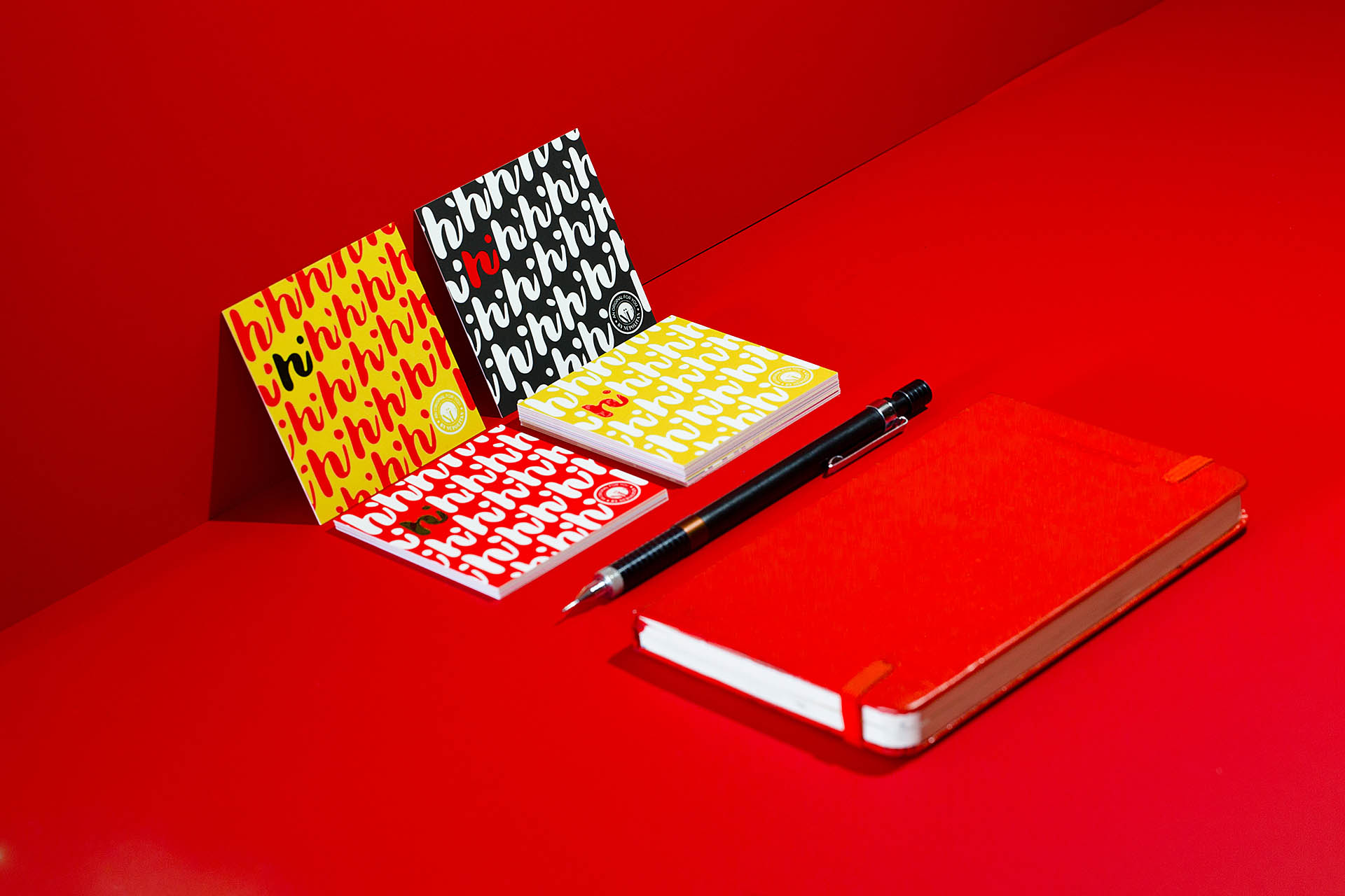
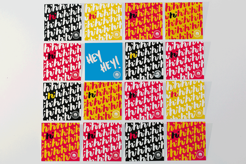
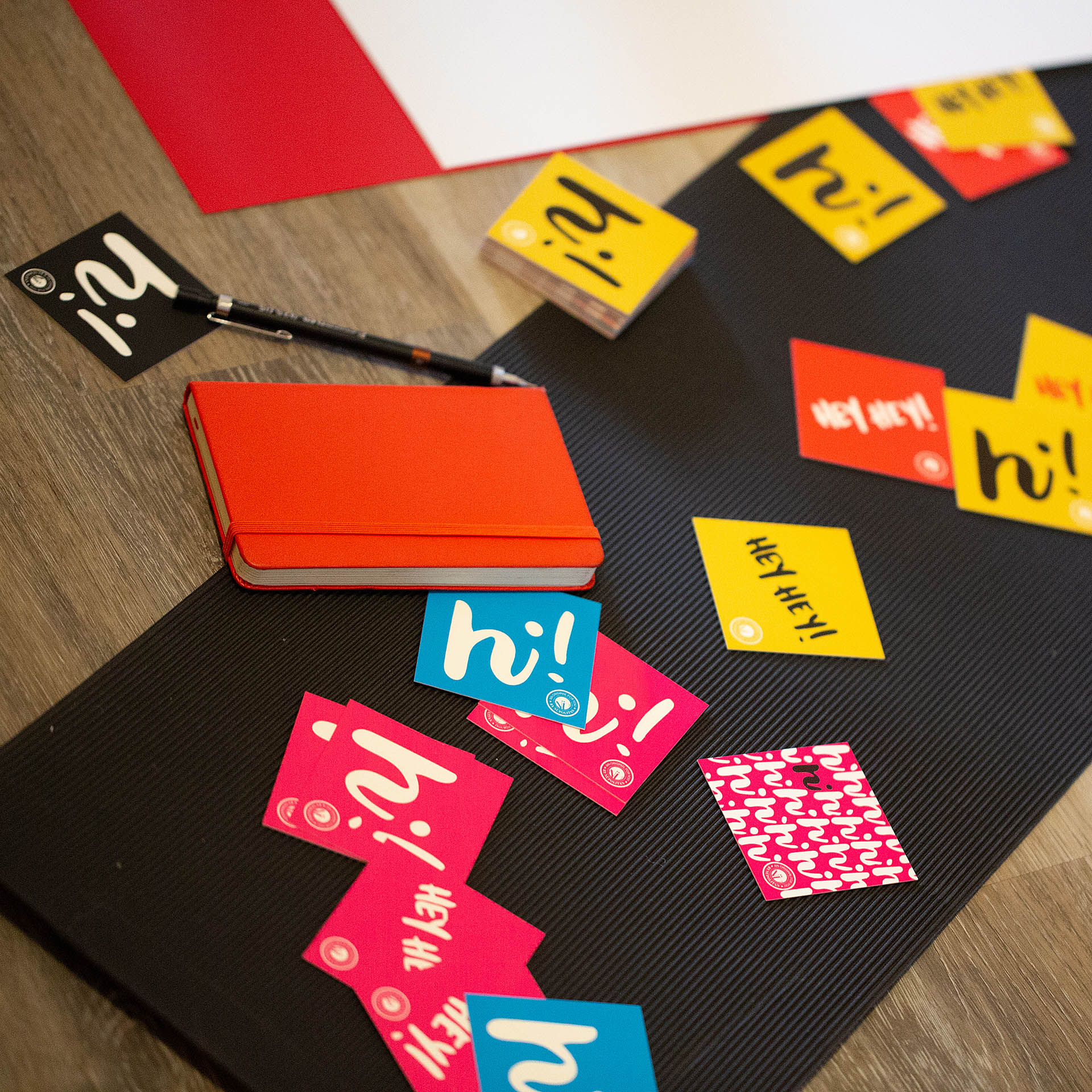
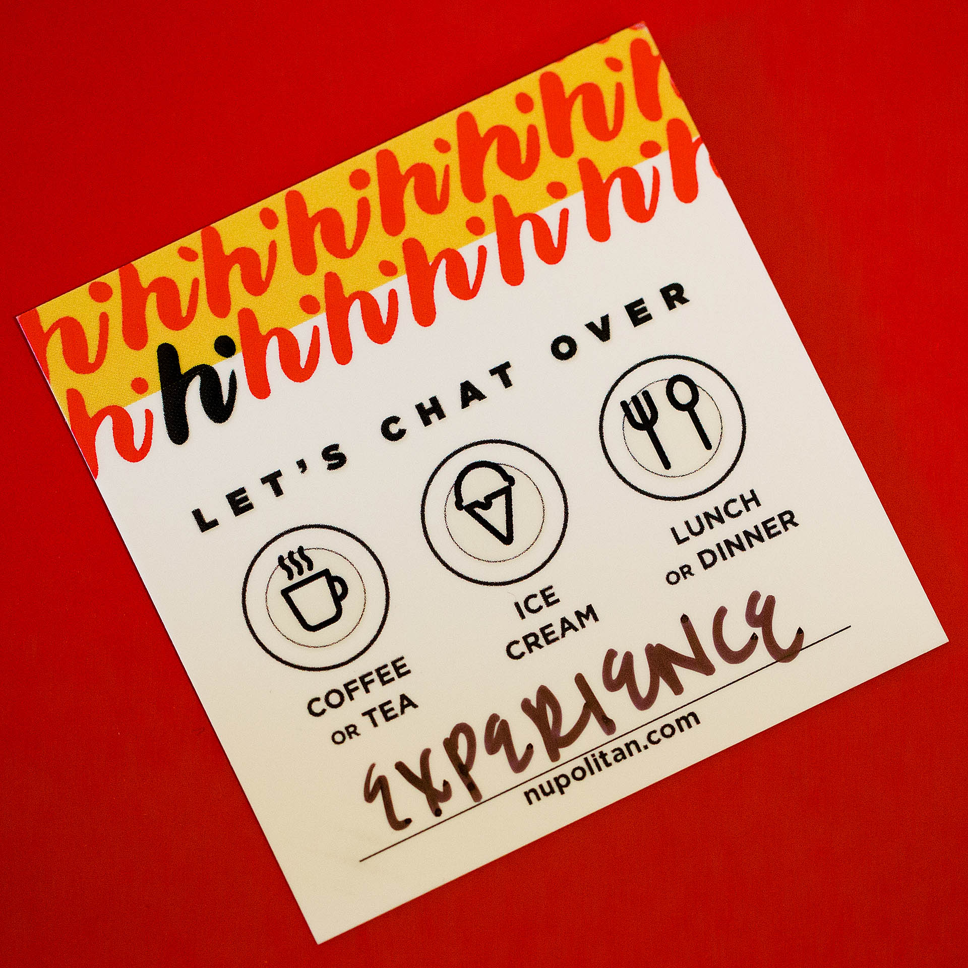
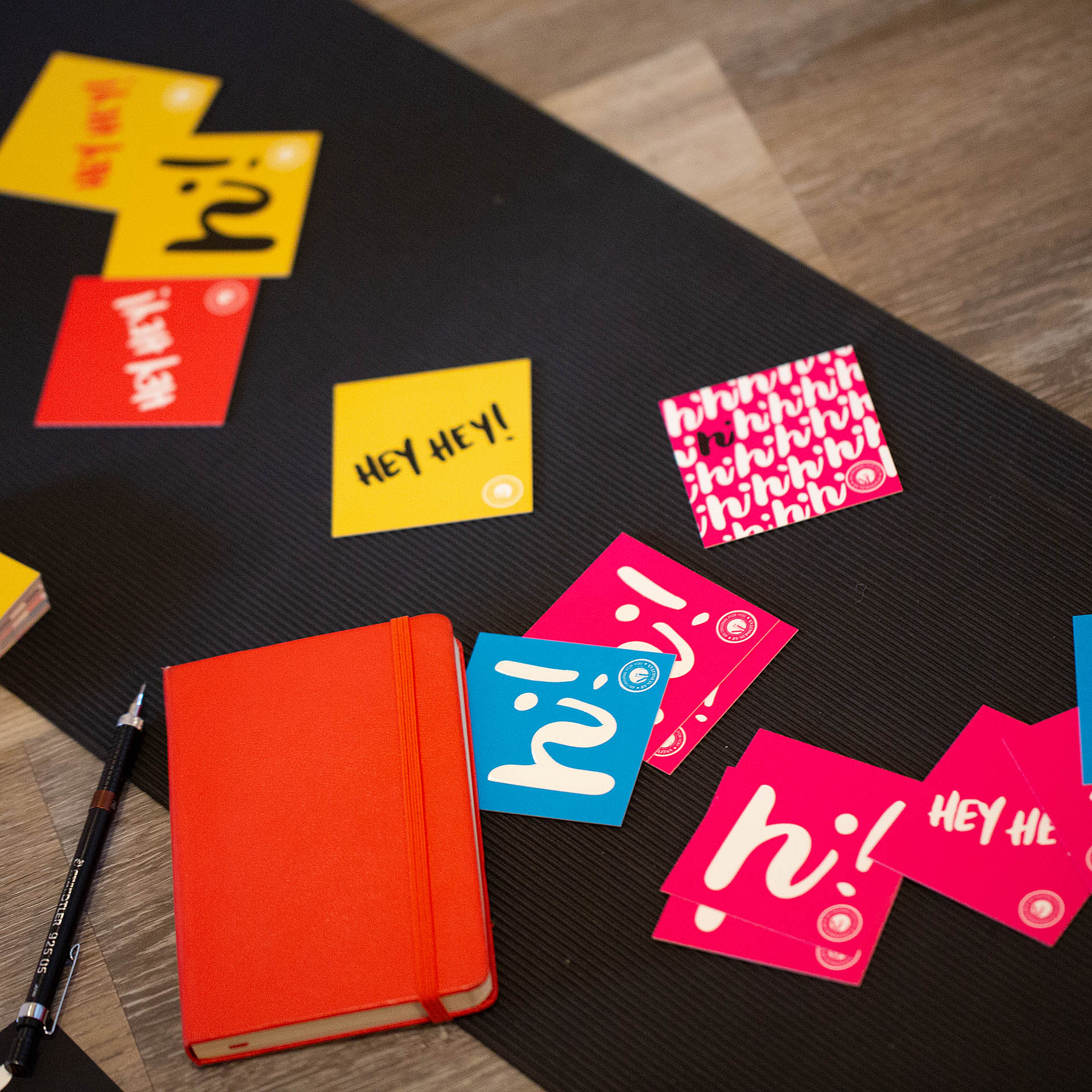
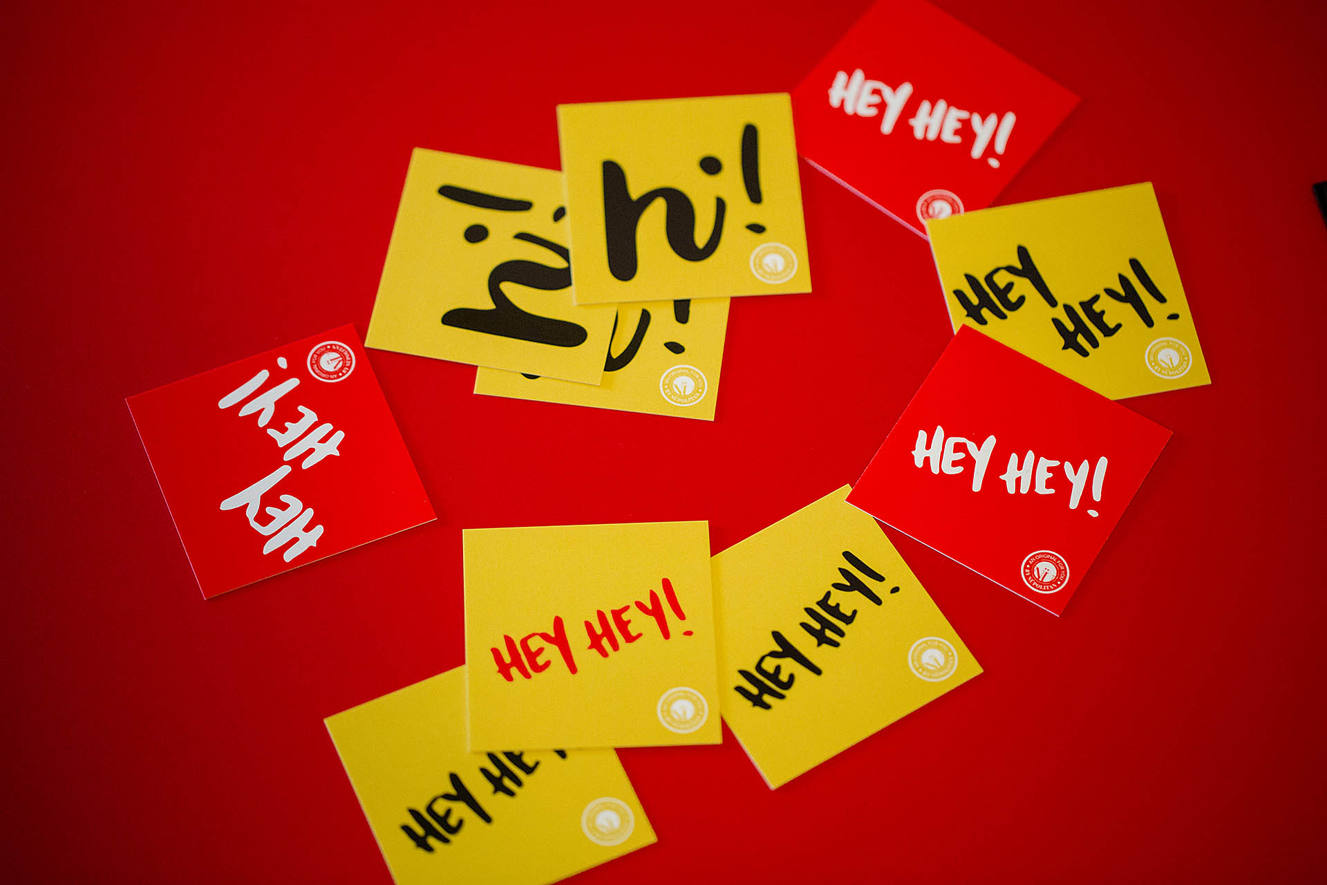
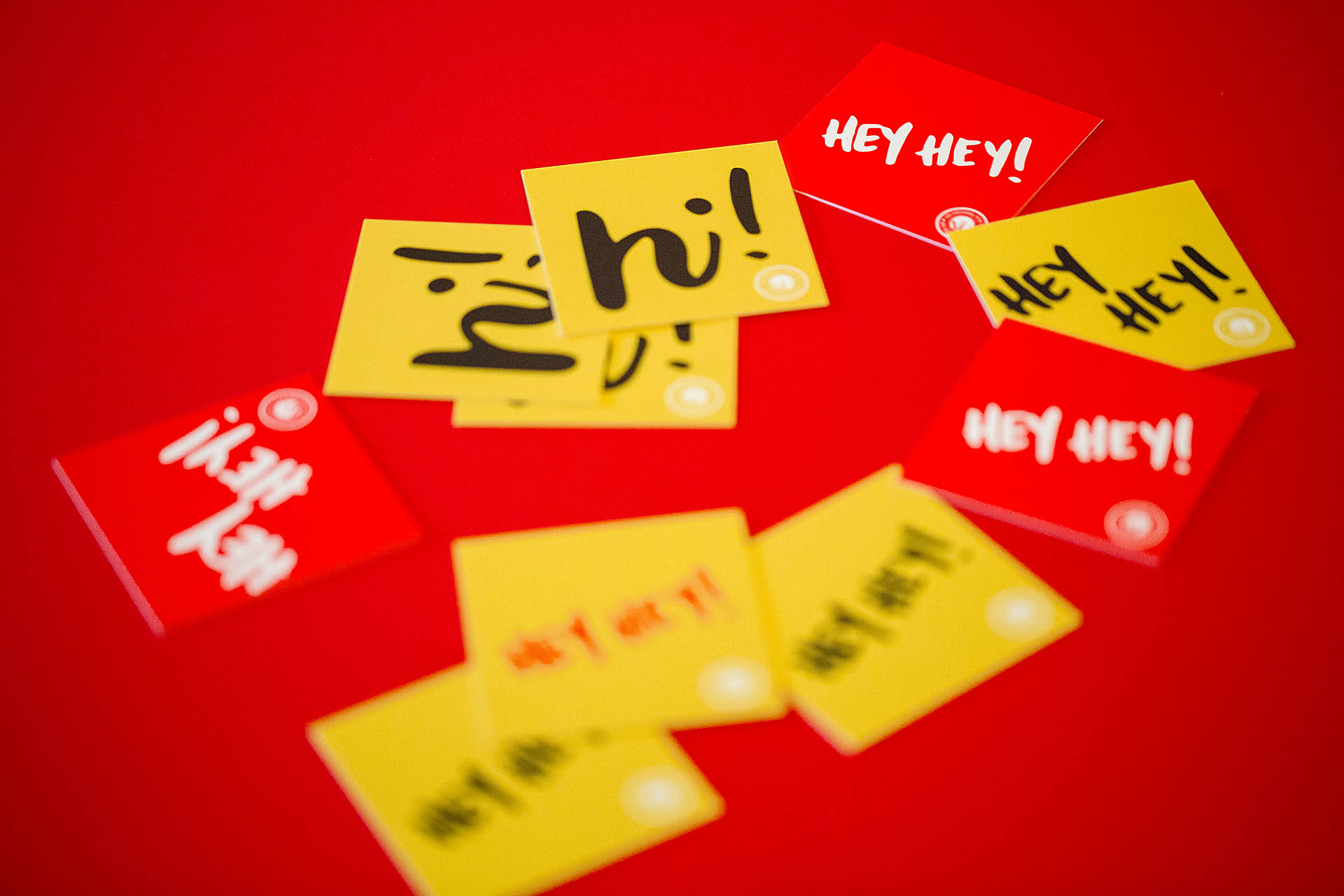
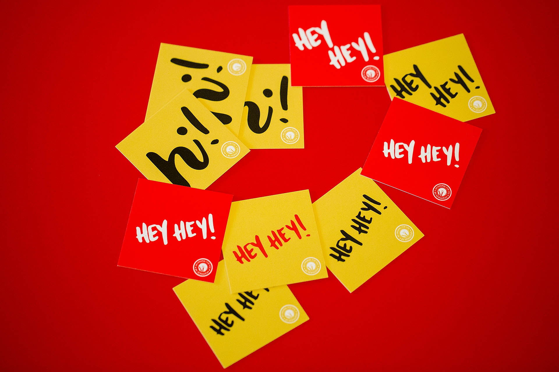
Designed to be a fun conversation piece and a reminder of exciting things to come, these cards feature a friendly message with a fun, bright pop of color. We merged the playfulness of hand-lettering with crisp, streamlined text and a highly-structured seal for an interesting visual. Raised spot gloss adds a tactile element to the experience.

What's your favorite thing to chat over?

Four colorful cards covered with a repeating hi pattern, a red journal, and black pen on a red background

The vivid hues pay tribute to the primary color palette used by graffiti artist Keith Haring and pop artist Roy Lichtenstein. These cards call attention with a loud, simple, and friendly visual message.

A grid of yellow, red, and black cards with a hi repeating pattern and hey hey printed on them
A grid of colorful square cards on a white background
A hand grabbing the corner card out of a grid of colorful square cards
A hand holding a card over a blurred grid of colored, square cards in the background

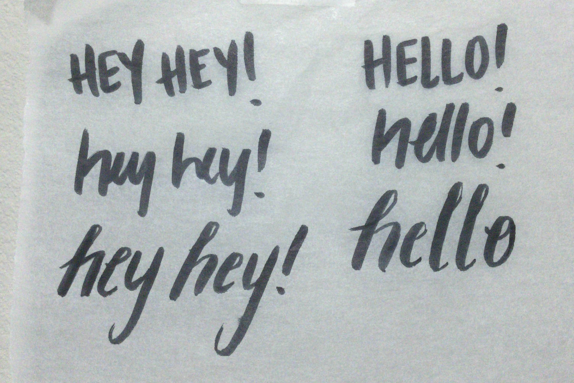
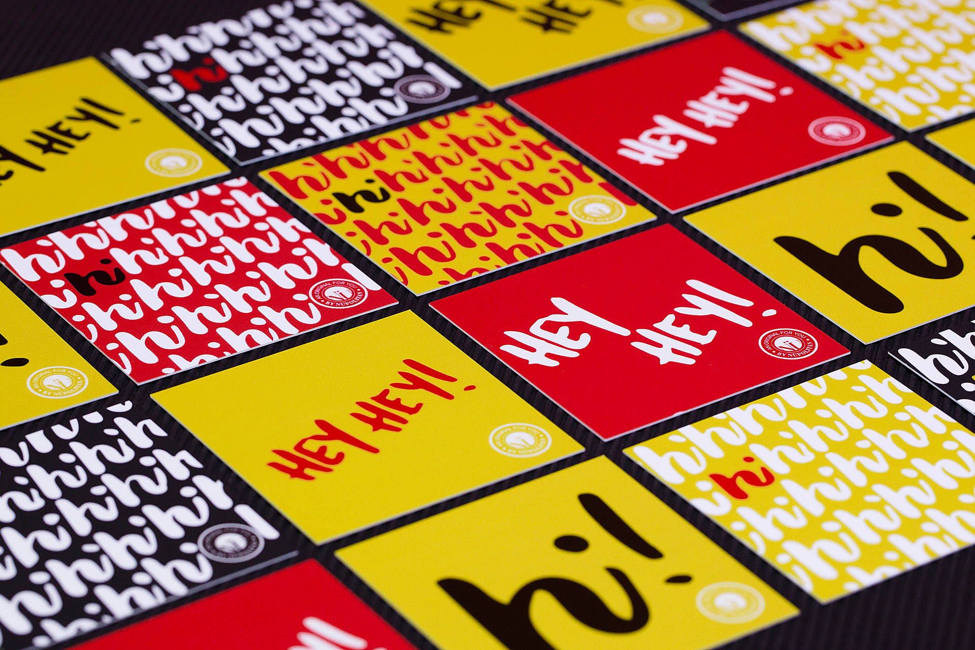
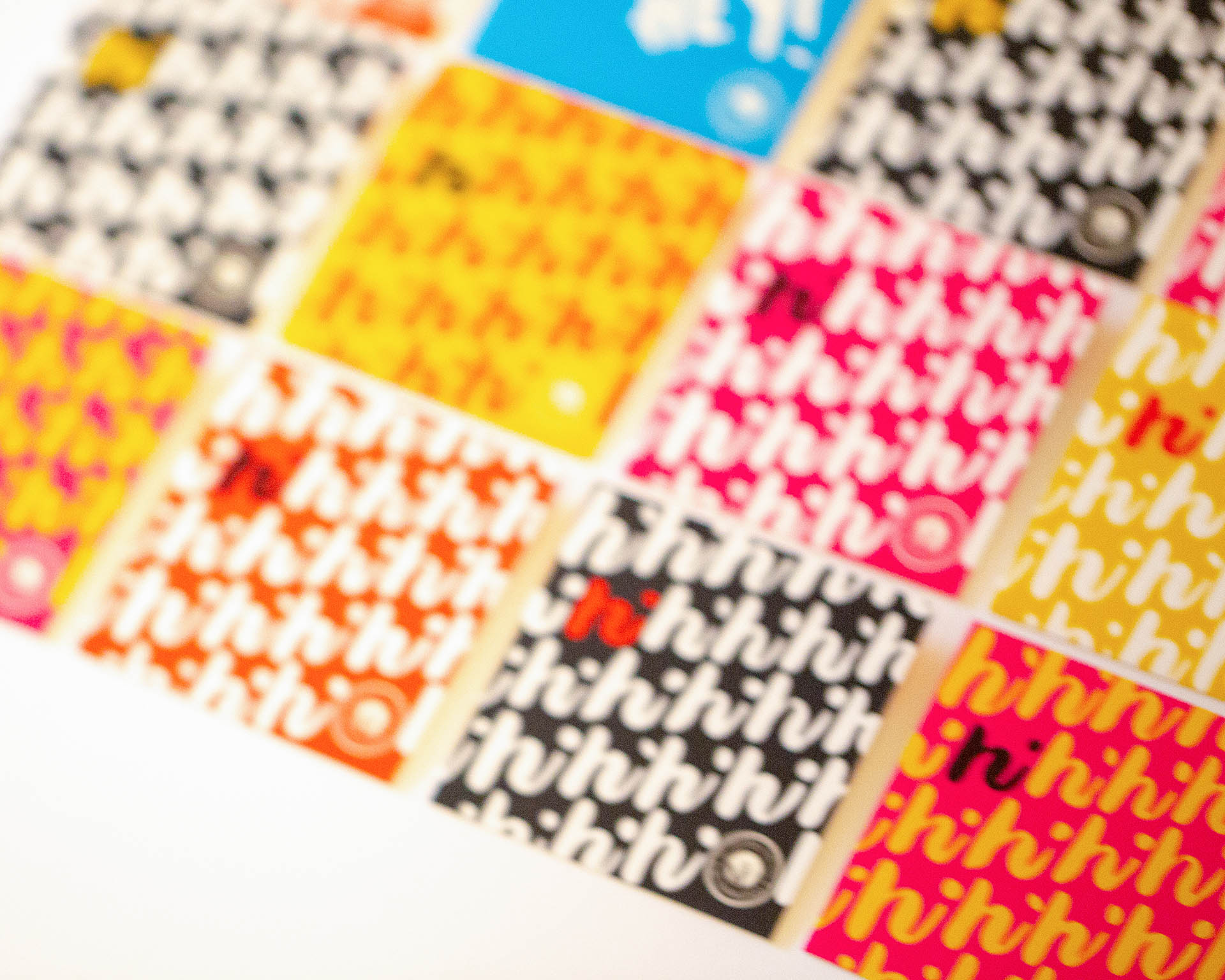
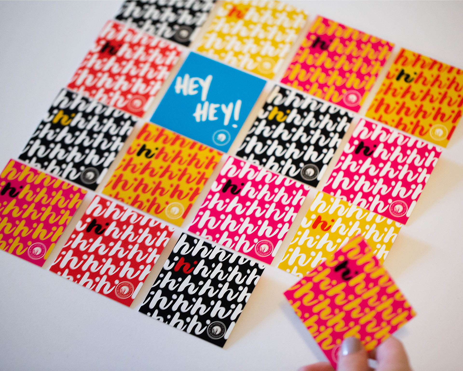
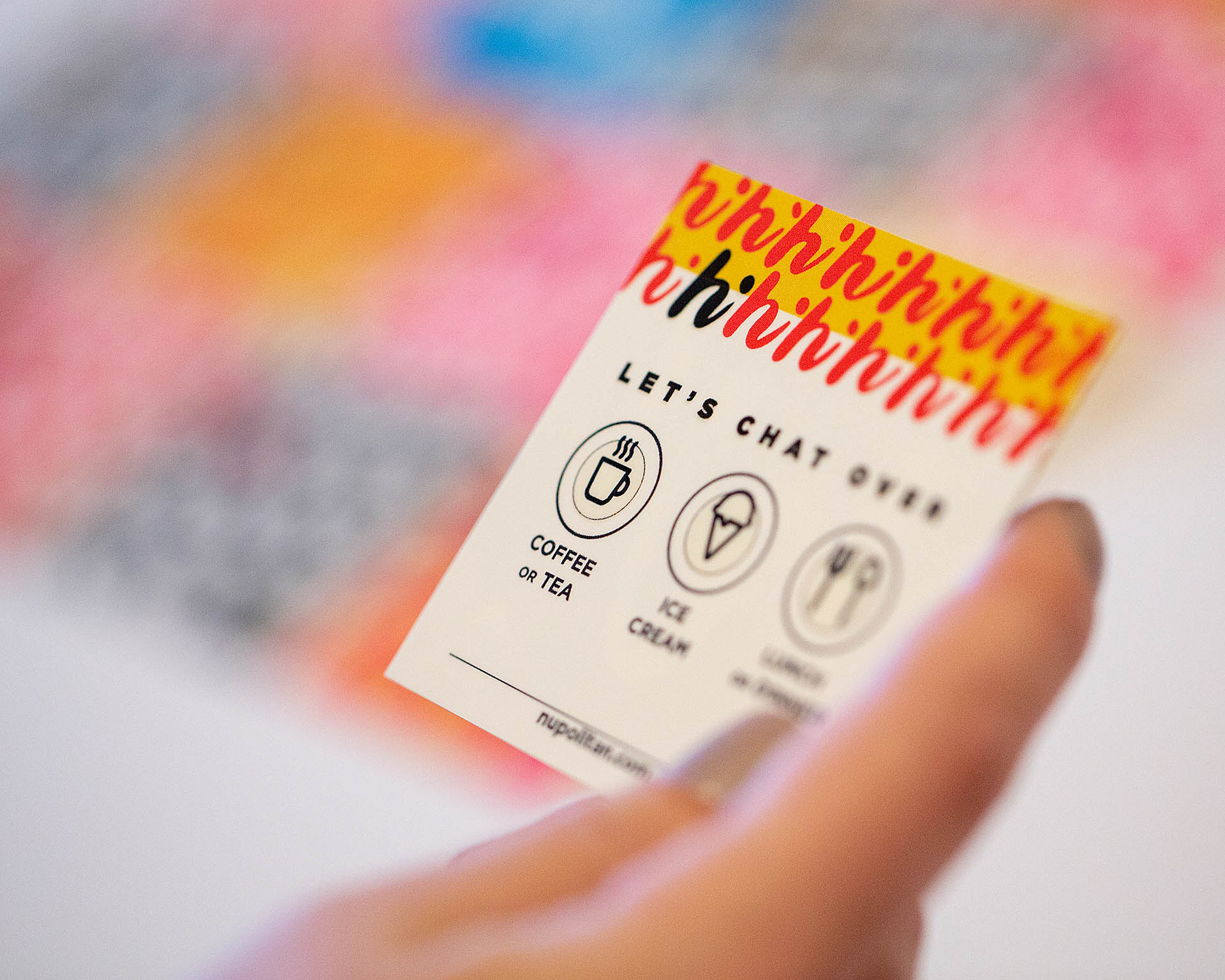
The cards are meant to spark conversation by suggesting a chat over a drink, a meal, or by sharing ice cream. Built as a system, the intent is for people to want to collect them all.

Two blue and two pink cards, a gray pencil cup, and pink post-it notes on gray felt
A grid of 16 square, colorful cards on a white background

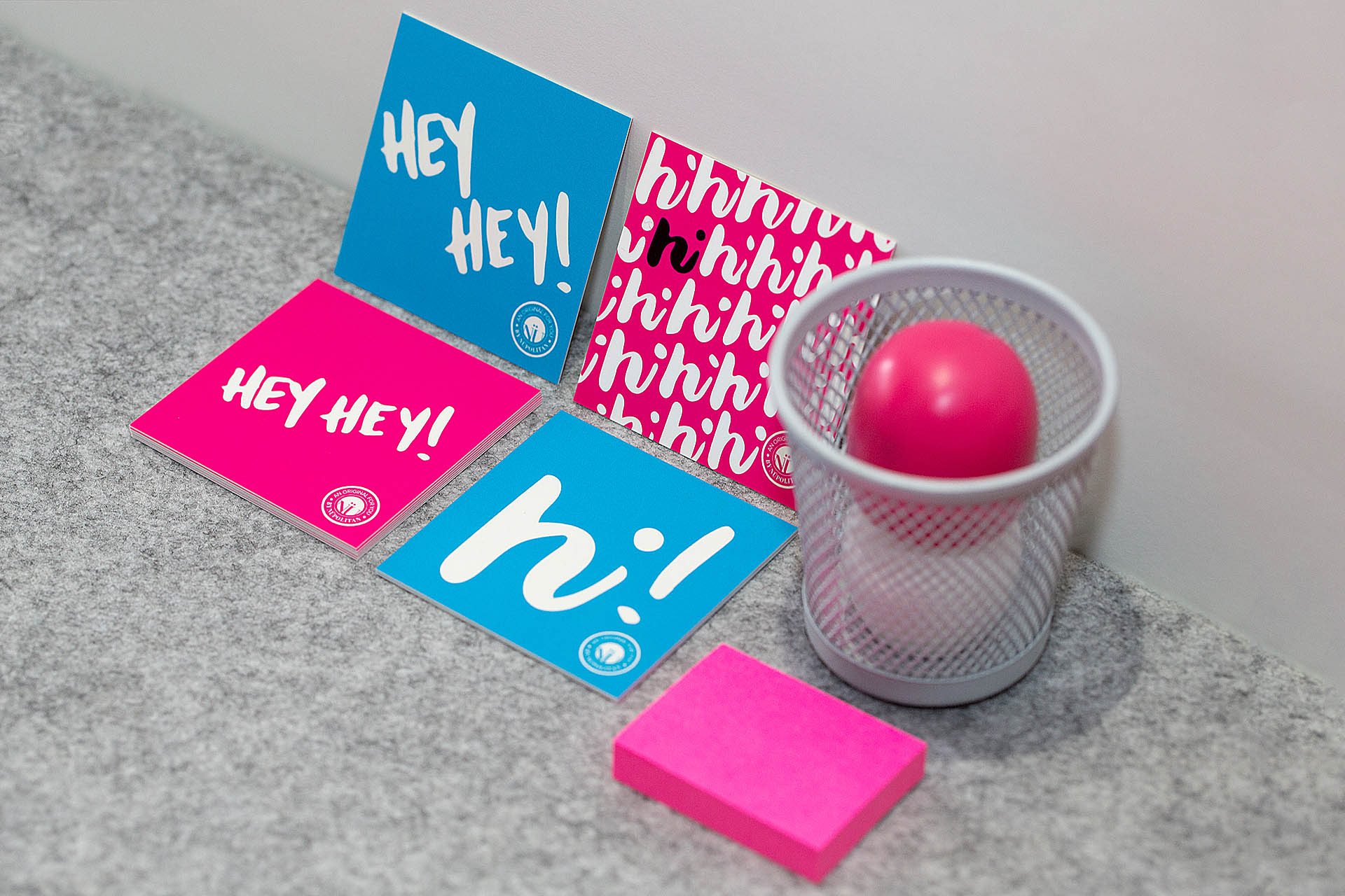
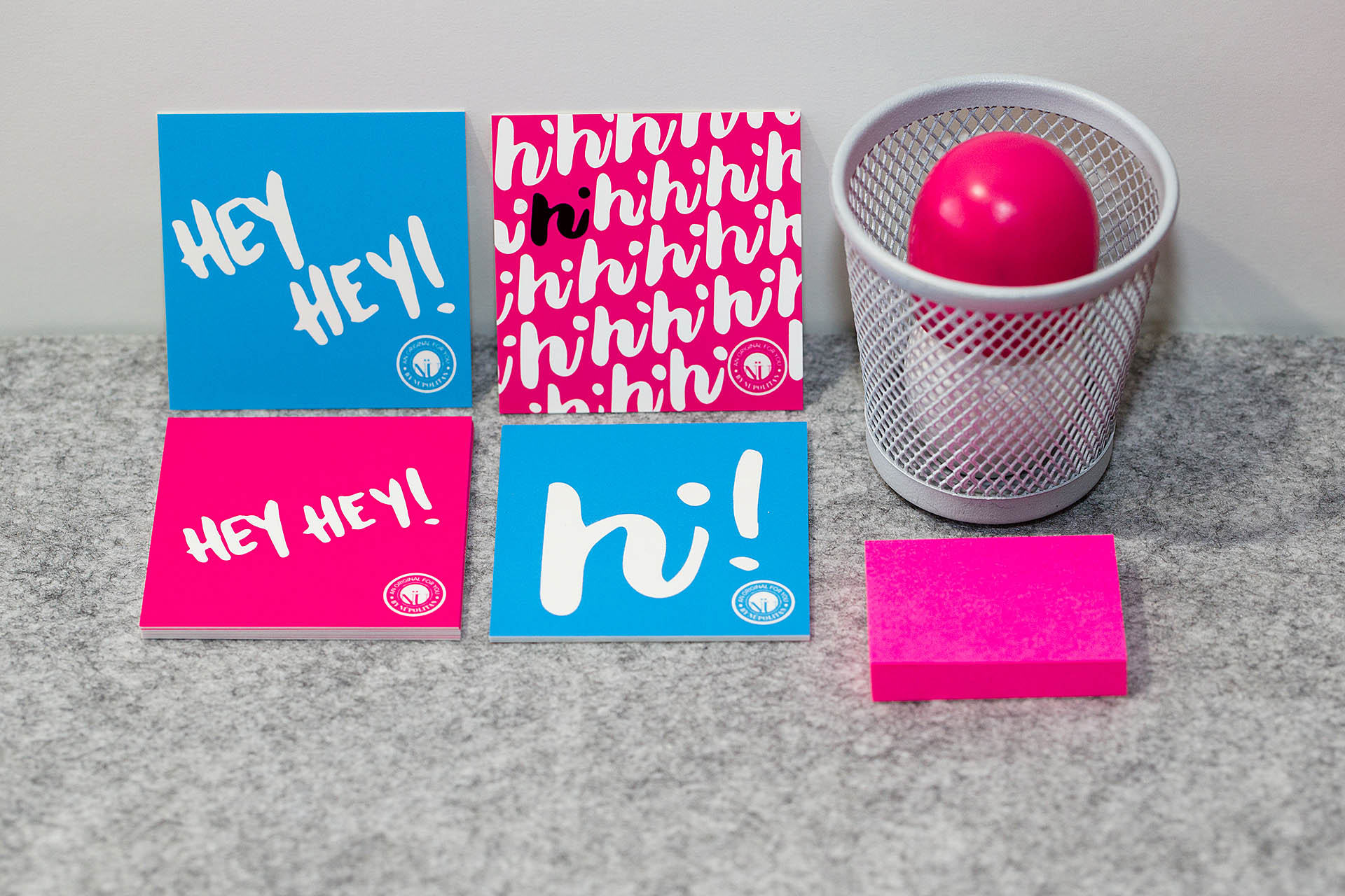
While the "Hey, Hey!" messaging may be too friendly for some, a nice "Hi!" can be a more simple approach.

An isometric grid of 16 square, colorful cards on a white background
A hand holding a card over a blurred grid of colored, square cards in the background
A hand holding black square card reading hi! with grid of colorful cards blurred in the background

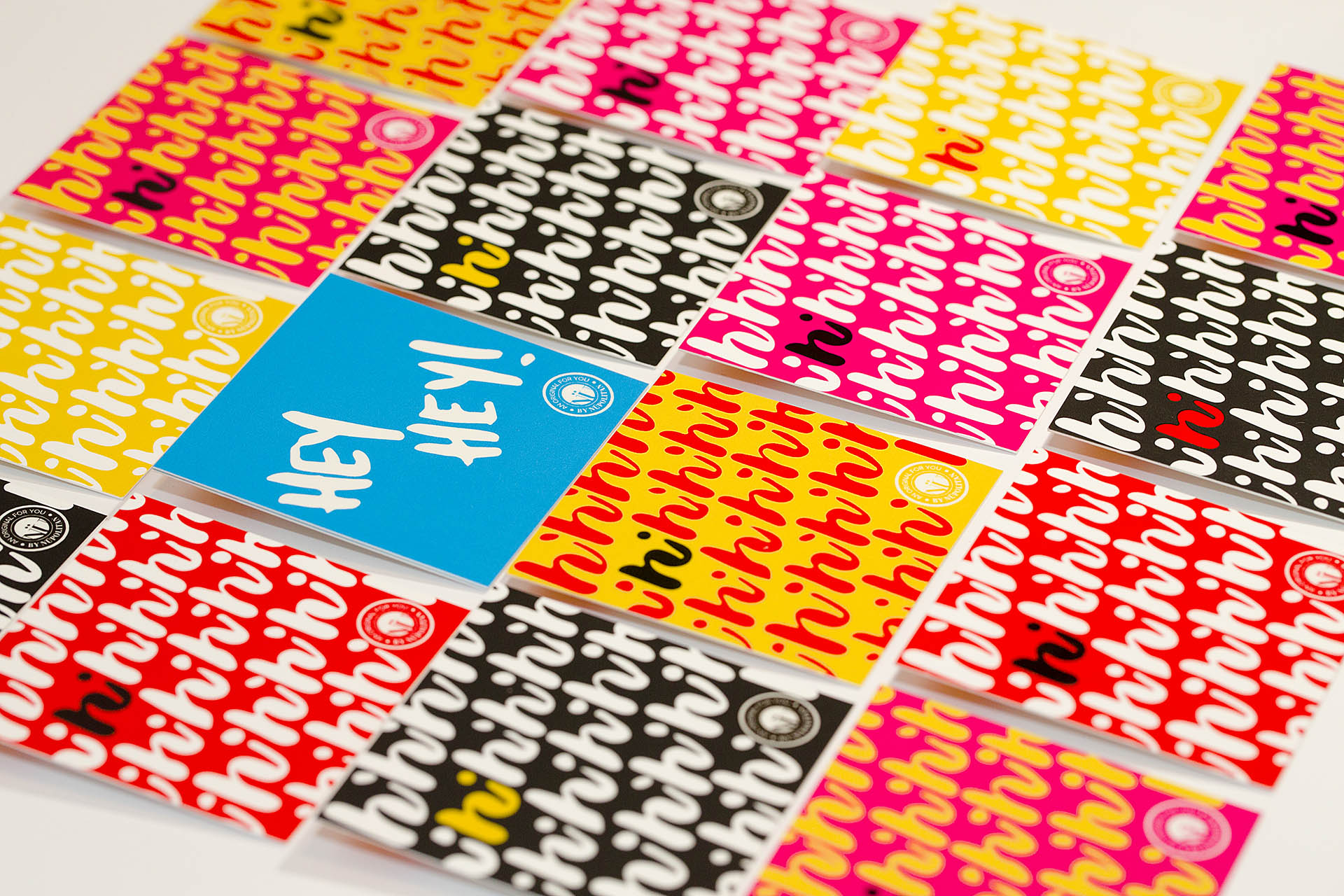
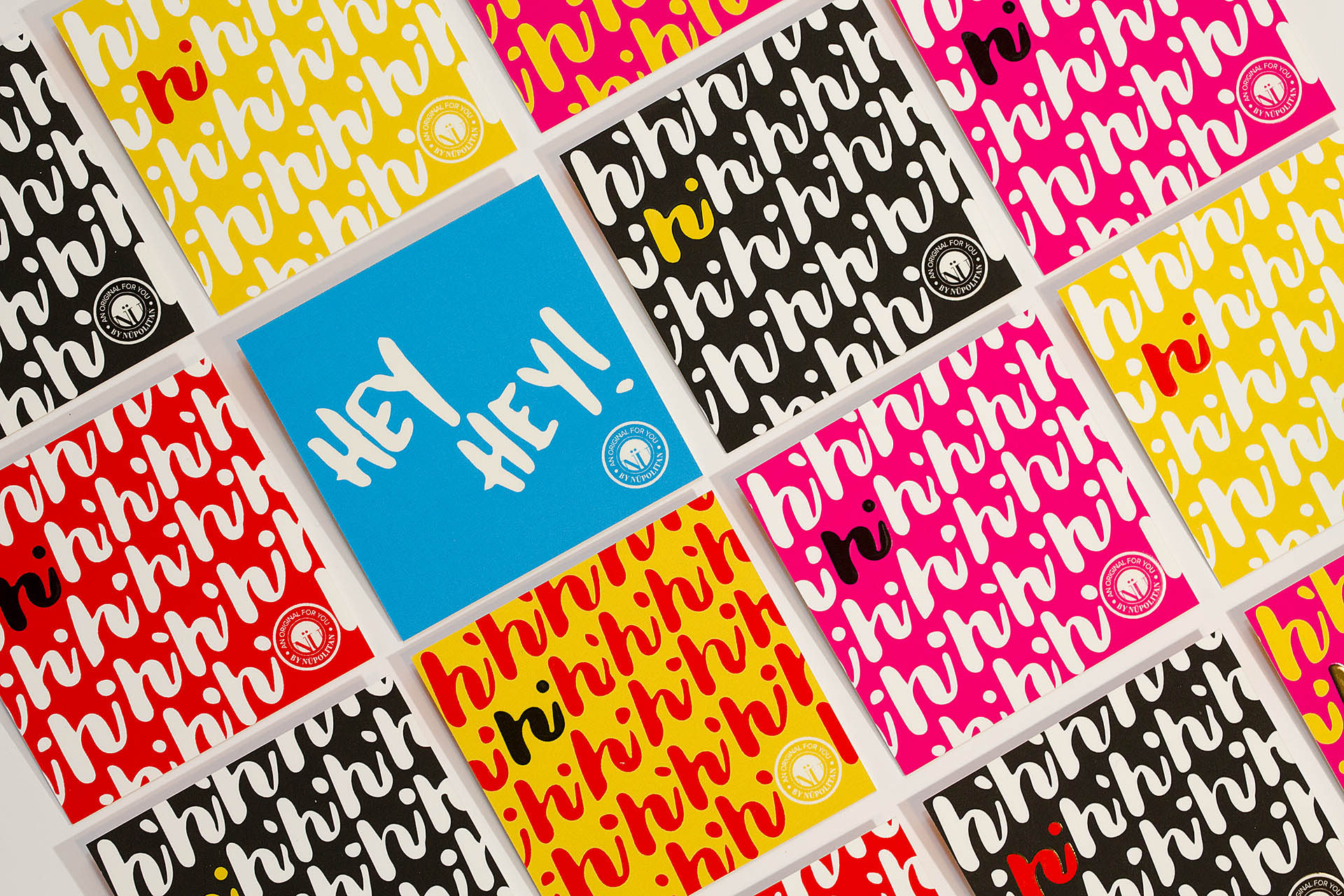
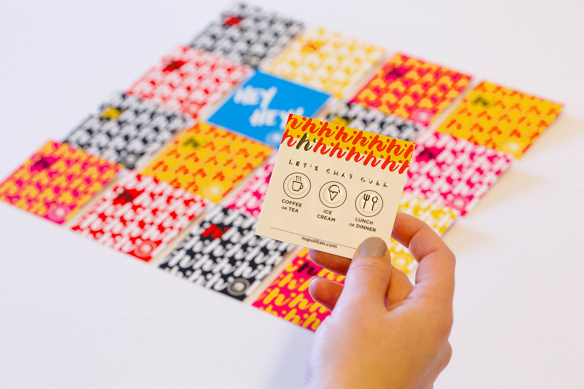
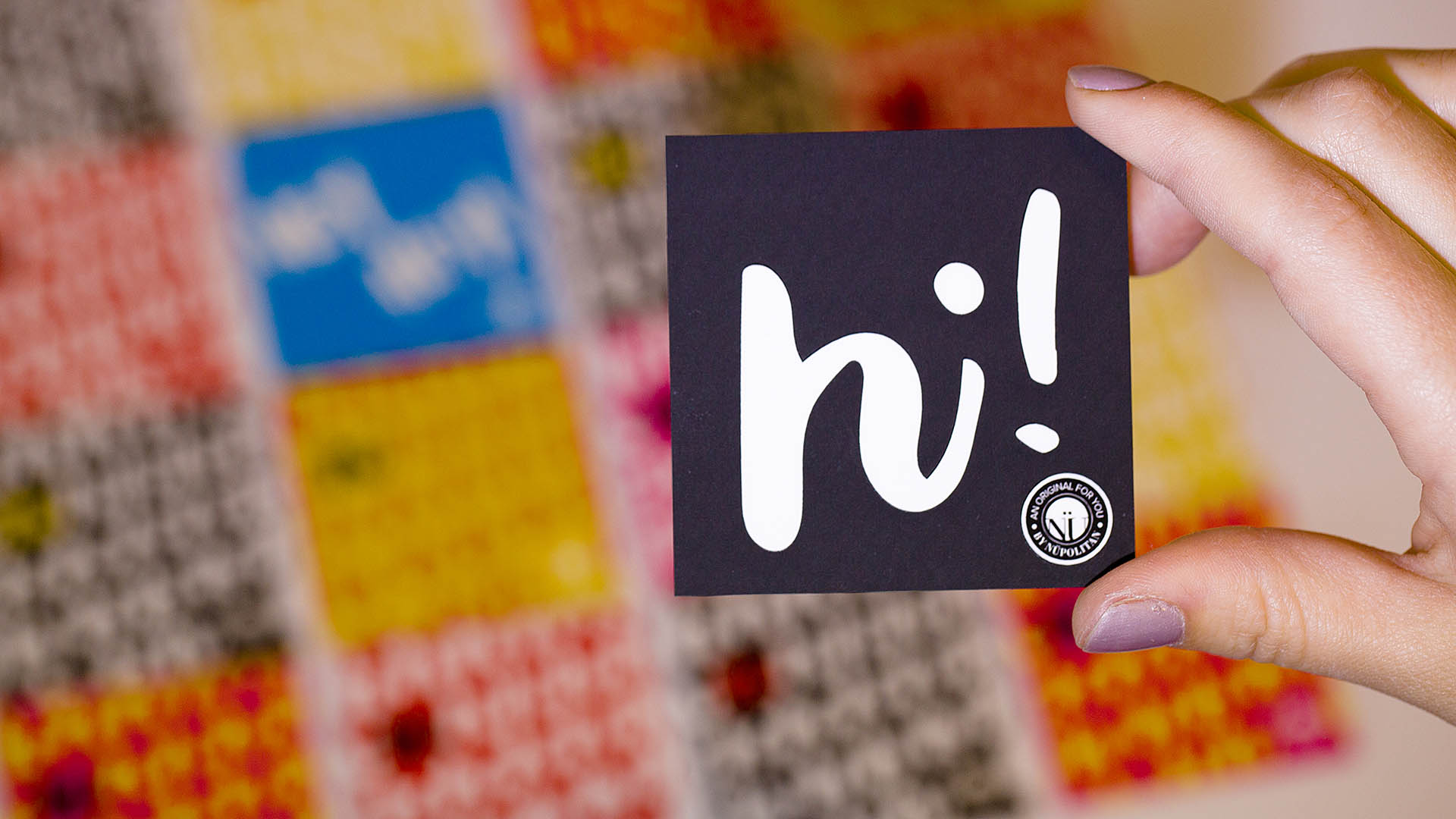
A raised spot gloss emphasizes the message and makes it pop to connect more directly with whomever interacts with it—whether through sight or touch.

Colorful square cards scattered on a piece of black paper
A single, square card displaying options to meet over coffee, ice cream, lunch or dinner
Colorful square cards scattered on a piece of black paper
Red and yellow square cards scattered on a red background
Transitions written in half pink and half lime green atop a pink and white background above a button mockup

Transitions

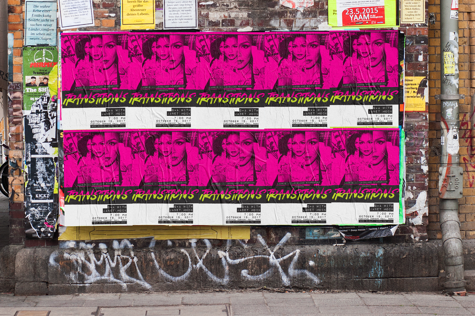
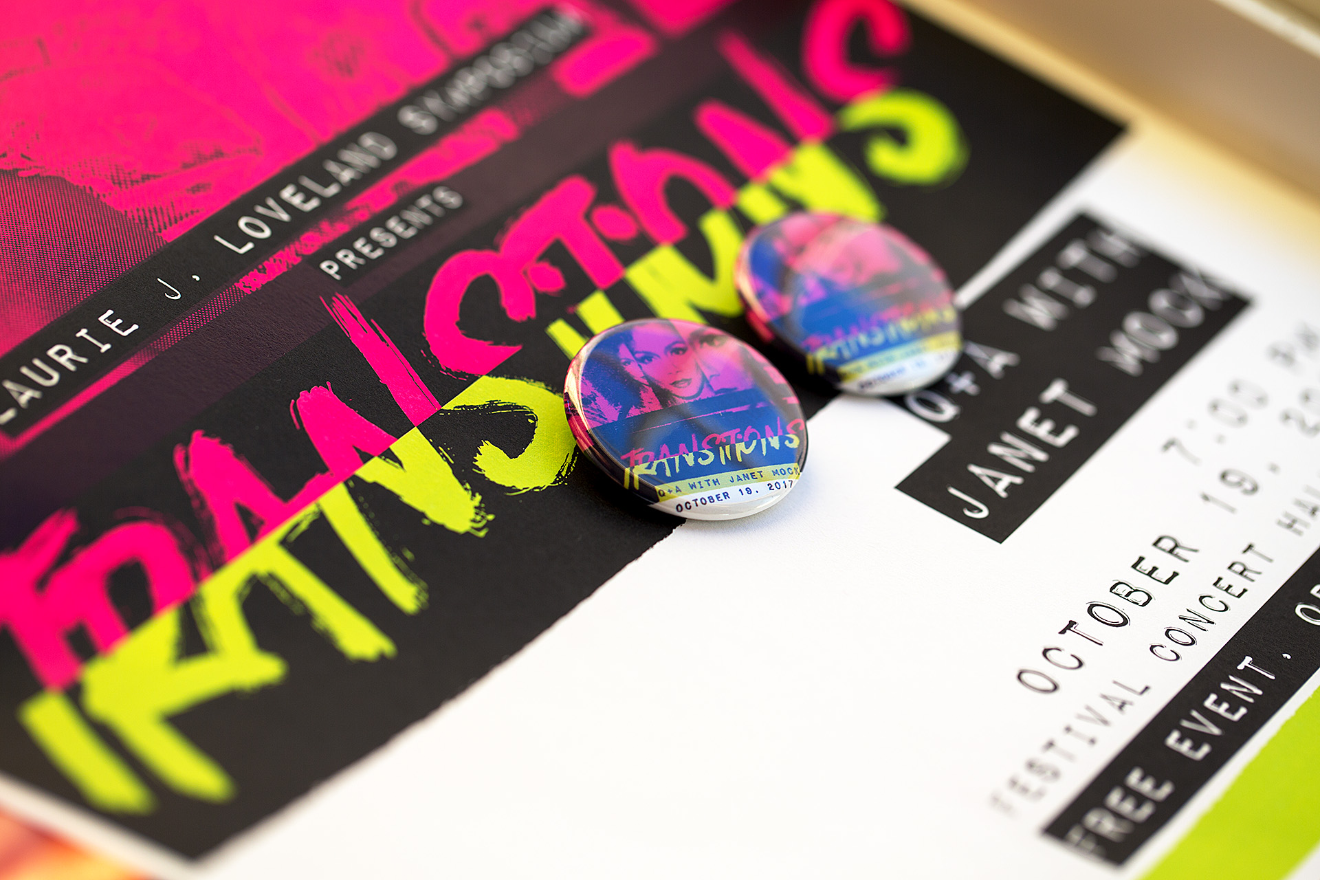
When the North Dakota State University Women and Gender Studies Department booked Janet Mock as their keynote speaker to kick off a regional conference hosted in Fargo, they needed to advertise in a way that would highlight Mock's vibrant and passionate energy. Mock, a writer and transgender rights activist, spoke on the topic of transitions in a time of political turmoil. The event was held as a Q&A with audience participation followed by a book-signing where attendees could meet Mock. The edginess and rawness with which Janet Mock writes, speaks, and advocates were conveyed through our use of bright colors that invoke the passion and grit of the Riot grrrl movement while still feeling relevant to today.

Sketchbook of design concepts next to a white camera and white cards atop a black gridded surface

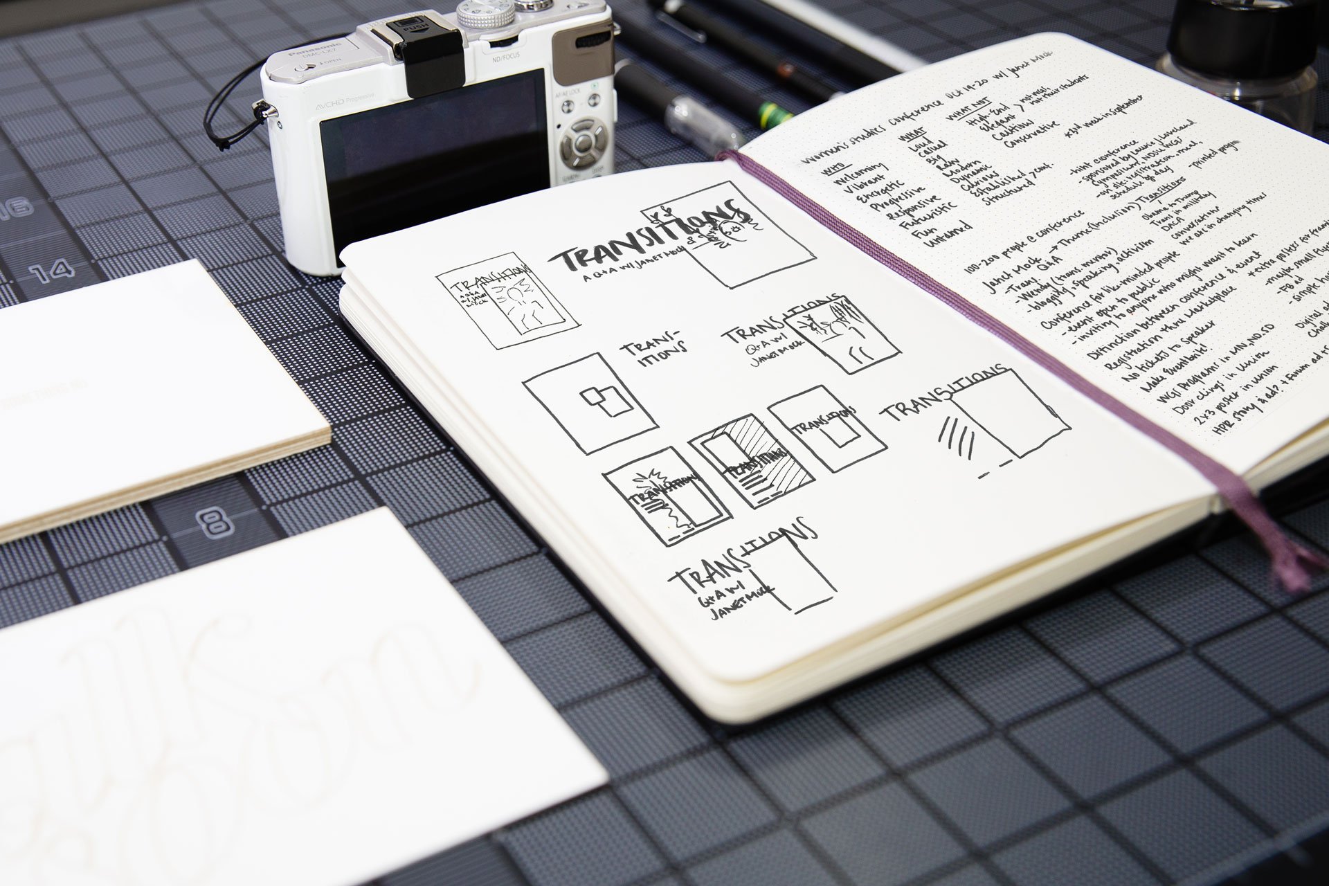
Sketches and notes from meeting with the client

A woman's hand sketching illustrative details on an iPad
A hand holding an iPhone displaying a Facebook event with pink and green cover photo

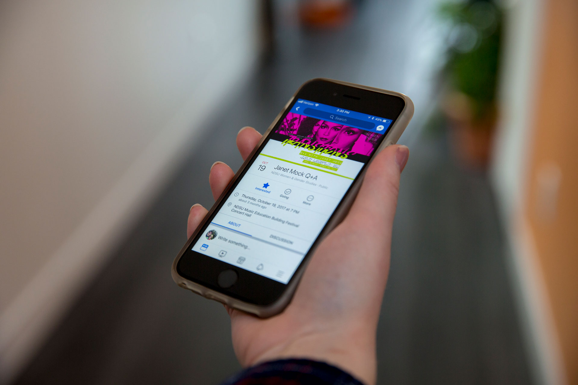
Digital graphics for Facebook event and Eventbrite pages were created

Black, pink, and white transformation poster plastered repeatedly on a city wall above graffiti
Close-up of two pink and black pins atop a pink, lime green, and black poster
A closed, printed brochure next to an open brochure both in pink, black, and white on a lime green and white background

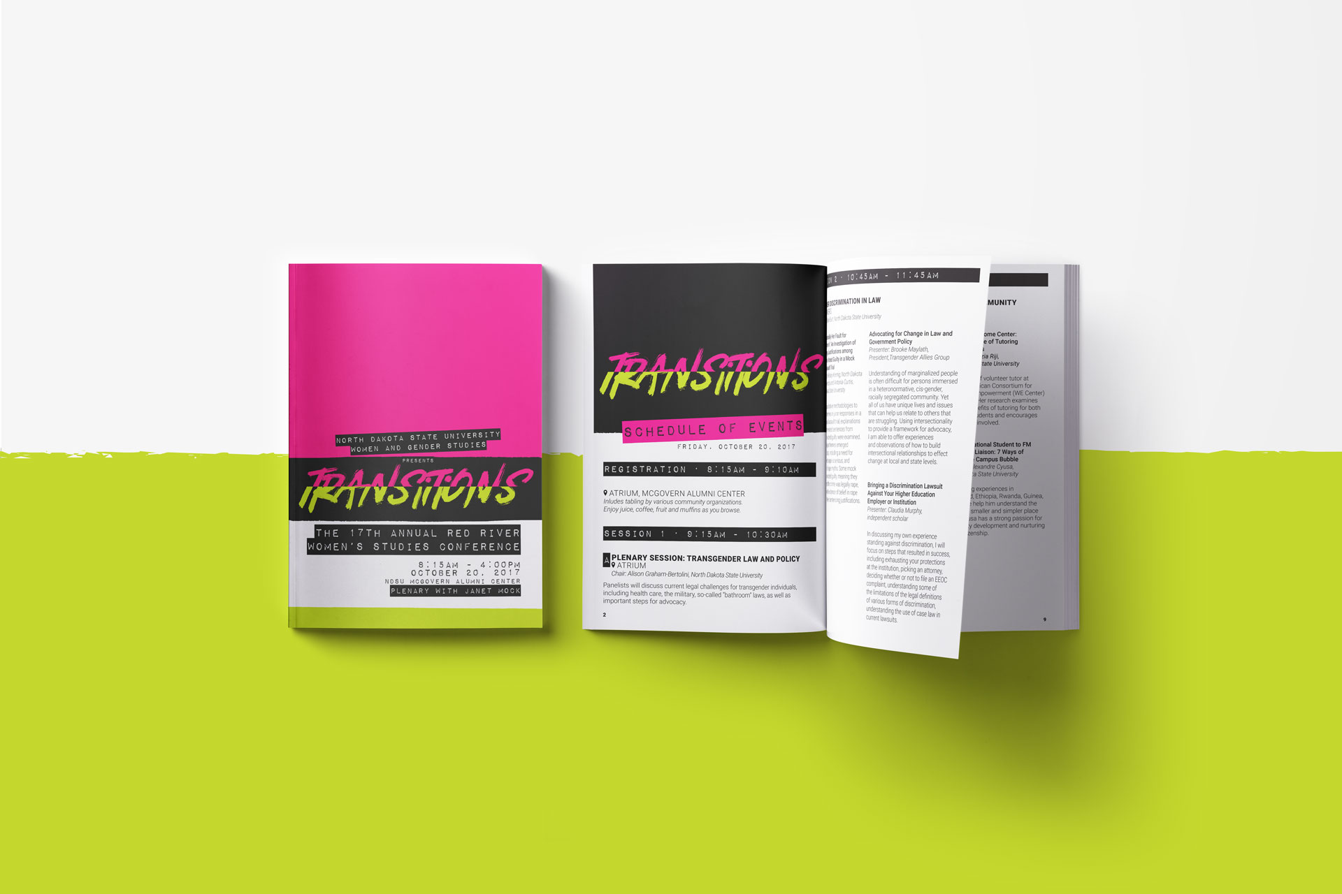
A program was designed to accompany the poster for use at the conference following the event.

Dancer jumping in the air with colored wisps in the background around the words Breaking Boundaries on a black background

Breaking Boundaries

North Dakota Academy of Dance's spring recital, titled Breaking Boundaries, featured performances by students ages 2-18 from each class offered over the course of the season. Provided with a photo from Dreamcatcher Photography, we designed a set of collateral involving 11x17 flyers, tickets for the production, social media graphics, a printed program, a t-shirt design, and a video that was projected as an accompaniment to one of the ballet performances.

Poster of dancer jumping with colored wisps behind her and the words Breaking Boundaries in white on a black poster

Printed poster for community promotion

Closed, printed program next to open program on a light gray background

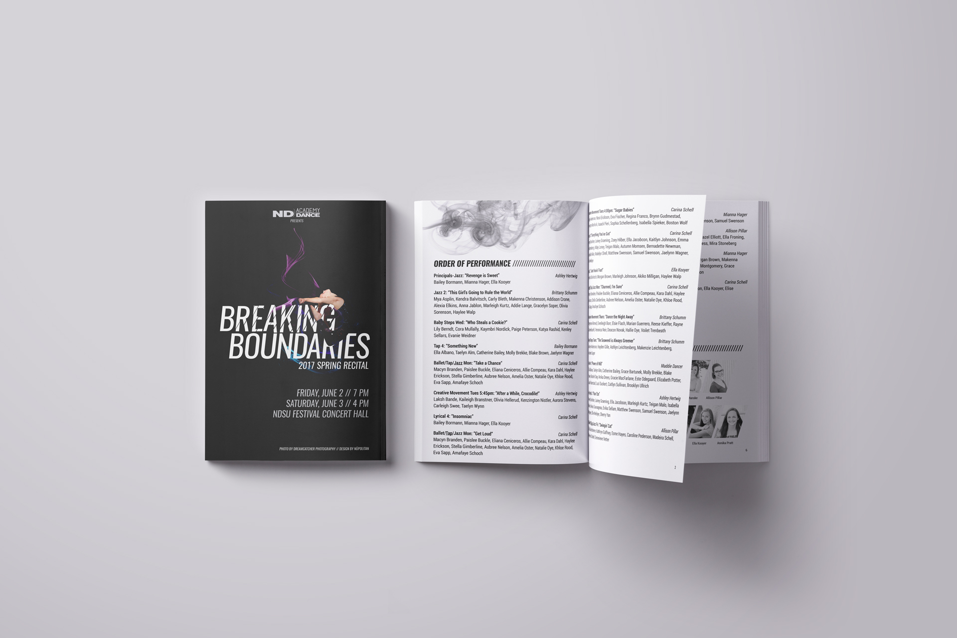
Program booklet design

Grid of black and white tickets for Breaking Boundaries recital

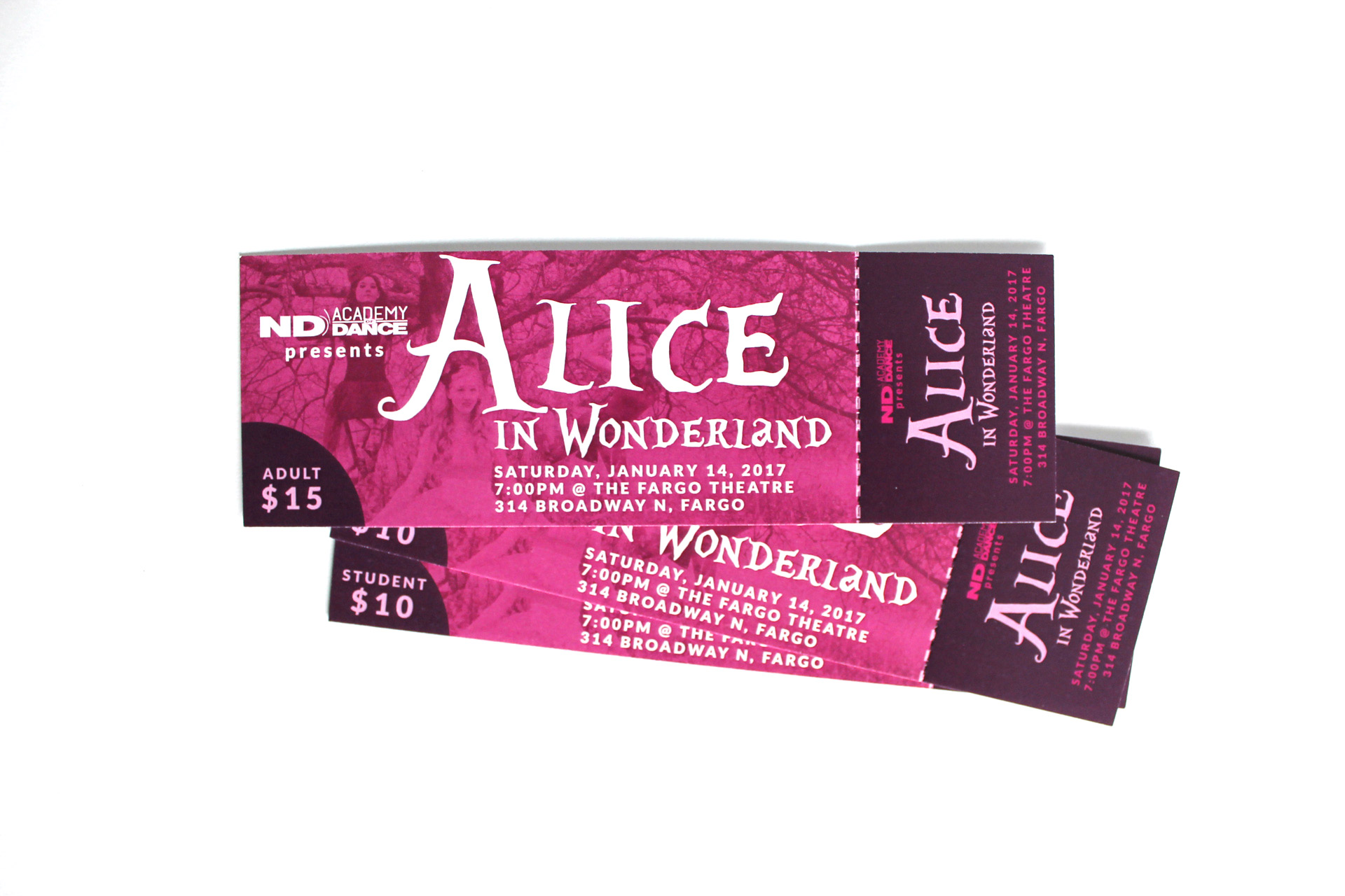
Varying colors designate different tickets for adults vs. students and reserved vs. general admission

Screen capture of Facebook event for Breaking Boundaries recital

Graphic for Facebook event page

Girl standing in front of tall grass wearing a gray baseball tee with blue sleeves with the words Breaking Boundaries on it

Projection videos accompany start to recital and Ballet 5 performance

2017 A Year for Nü Resolutions in black with rotating colored words

2017 Nu Year Calendar

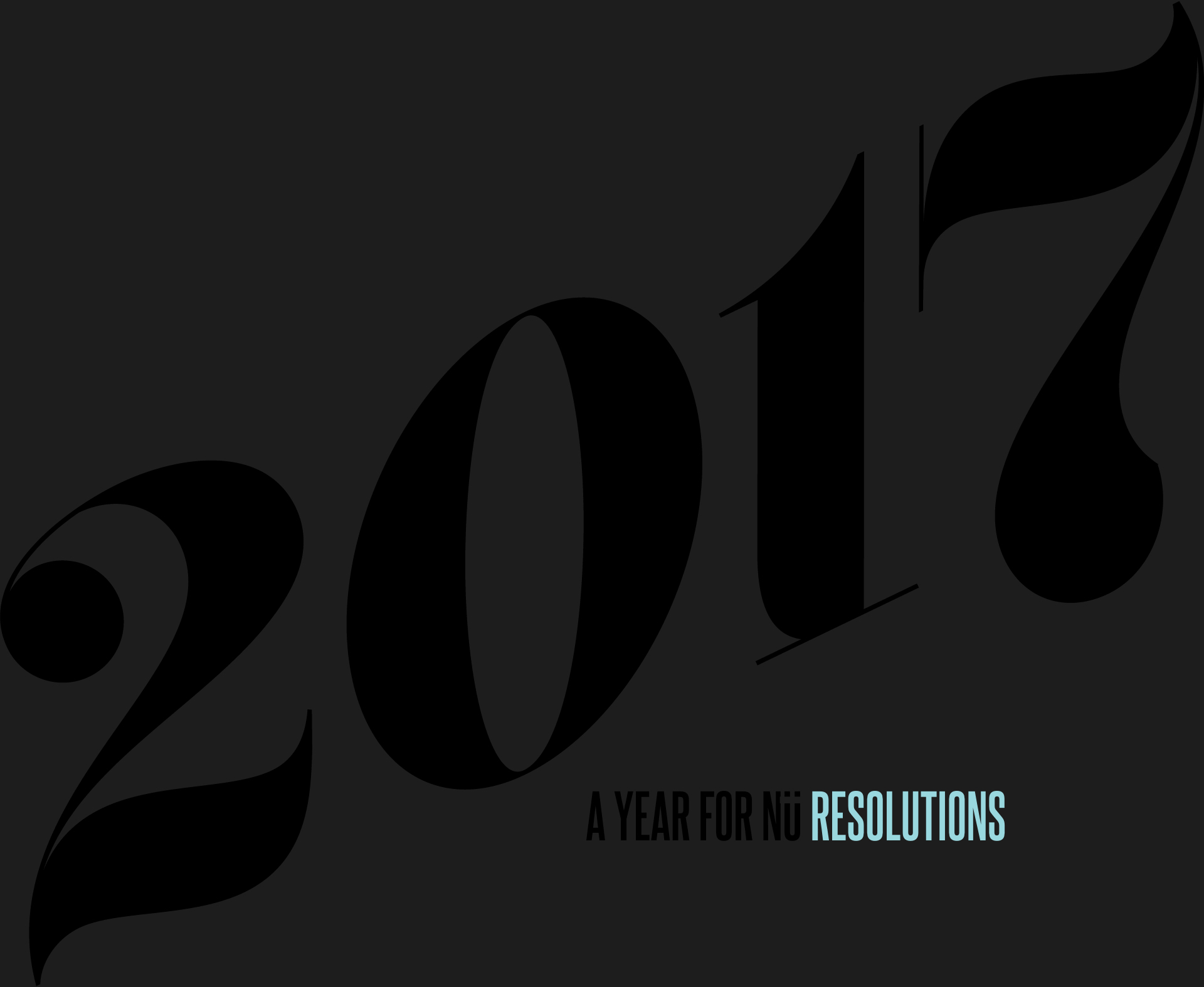
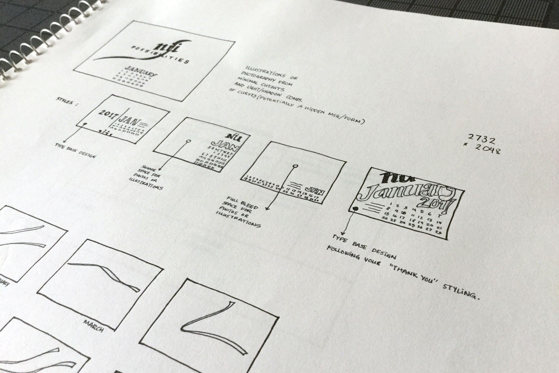
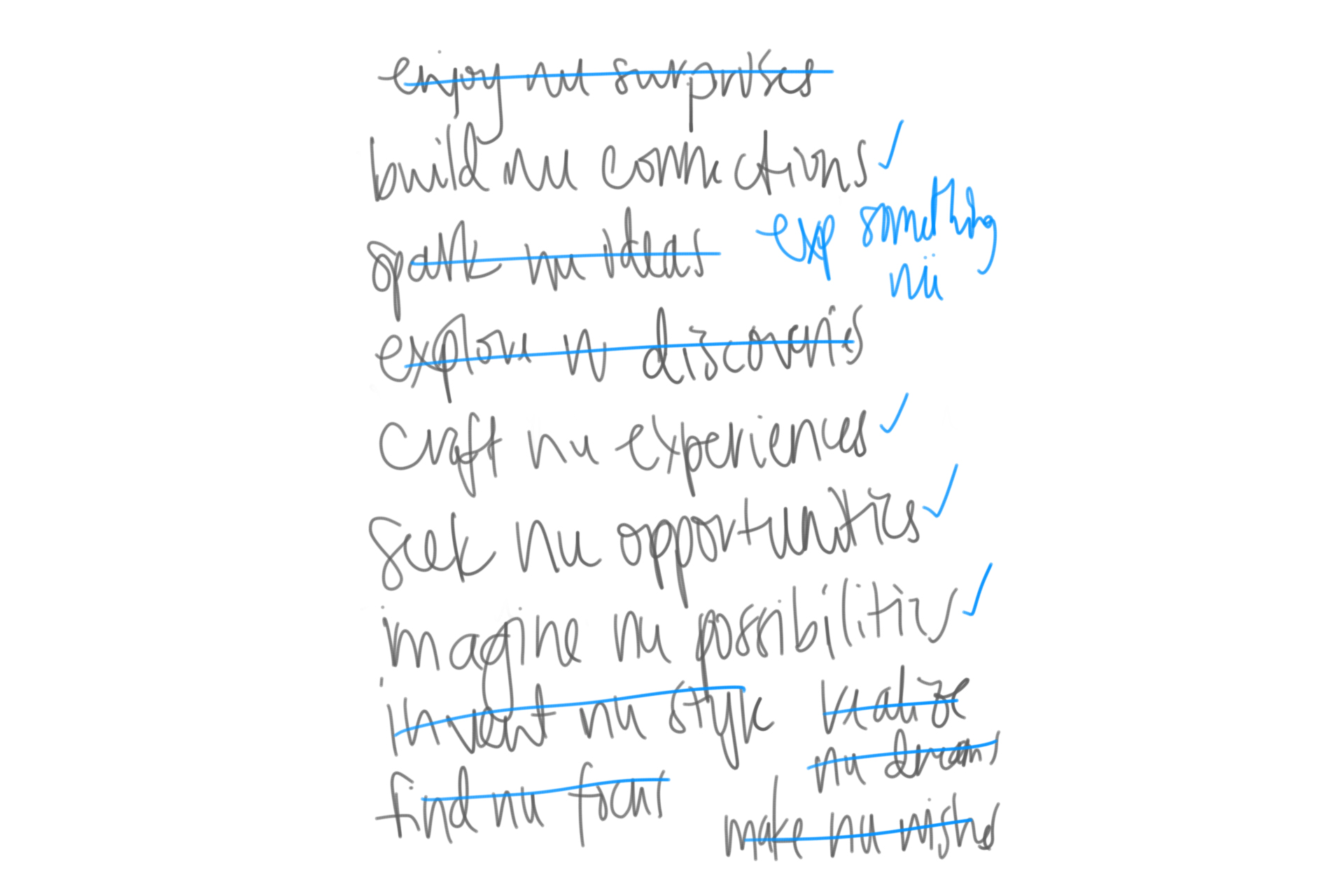
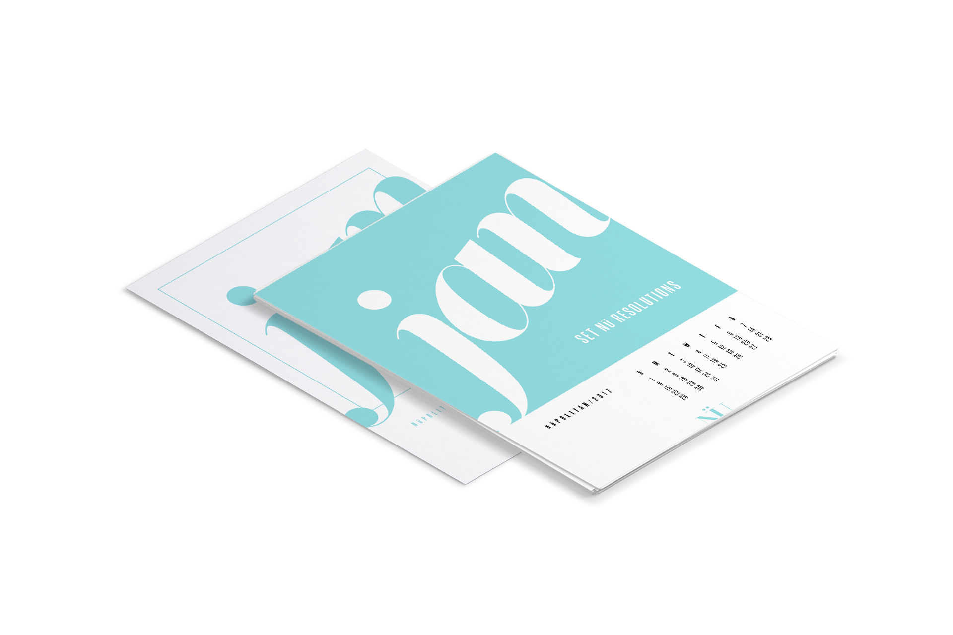
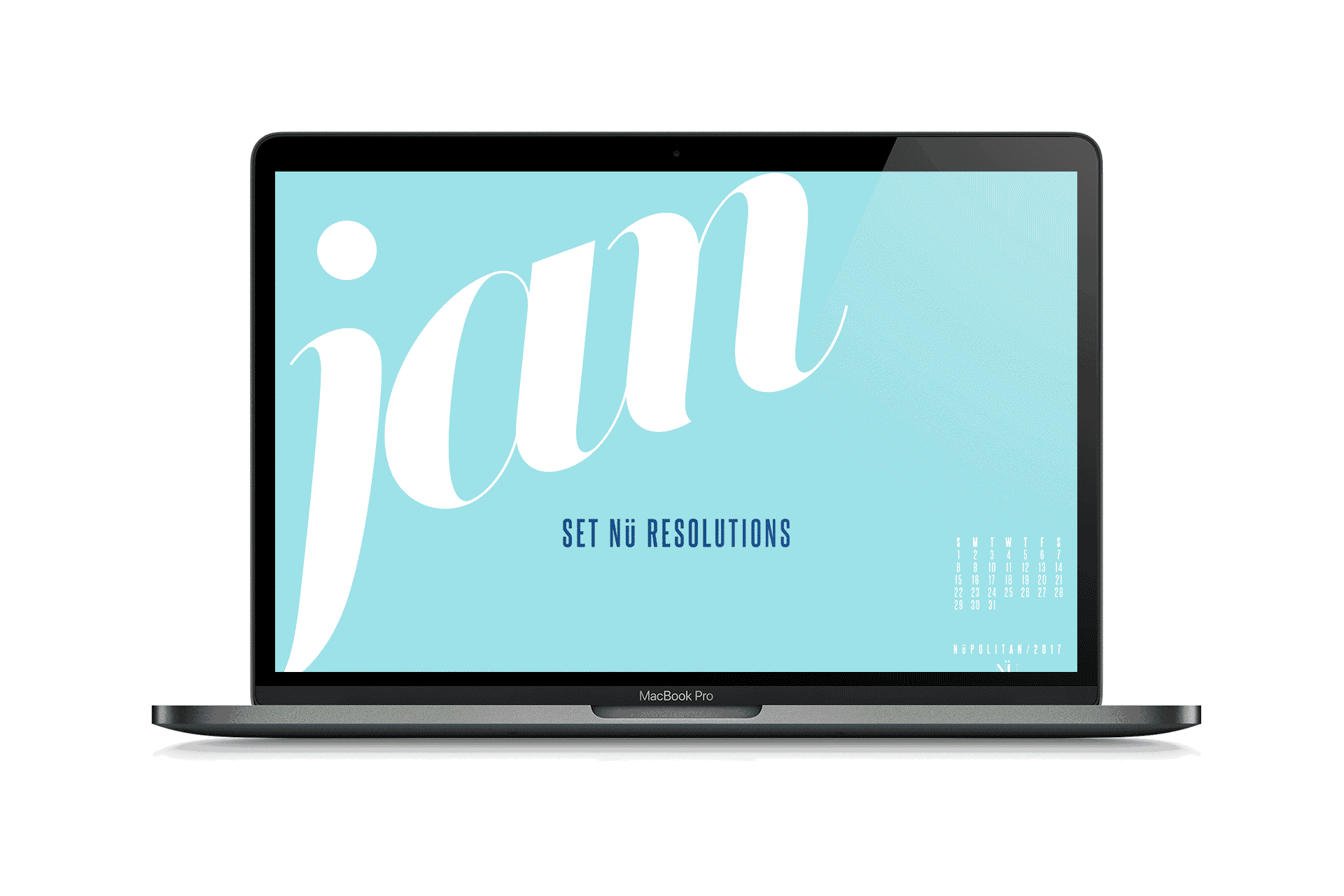
To begin the new 2017 year, we created a calendar full of color to spark curiosity and create energy for our friends, peers, and clients. The calendar was sent via email as a downloadable file for desktop or print along with a greeting of good wishes for an exciting new year full of possibilities.

Sketchbook containing calendar sketch concepts

The careful selection of invigorating and inspiring words that translated in motivating short sentences took us longer than we expected, as distilling ideas often do.

Sketches for calendar concepts
Hand-written text on white page for calendar messaging concepts

Iterating sketches and phrases

Knowing the recipients would likely be printing the calendar on inkjet printers at home, we provided a more eco-friendly and ink-conserving option in addition to the full-color version for print.

The printable calendar files also included illustrated instructions to create a simple, easy-to-fold stand for an alternative way to display the calendar.

Two Jan calendar pages, one all white with blue lettering and one with blue background and white lettering
Grid of 12 months of calendar with white backgrounds and colorful month names

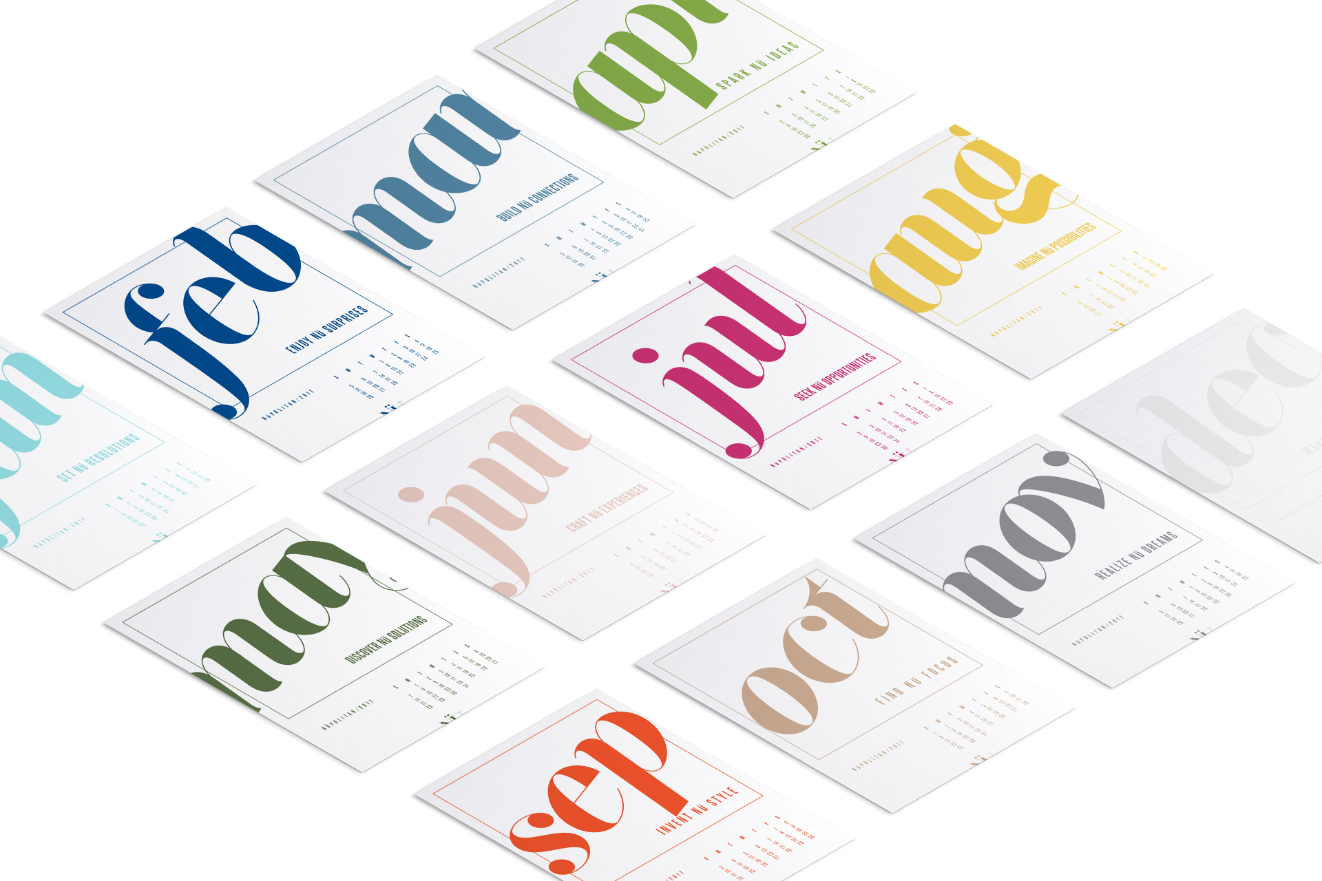
The printable calendar in full color and less-ink formats

Mockup of Letter size printable calendar pages and stand instructions

Calendar and foldable stand instructions formatted for easy at-home printing.

Light blue January calendar page leaning in stand on yellow bookcase in front of magazines

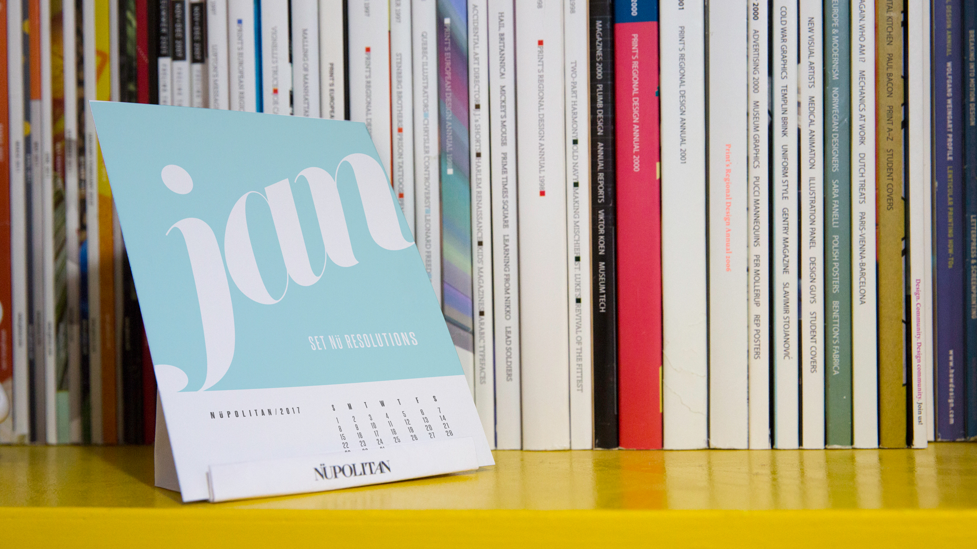
Printed calendar with foldable stand
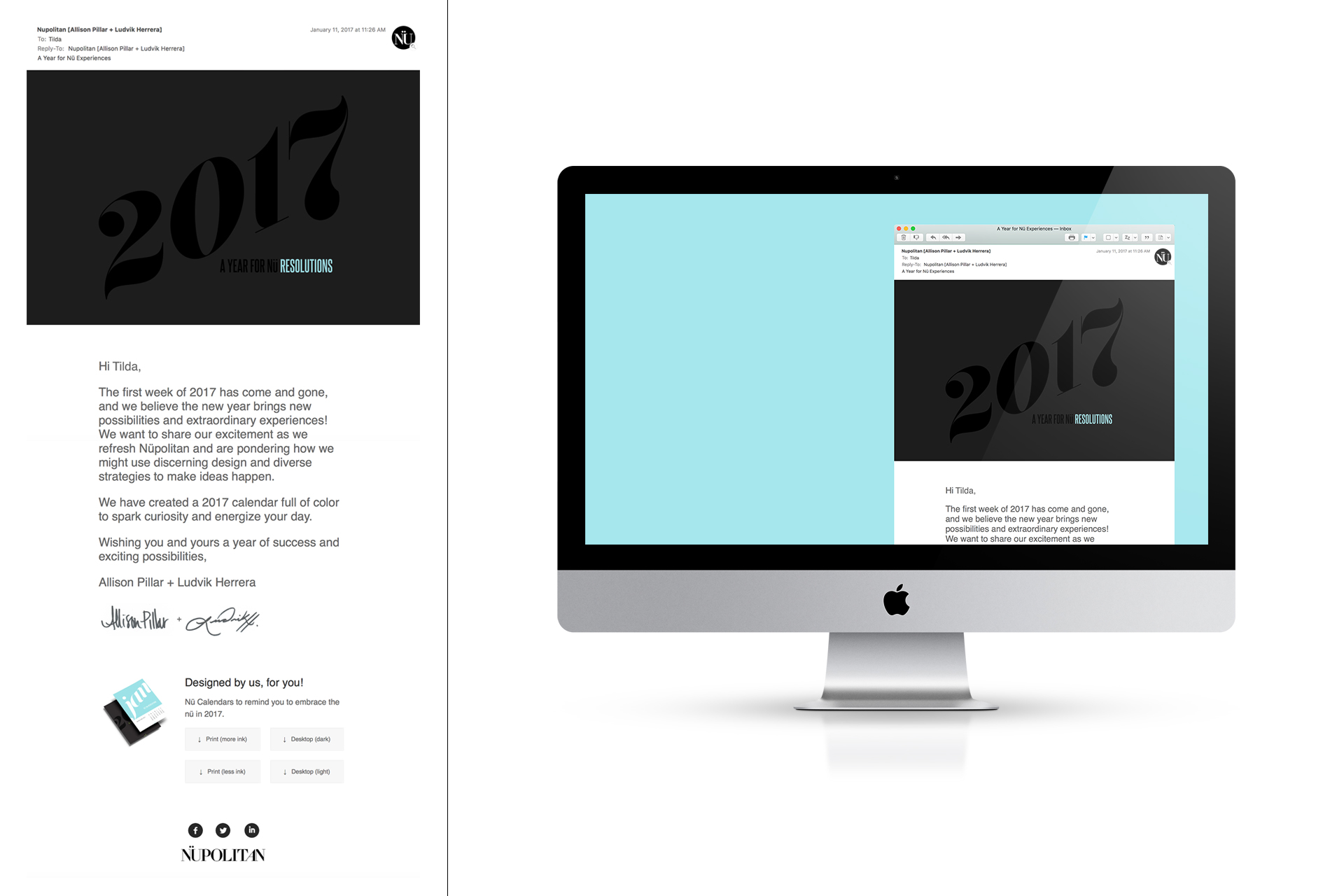
Screen capture of email next to iMac mockup of email with black header image and text

Layout of the email

January desktop background in light blue on macbook

The desktop version was available in light and dark color themes. (light set shown)

Three people's hands playing cards on a wood table

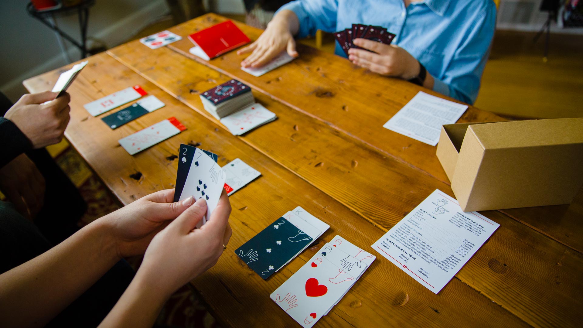
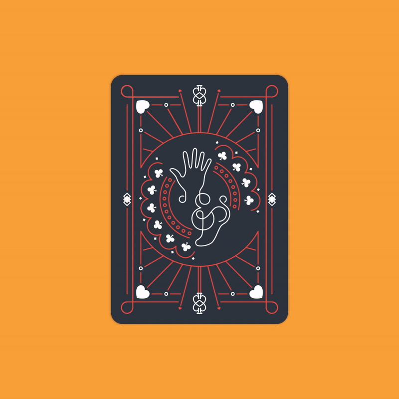
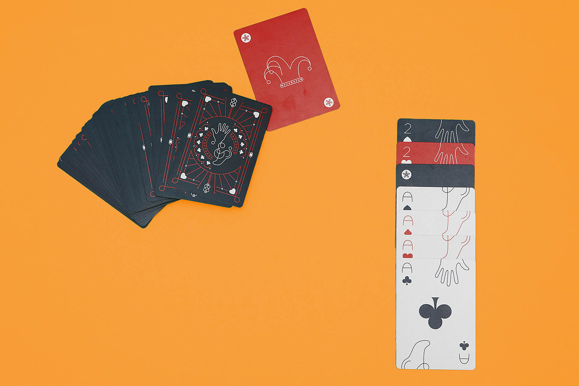
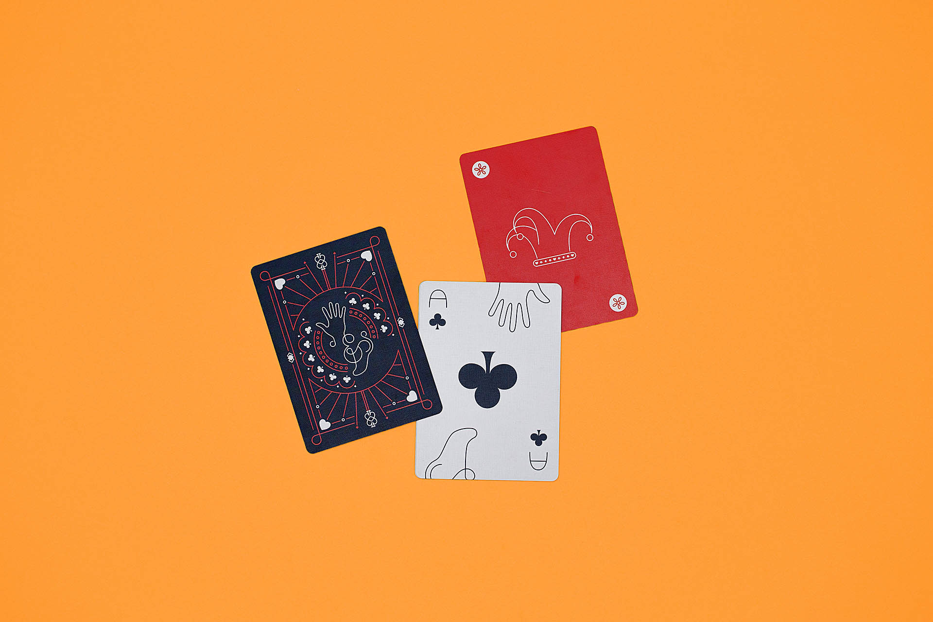
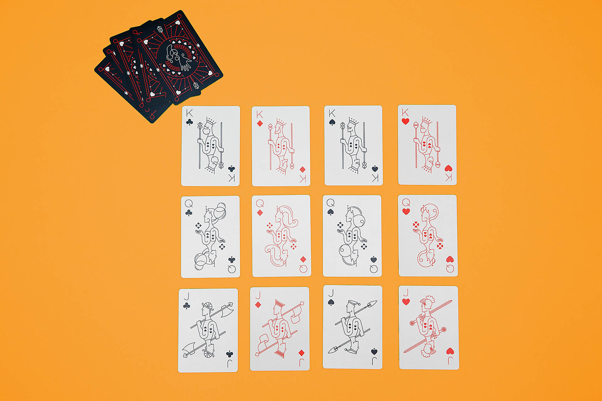
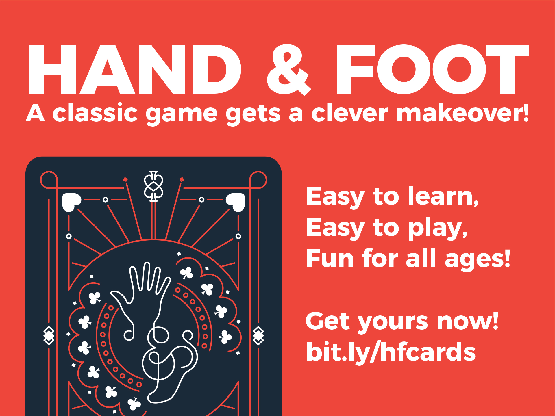
Hand and Foot, a version of Canasta, is a card game in which players must play through two piles of 11 cards (their hand and foot) by making ends to get the highest number of points over the course of three rounds. While Canasta is a game Allison enjoyed growing up, she learned to play Hand & Foot over the past year and has enjoyed playing it with family and friends since. Although many people play the game with decks of standard Bicycle playing cards, Allison began creating designs for a custom set of cards for the game.

Yellow tracing paper with sketches of hands and feet on them
Sketchbook featuring logo concept sketches
Sketches of hand and foot card back layouts

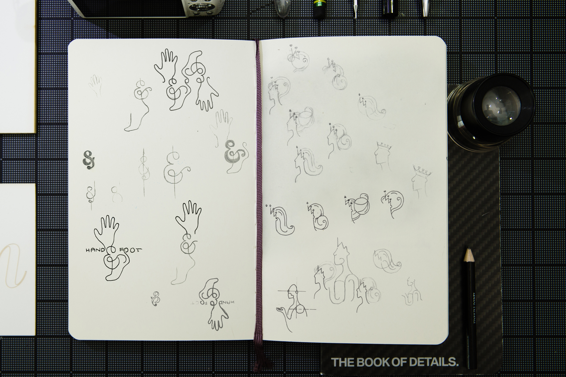
Sketching components for the card fronts and backs

Woman holding cards over black table with a box, stickers, tape dispenser, and paper on it
Box of cards, notepad, stickers, and game rules on black table

Prototyping the game sets

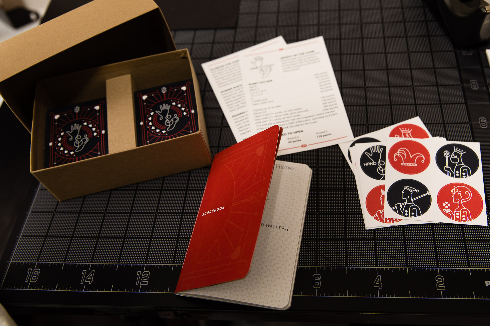
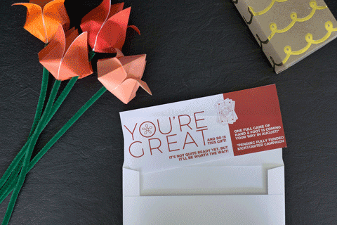
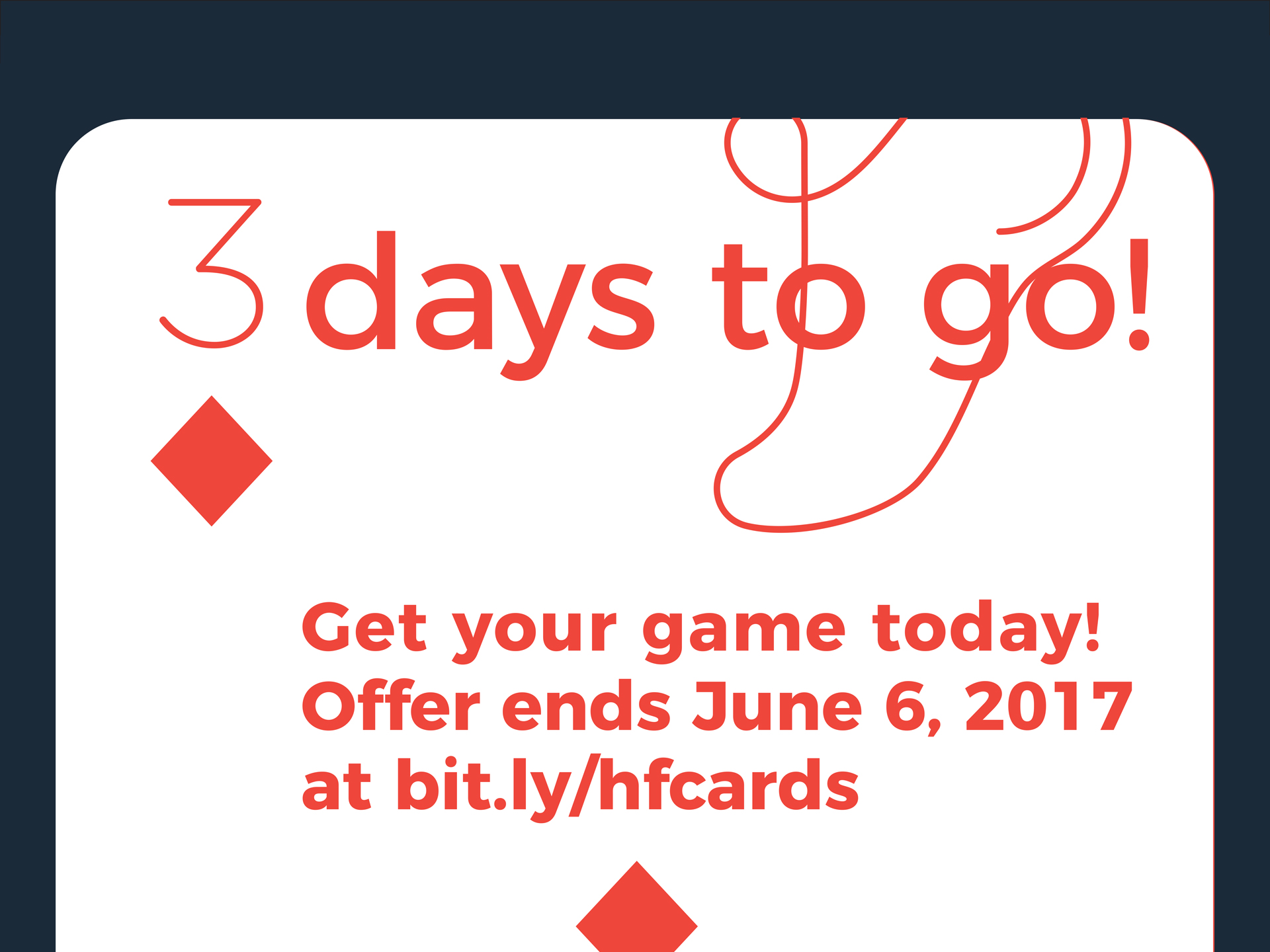
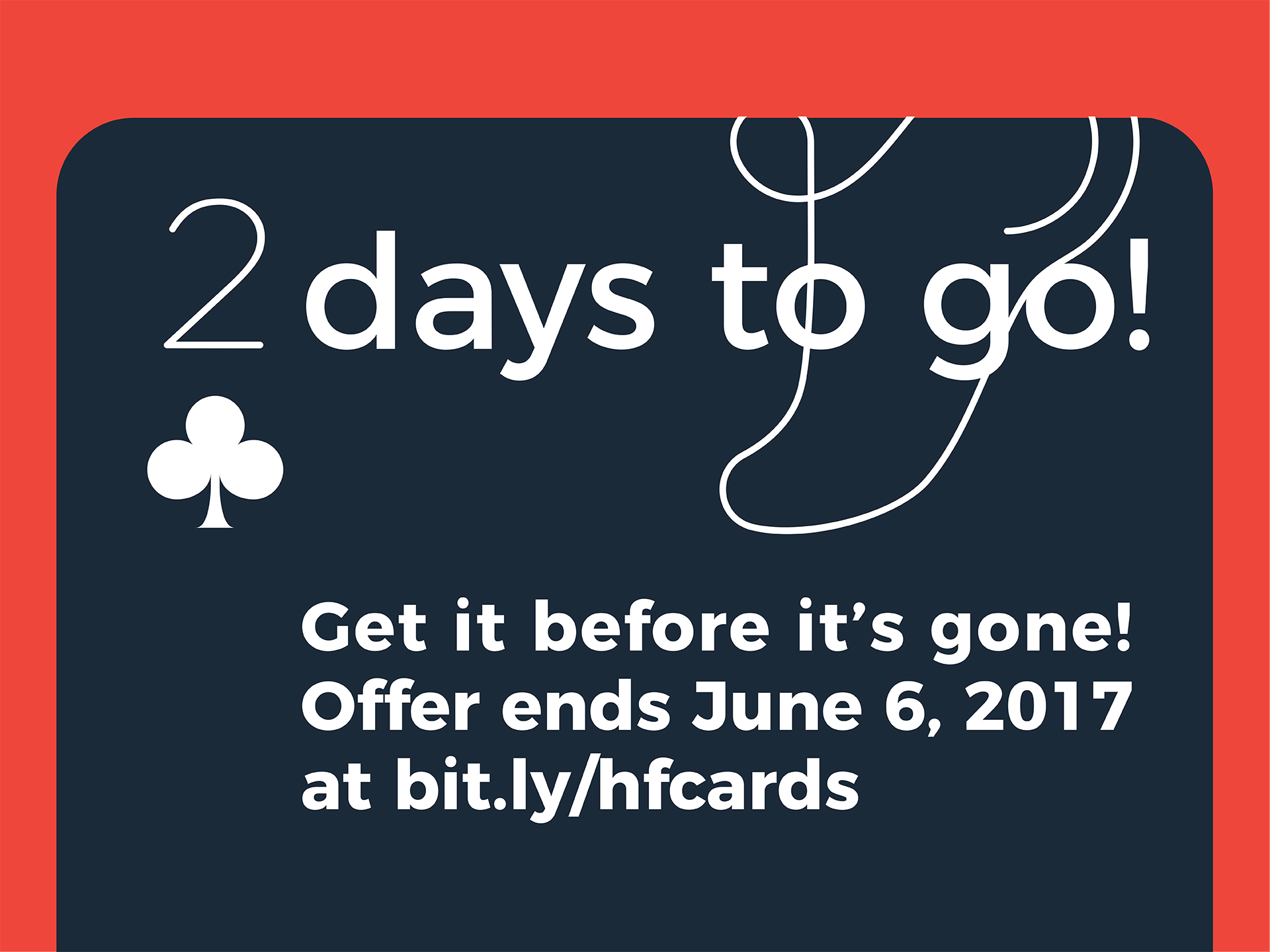
After designing the custom card fronts and backs, Nüpolitan decided to build out the cards as part of a game set and launch a Kickstarter campaign to produce the game and get it into the hands of people who love to play. The game set included a custom notepad, rigid game box, and stickers as well as instructions for game play and a mini, erasable pencil.

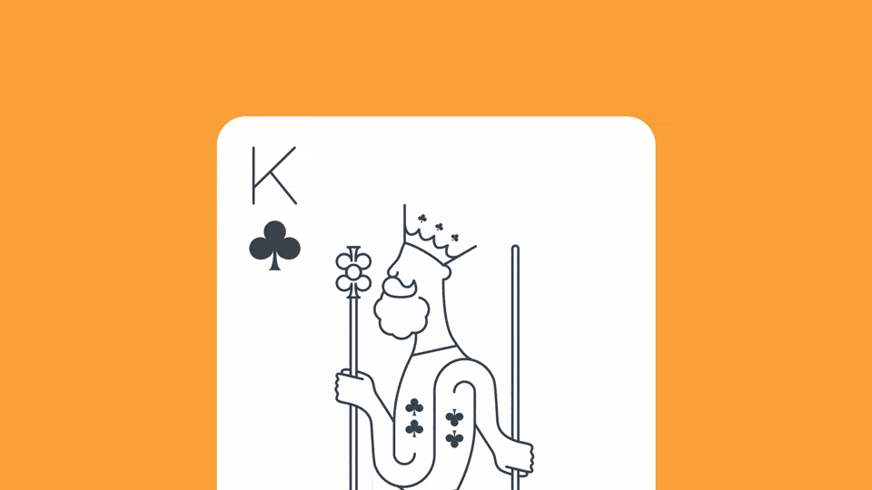
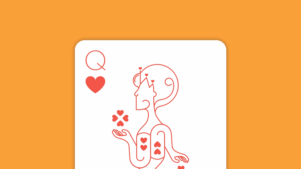
The full game included 216 custom-designed cards printed on high-quality 310gsm casino paper card stock with a linen finish, making them durable and easy to handle.

Animation of card flipping over from back to front

A teaser of the cards made for Instagram

Box of cards, round black and red stickers, red notepad, game rules, and mini black pencil on orange background

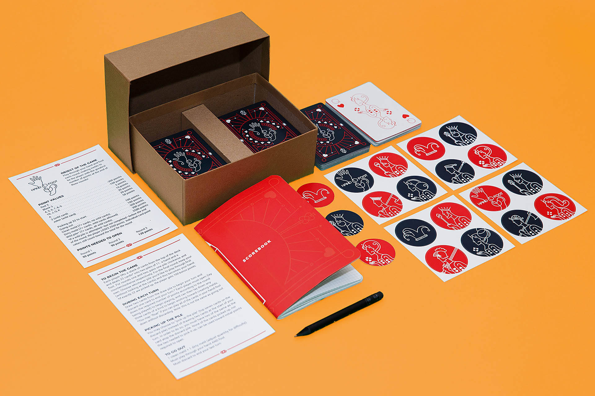
Jokers and 2s, which act as wild cards, are printed full color to make them stand out amongst the crowd. Kings, Queens, and Jacks were built with elements of their respective suits, creating unique and playful profiles.

Dark gray backs of cards and a stack of aces face-up on an orange background
A dark gray card, ace of clubs face-up, and red joker face-up on an orange background
Kings, queens, and jacks laying face-up in a grid on an orange background
Animation of club becoming the King's beard on a close-up of the king of clubs card
Animation of a heart becoming the queen's chin on a close-up of the king of hearts card

To promote the game and campaign, we created videos further explaining the points system and rules for gameplay as well as a series of ads for social media.

Animation of paper flower opening up and becoming gift certificate
Animation of gift certificate scooting into an envelope and the envelope closing with a heart-shaped sticker

Ads promoting the game as a gift idea for Mothers' Day.

Gray back of card with white text on red background in ad for social media
Red playing card reading 2 weeks left
Red playing card reading one week remaining
White playing card reading 3 days to go!
Gray playing card reading 2 days to go
Red playing card reading one day left to buy
White playing card reading Last Day!

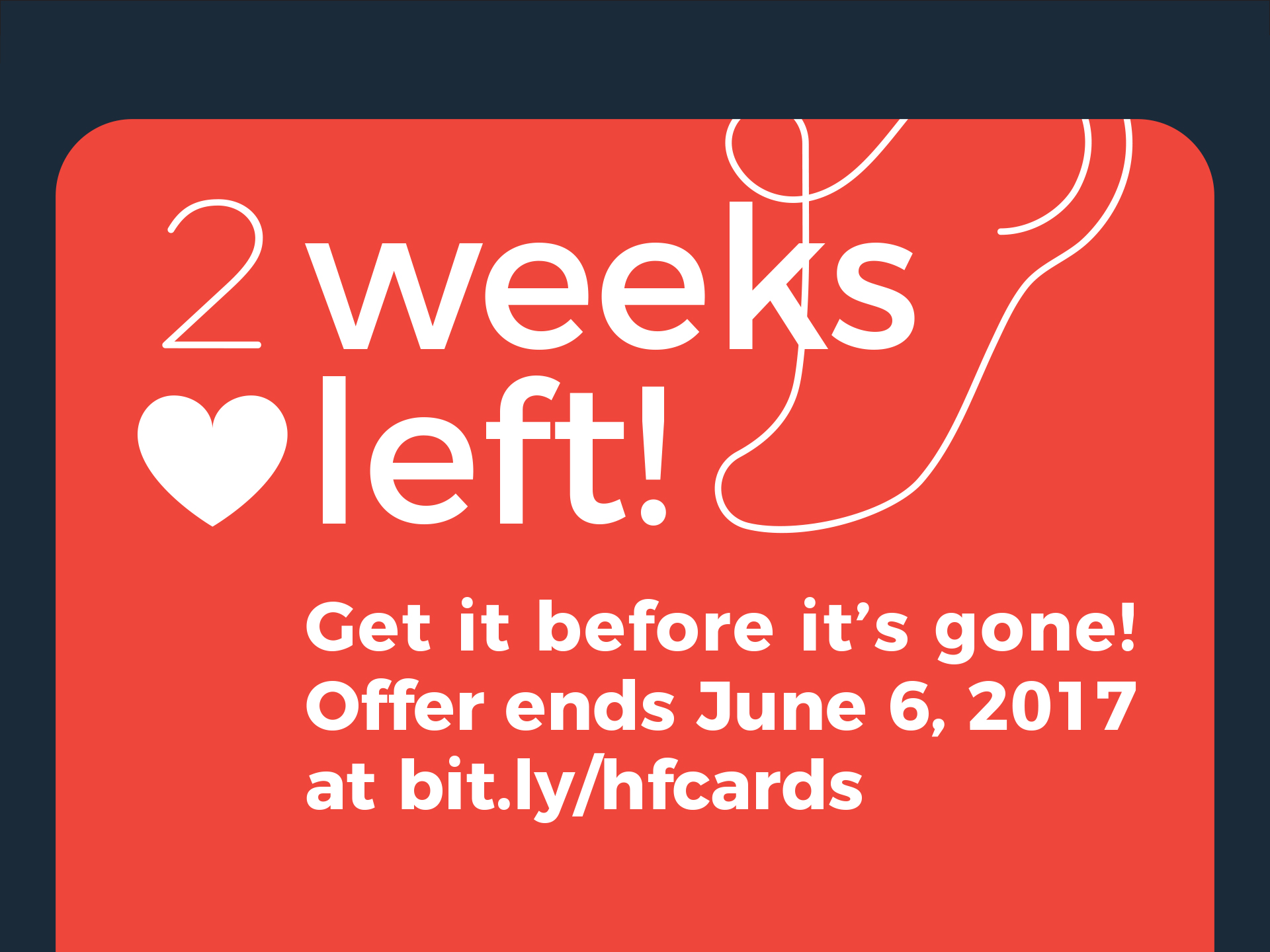
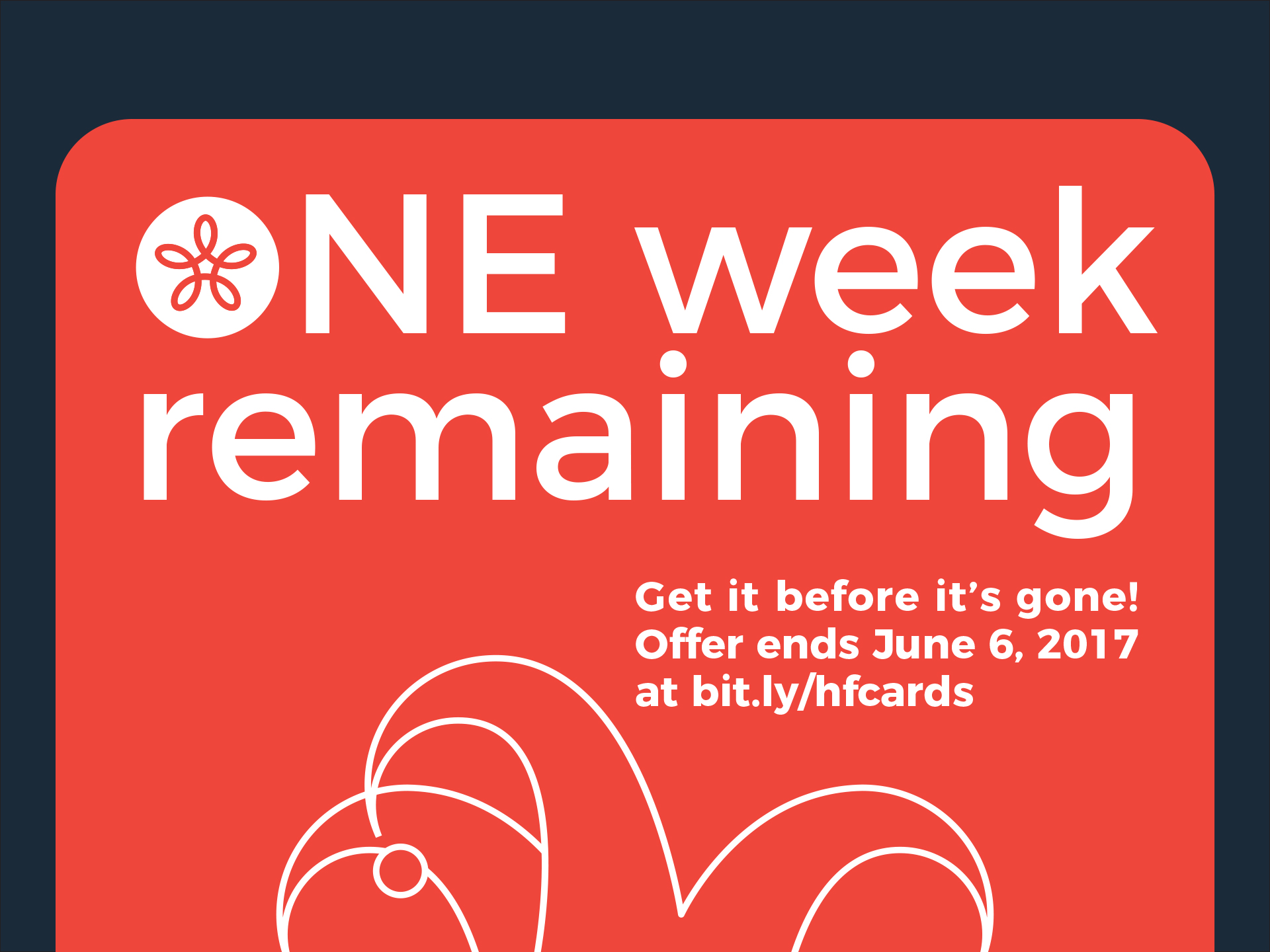
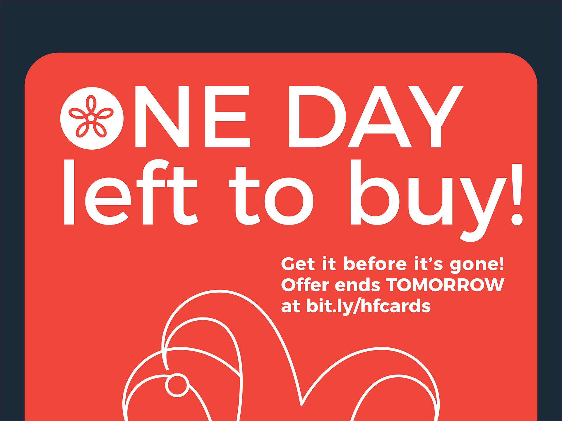
A countdown to the end of the campaign.

Although the campaign’s funding was unsuccessful, the project offered a lot of insight into the knowledge needed to accurately price and manufacture a high-quality game and offered a fun, creative outlet!

Two women and one man playing cards on a wood table with a lit tree in the background

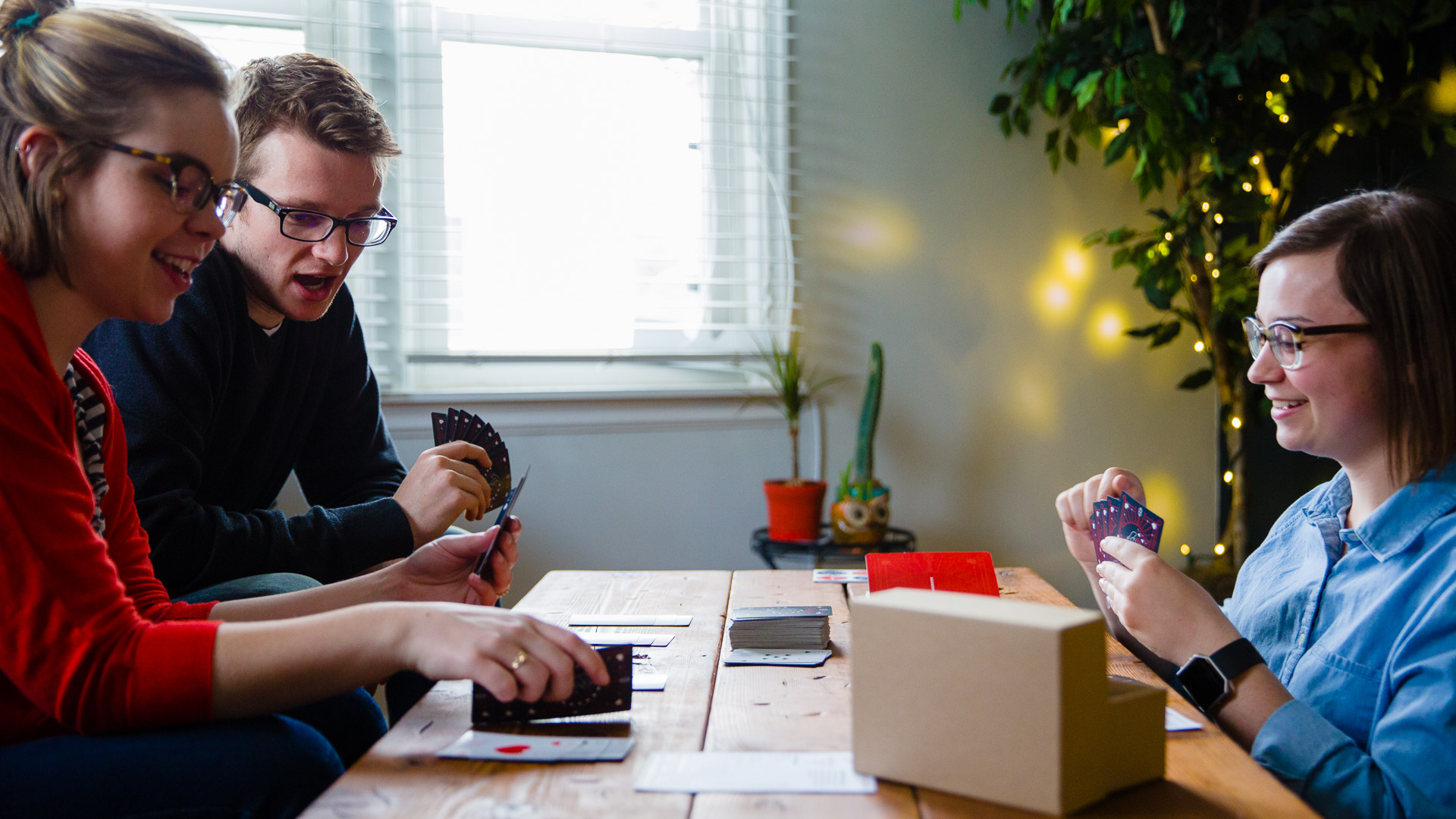
Enjoying a fun game of Hand & Foot with friends.

Alice in Wonderland program cover laying on top of open program on white surface

Alice in Wonderland

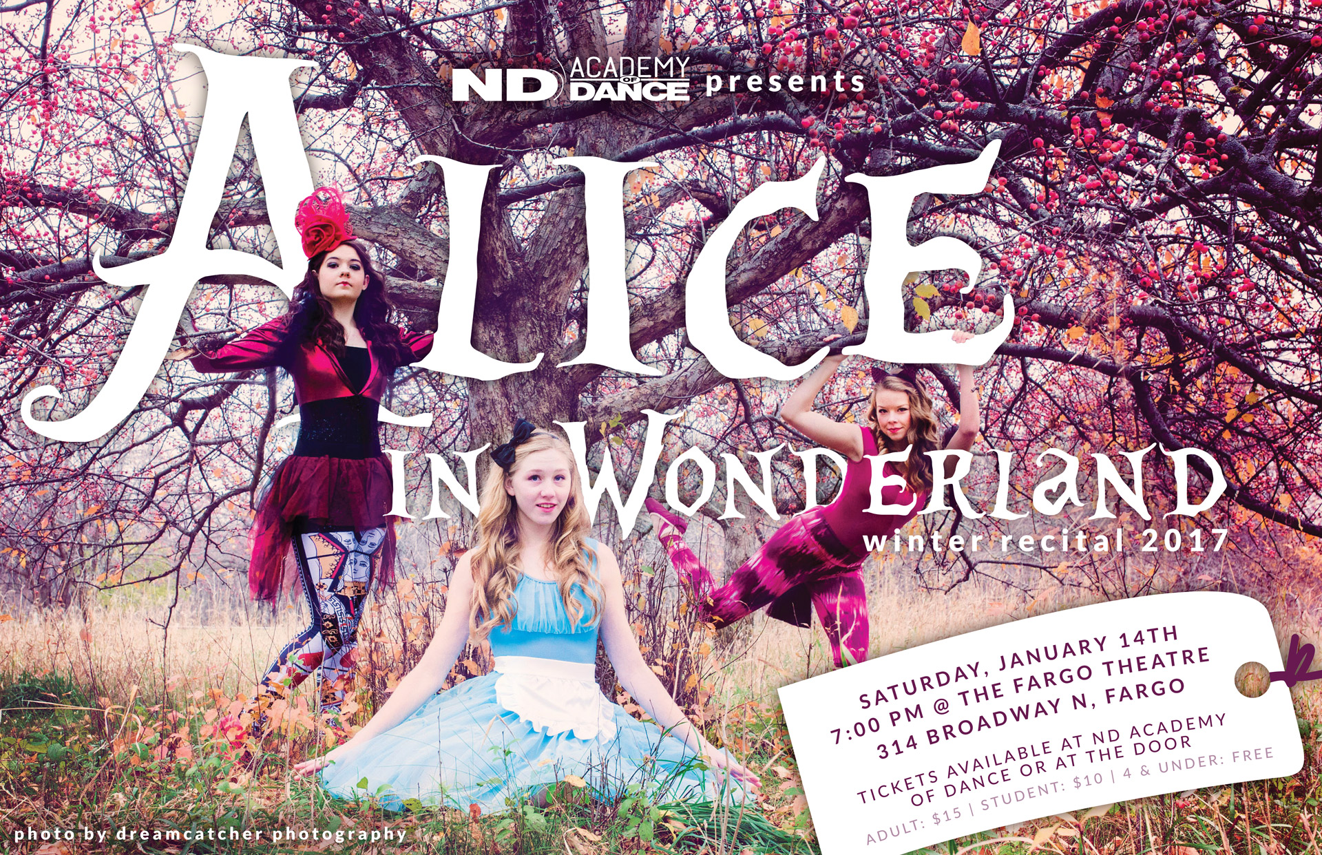
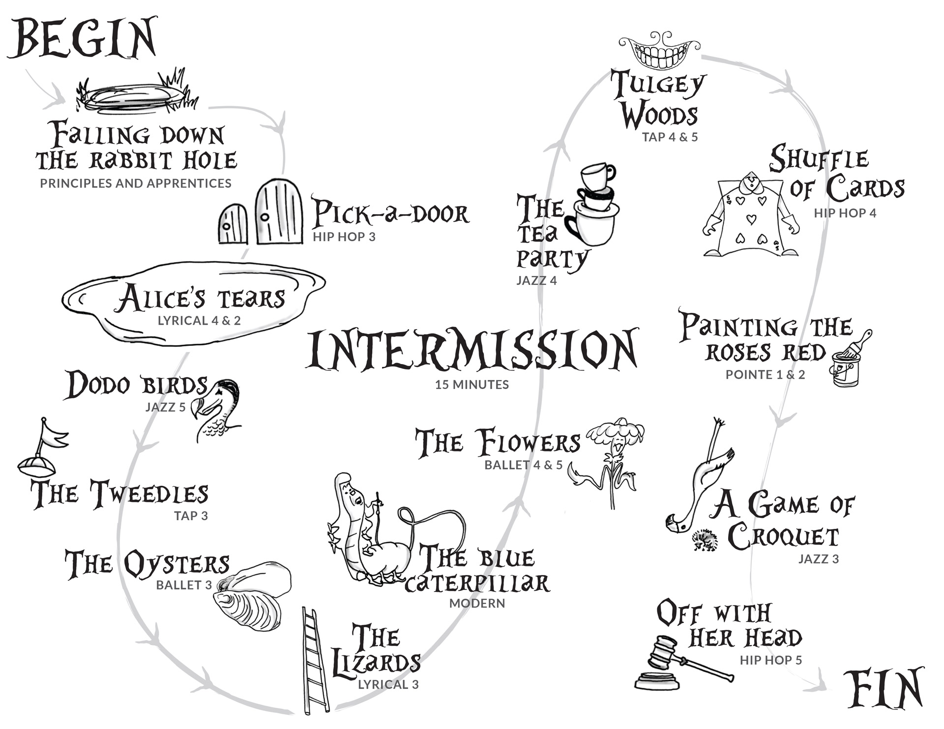
The North Dakota Academy of Dance's winter recital was an all-genres production of Alice in Wonderland. Provided with a photo taken by Dreamcatcher Photography, we designed 11x17 flyers, tickets for the production, social media graphics, and a printed program.

Alice in Wonderland poster with large white lettering and three dancers dressed as Alice, Queen of Hearts, and Cheshire Cat

Printed poster for advertisement around the FM Community

Stack of pink and purple tickets to Alice in Wonderland on a white backdrop
Screen capture of Alice in Wonderland Facebook event page

The owner of the studio and choreographers for the production wanted a non-traditional approach to the program, taking the audience on a journey following Alice through Wonderland rather than merely listing each piece. We chose to take a map approach and hand-sketched elements from the 1951 film to graphically represent each piece in the production. The cast list was printed as an insert so as not to detract from the flow of the “map”.

Tracing paper with sketches of animated Alice in Wonderland elements on a wood table next to a pen and pencil
Close up of illustrations on tracing paper sitting on a wooden table
Close-up of hand drawing Mad Hatter illustration on tracing paper atop a wooden table

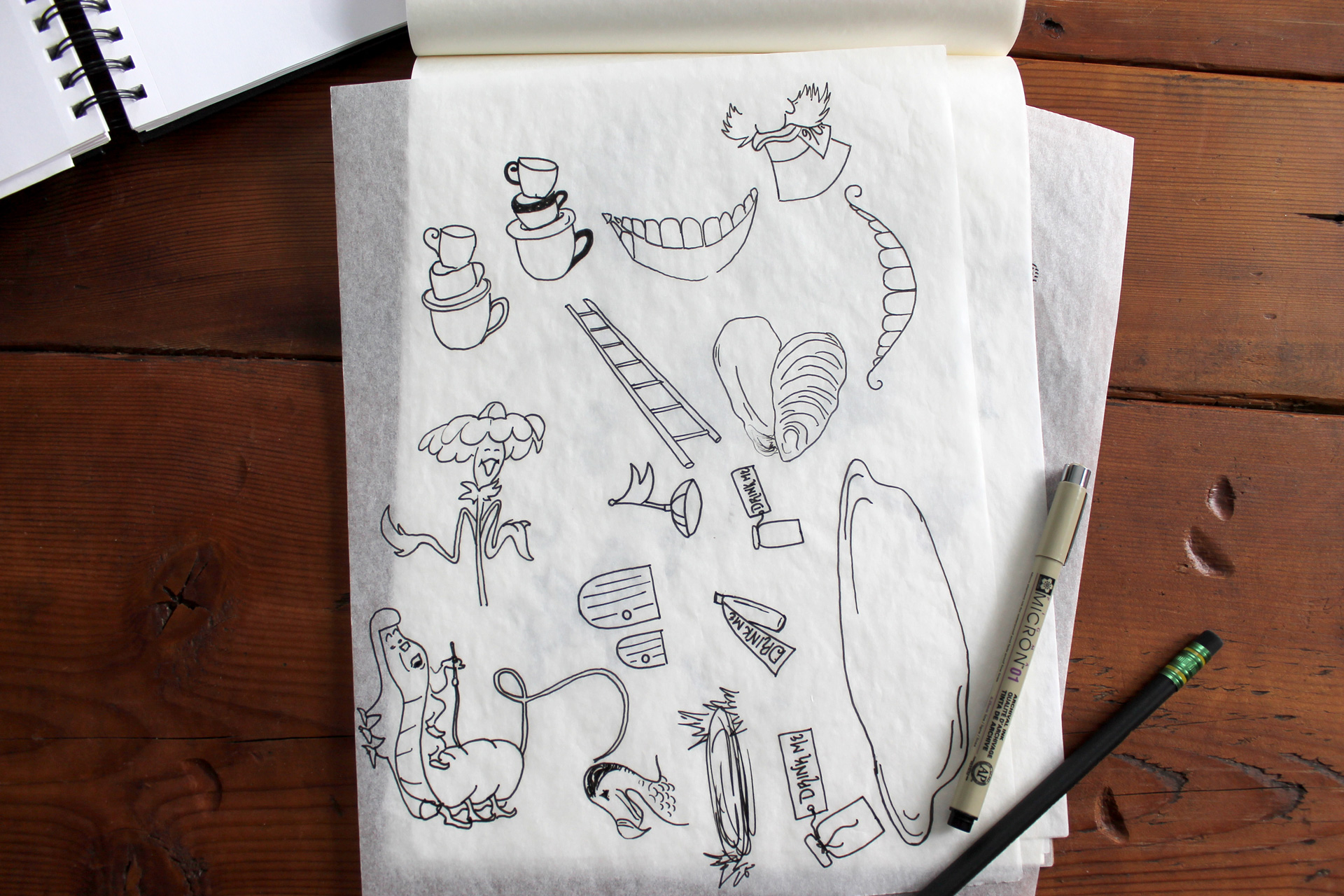
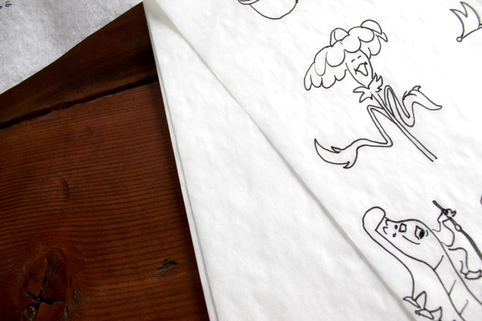
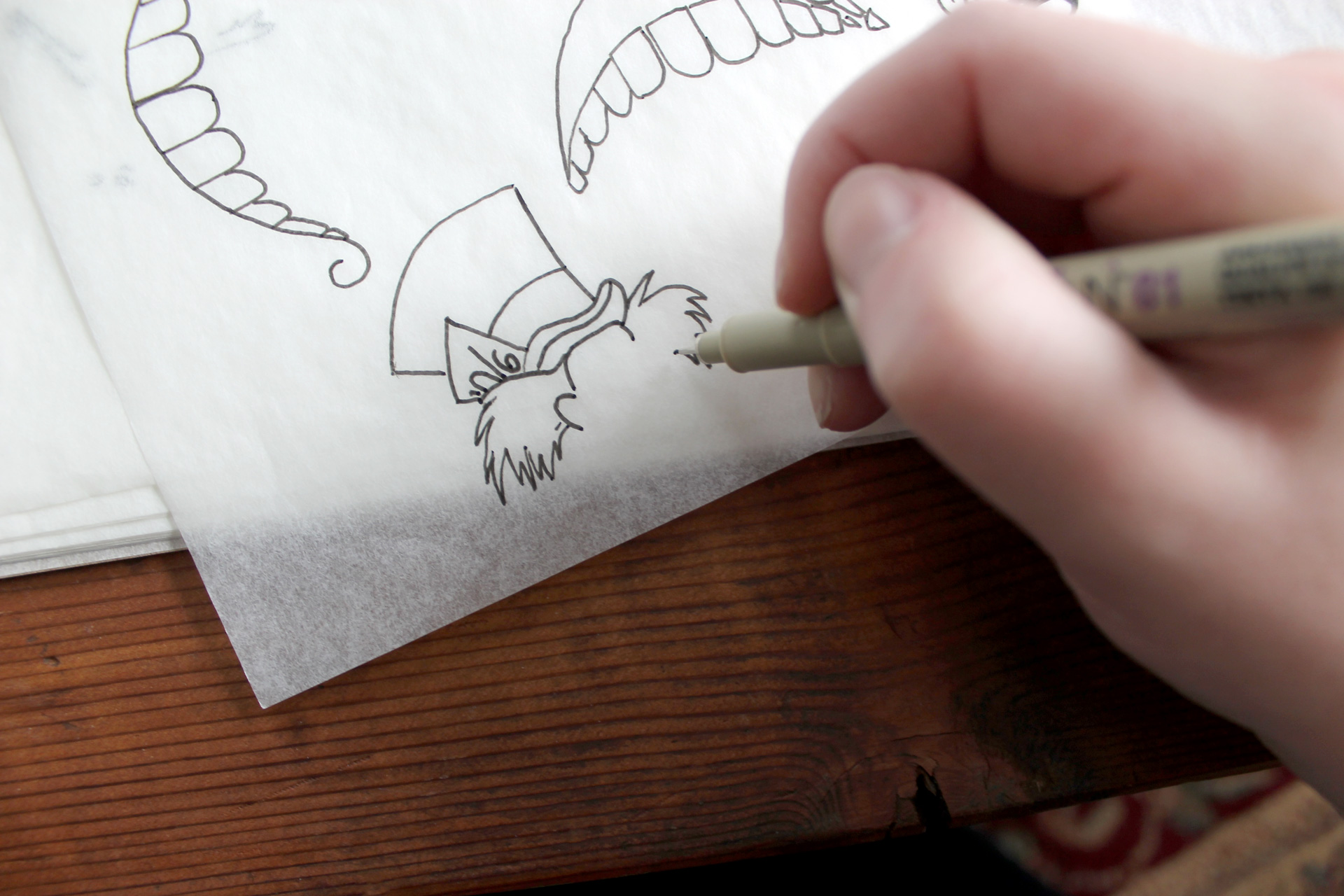
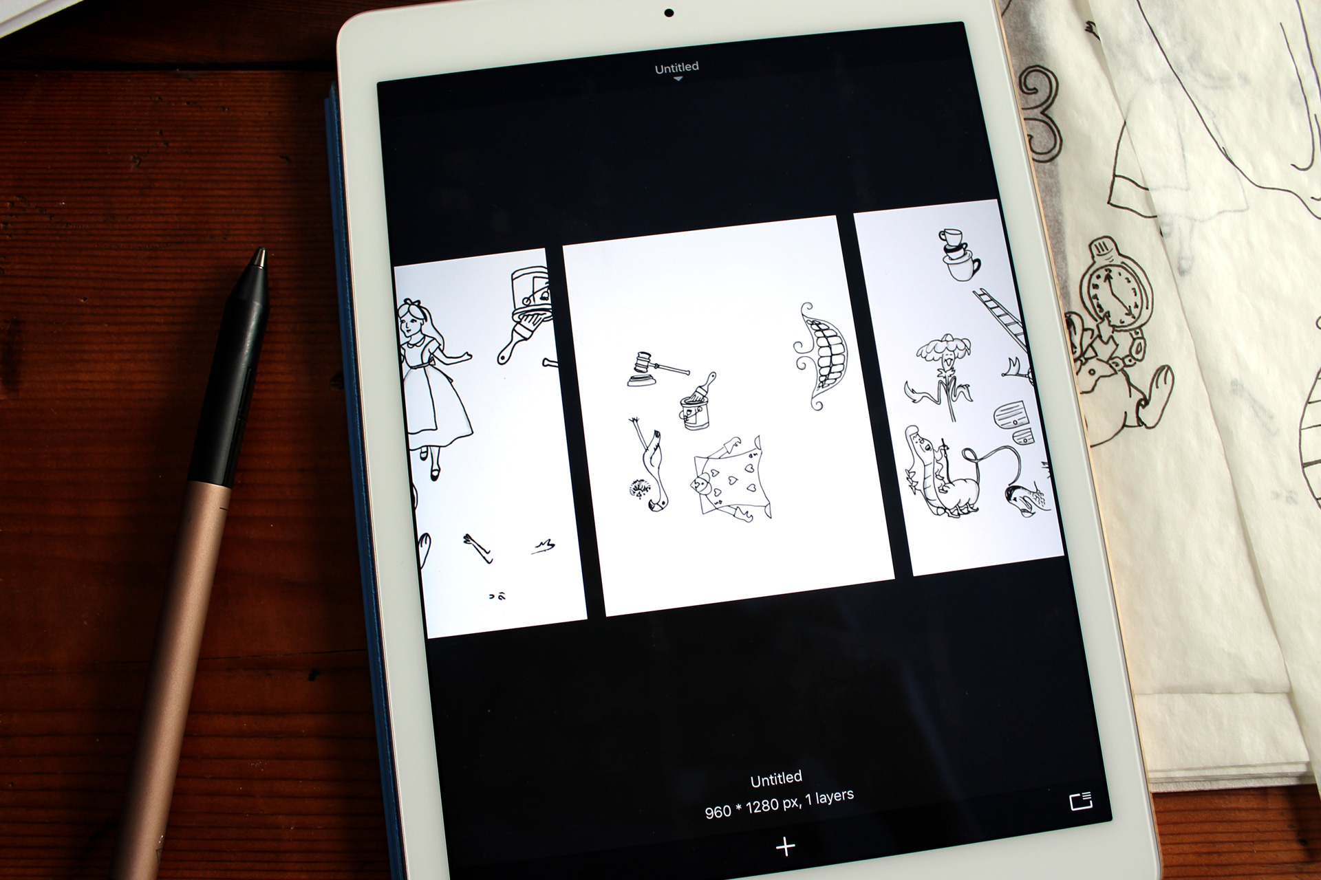
Sketches for program, each corresponding to a specific dance piece in the recital

Two photos of vectorized Alice in Wonderland character sketches
iPad showing sketches next to tracing paper and a gold stylus

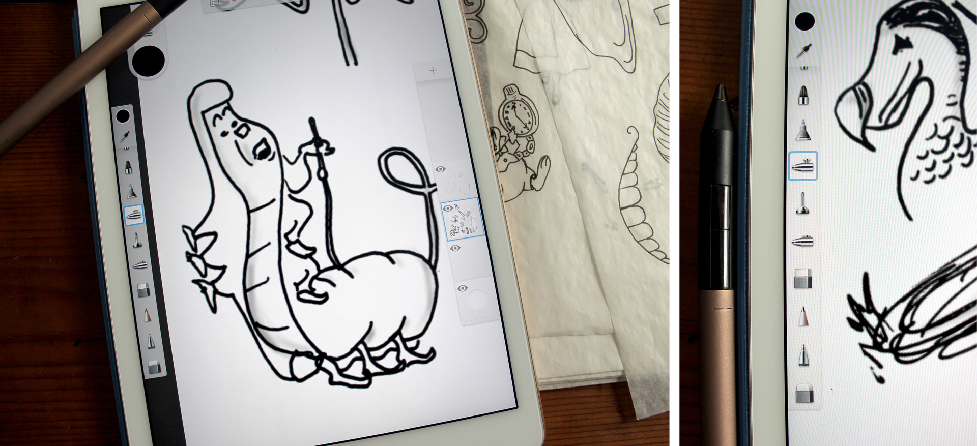
Shading added digitally

Purple outside cover of program for Alice and Wonderland
Illustration of order of performance as a path through Wonderland
Closed, printed program next to open program on a light gray background

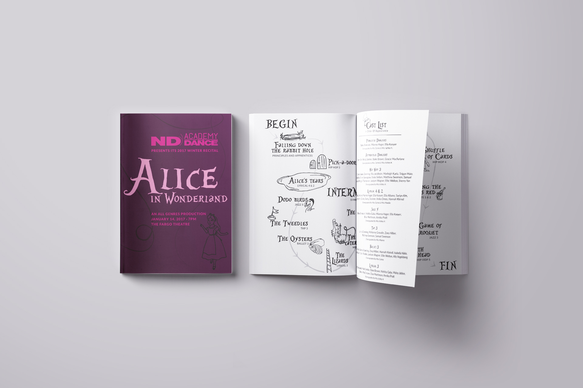
Printed program with cast list insert

White brochure with blue smoke cloud on cover on blue background

New American Consortium for Wellness and Empowerment

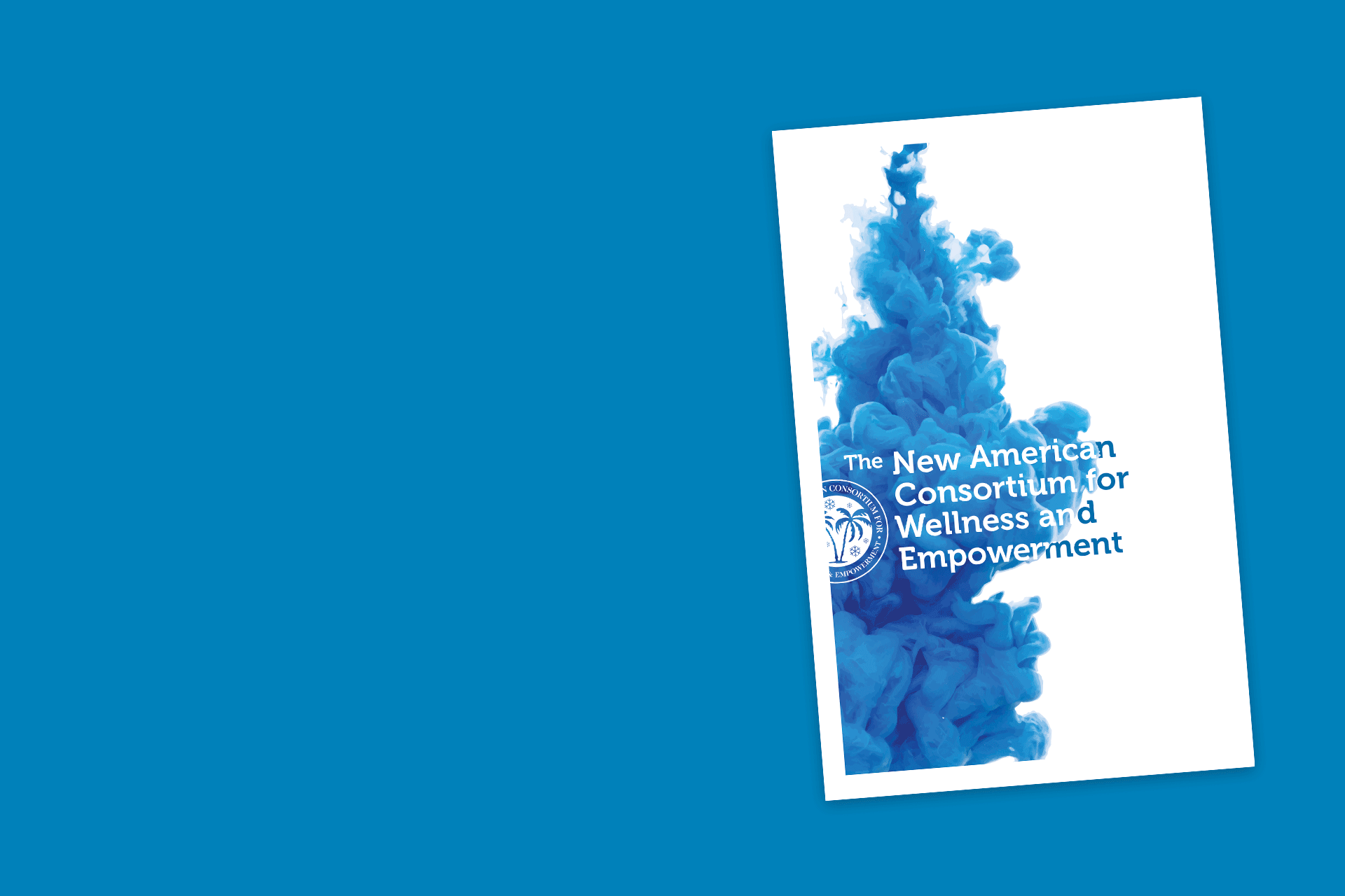
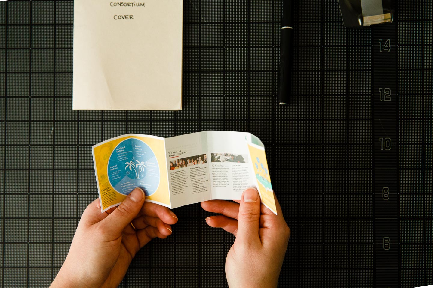
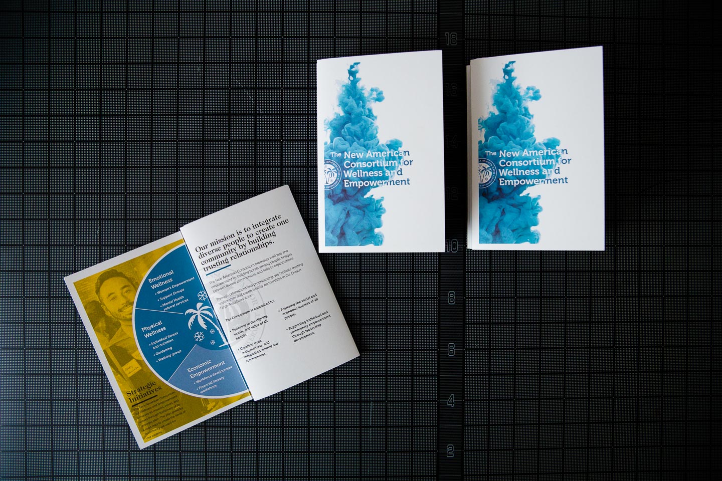
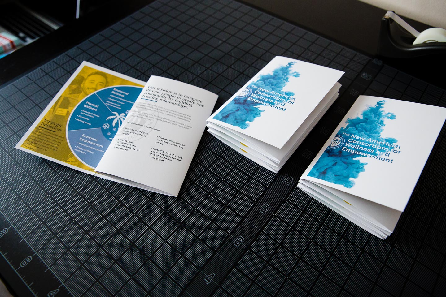
The New American Consortium for Wellness and Empowerment needed a way to share the work of their organizations and allow potential donors the opportunity to give. Instead of the traditional tri-fold brochure, we designed an informational packet of mailable size to provide a more substantial in-hand experience. The packet incorporates photos from the group’s events and social media accounts while giving an overview of the activities and goals of the organizations that comprise the Consortium.

Man in front of computer with character icons on the screen
Man in front of computer with character icon and vector truck on the screen

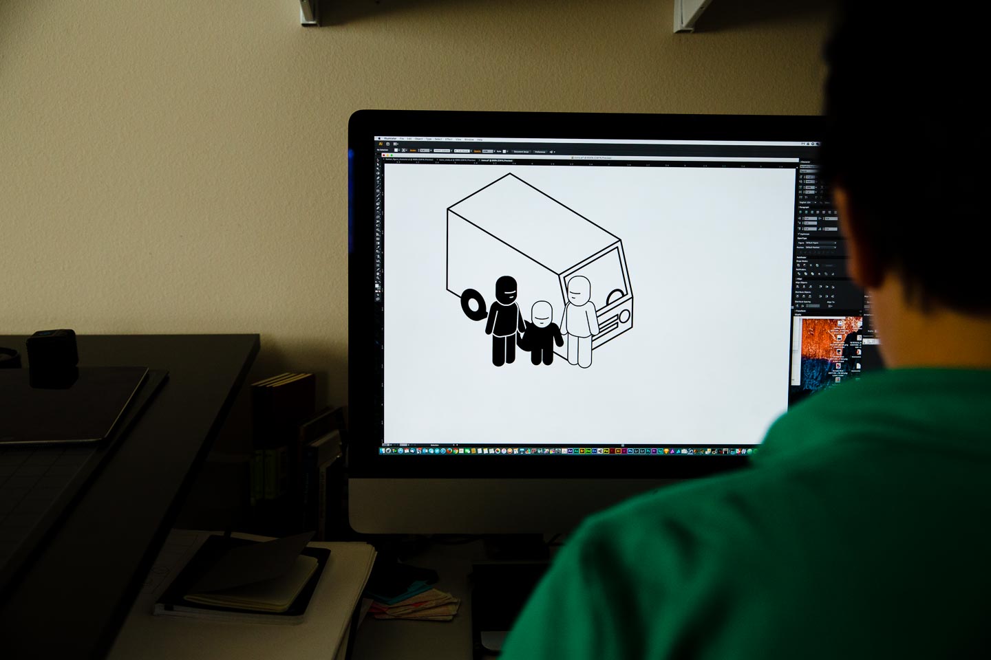
Building the elements for the illustration

Open sketchbook full of sketches next to cards, tape dispenser, and pens on black gridded background
Scan of page layout sketches

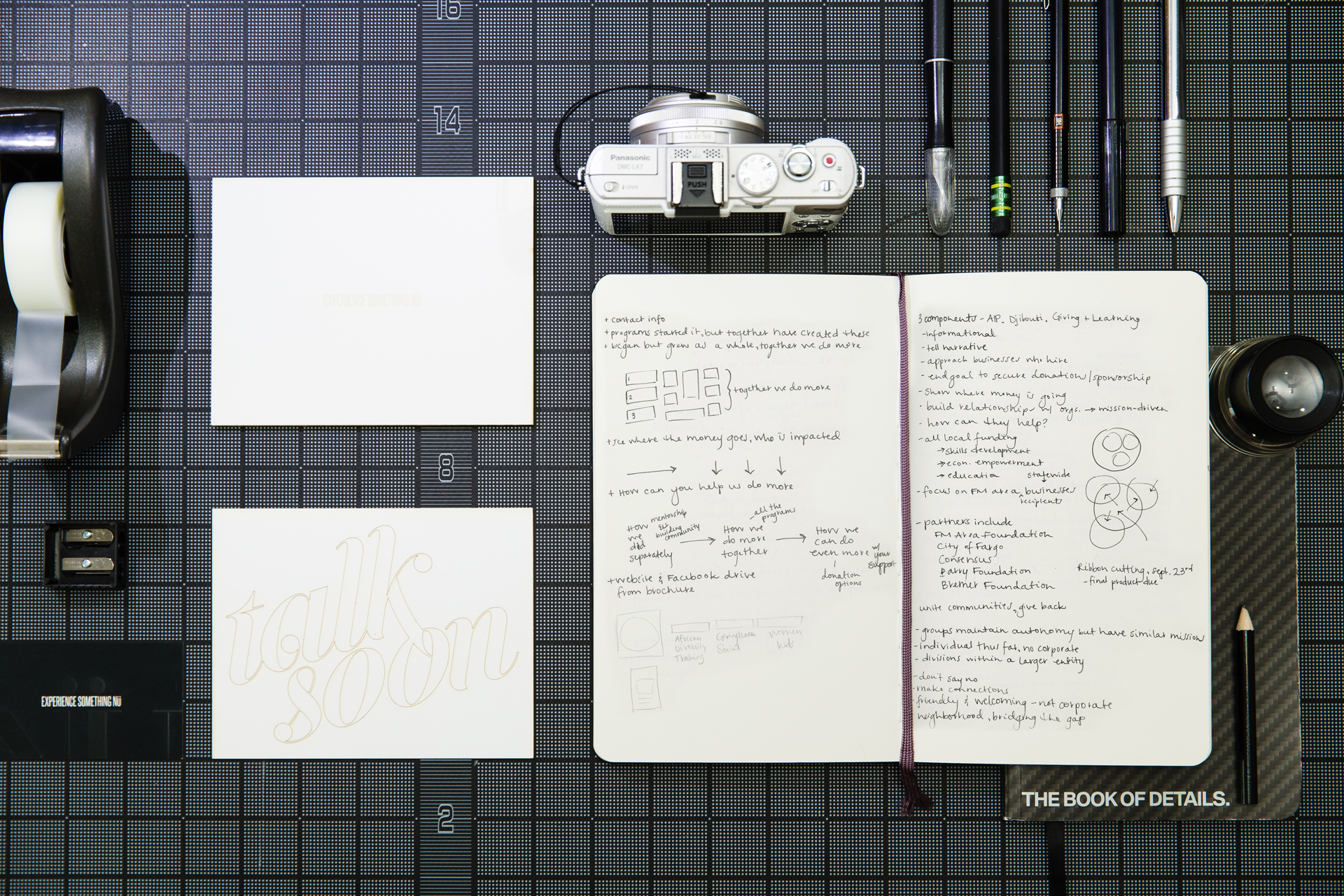
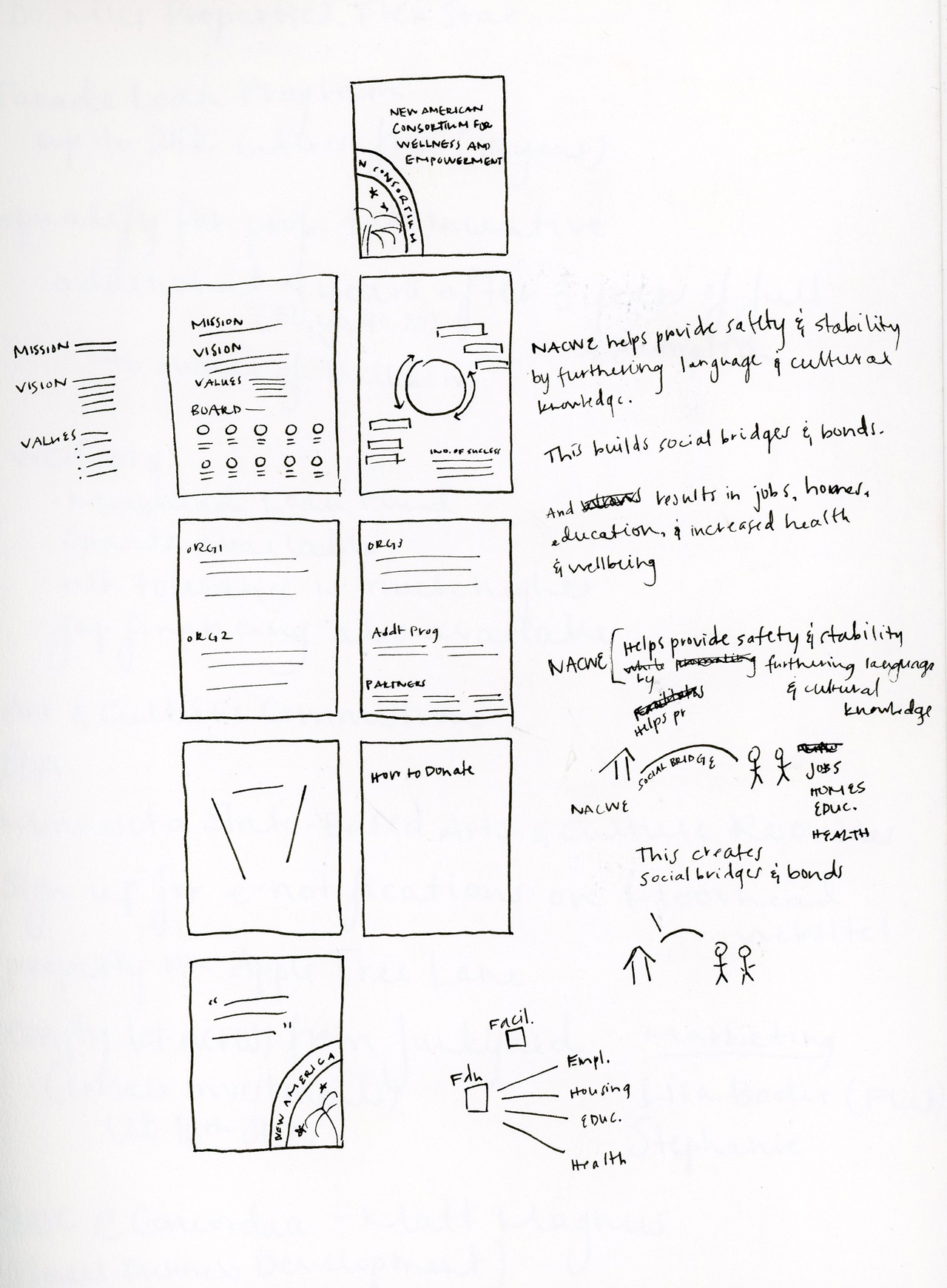
Notes and sketches for key points and page layouts

Two hands holding miniature prototype of folded brochure over black gridded background

Prototyping on a small scale to test folds

Full-size brochure next to miniature prototype of folded brochure over black gridded background
Full-size brochure next to various prototypes of folded brochure over black gridded background
Brochure open below stack of folded brochures and miniature prototype on black gridded background

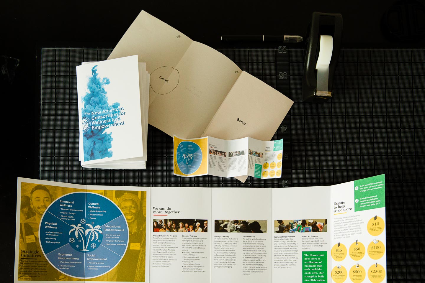
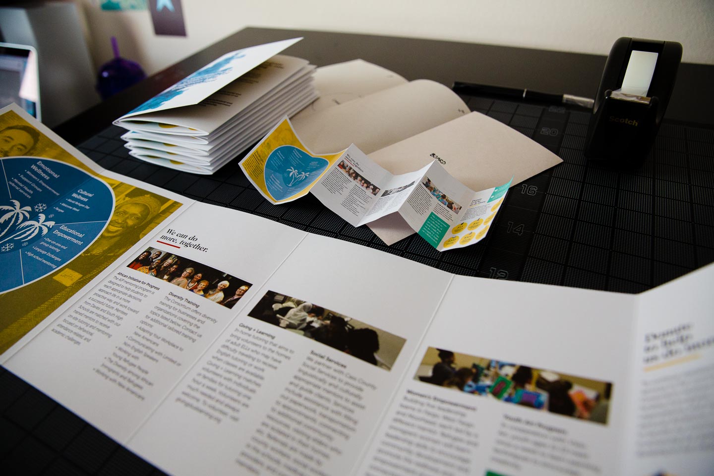
The layouts of the pages are designed to interact and adapt as the document is folded and unfolded. The final page has the ability to stand alone and provides pertinent information about donating and an informational graphic giving a quick overview of the Consortium’s mission.

One partially open brochure and two folded brochures on a black gridded background
Wunderfold in its card form, punched out hexagon form, and folded 3D tree form in green, red, and black

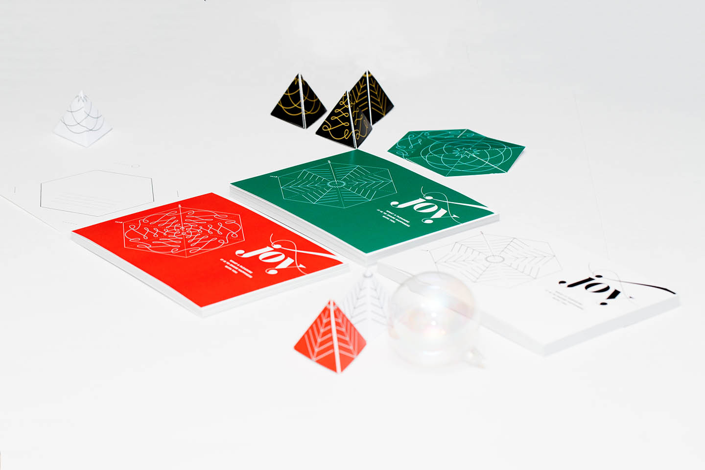
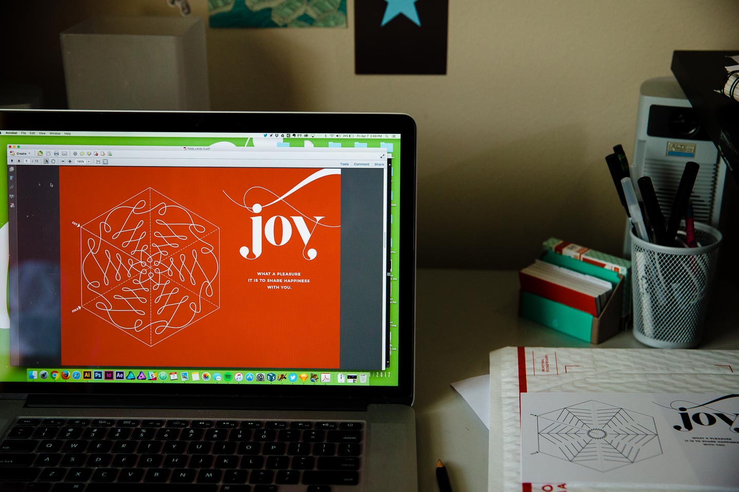
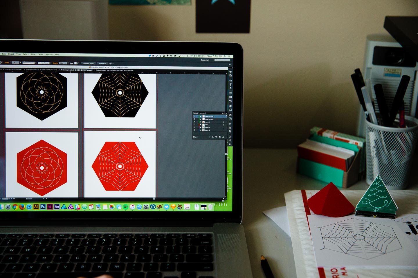
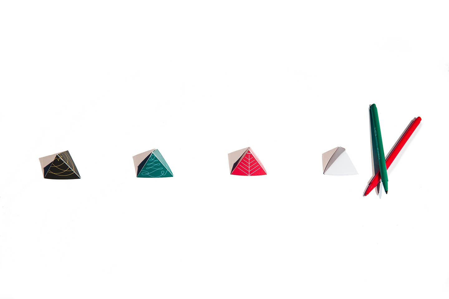
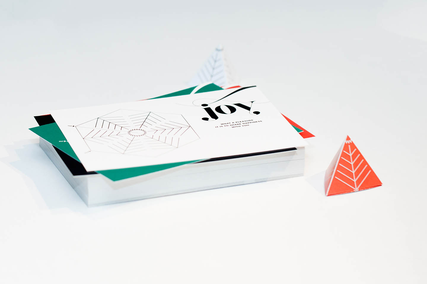
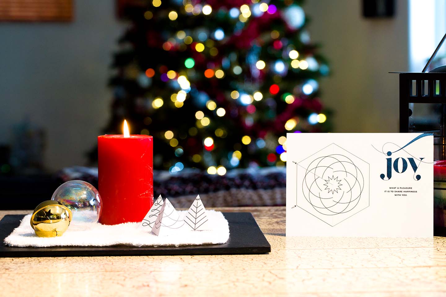
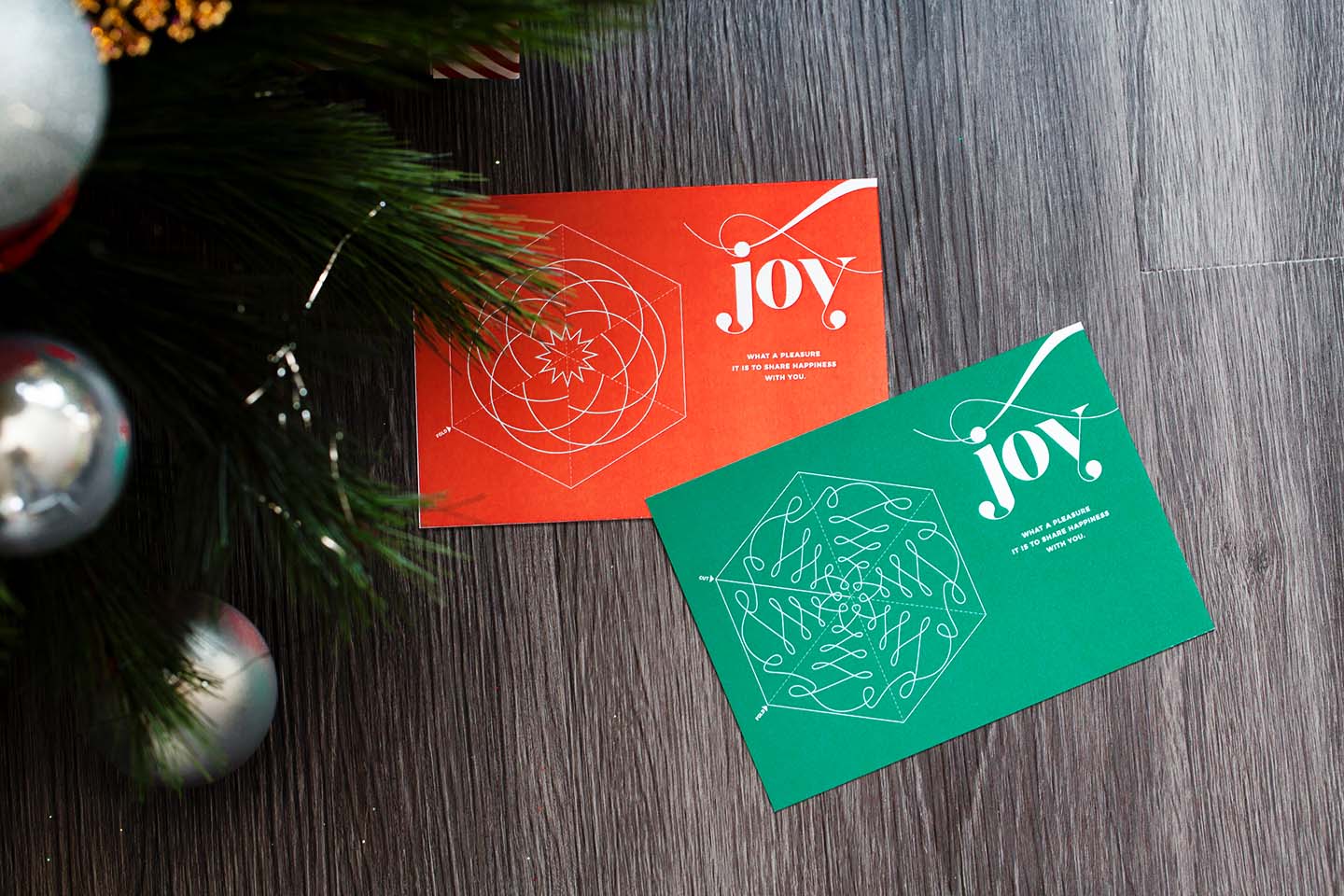
Wunderfold is a foldable greeting, designed to be a fun and interactive alternative to the traditional card. The first edition was designed for the 2016 holiday season and consisted of a postcard sharing a message of joy and foldable tree.

An iPad sitting on a red background displaying a circular pattern on its screen
An iPad sitting on a red background displaying various patterns on its screen
An iPad sitting on a red background displaying a circular pattern on its screen

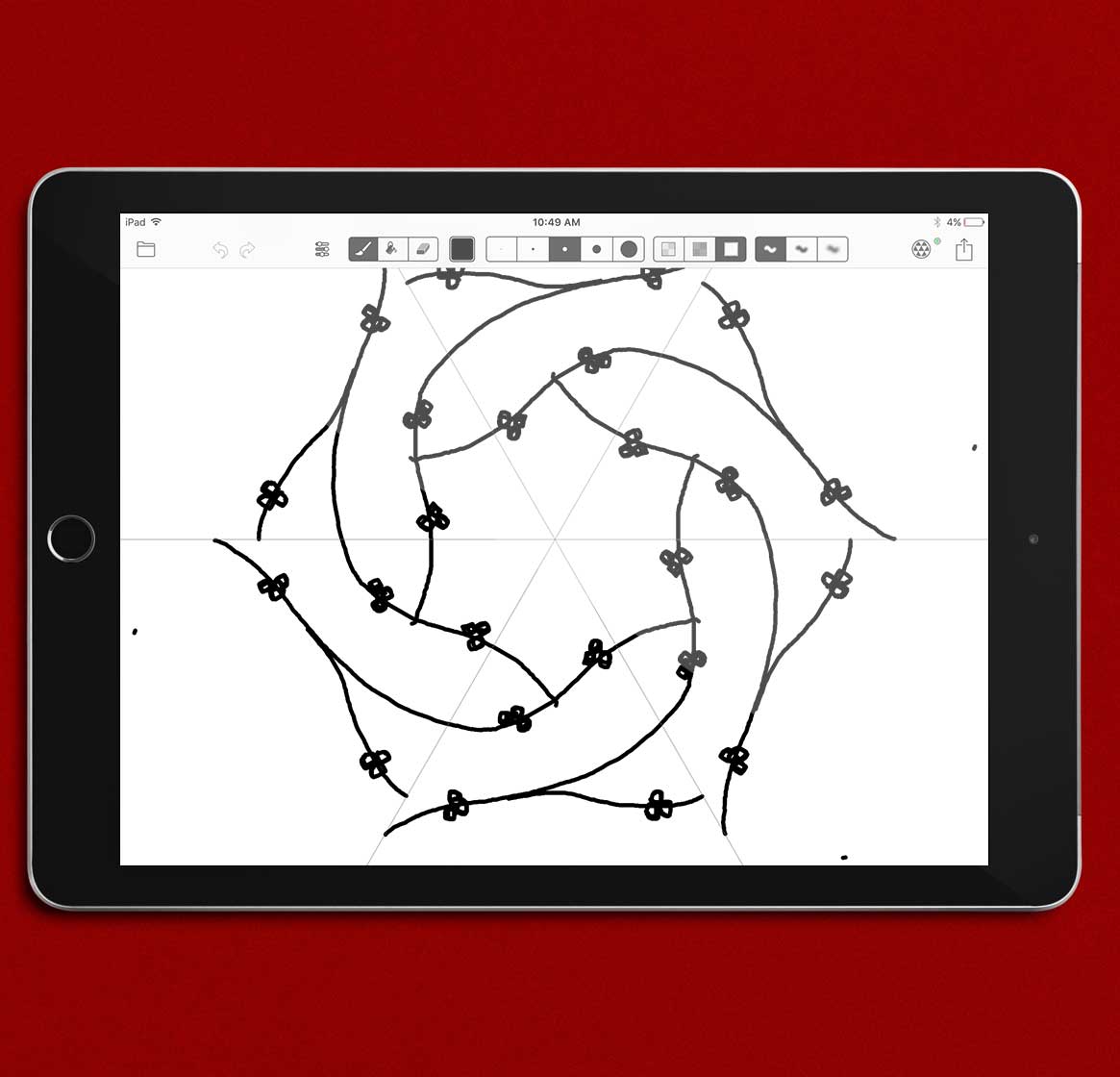
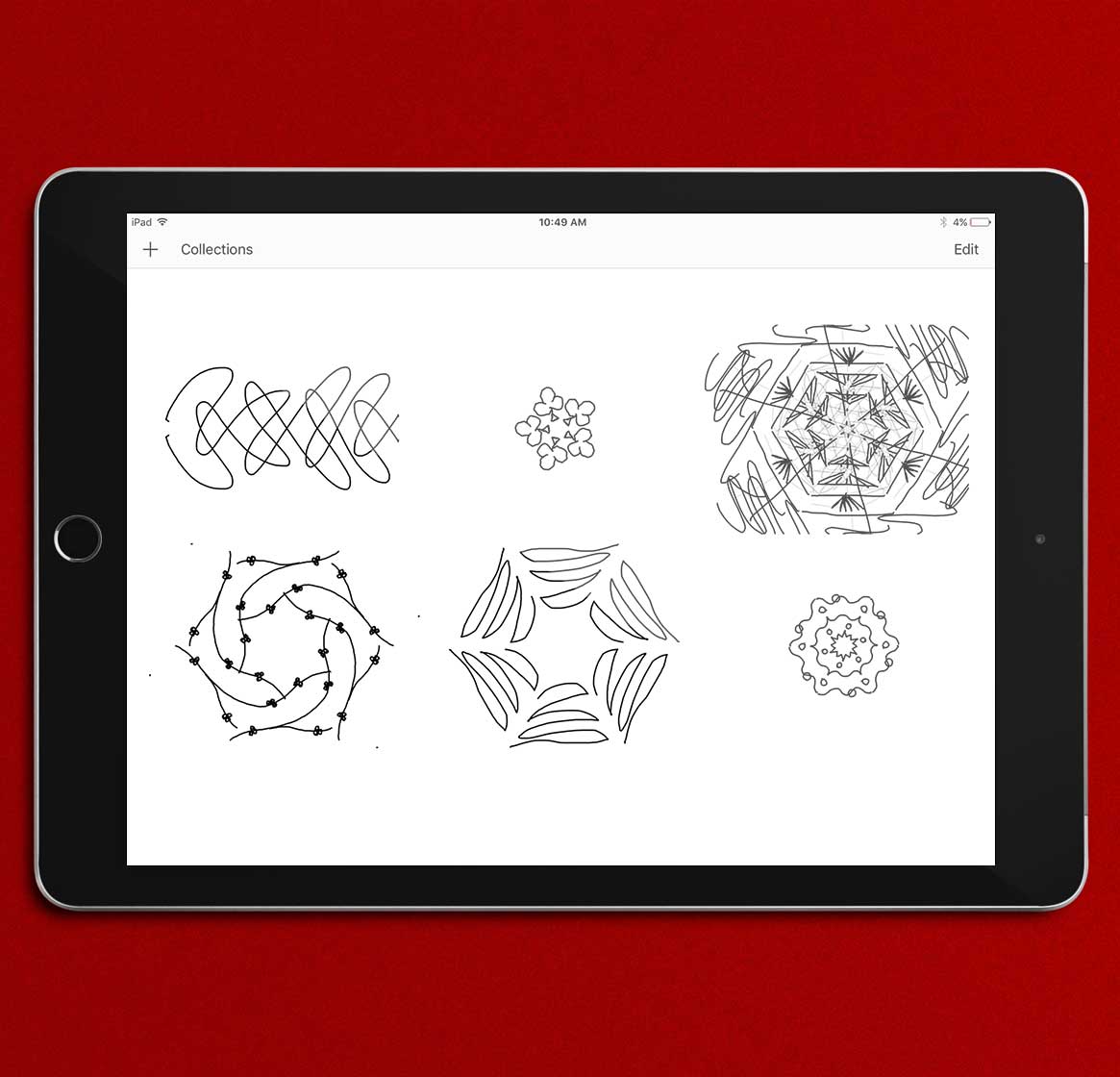
Paper and digital sketches for initial concept

Small triangular paper prototypes in red, green, and black atop a black gridded cutting mat
A woman cutting hexagons from red paper with small 3D paper triangles beside her
White paper prototypes of mini christmas trees on a black gridded cutting mat
Red and white paper hexagons and small 3D paper trees sitting on a black gridded cutting mat

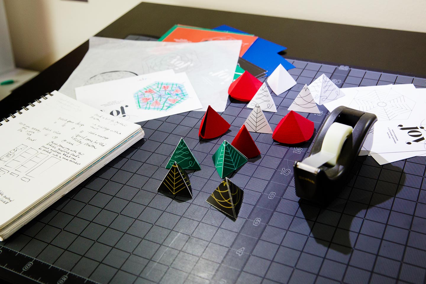
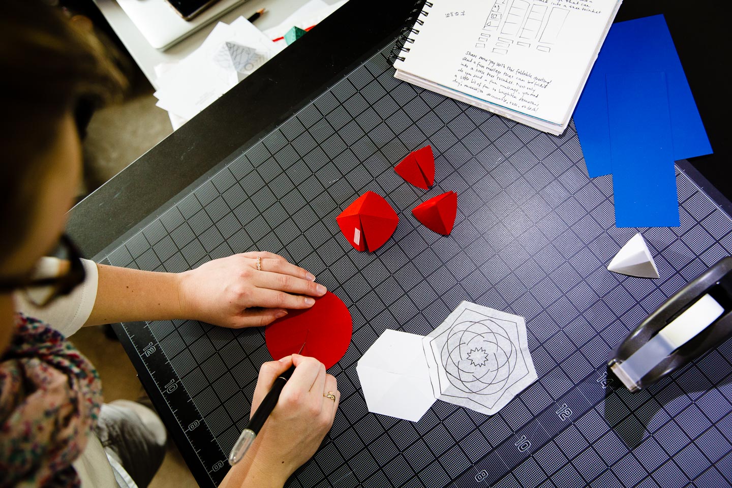
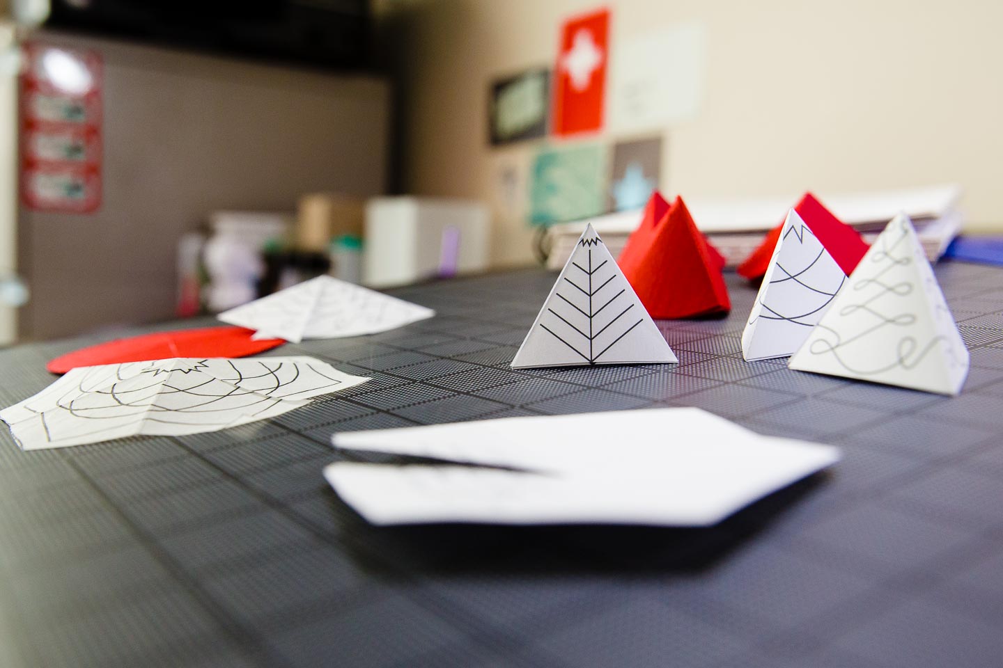
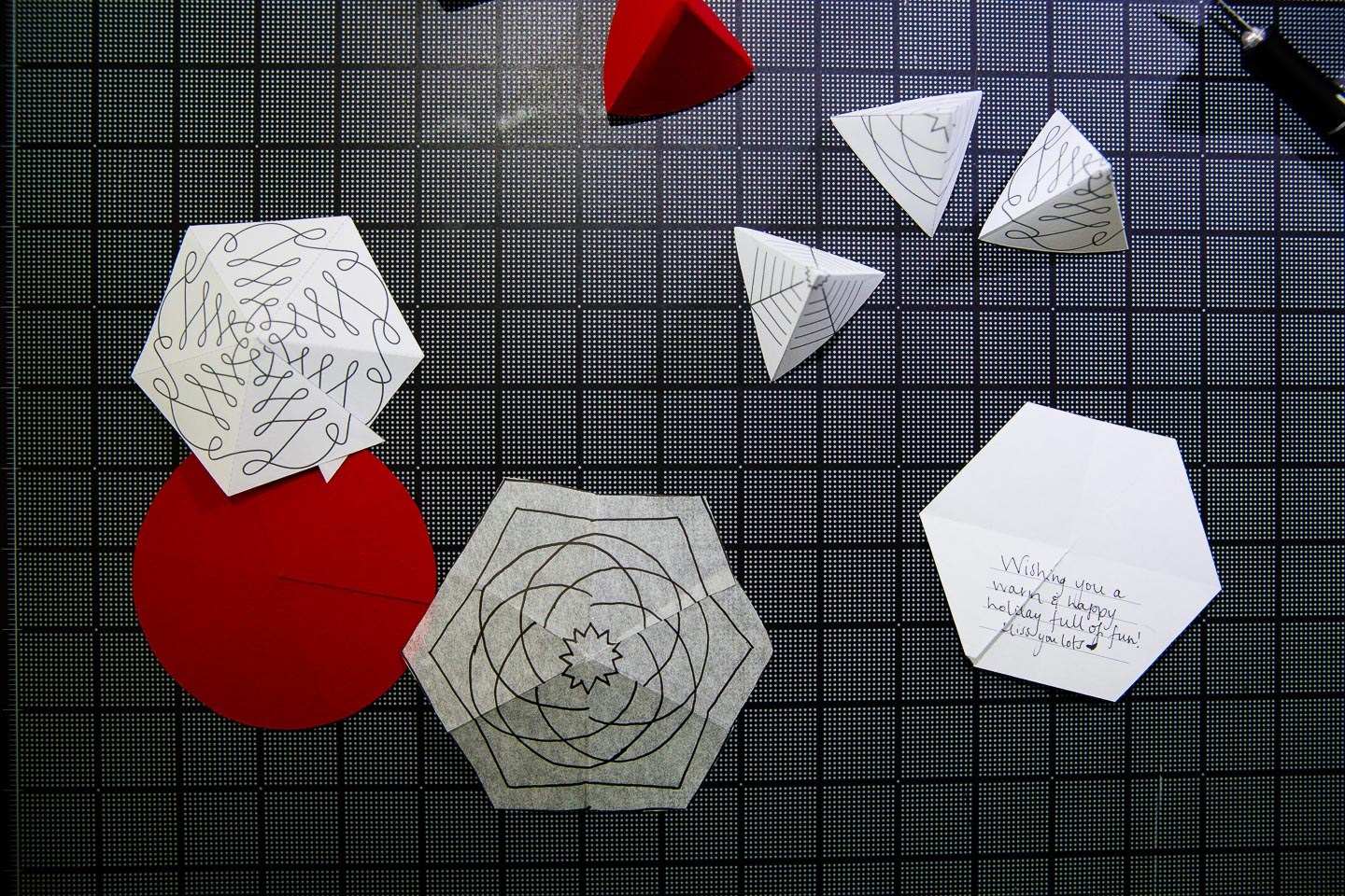
Prototyping the foldable hexagons

A woman designing circular patterns on a laptop
A woman working on a laptop creating a black postcard that reads Joy next to a circular pattern
A laptop with its screen displaying a red card reading Joy with a circular design on it
A laptop screen displaying four hexagons in black and red

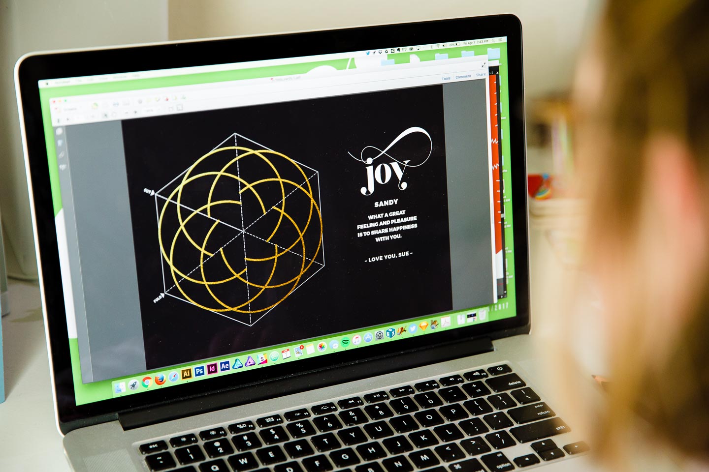
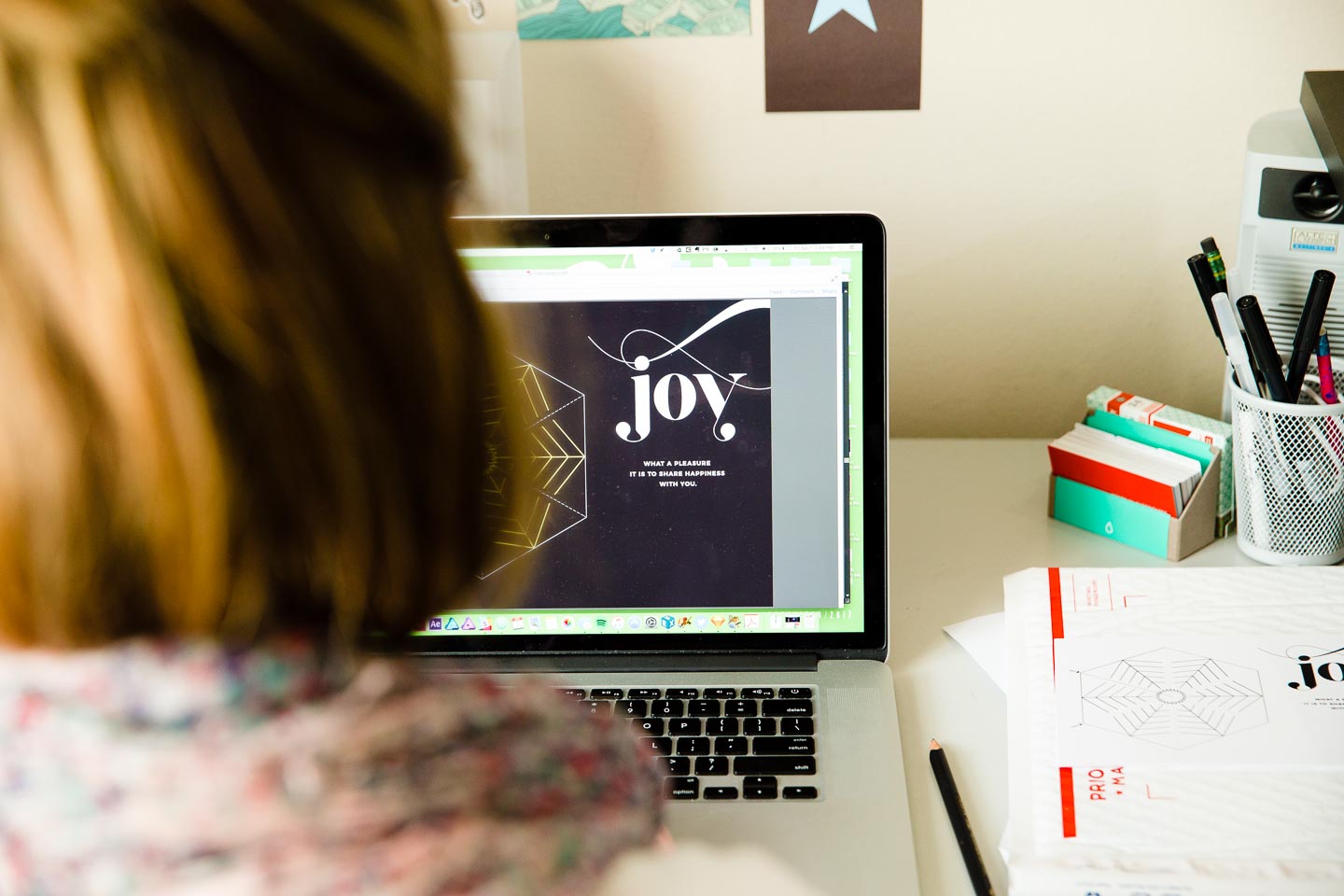
Cards were available for download at wunderfold.com with three designs in four color combinations each. Additionally, a fully customizable, blank template was available for people to create their own designs.

Wunderfold in its card form, punched out hexagon form, and folded 3D tree form in green, red, and black

Wunderfold trees in their various forms

Black, green, red, and white 3D folded trees next to red and green markers on a white surface
Wunderfold in its card form and folded 3D tree form in red
Wunderfold in its card form, punched out hexagon form, and folded 3D tree form in green and red
A white Wunderfold card with the word Joy on it next to a nutcracker and tree in front of a large Christmas tree
A white Wunderfold card with the word Joy on it next to a candle in front of a lit Christmas tree
Two Wunderfold cards, one red and one green, on a wood floor beneath a Christmas tree
Black illustration of Wizard of Oz characters in front of a blackboard on a green background

Research Experience for Undergraduates 2015 & 2016

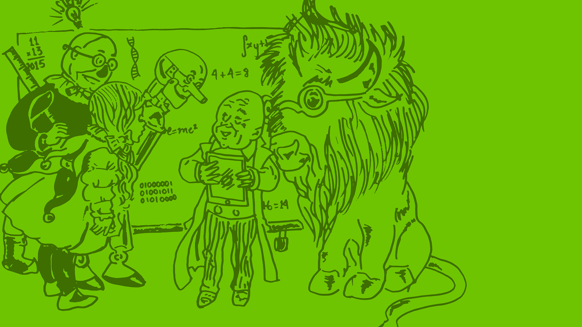
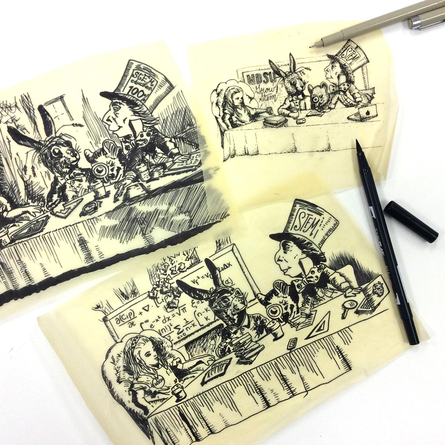
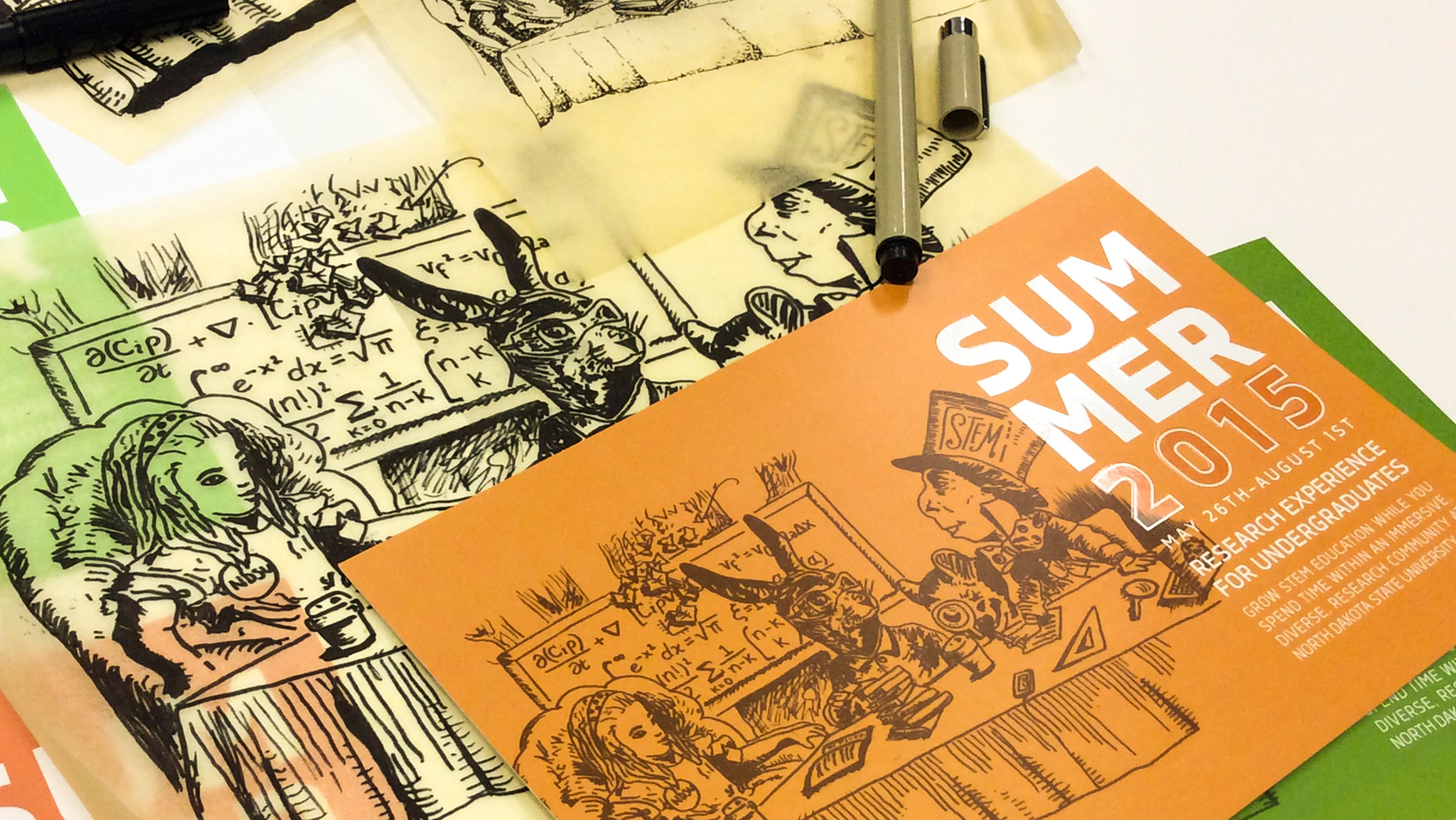
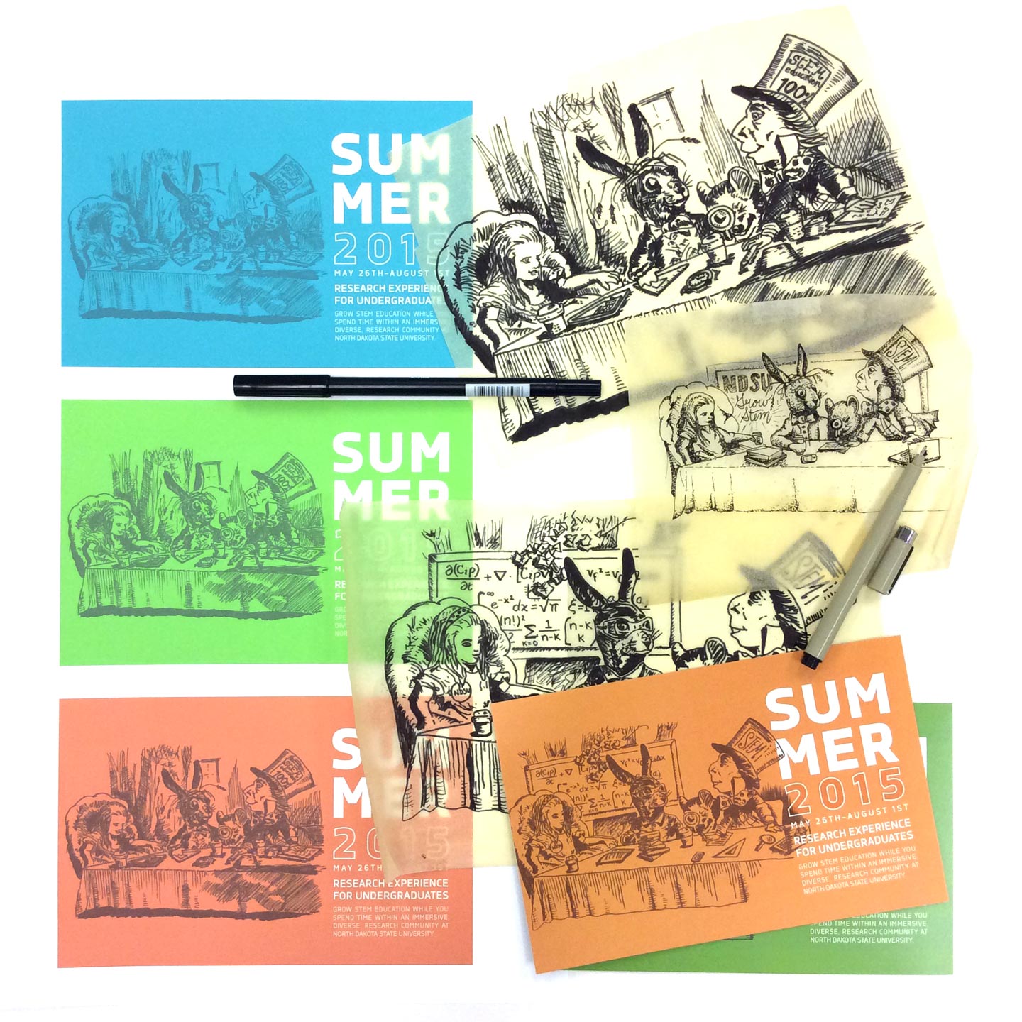
Higher Education demands a level of dedication to a market that has several audiences at once. By studying what engages faculty, staff, and students, we created materials to promote STEM careers.

We selected a classic illustration by John Tenniel for a youthful feel and made STEM-themed modifications so that the illustration included an NDSU button, chalk board with equations, and laptop among other items.

Whiteboard with gray border and handle covered in colorful post-it notes and writing
Close-up of orange and purple post-it notes on a whiteboard

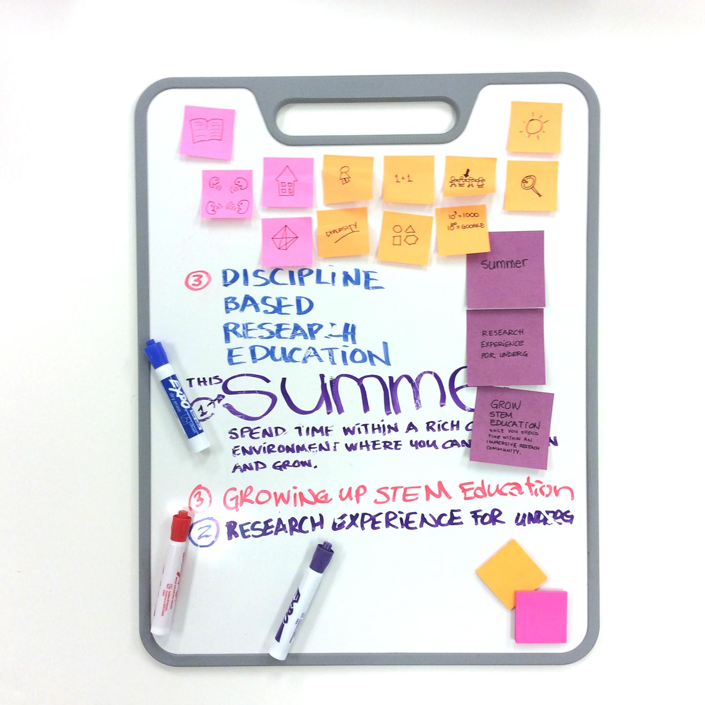
Setting the hierarchy of the information

Four yellow post-it notes with writing on them and a black pen on a white surface

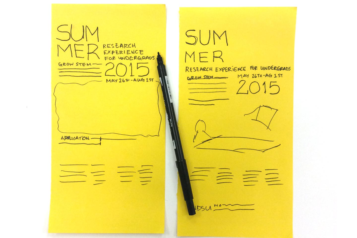
Sketching and planning

Sheets of tracing paper with black sketches from Alice and Wonderland on them next to a black pen on a white surface
Close-up of a pen and a sketch of a mouse holding a magnifying glass

Iterations of sketches with different STEM and NDSU-themed elements

Orange and green postcards laying on tracing paper with black illustrations from Alice and Wonderland on them
Tracing paper with sketches laying on top of colored postcards

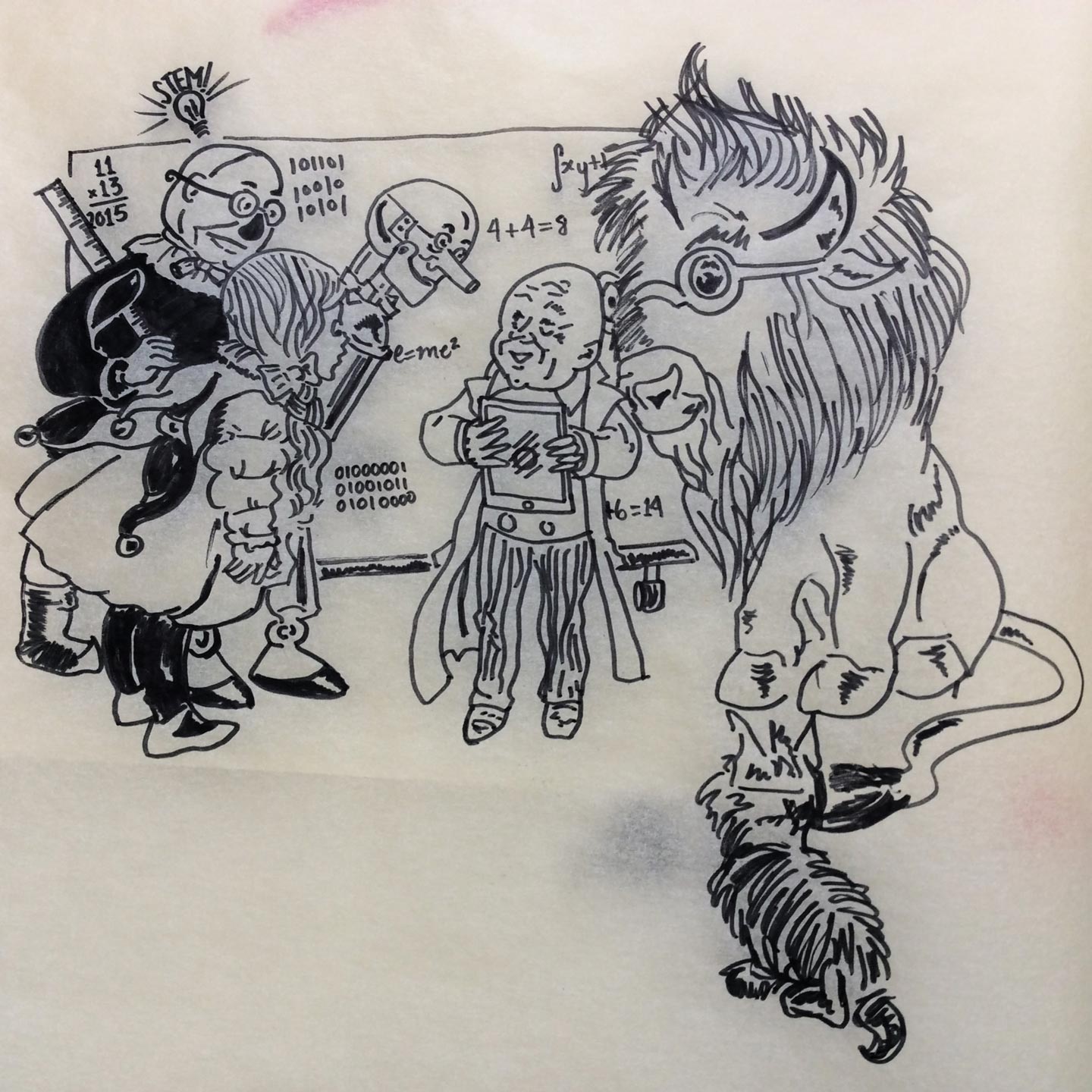
For 2016, we updated the graphic to an illustration by William Wallace Denslow to maintain consistency with the previous year's theme while freshening up the appearance through color and new custom STEM and NDSU-themed elements including a bison in place of the Cowardly Lion.

Woman in gray sweatshirt drawing on tracing paper atop a white desk

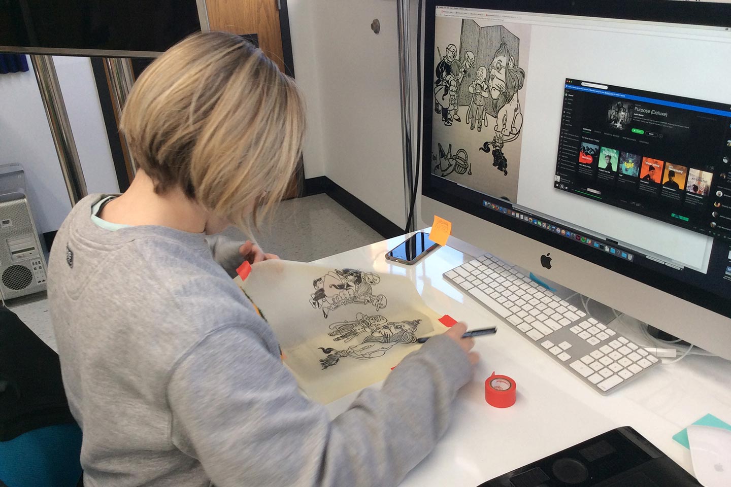
Referencing Denslow's illustrations for the 2016 update

Illustration of Wizard of Oz characters with a bison in place of the lion on tracing paper
Green postcard featuring an illustration of a customized Wizard of Oz character sketch for NDSU REU
Green Poster featuring an illustration of a customized Wizard of Oz character sketch for NDSU REU

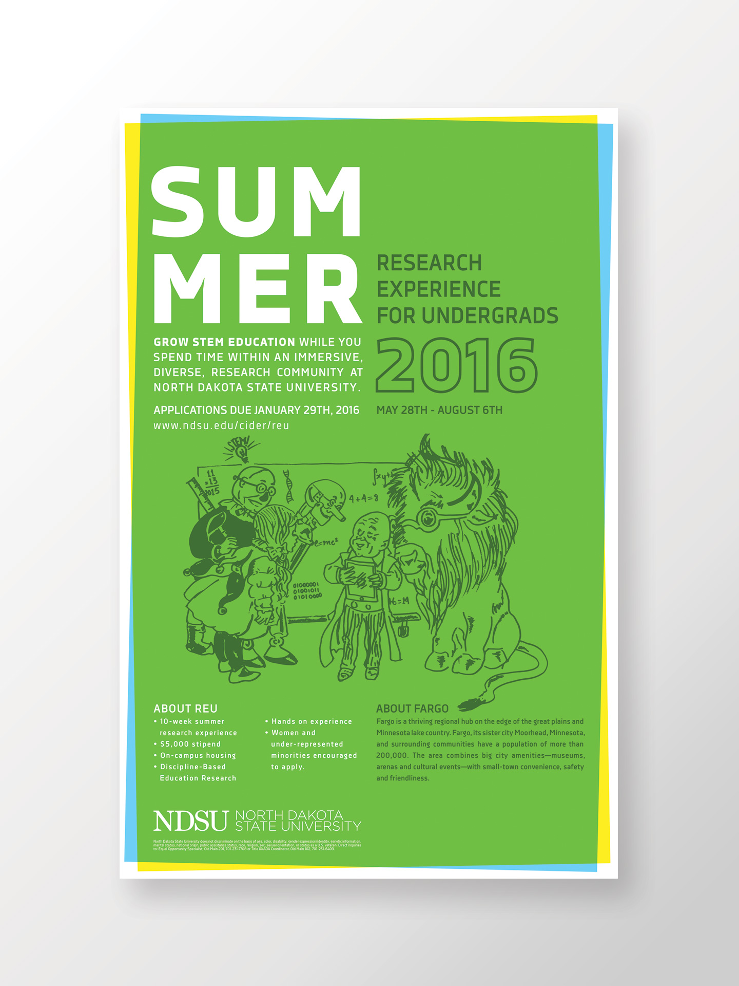
Final printed posters for 2016

BernBaum's icon printed on water bottle label, logo printed in green on kraft bag with bagel poking out, and cup of coffee

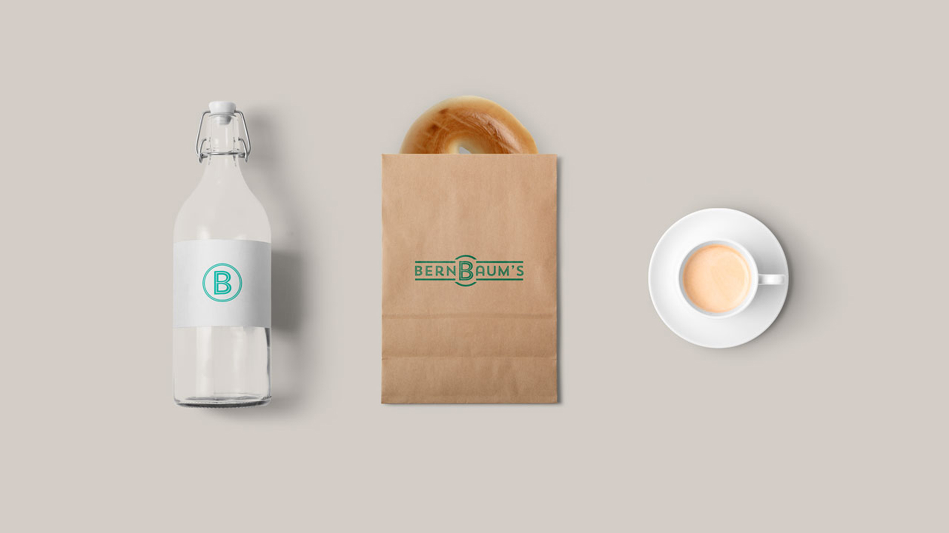
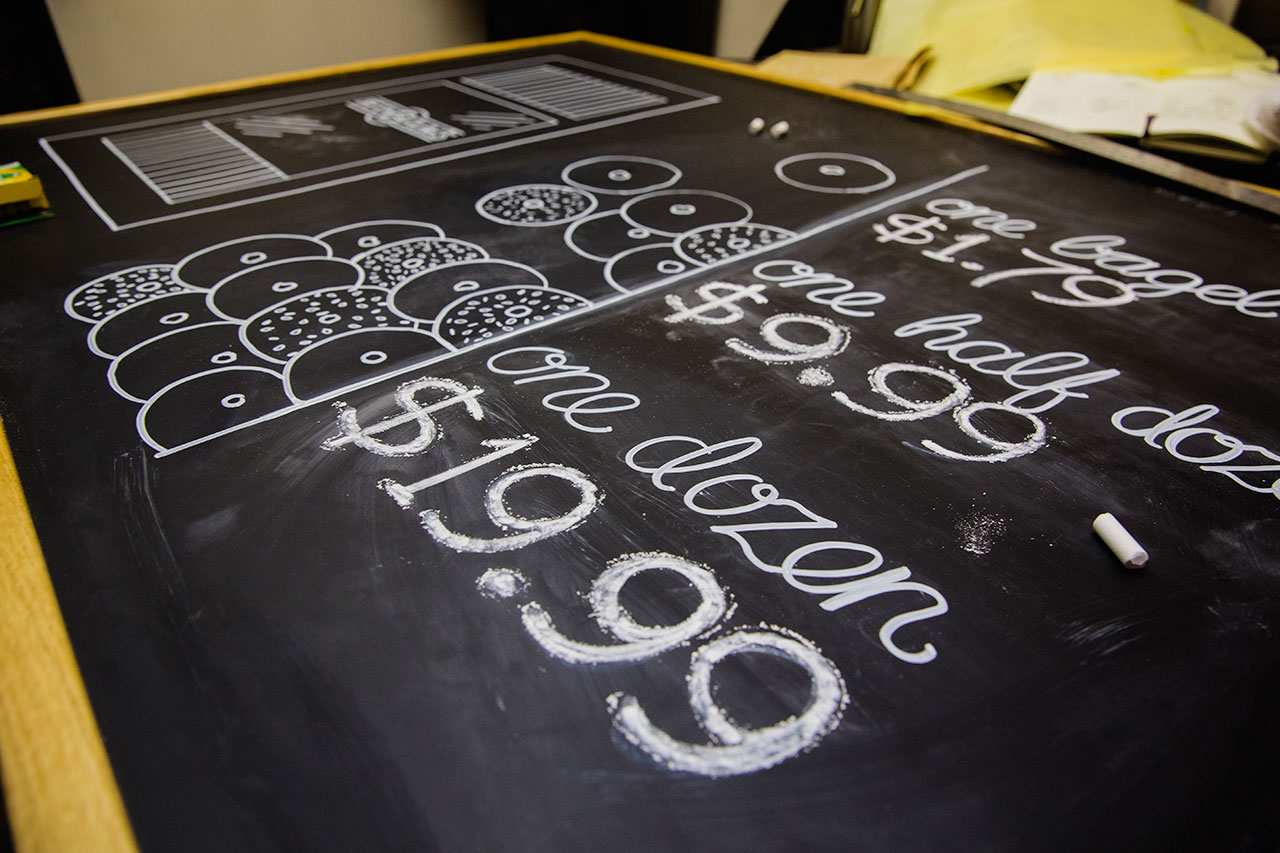
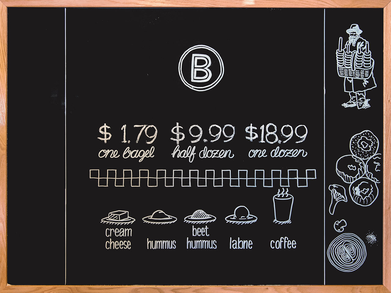
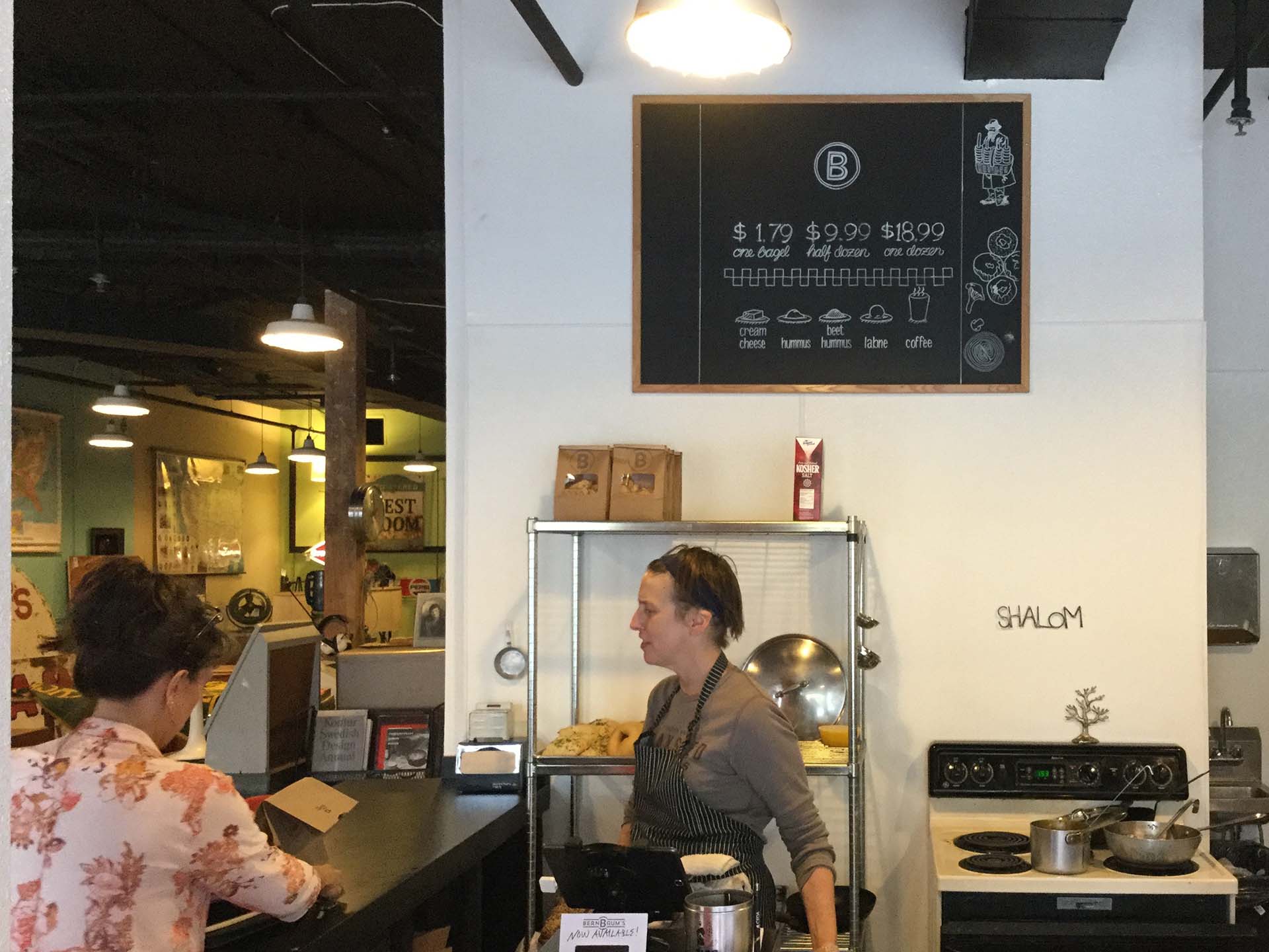
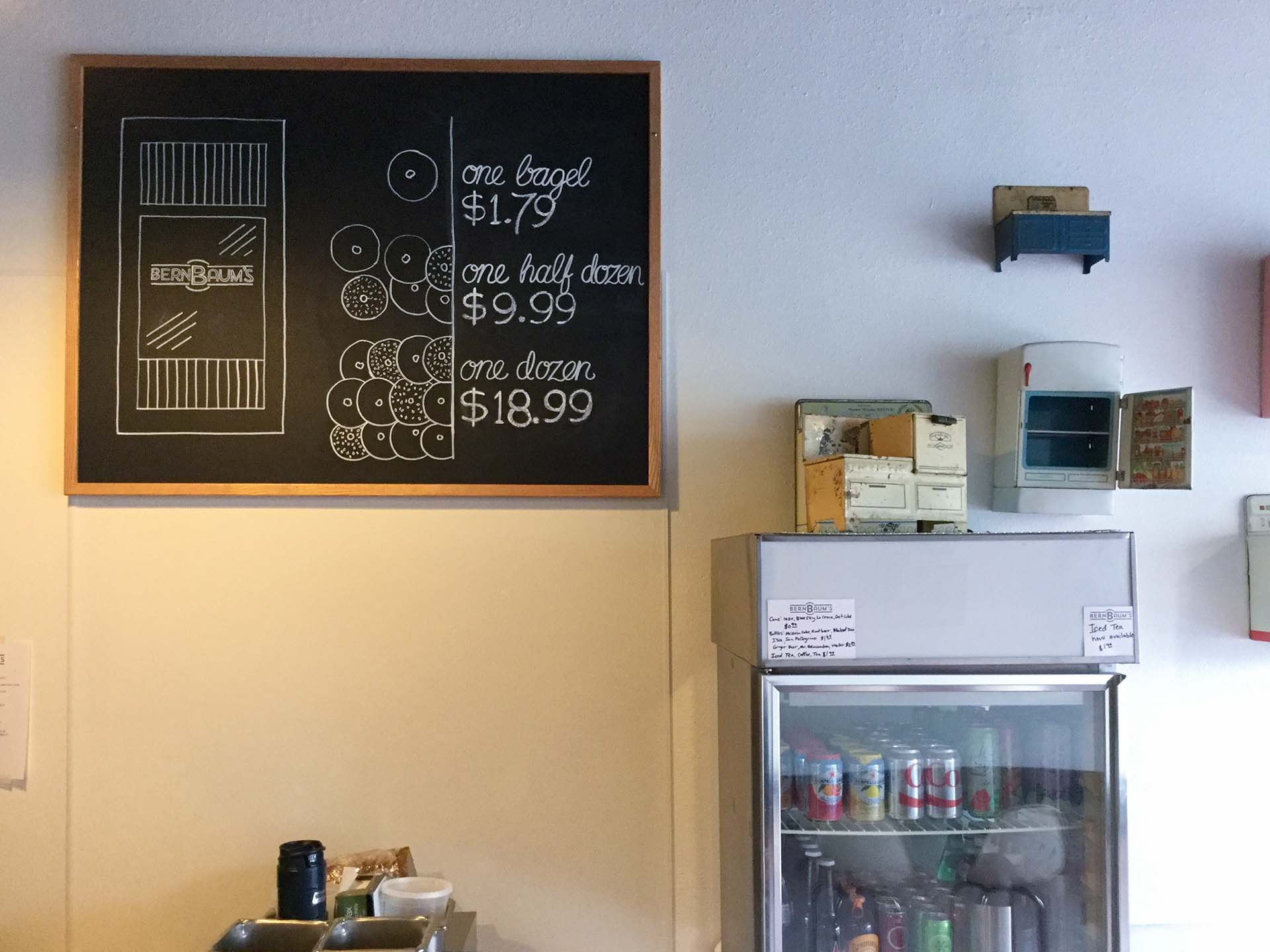
A local baker had an idea of starting a small bagel shop in the heart of the Upper Midwest and wanted an authentic place that connected her Jewish ancestors and roots with the feel of a NYC bagel shop. To capture this look, feel, and meaning, we investigated the history of Jewish traditions and historic bagel shops in New York City.

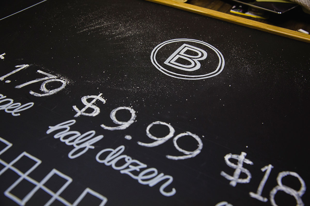
The colors, letter forms, and illustrations created were done by hand and carefully traced to reflect the style of the 1940's and 1950's. The letter ‘B’ stands for the word bagel, but furthermore, the letterform has a double-layered B as it’s also the owner’s joined family name, BernBaum, stemming from Bernath and Baumgardner.

The circle surrounding the letter type represents both the incredibly strong bonds found in many Jewish families as well as the more obvious reference: the shape of a bagel. The result: A minimal brand mark that will trigger delicious memories of tradition, family, and scrumptious baked goods.

Scan of sketchbook pages containing illustrations of bagels and toppings
Scan of sketchbook pages containing illustrations for chalk board design
Sketchbook containing logo design concepts laying open on desk next to camera, and pens, and white card reading talk soon
Sketchbook of BernBaum's concepts with pieces of tracing paper covering the corner

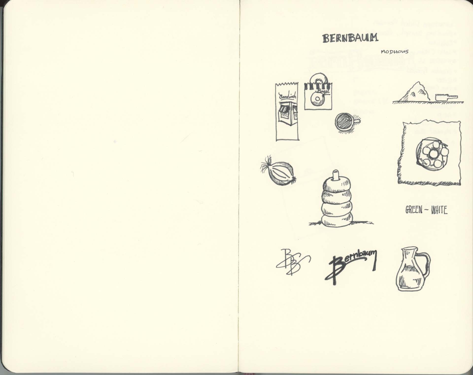
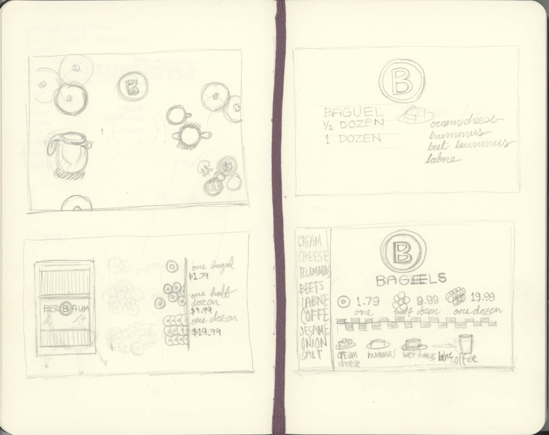
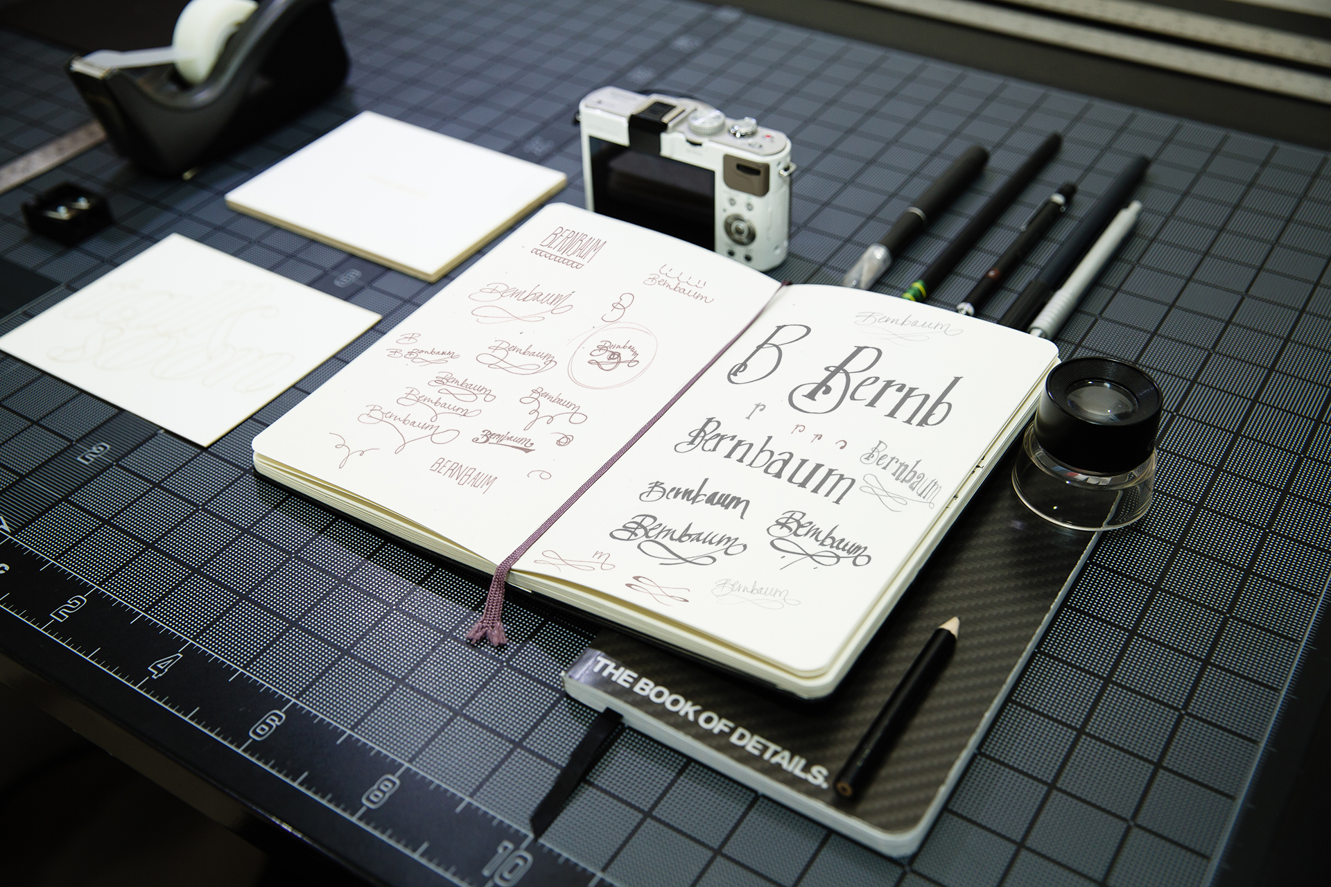
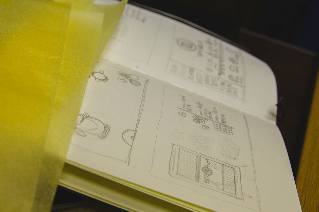
Initial concept sketches

Hand using white chalk marker to paint the BernBaum's logo on a chalk board
Close-up of chalkboard displaying BernBaum's B icon and pricing for bagels
Man drawing prices and bagel illustrations on chalkboard for Bernbaum's

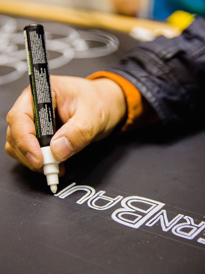
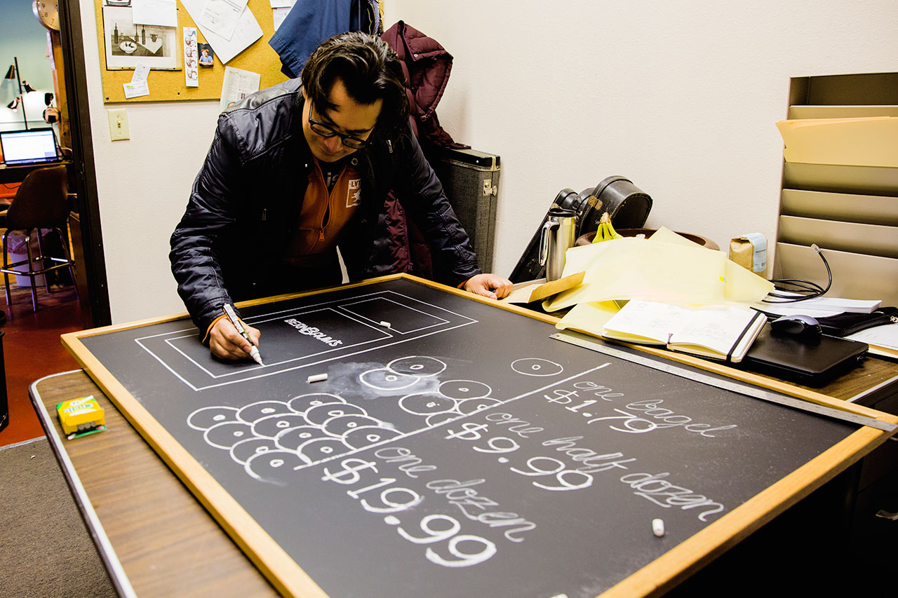
Hand drawing the signs adds a homemade feel to the design

Close-up perspective of pricing and bagels illustrated with chalk on black chalk board
Black chalkboard with white chalked BernBaum's B logo, pricing for bagels, and illustrations of spread options
Black chalkboard with white chalked pricing of bagels, illustrations of plain and seeded bagels, and BernBaum's front door

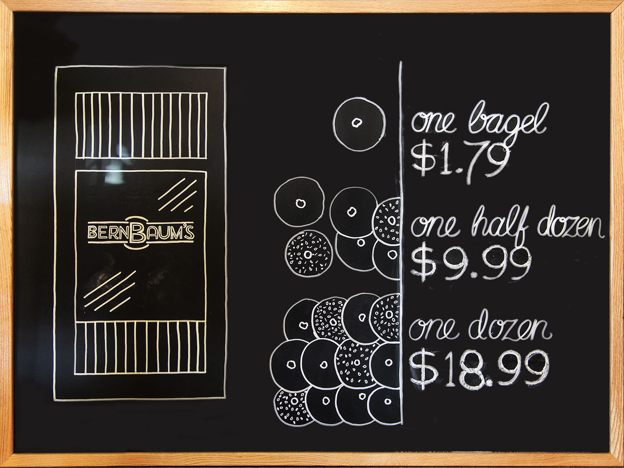
The finished signs to be hung side-by-side behind the counter

Concept for windows with hand-drawn white awning, listing of ingredients, and illustrations of ingredients and bagels

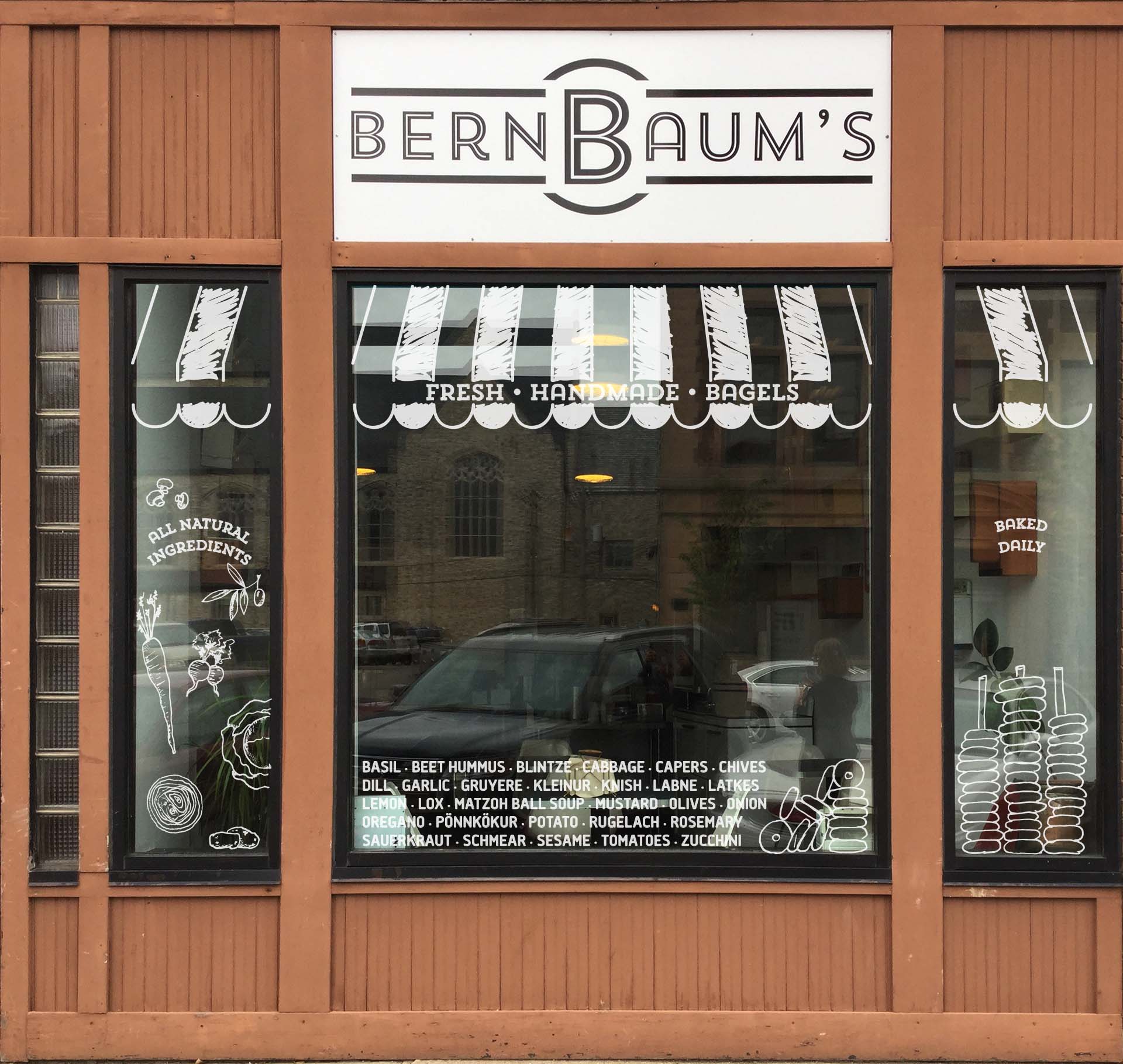
Conceptual window signage on the Bernbaum's storefront.

Hand-drawn pricing chalkboard on display behind counter where two women are talking
Pricing chalkboard on display in BernBaum's near refrigerator
Metal toy appliances mounted on a white wall

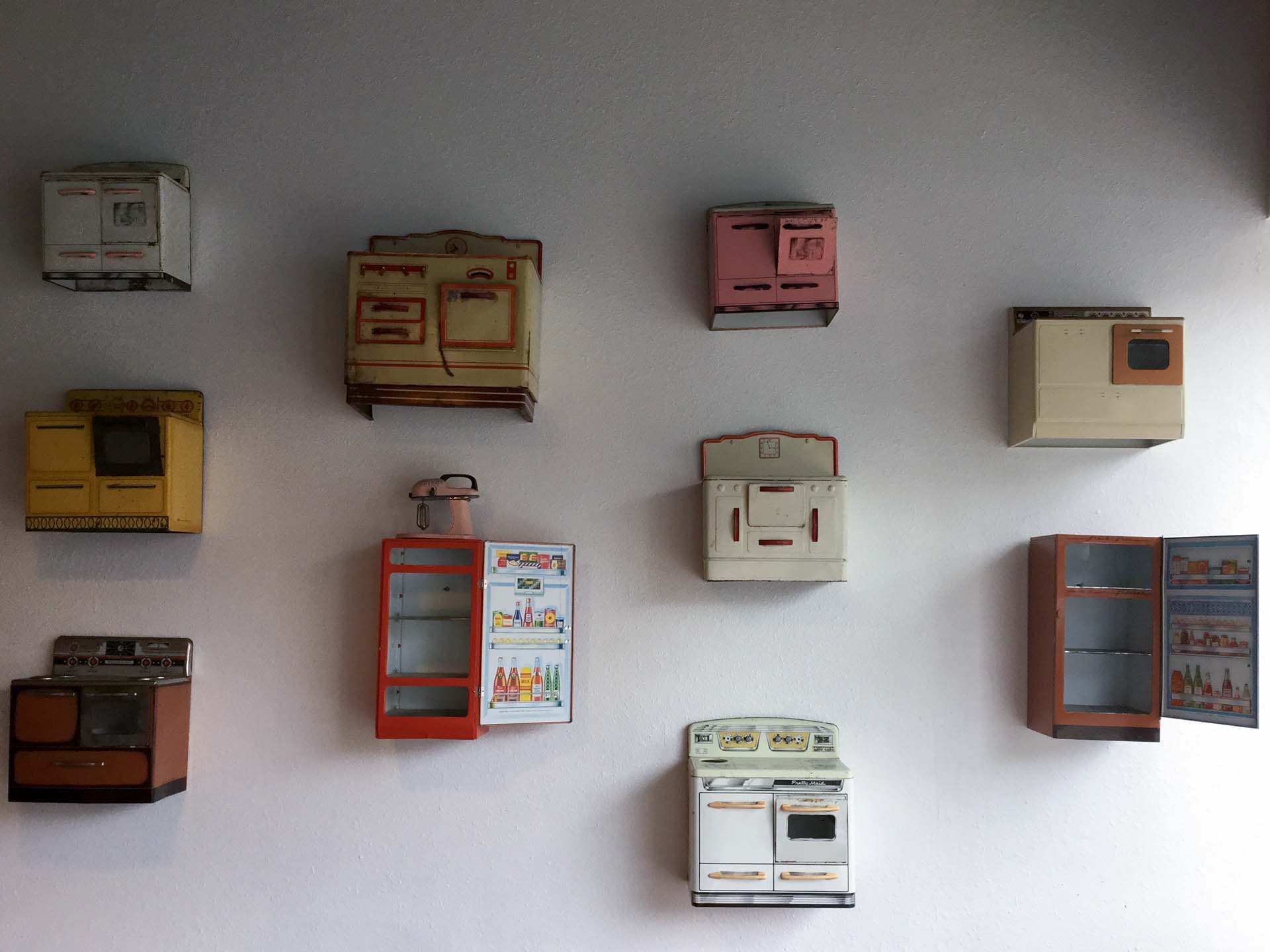
Signage and interior wall decor.

White walled studio with whiteboard, white tables, and gray desks with orange and green chairs

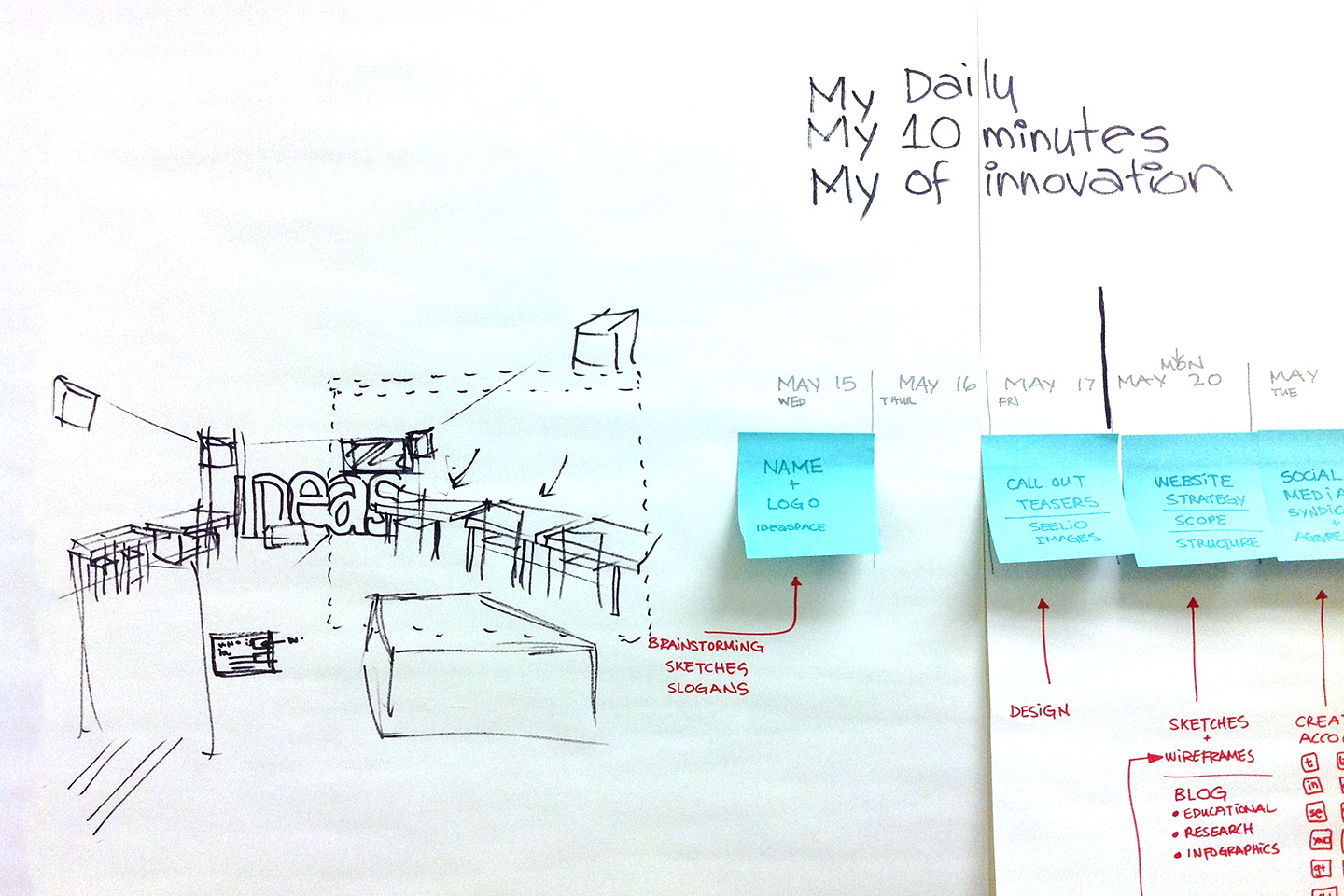
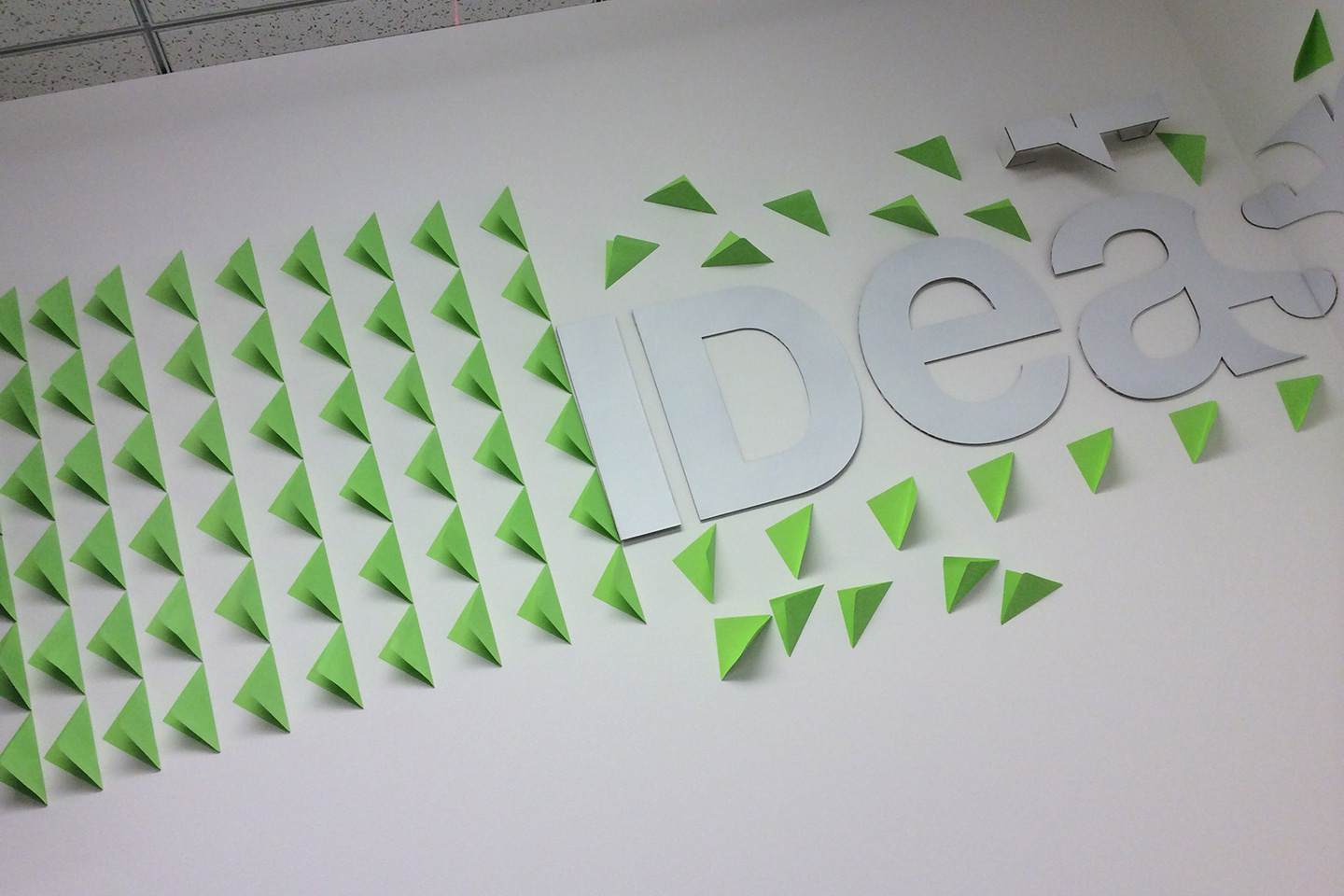
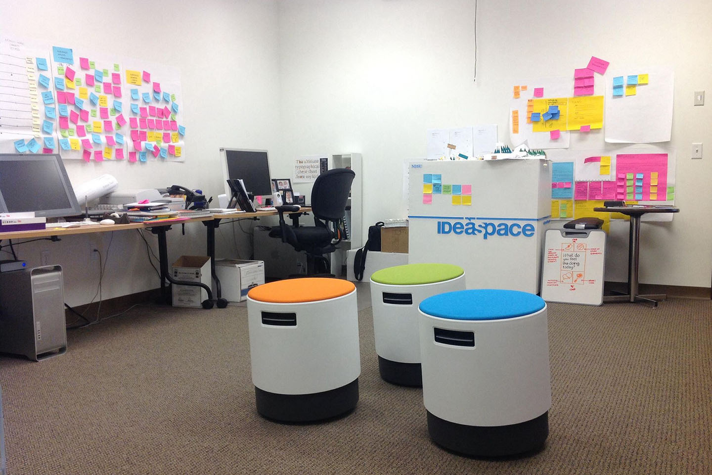
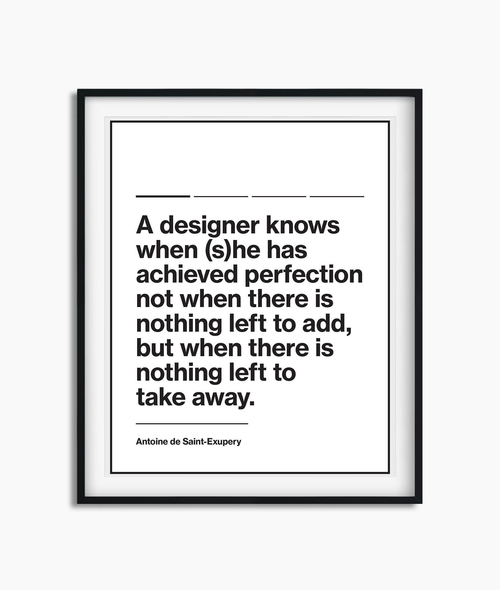
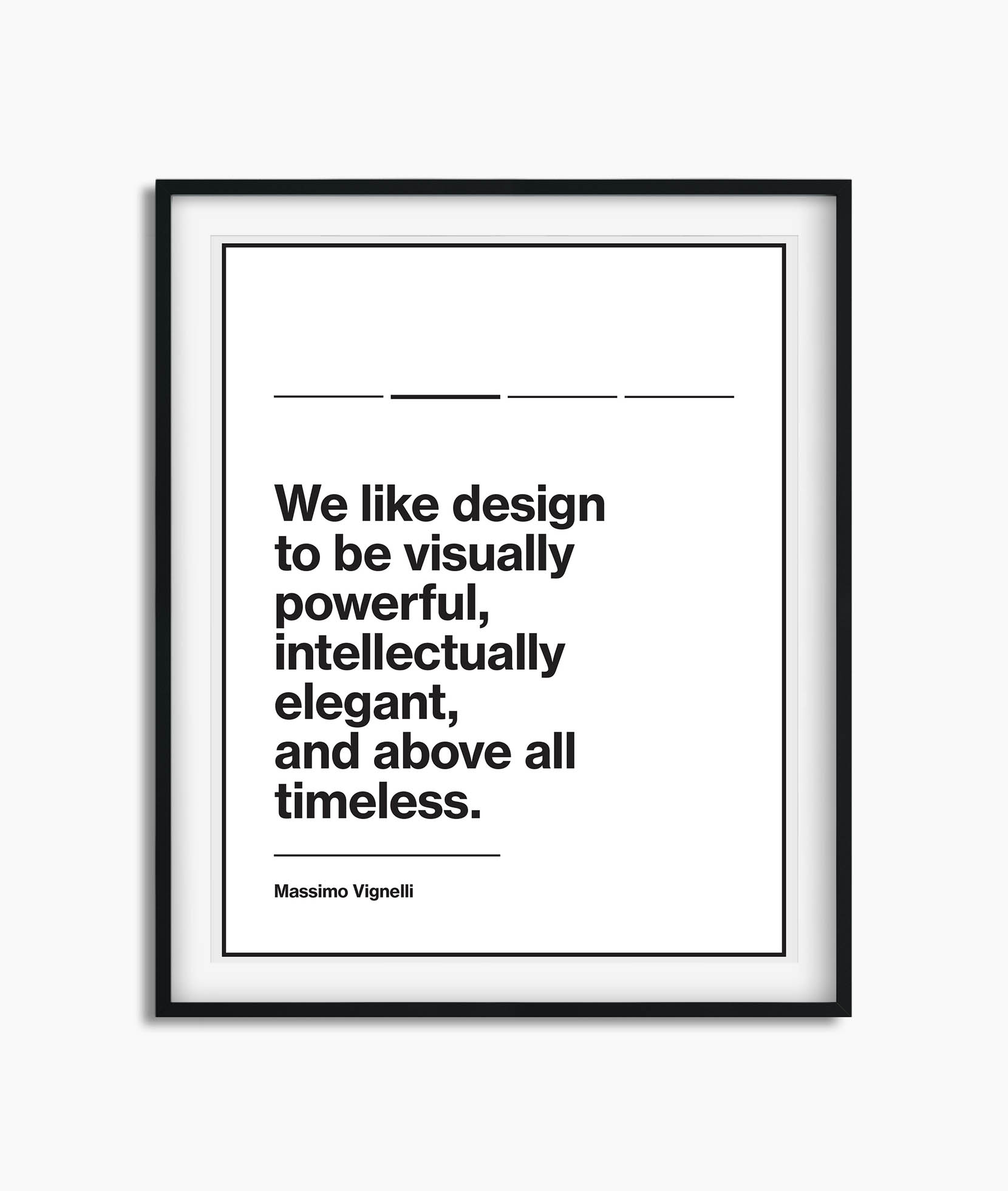
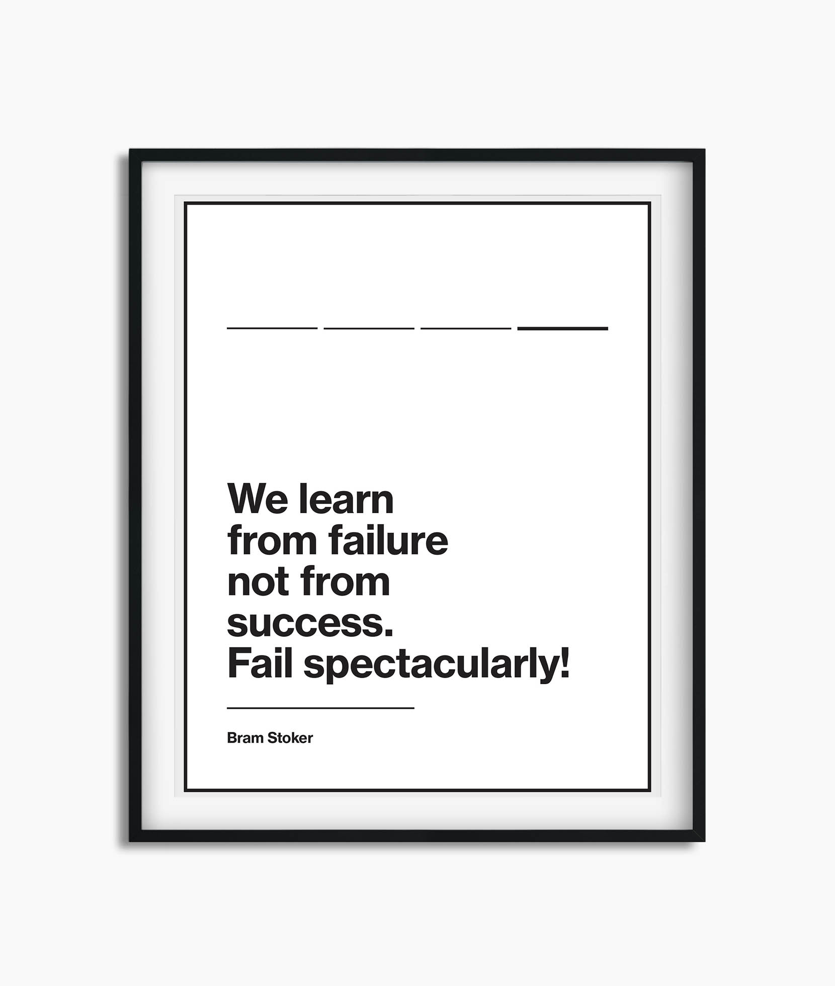
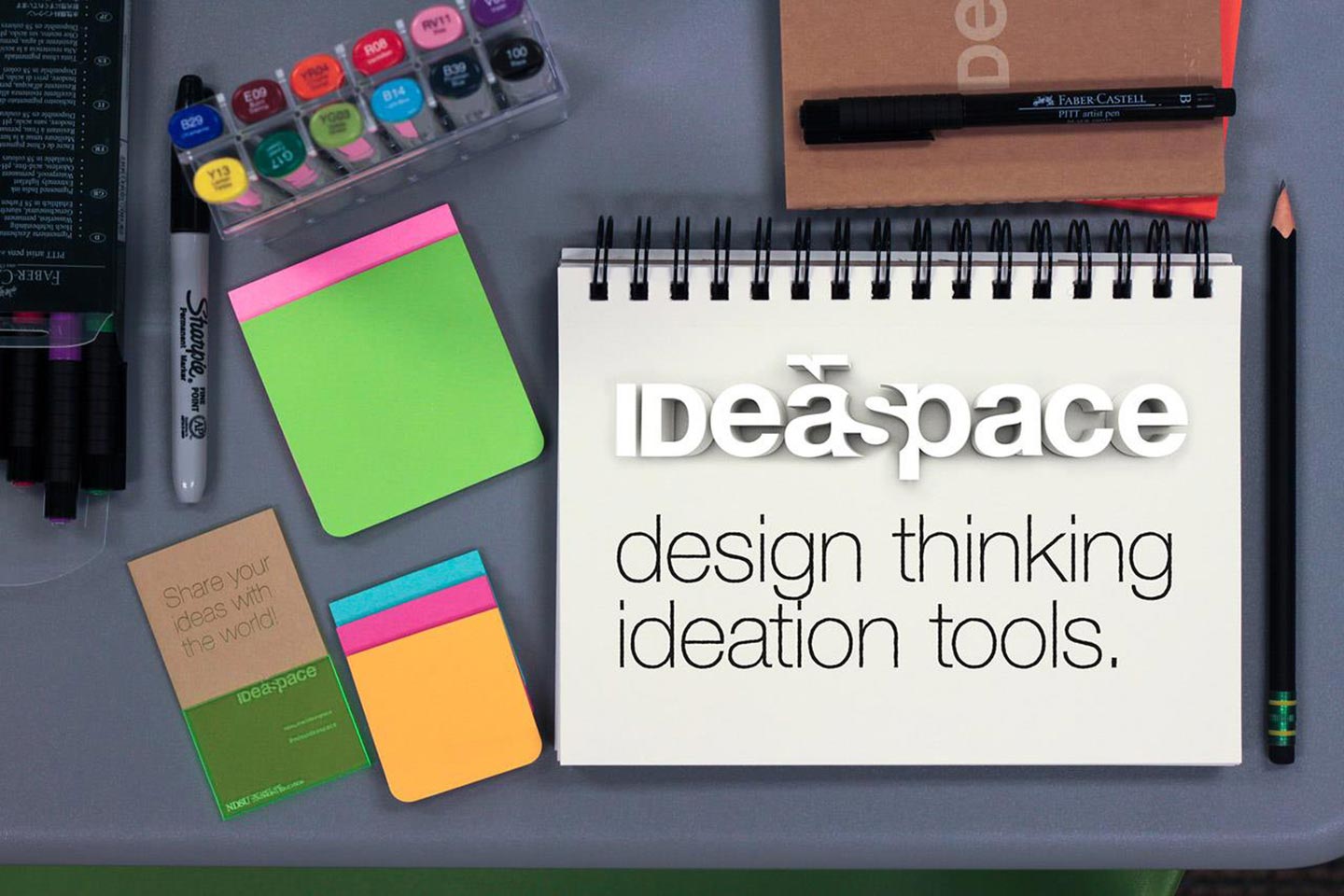
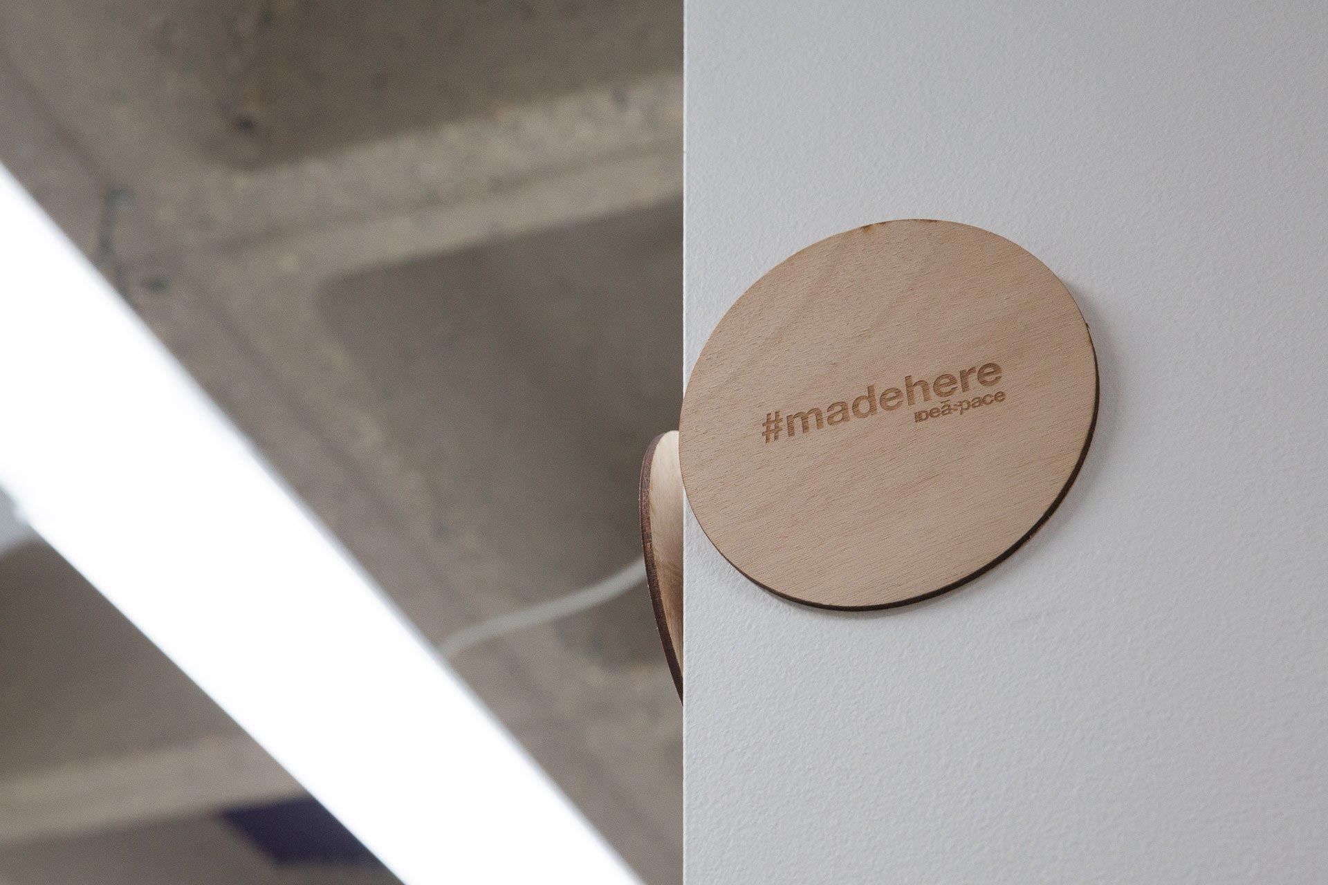
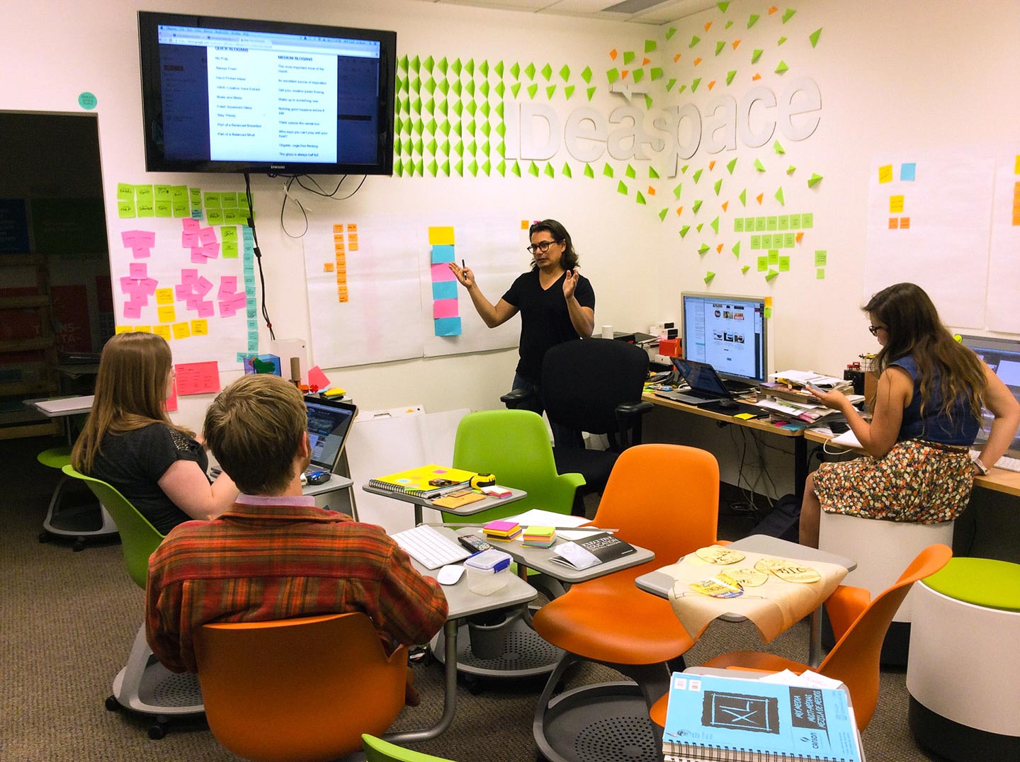
A design studio and makerspace on the North Dakota State University Campus with the goal of nurturing creative confidence in order to empower innovation through design thinking and collaboration of faculty, staff, college students, and K-12 students and teachers. We built interdisciplinary teams with a mix of expertises and passions to provide full solutions in an agile environment.

IDeaspace designed with, and for, departments and student groups on the NDSU campus, held design thinking and coding workshops for the campus and community, and encouraged all who entered to realize that failure could be good and to always think and act with intention.

Notebook open to a page displaying logo concepts for ideaspace
Sketchbook page covered in icon and logo concepts
IDeaspace logo concept in black and white
IDeaspace handwritten in red

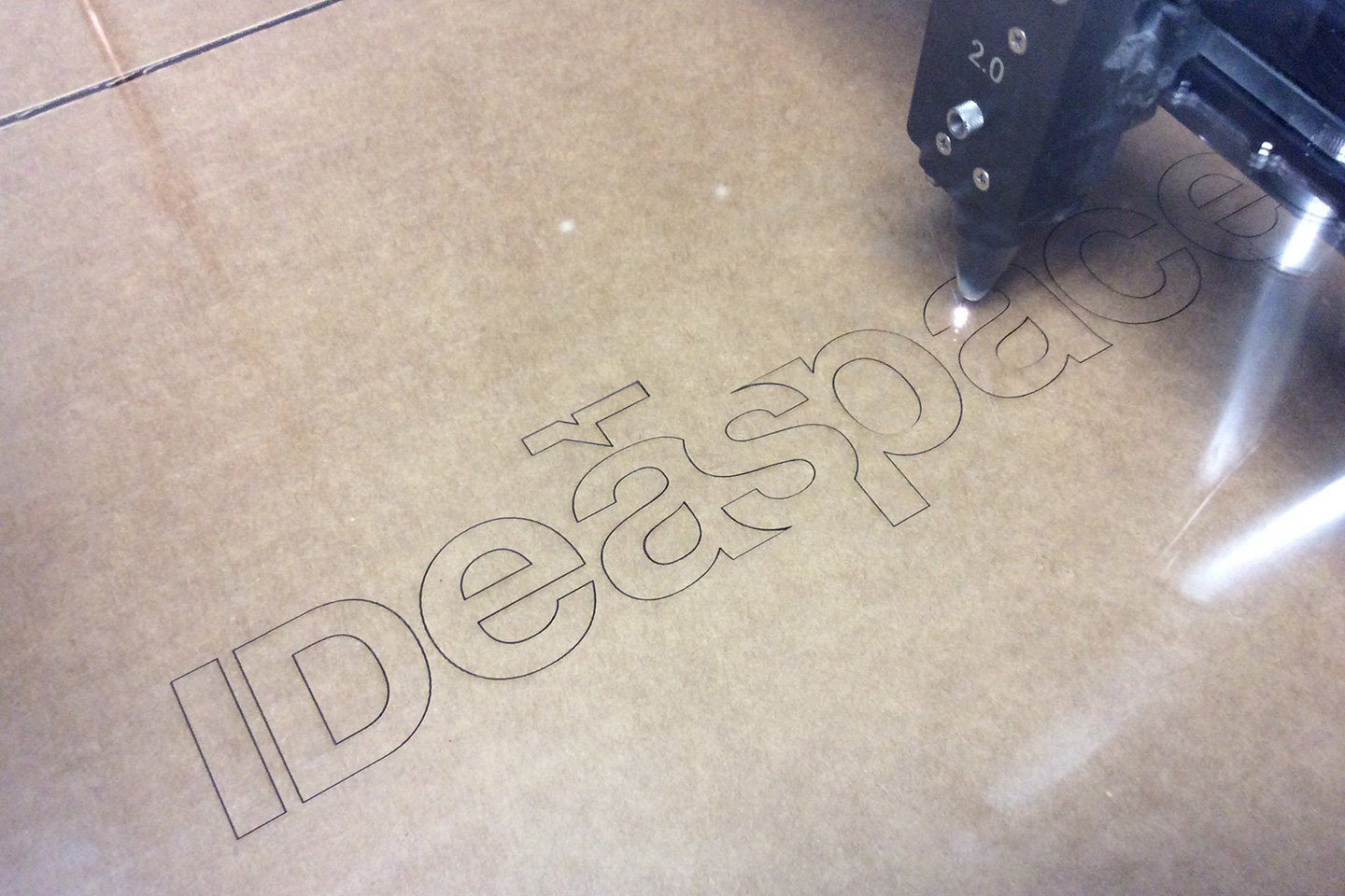
So many ideas for such a short word

A light wood table covered with papers showing various iterations of the IDeaspace logotype
Hands marking up a page featuring IDeaspace logotypes with a red marker

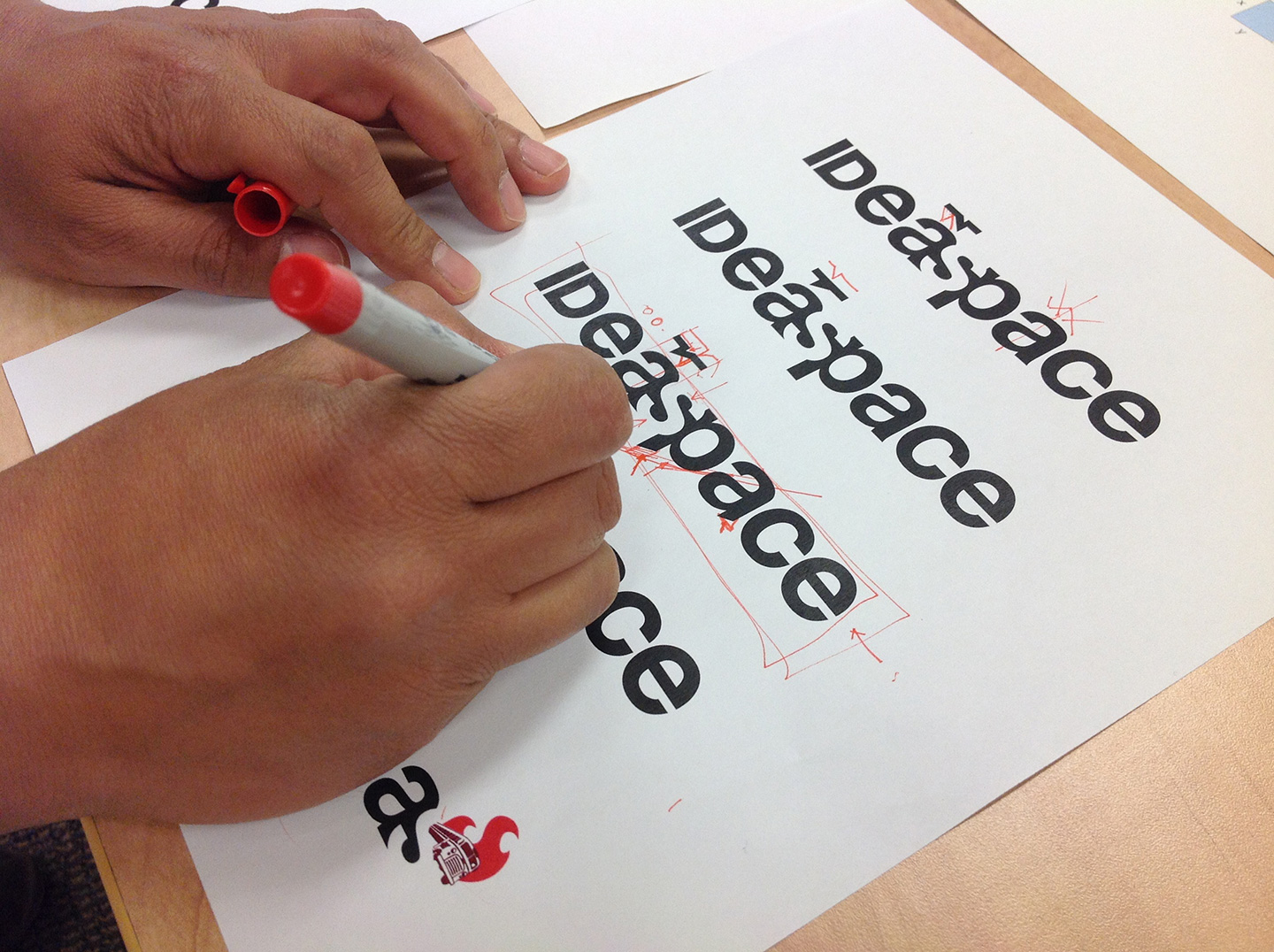
Typesetting details, kerning and tracking.

IDeaspace logotype and color scheme on a white piece of paper
IDeaspace logotype in white on a blue background
IDeaspace logotype in white on a black background
IDeaspace logotype in white on a red background
IDeaspace logotype in white on an orange background
IDeaspace logotype in white on a pink background

The IDeaspace logo was created with the idea to be multifaceted, by leveraging a simple design and the inverse space 'S' it accommodated to busy or simple colors and backgrounds.

Sketch of design studio
Laser cutter cutting the IDeaspace logotype out of clear acrylic
Colored post-it notes and IDeaspace written in blue
Green post-it notes folded in half on a white wall being aligned by a laser line
Green post-it notes on a white wall around the word IDea
The IDeaspace logotype in white on a white wall surrounded by orange and green post-it notes
Colorful stools, post-it notes, and two desks in an office with white walls and brown carpet
White poster with black design quote
A grid of photos of hands holding lime green acrylic in front of famous landmarks across the world

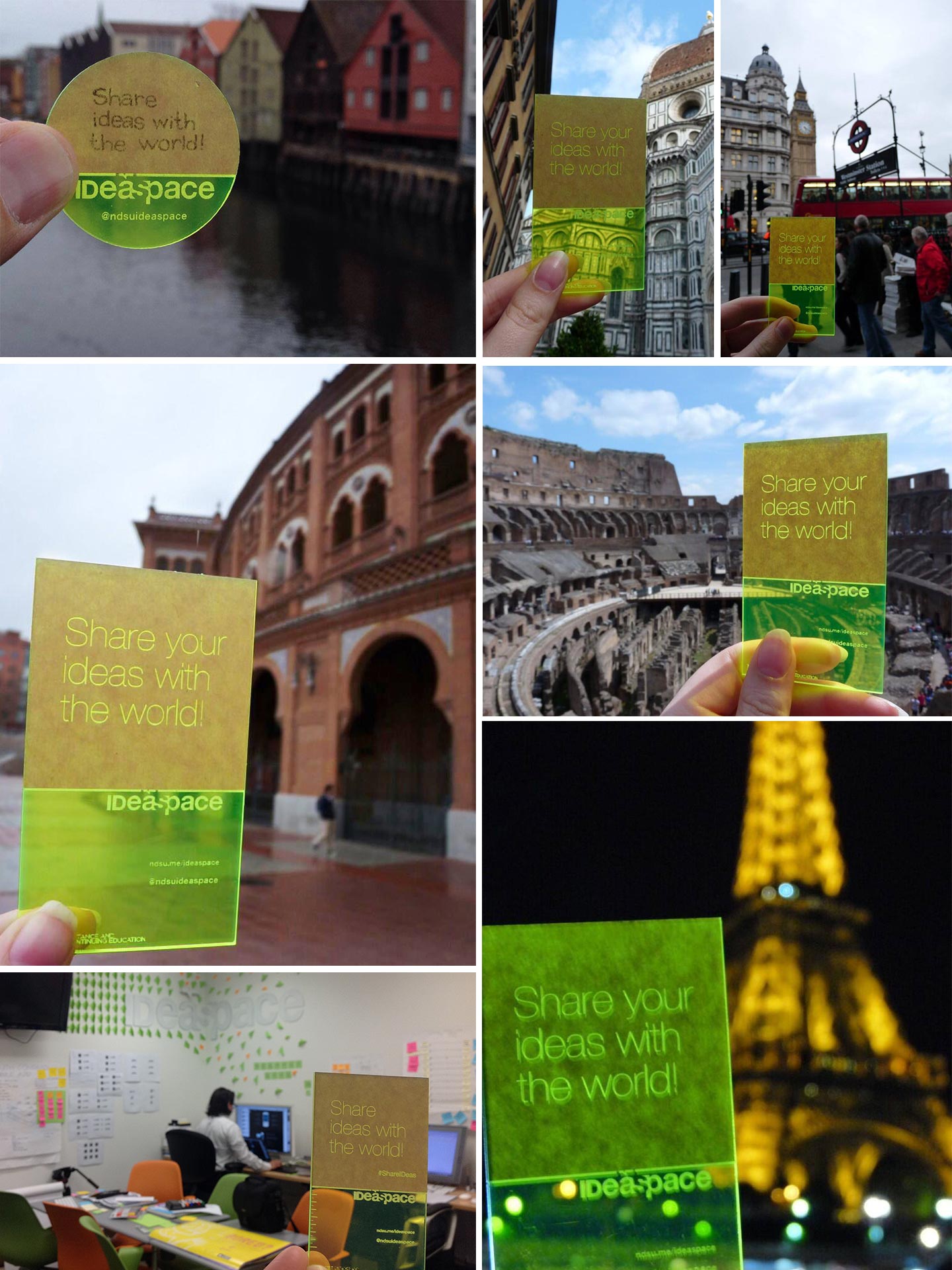
Sharing ideas with the world

A gray desk covered with neatly arranged colorful post-it notes, markers, a sketchbook, pencils
Screen mockup of a trivia question layout

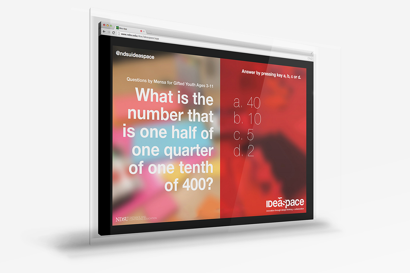
Interactive questionnaire app

Text reading What is IDeaspace? on an orange background
Text reading What is IDeaspace? on a blue background next to three notepads
Text reading What is IDeaspace? on a pink background next to three notepads covered in post-it notes
Whiteboard covered in sketches hanging on a white wall beneath the word empathize
Whiteboard covered in sketches hanging on a white wall beneath the word define
Whiteboard covered in sketches hanging on a white wall beneath the word ideate
Whiteboard covered in sketches hanging on a white wall beneath the word prototype
Whiteboard covered in sketches hanging on a white wall beneath the word test

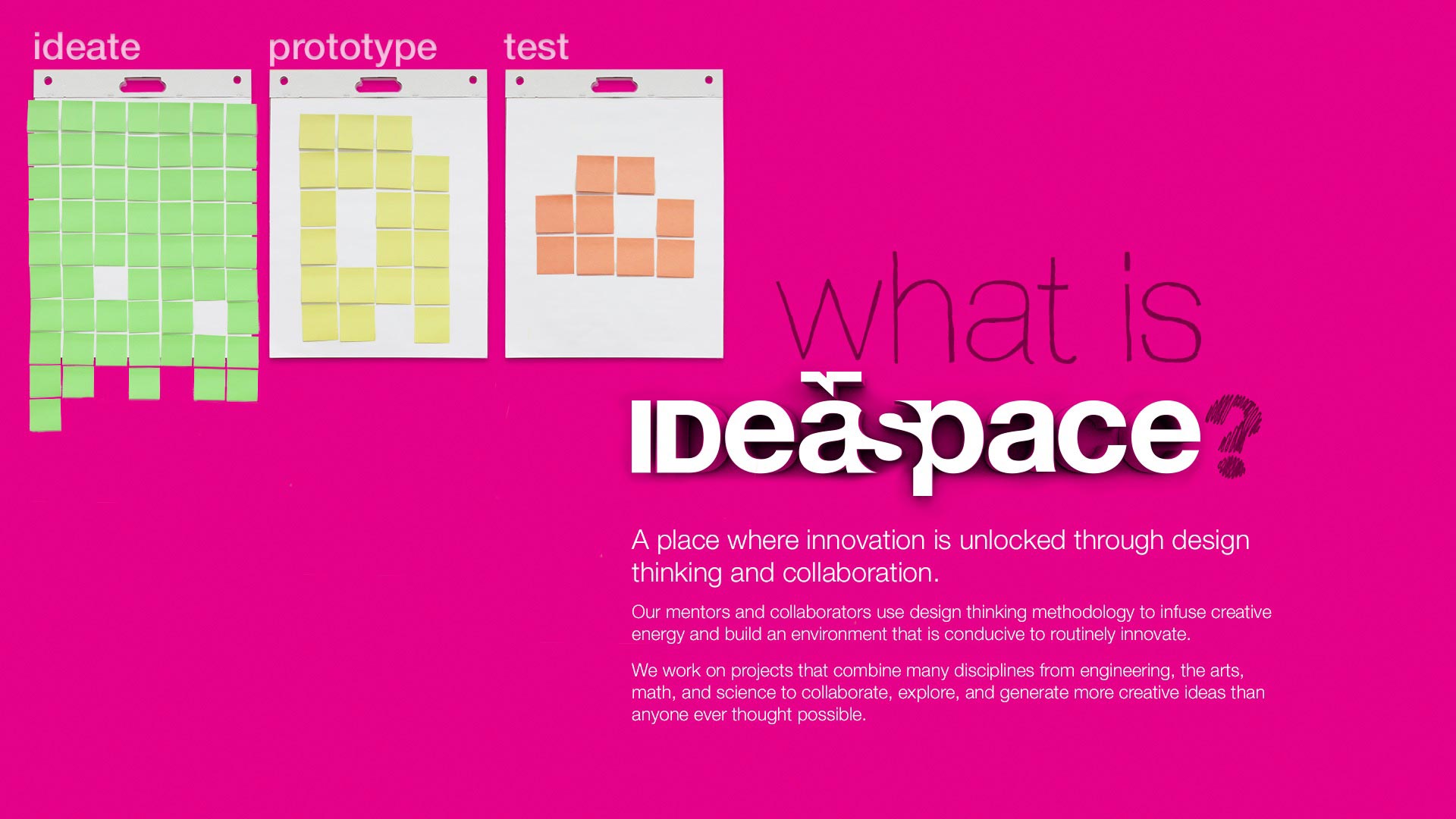
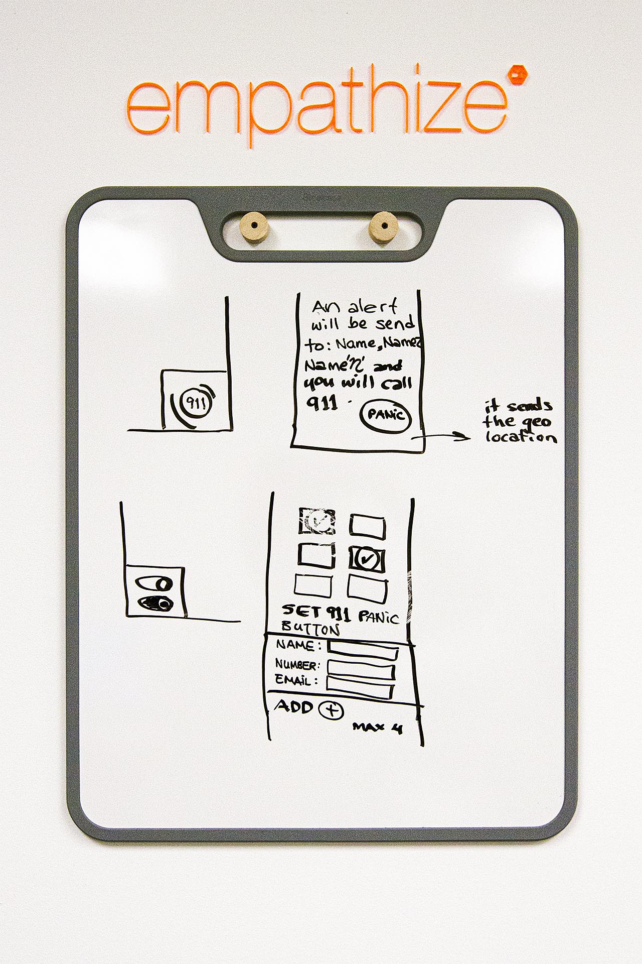
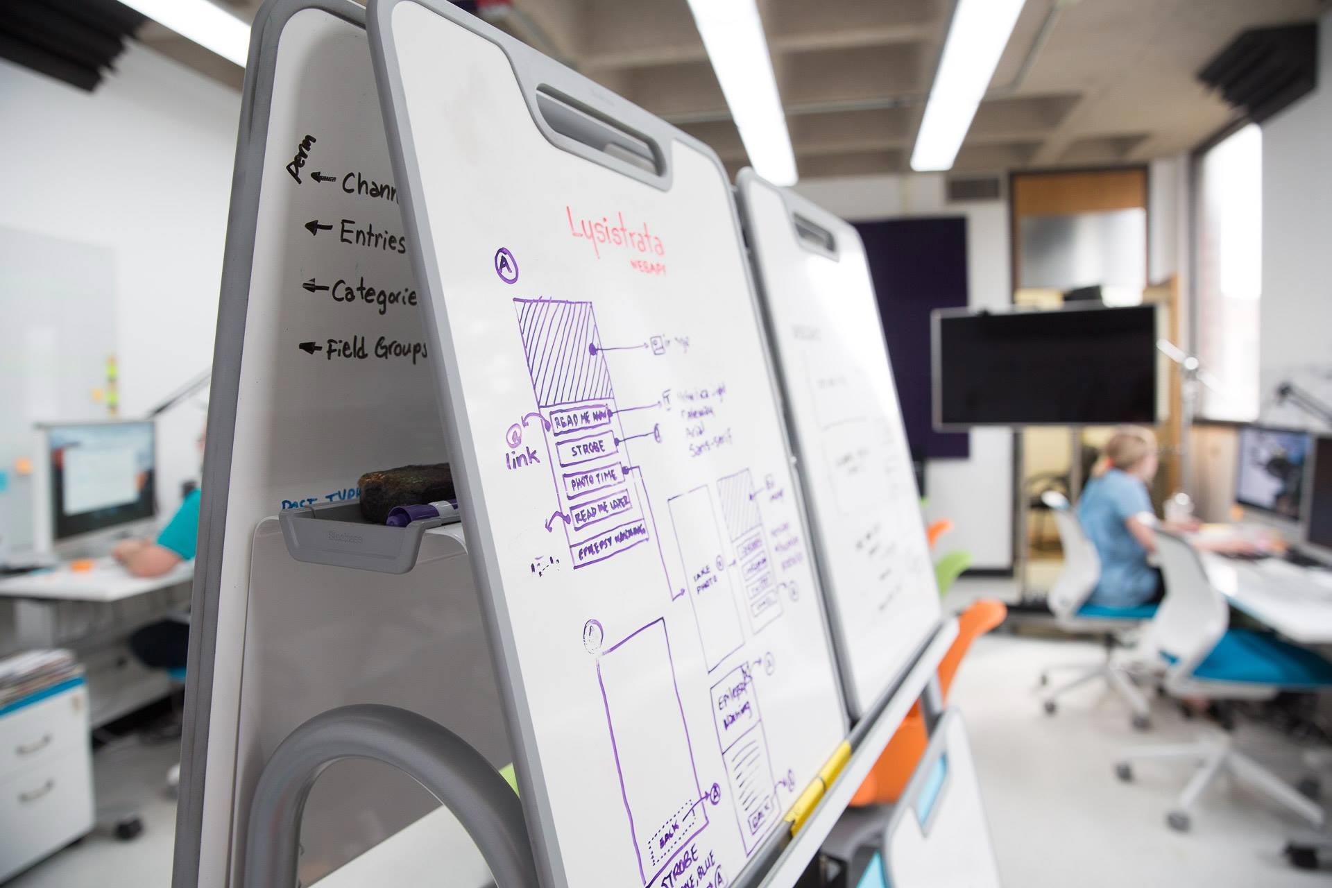
IDeaspace's team followed the design thinking methodology and process and noted every step of a project to make sure everyone knew in what task or iteration every project were.

Wooden circle etched with #madehere hanging on the corner of a white wall
Easel of whiteboards with a TV and desks in the background
TRANSPORTATION written in white on an orange background with white and green line illustrations as accents

Transportation Leadership Graduate Certificate

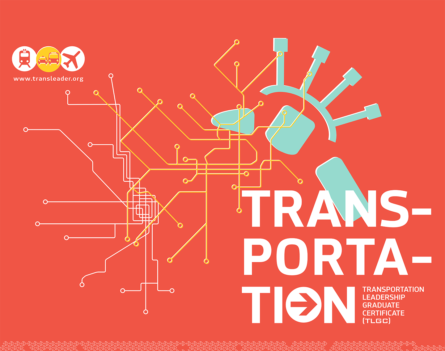
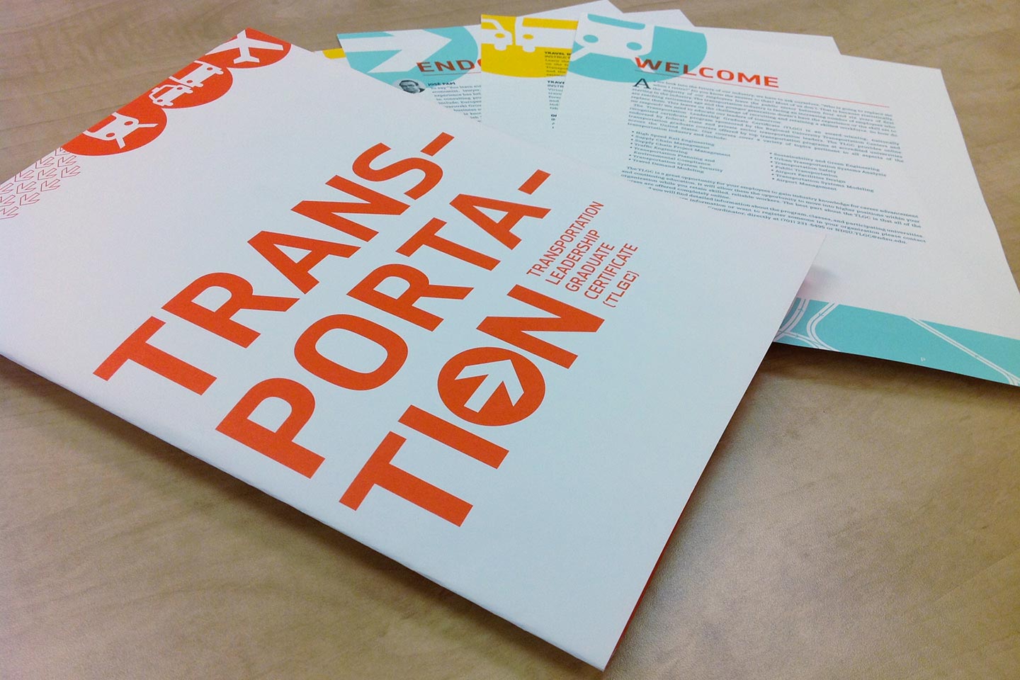
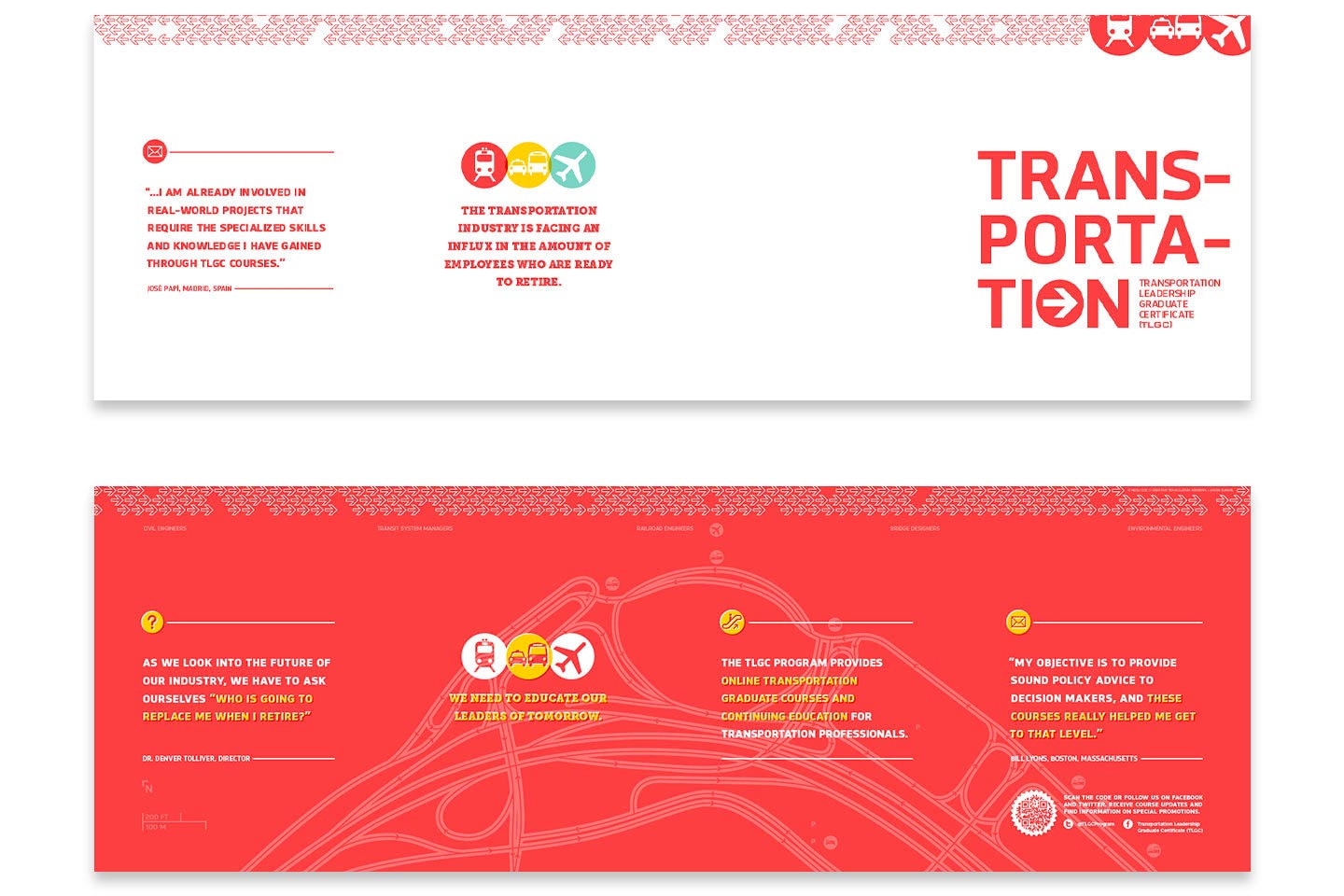
With changing demographics and trends in the transportation industry, an undergraduate certificate program created opportunities for professional growth and career advancement and development.

We combined elements of public transportation: water, air, and land, in order to create a powerful and rich message for those in the transportation industry wanting to continue their education. The iconography, based on AIGA's transportation icon set, contributes to the common voice of the industry.

A large white notepad covered in notes next to a box of markers on a wood table
Two hands turning a page and drawing on the corner of the following page
Two hands folding a transportation brochure atop a light blue gridded cutting mat
Two hands folding a transportation brochure atop a light wood table

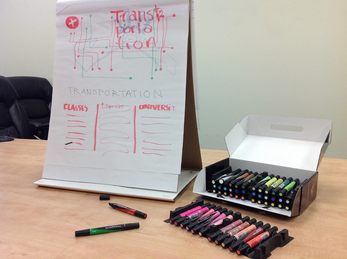
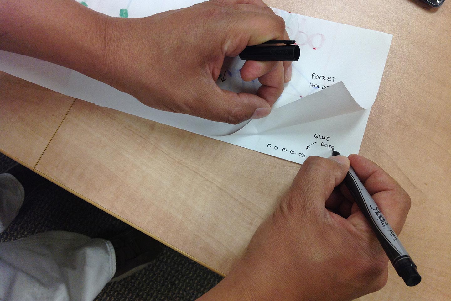
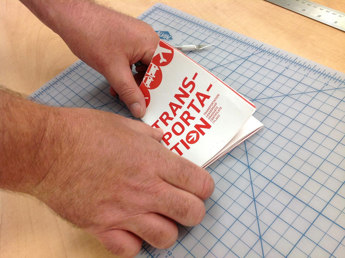
Prototyping the brochure, counting folds and pages

We chose a strong orange that required custom creation to be highly visual with the blue and yellow selected as secondary accents. The materials were designed with the feel of letterpress to resemble traditional map systems. The map graphics used reflect New York La Guardia Airport, Chicago's L-Train, and Philly's SEPTA.

Color swatches and printing proofs of transportation brochure and poster

Press color check

Orange, green, and white transportation posters
Close-up of white text on red background of transportation brochure
Color swatches and printing proofs of transportation brochure and poster
Four white, orange, blue, and yellow transportation brochures fanned out on a light wood table
Two stacks of orange transportation posters sitting beside yellow and blue stacks of letterhead

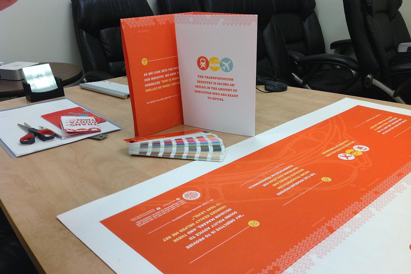
Posters printed, packet ready for assembly

Blue and yellow letterhead design for the transportation leadership graduate course

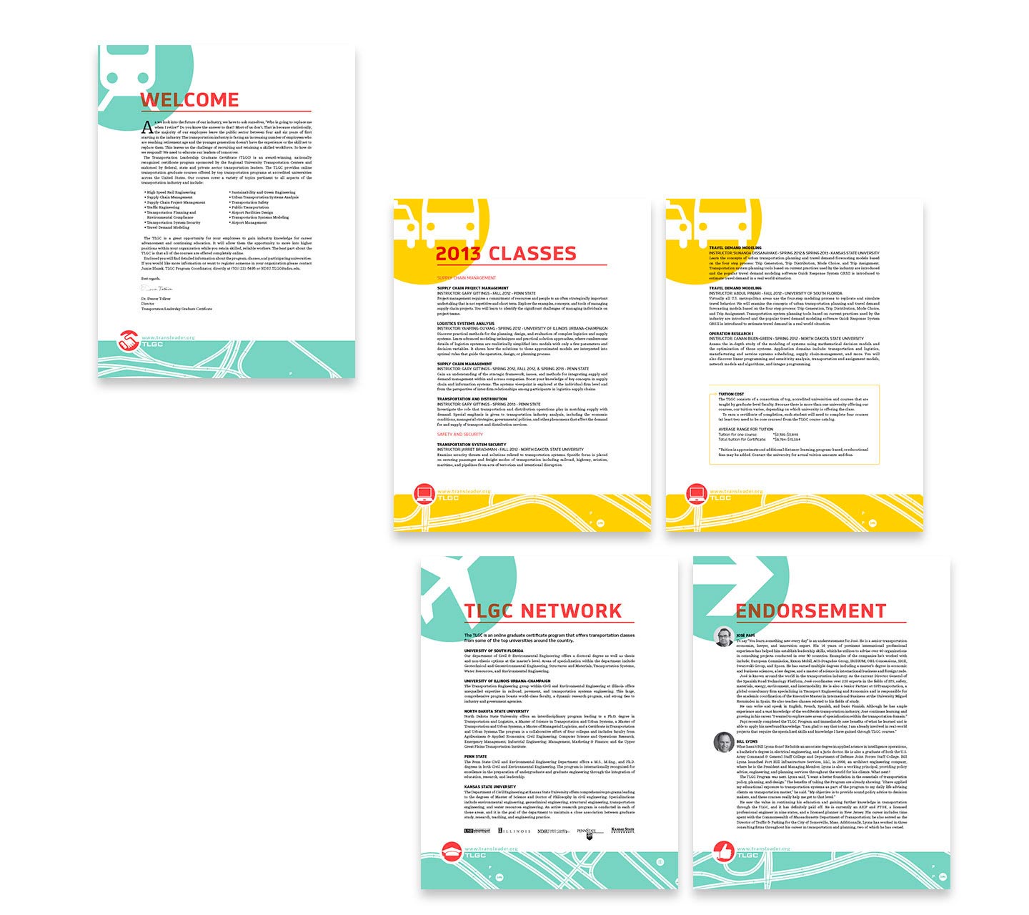
TLGC individual packet sheets

Unfolded view of orange and white transportation brochure front and back on white background
TRANSPORTATION written in white on an orange background with white and green line illustrations as accents
Laptop on white table in front of wood and yarn installation

OTA: Fargo 2014

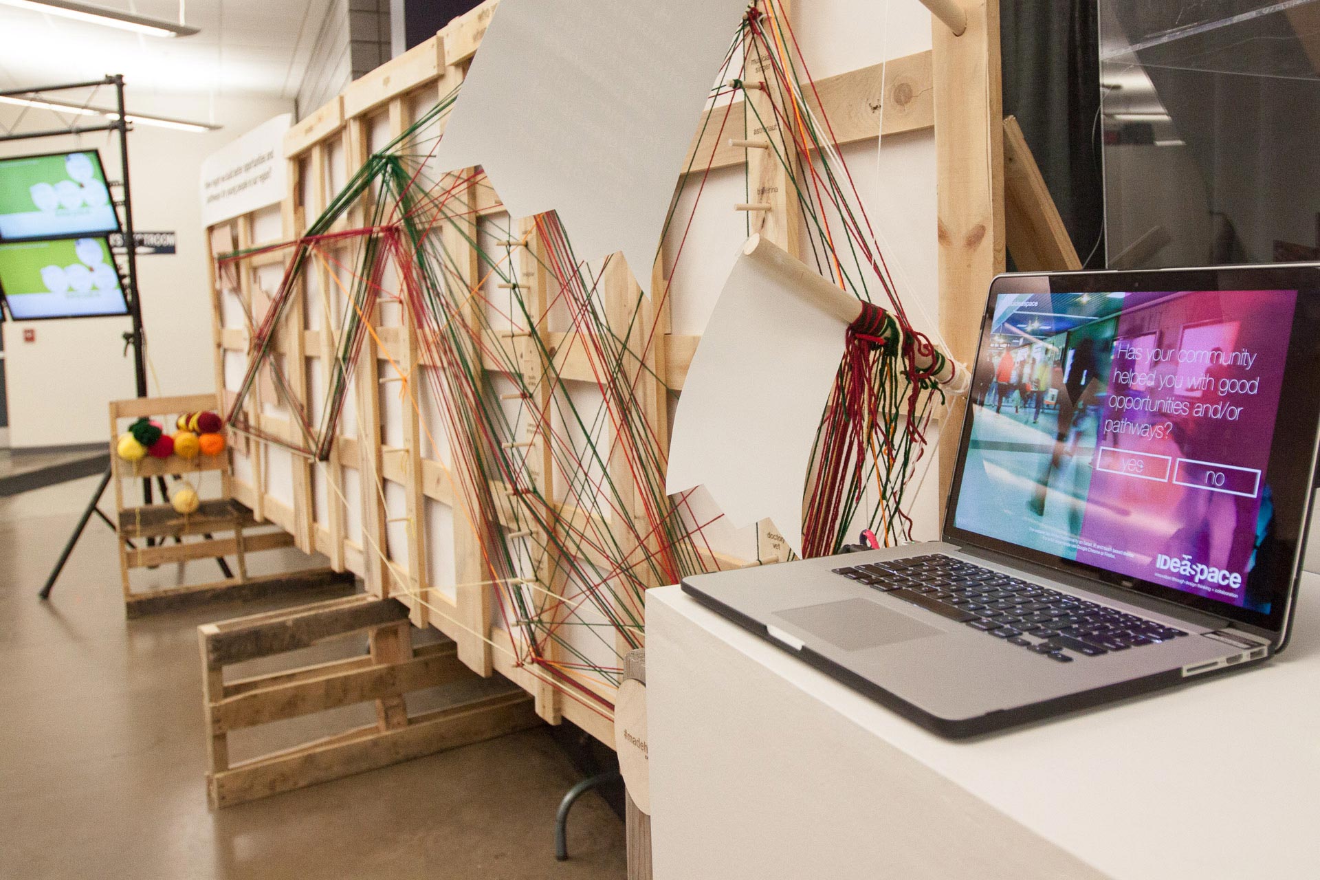
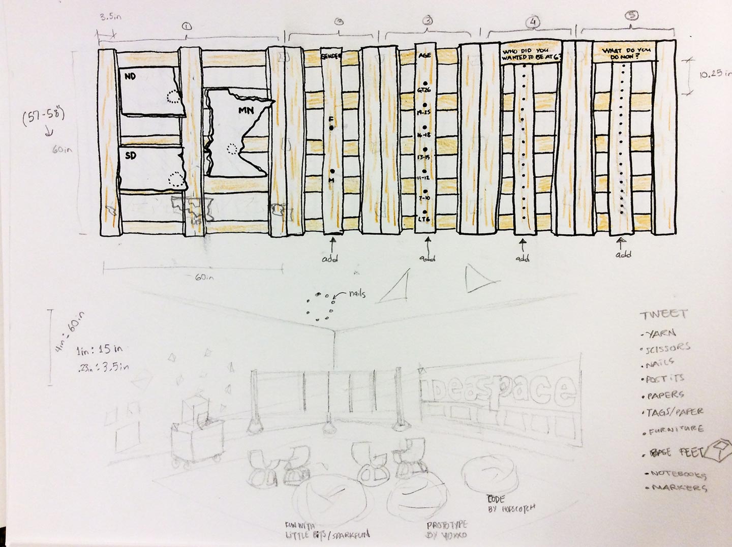
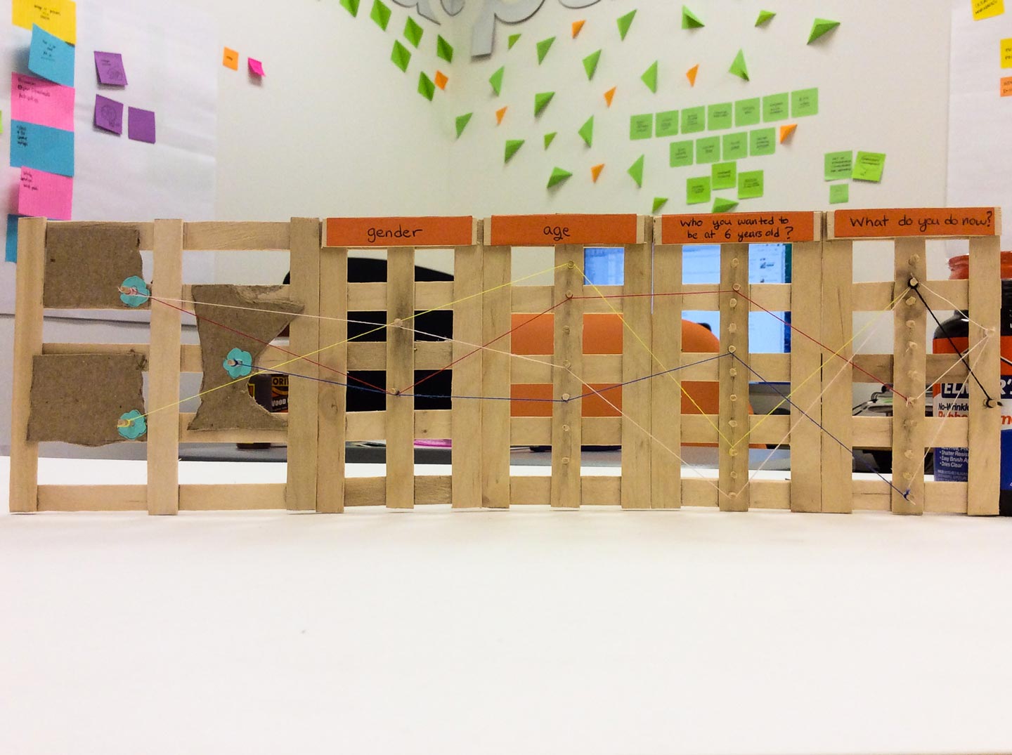
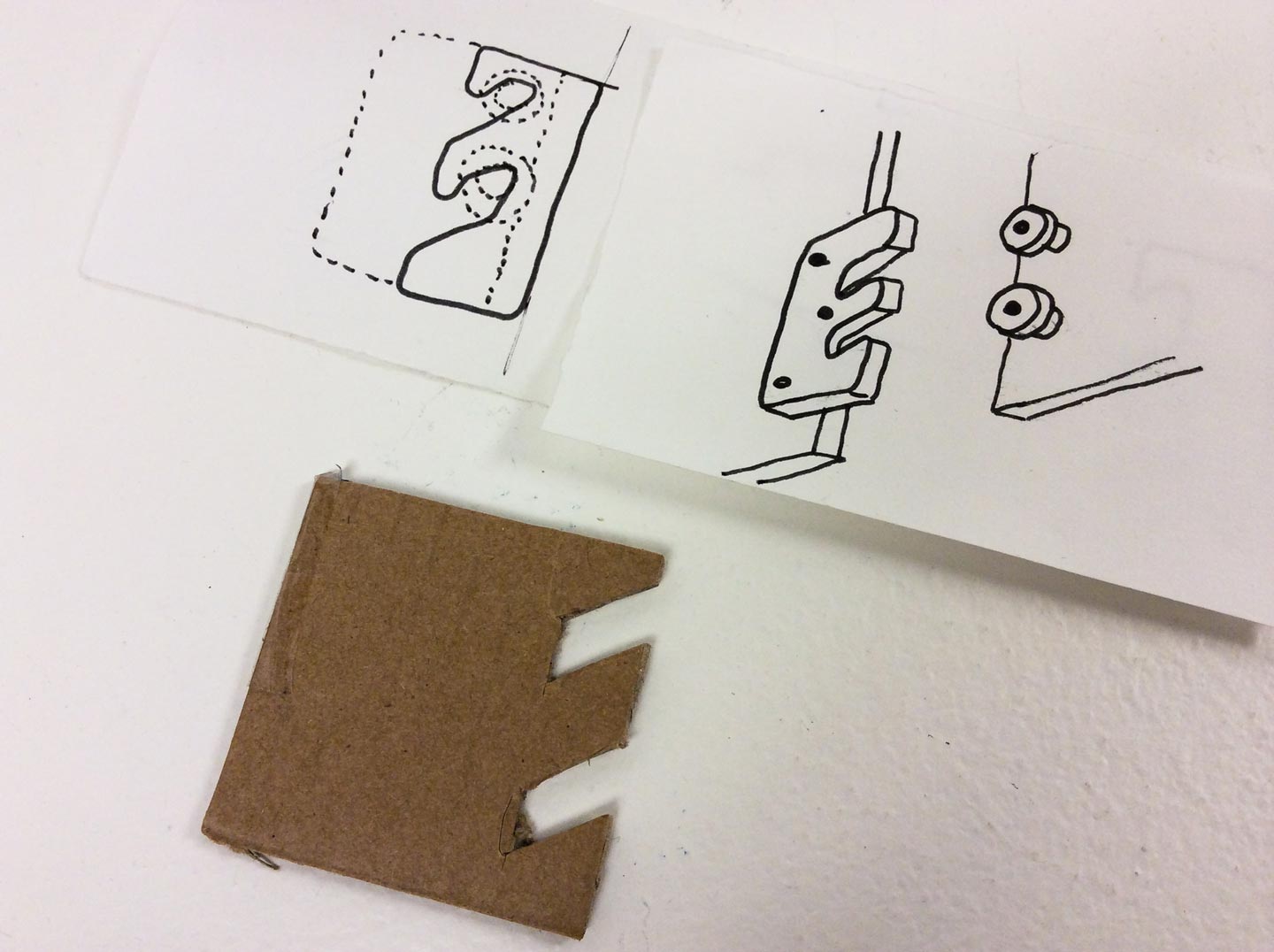
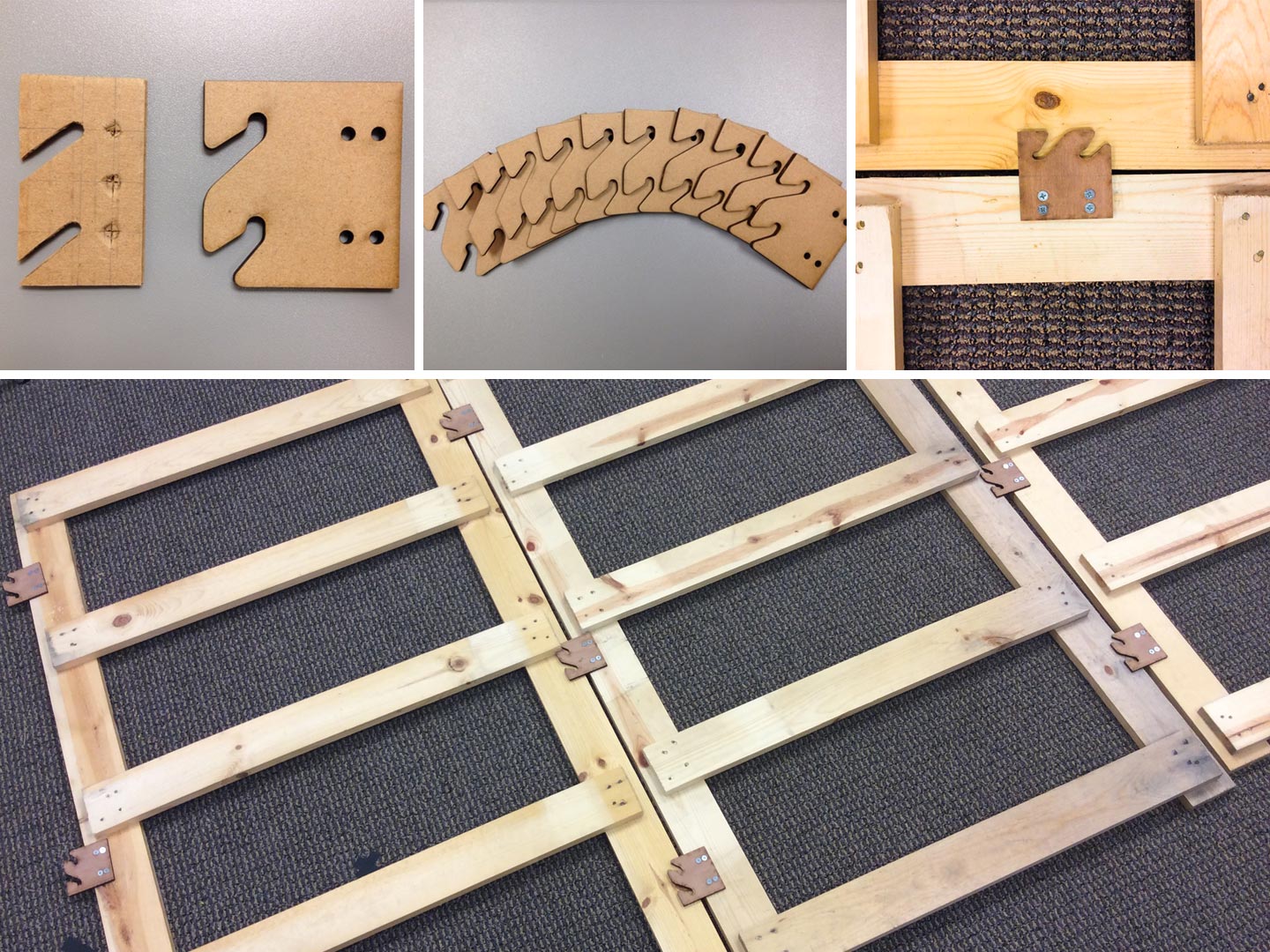
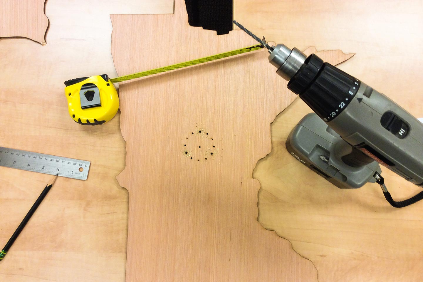
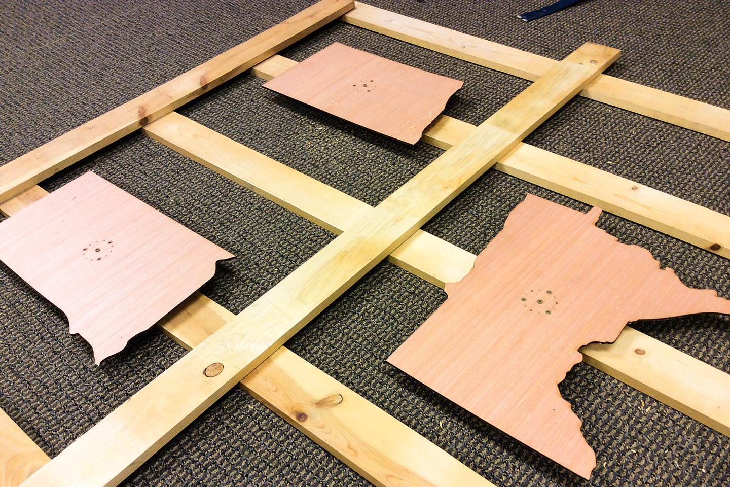
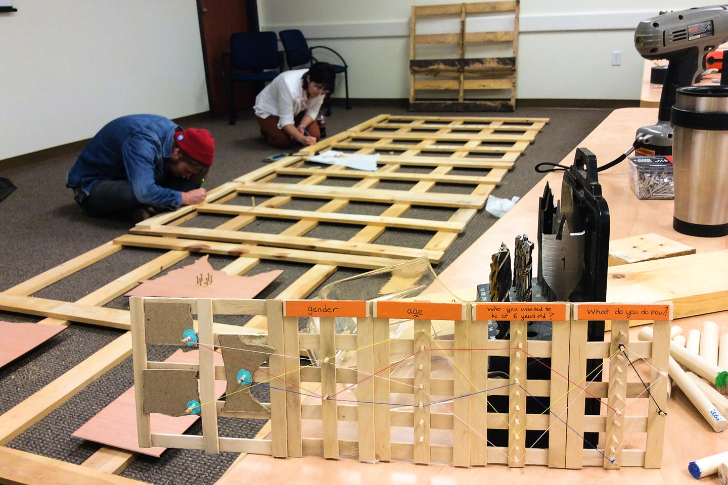
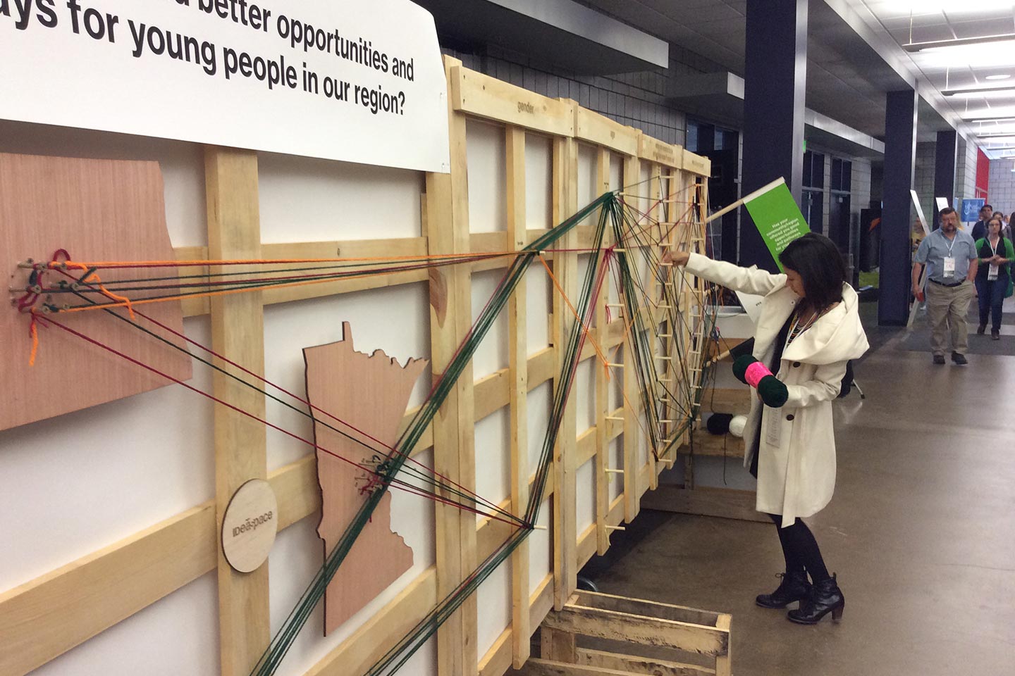
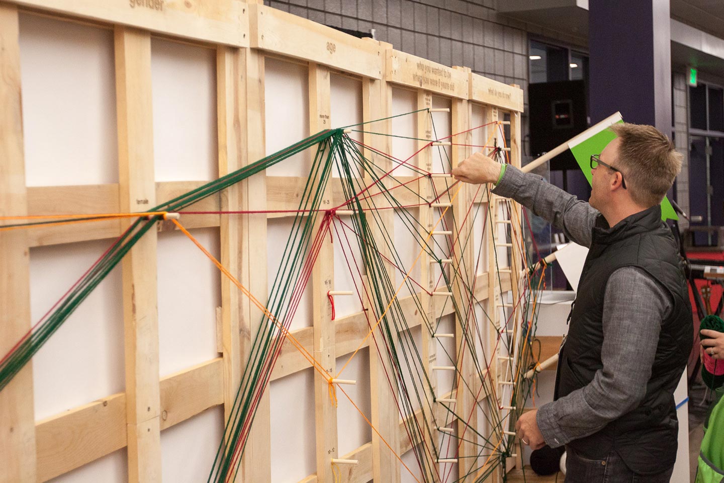
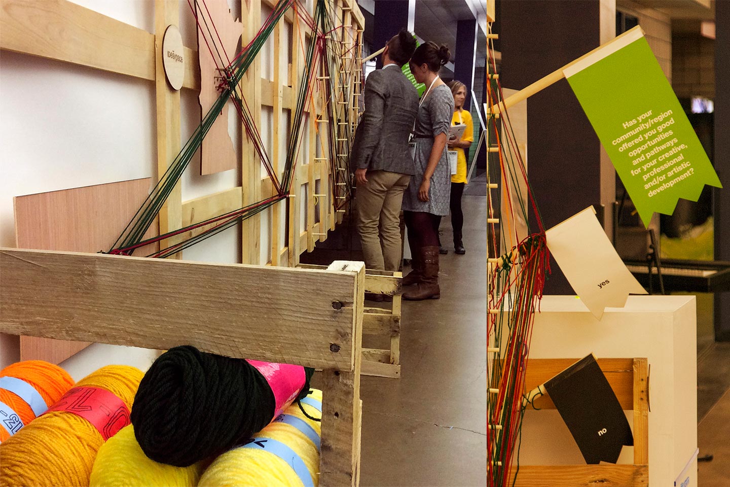
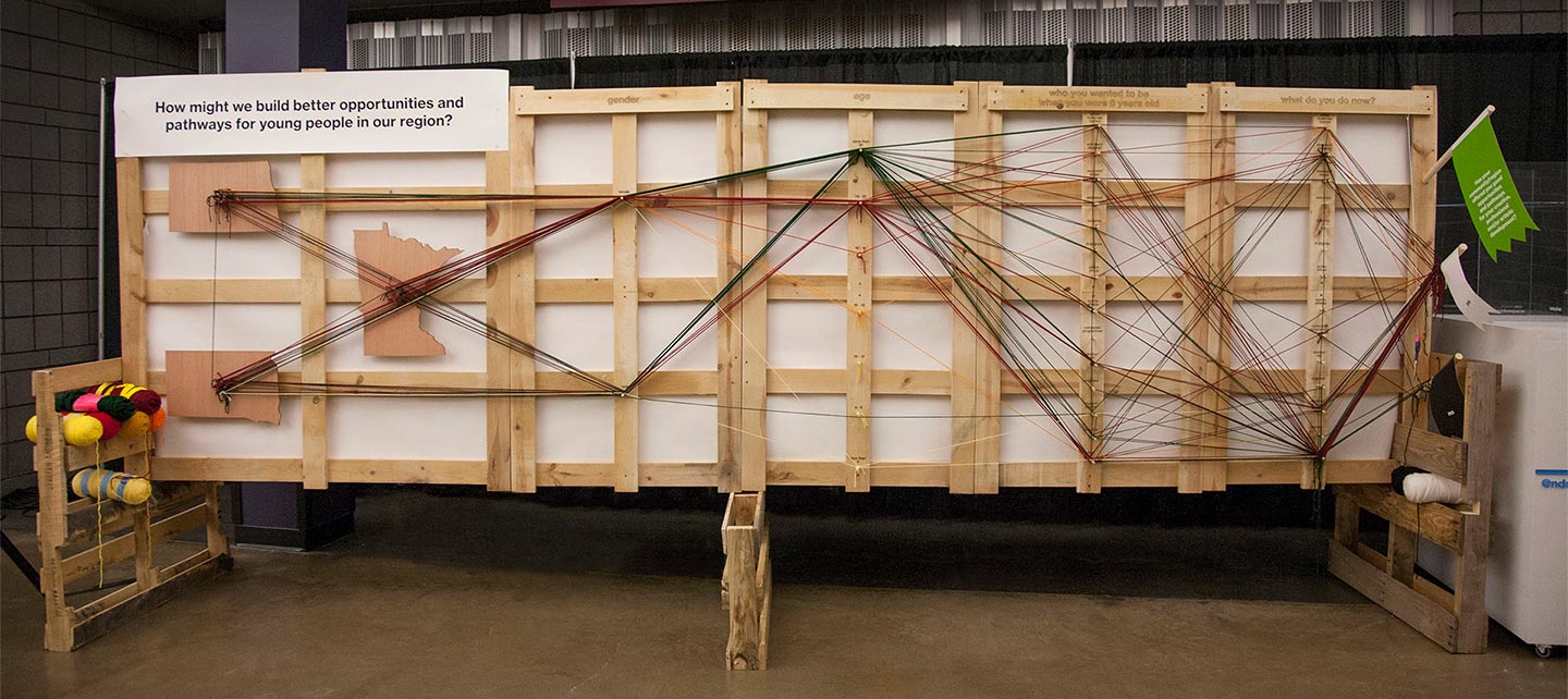
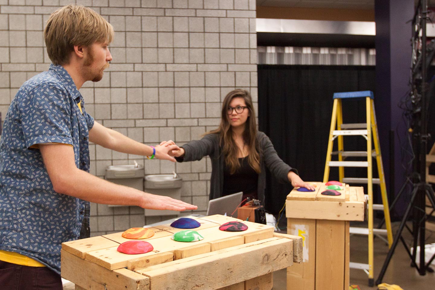
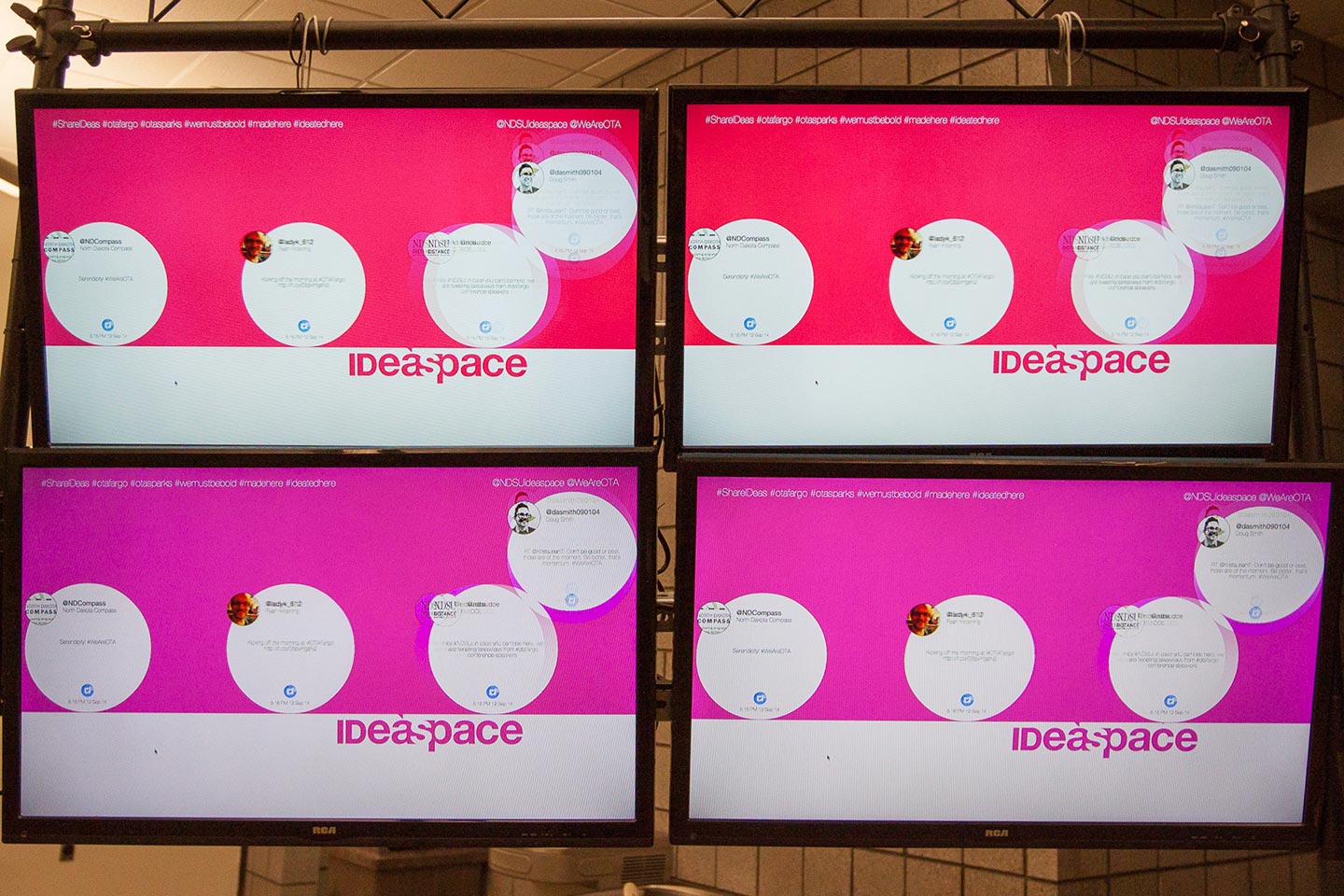
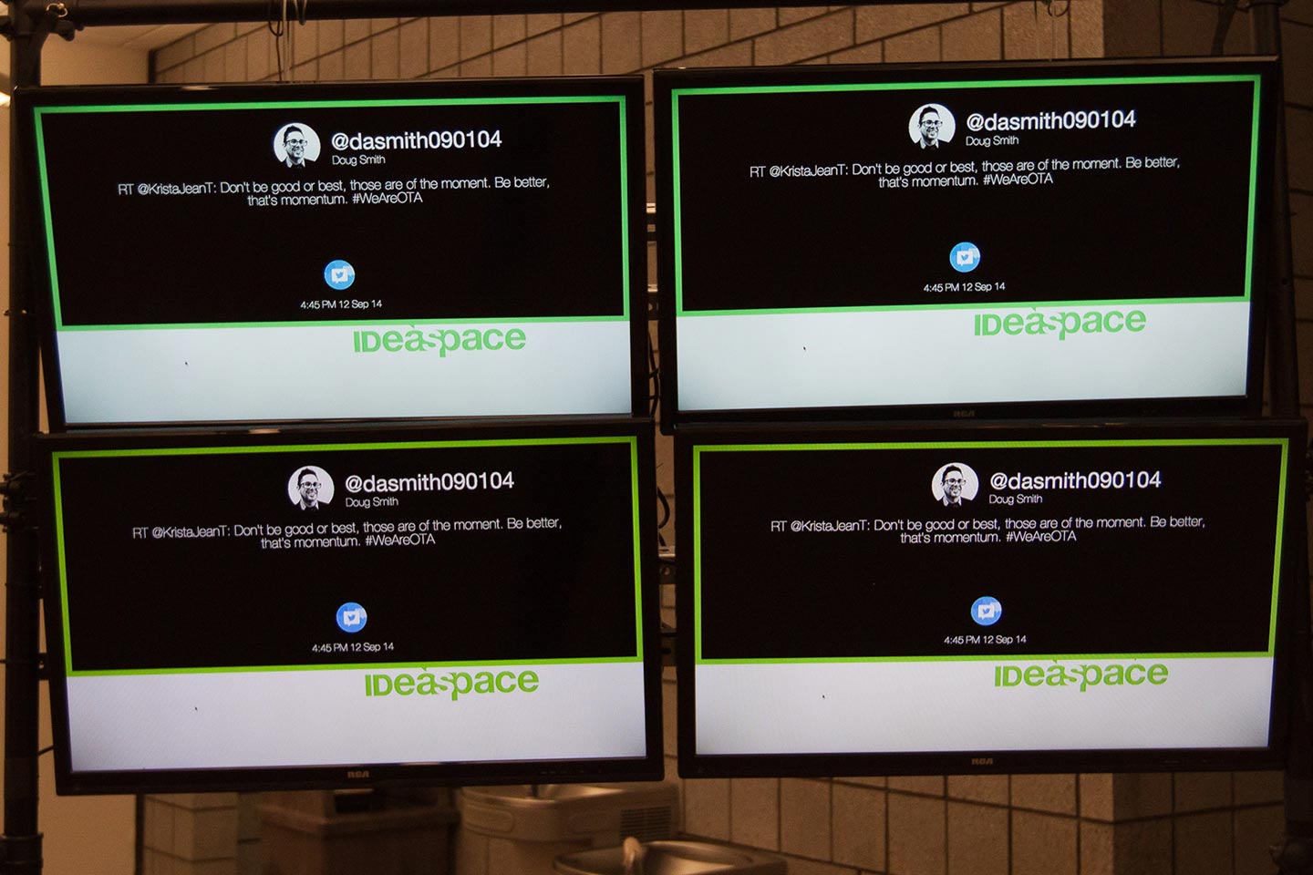
We collaborated with students across several disciplines to create a series of interactive pieces for 2014 OTA: Fargo, an event to connect and celebrate creatives in North Dakota, South Dakota, and Minnesota.

The live infographic for the event involved collaborating with students in Architecture, Women's Studies, and Communication. The idea behind the interactive chart was to showcase whether or not the region has provided them with career pathways.

Man standing in front of students in colorful desks in white studio with colored post-it notes on the walls
Sketch for construction of wooden structure containing outlines of North Dakota, South Dakota, and Minnesota
Sketch for construction of wooden structure containing outlines of North Dakota, South Dakota, and Minnesota and prototype

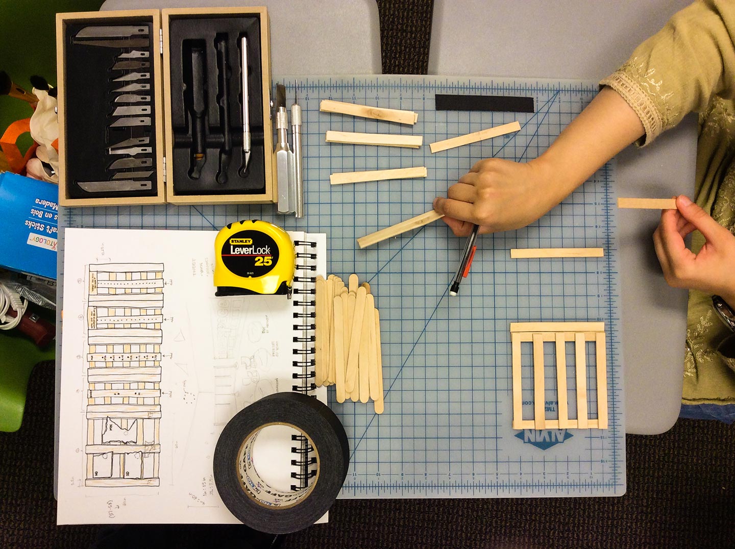
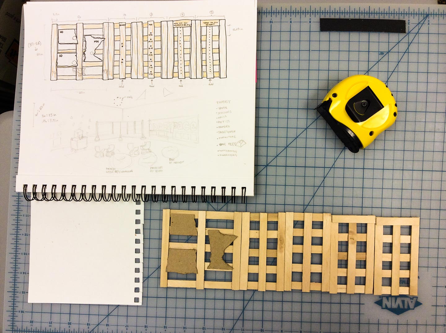
Constructing the prototype

Small prototype of wooden structure containing outlines of North Dakota, South Dakota, and Minnesota
Sketch and prototype of small wooden bracket
Wooden brackets and prototypes of OTA installation
Drill, tape measure, and wood in the shape of Minnesota
Wooden structure with wood outlines of North Dakota, South Dakota, and Minnesota mounted on it
Two people assembling wooden structure with small prototype in the foreground
Close-ups of wood and yarn installation
Woman interacting with wood and yard installation
Man interacting with wood and yard installation
Group of people looking at wooden installation with yard in foreground
Large installation made from wood and yarn

Additionally, we created an interactive drum kit implementing HTML5/CSS3 and Javascript to build a musical display triggered by human touch using a makeymakey by Sparkfun.

Chalk on concrete floor that reads: connect here to make sparks that sound
Man and woman holding hands while interacting with makey makey clay installation

A "Tweet Wall" was created, based on Twitter's Streaming API, to show realtime tweets. This allowed people in attendance to see what others were posting and sharing about the event.

Four TV screens displaying interactive installation digital interface in pink and red
Four TV screens displaying interactive installation digital interface in black and white
iPhone and iPad mockups displaying godoo app

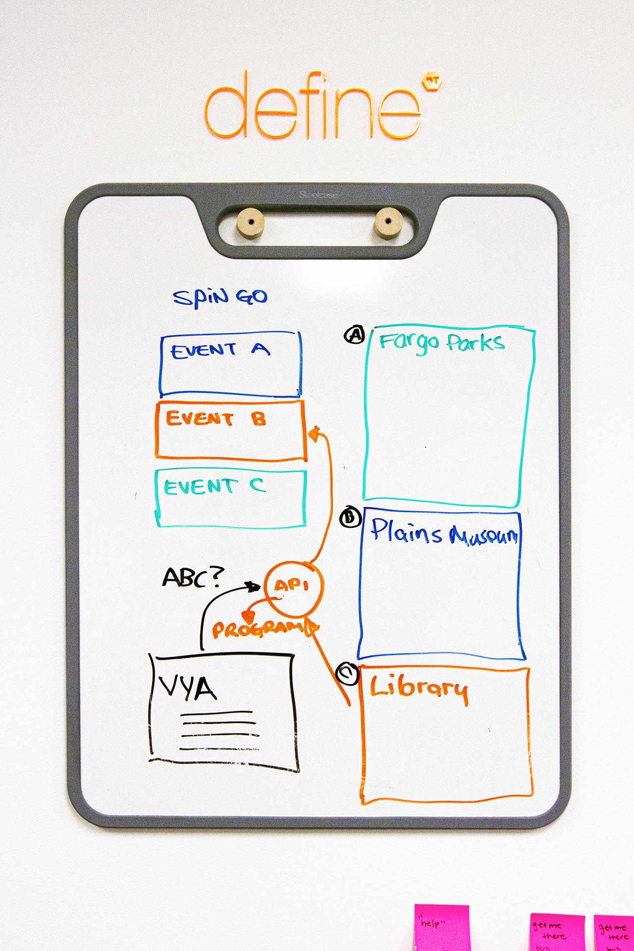
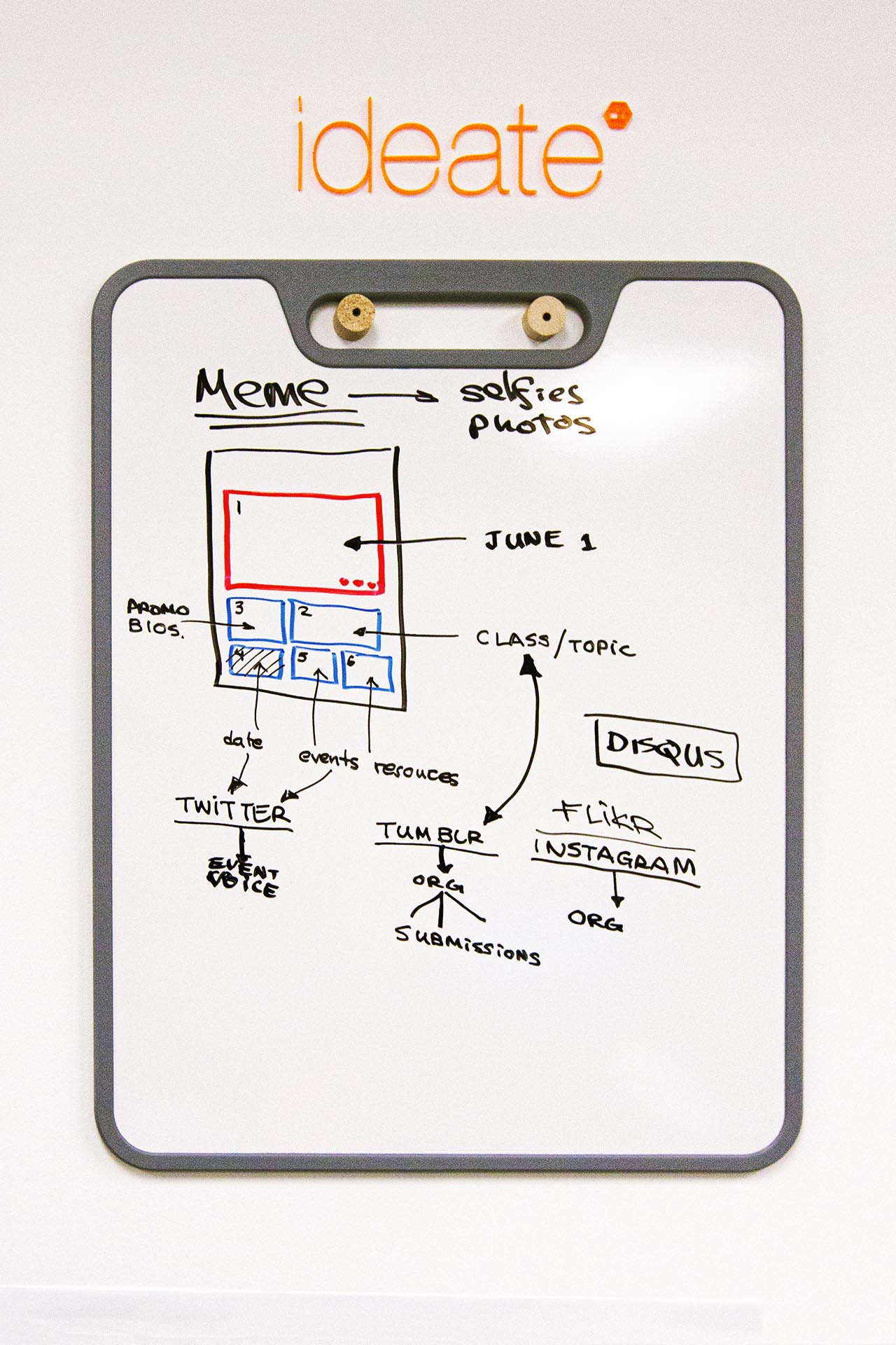
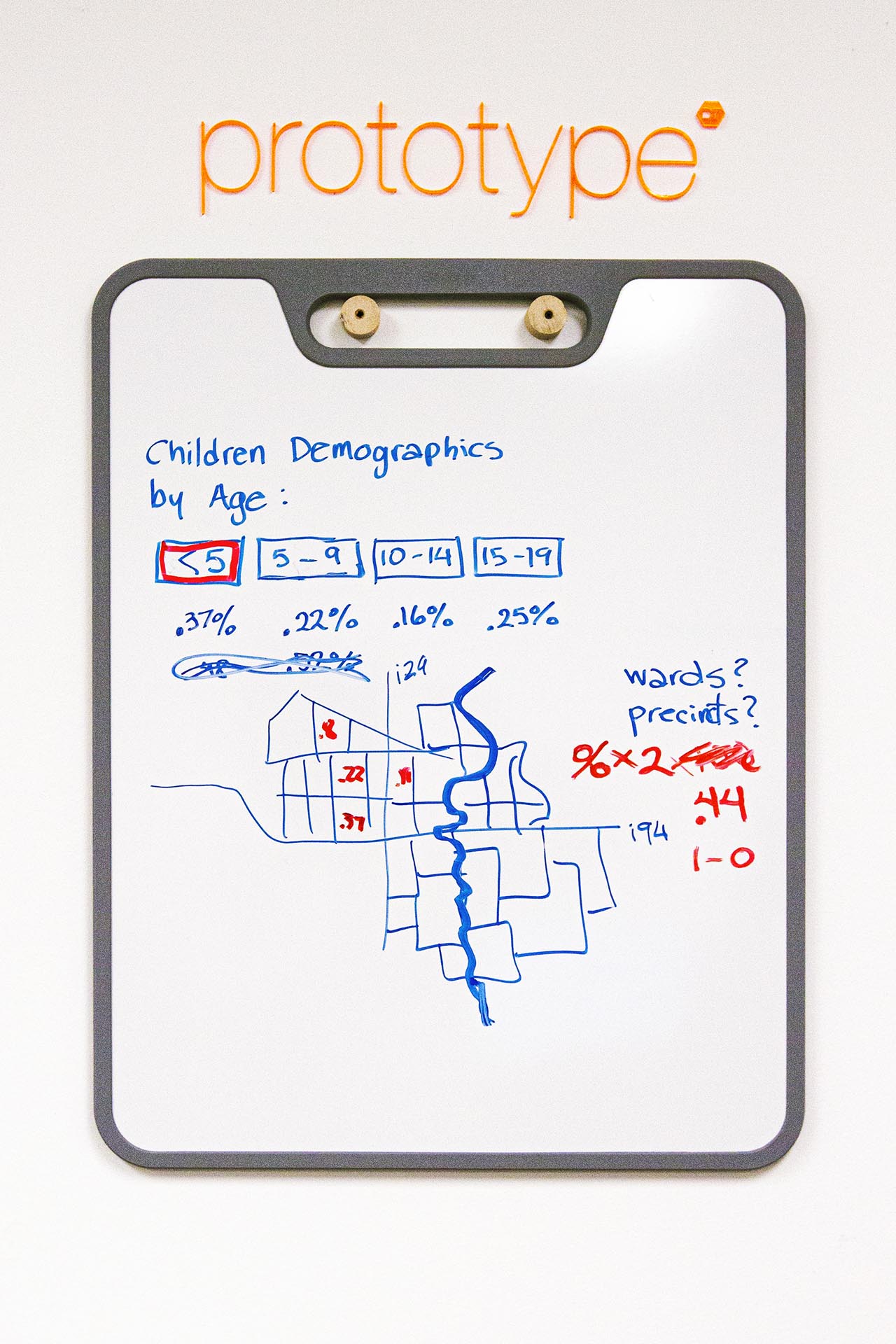
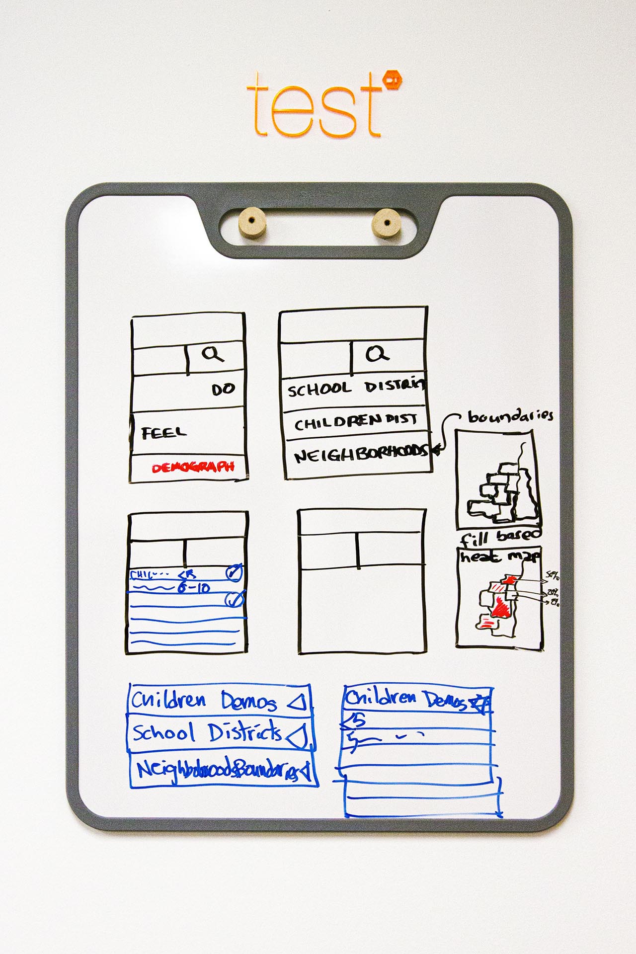
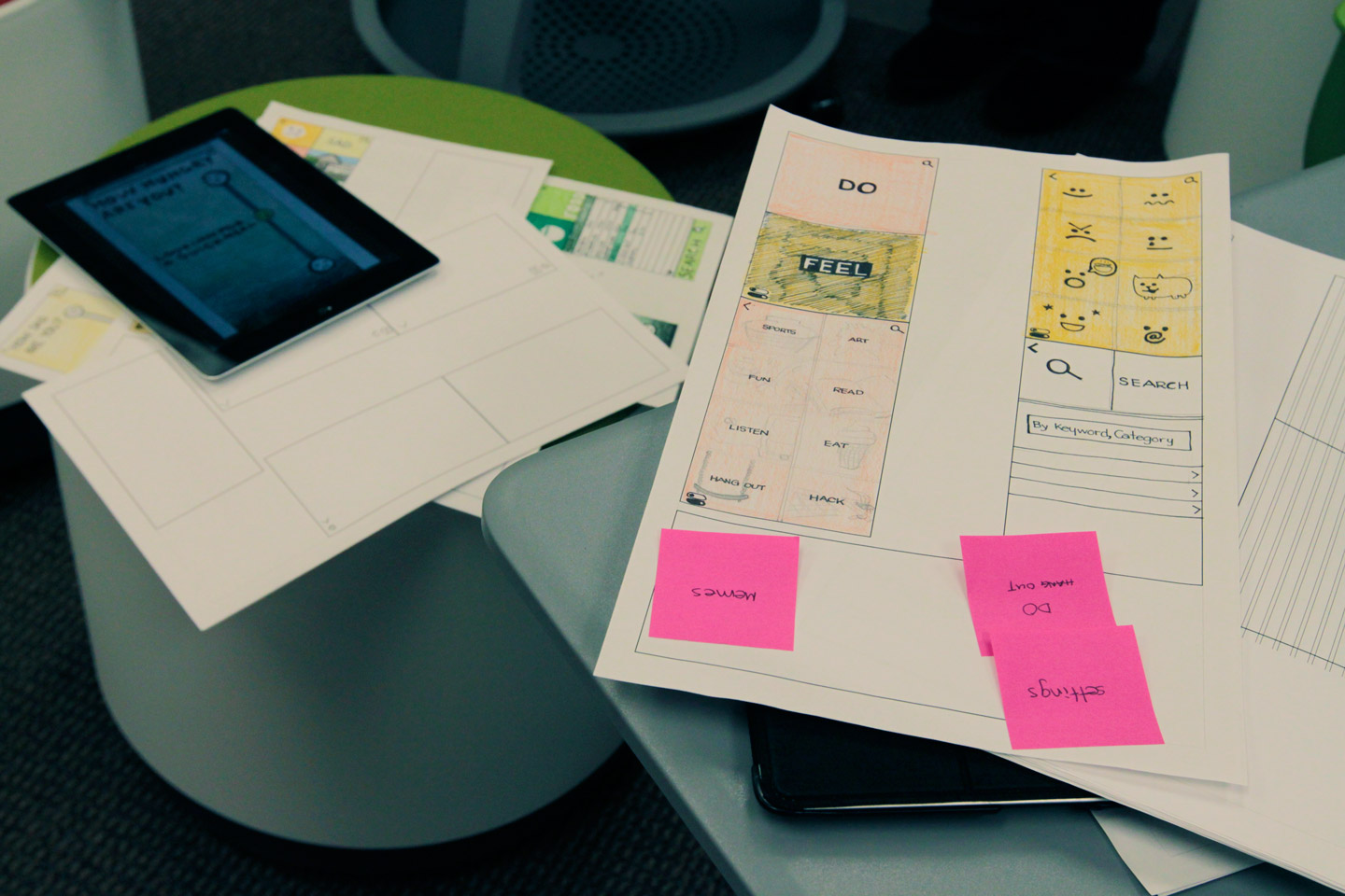
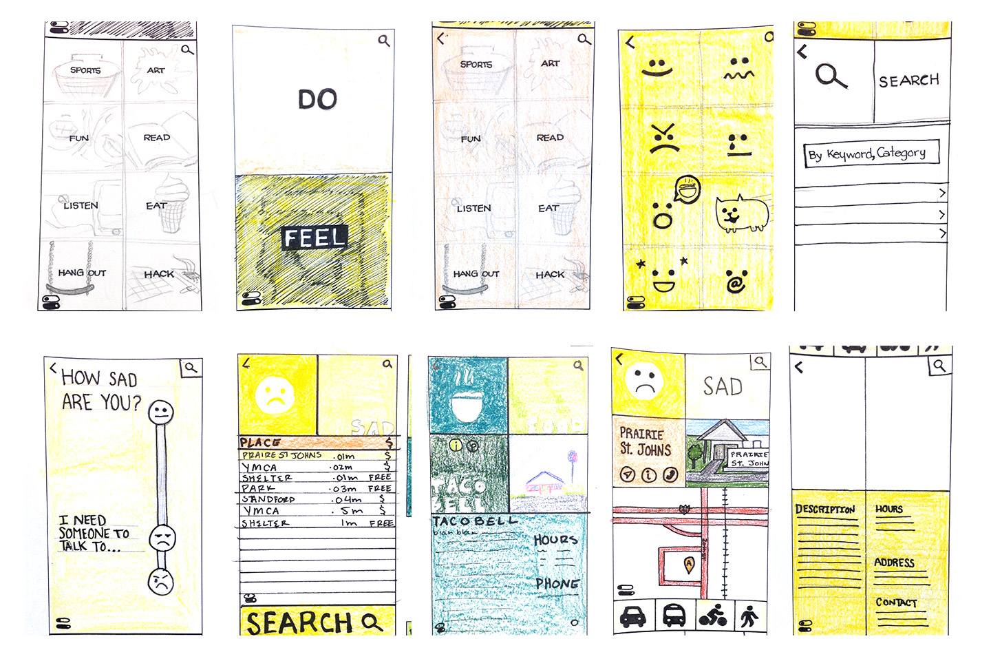
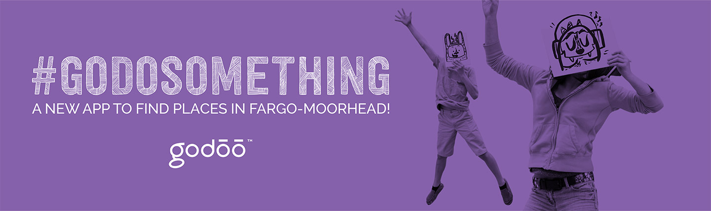
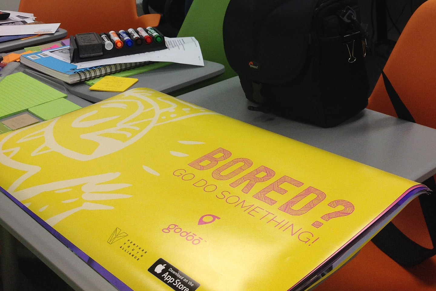
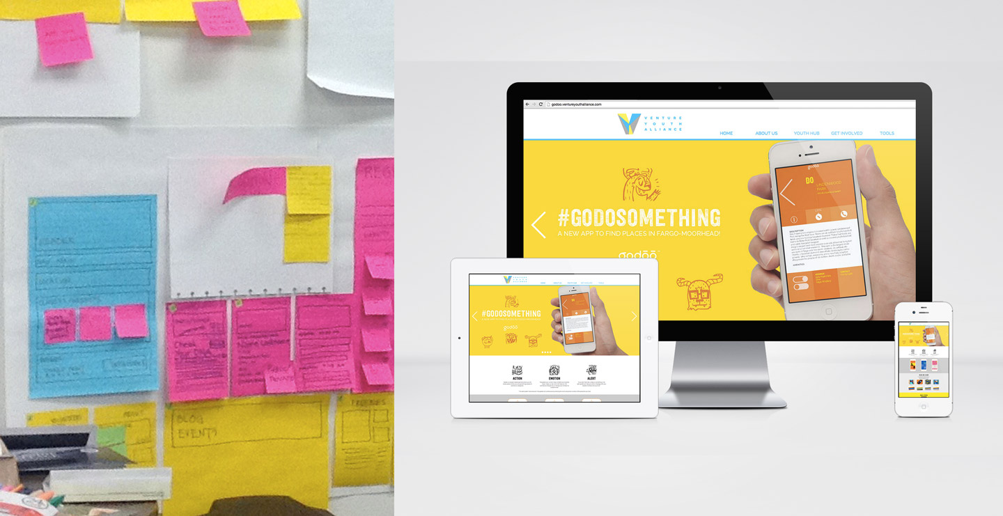
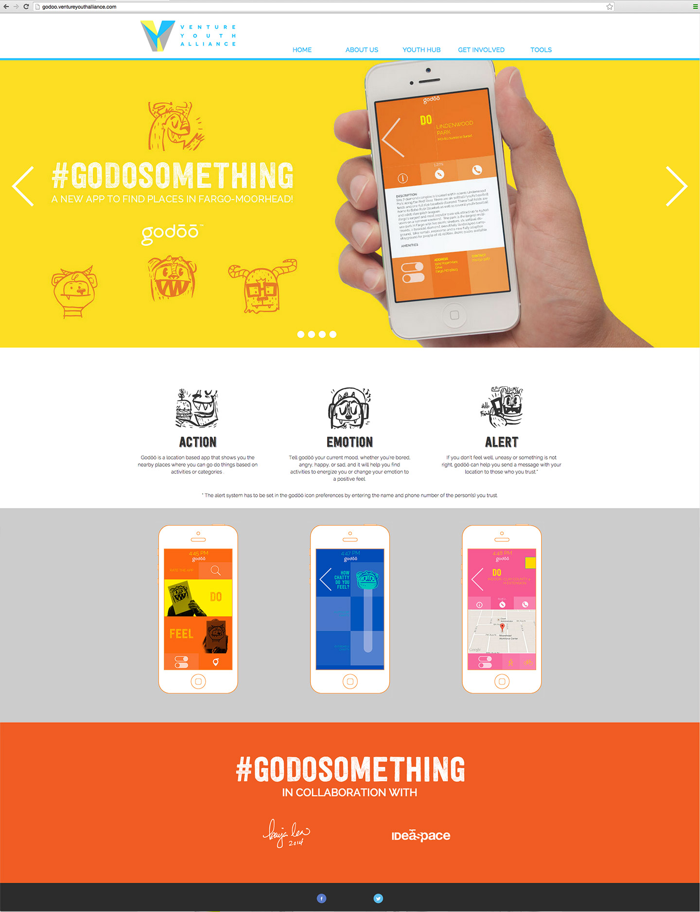
Venture Youth Alliance, a non-profit organization with the goal of bringing youth activities to children ages 2-18, wanted a solution developed for and in collaboration with local kids. As a result, we worked with several designers, illustrators, and students to create a mobile application and campaign for parents and children to discover the fun in their surroundings.

The app included detailed information about their whereabouts and displayed activities and amenities nearby.

White board covered in colorful post-it notes
White board with colored post-it notes and an illustration of a map of the Fargo-Moorhead area

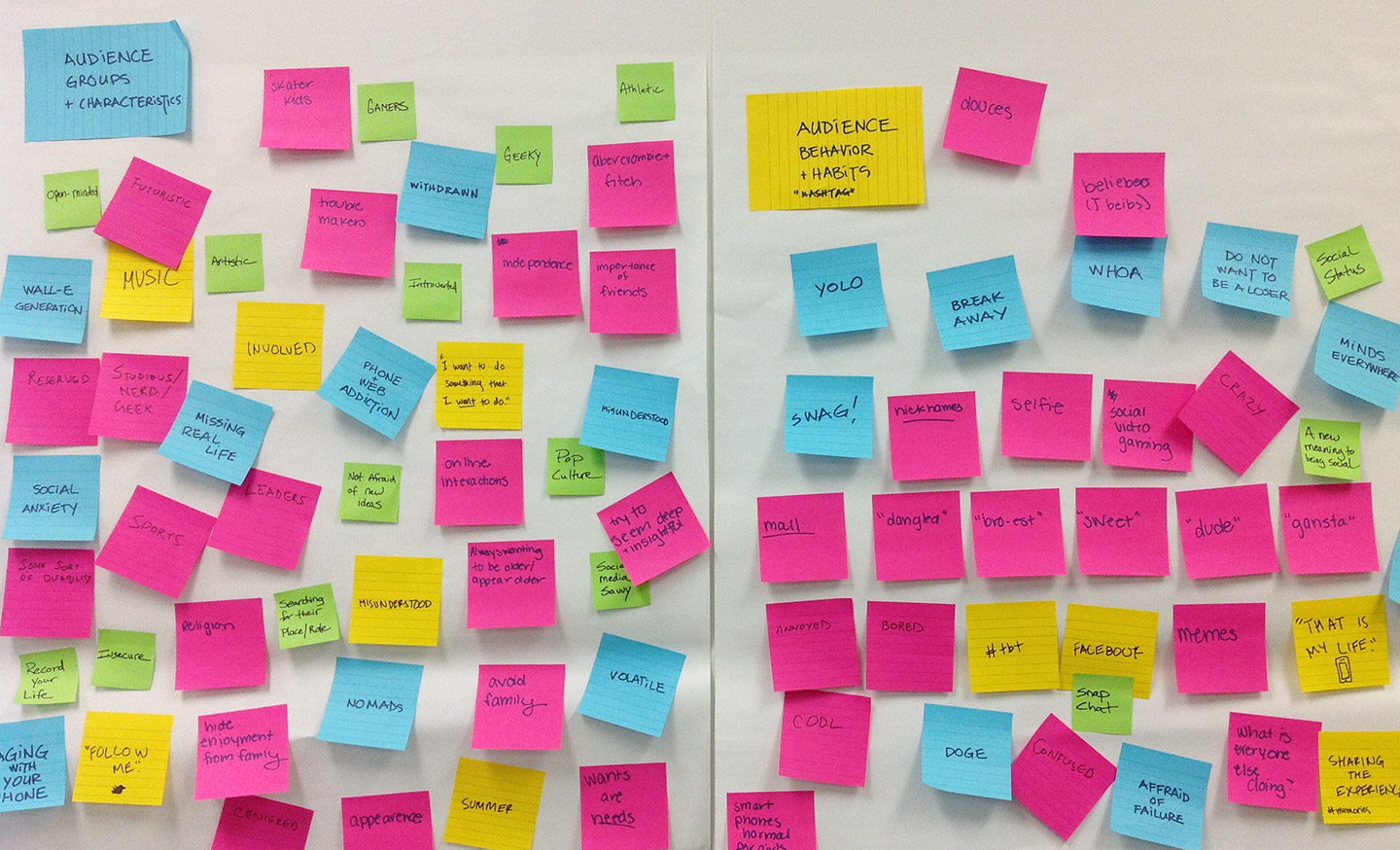
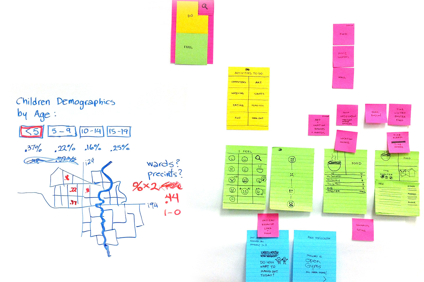
Gathering and organizing audience characteristics, behavior, and habits

Sketches of app layouts and an iPad sitting on stools
Wireframe sketches for the godoo app
A table covered with sketches of cute monsters
Cute monster sketches

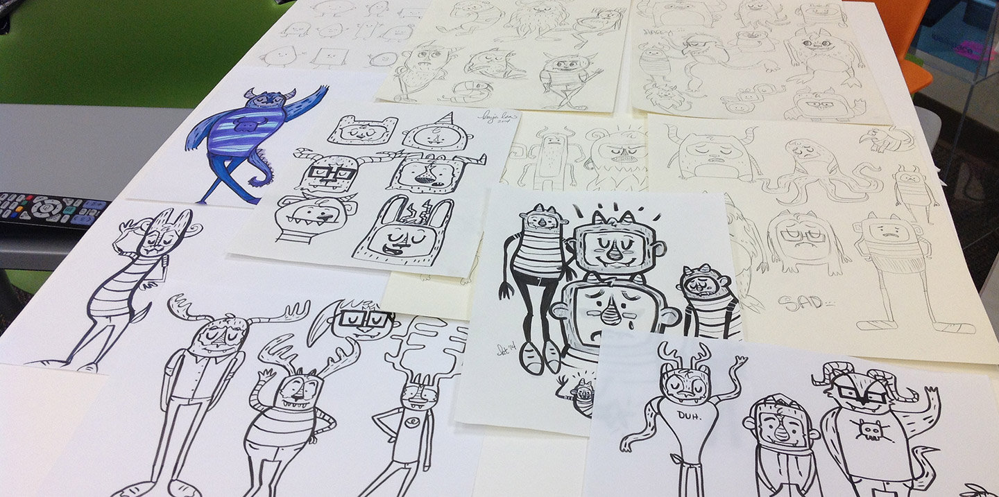
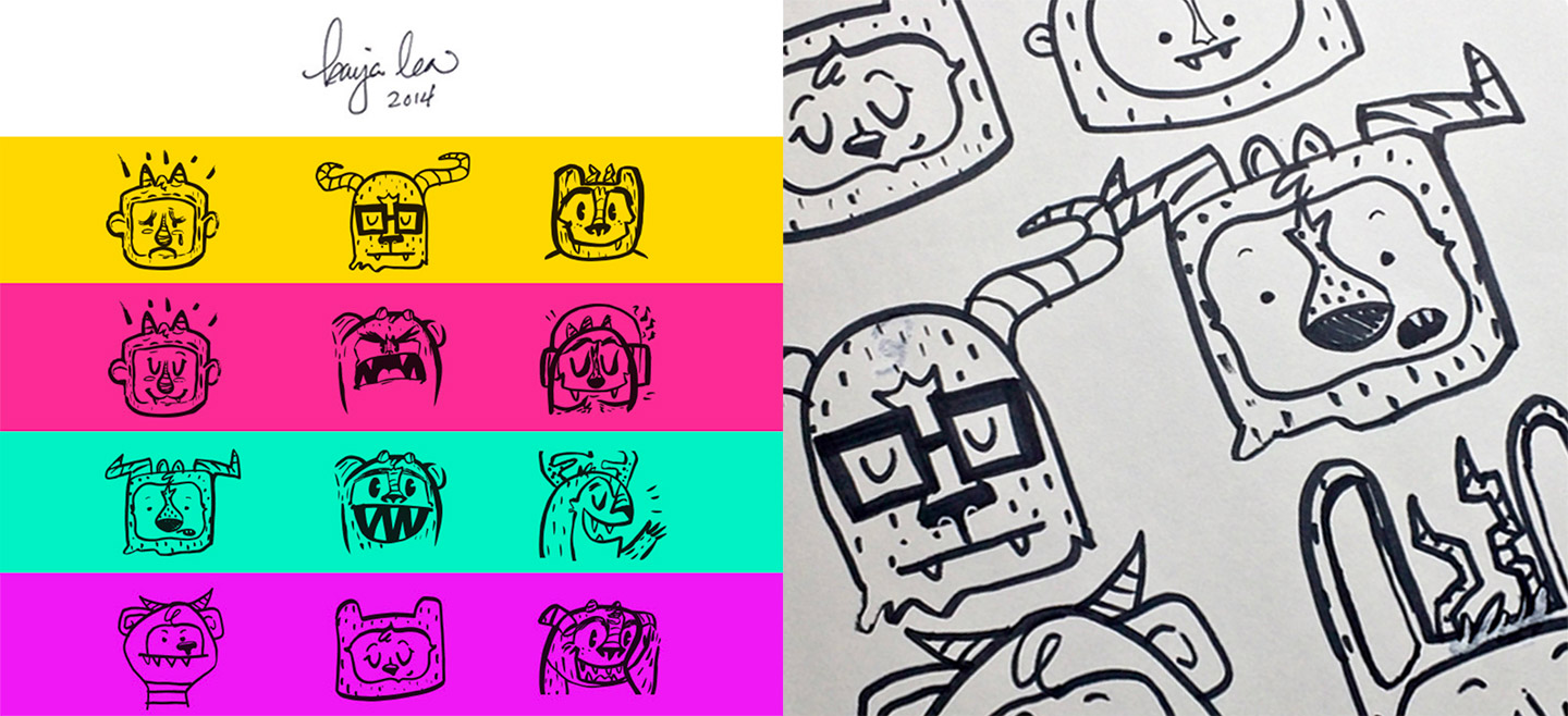
Sketches of characters with personality by Kaija Lea

go do something + map icon = godoo icon overlaid on a blurred map of the Fargo-Moorhead area
Three-dimensional godoo logomark and typography strategy
Logo concepts printed on sheets of paper hanging on a white wall
Godoo logo and logomark laid out on a grid

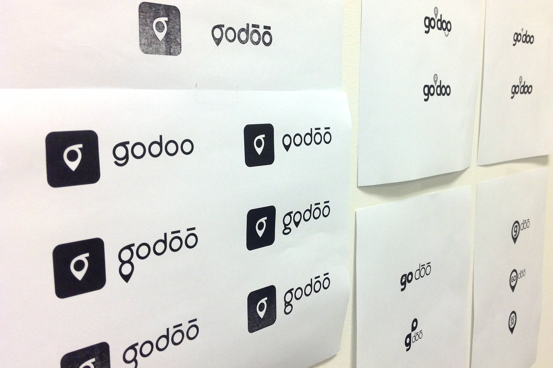
Brand mark development and refinement

#godosomething hashtag with five colorful buttons featuring cute monster illustrations
Godoo ad with text #godosomething a new app to find places in Fargo-Moorhead and a photo of the godoo icon in a park
Godoo ad with text #godosomething a new app to find places in Fargo-Moorhead and a photo of the godoo icon at a waterpark
Ad reading #godosomething a new app to find places in Fargo-Moorhead and a photo of two kids holding cute monster signs

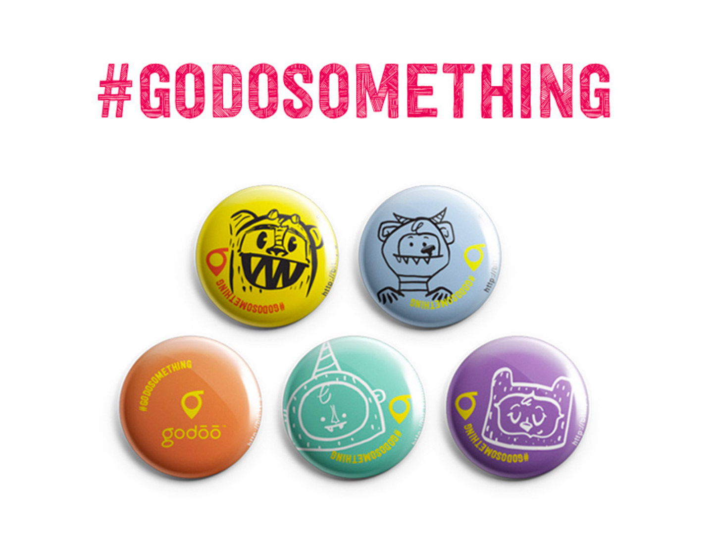
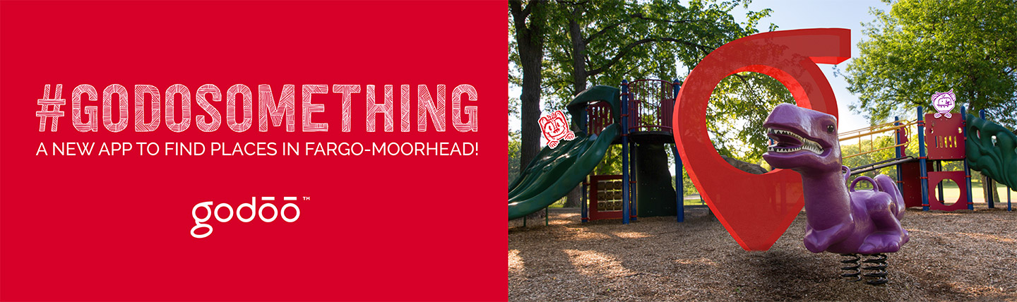
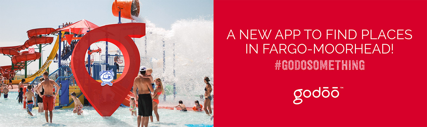
Posters to inspire action

Yellow poster reading Bored? Go do something sitting on a desk
Man taking photo of three kids holding paper over their faces
Three kids holding paper over their faces displaying cute monster illustrations
Girl holding paper over her face displaying a cute monster illustration in purple
Girl holding paper over her face displaying a cute monster illustration in orange
Girl holding paper over her face displaying a cute monster illustration in yellow

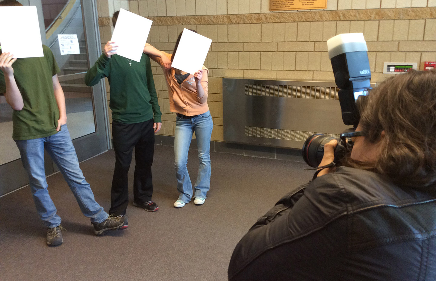
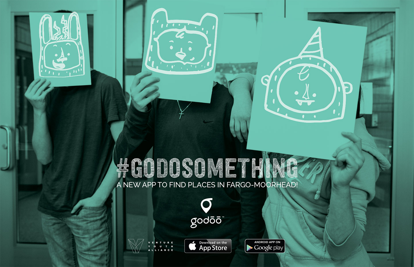
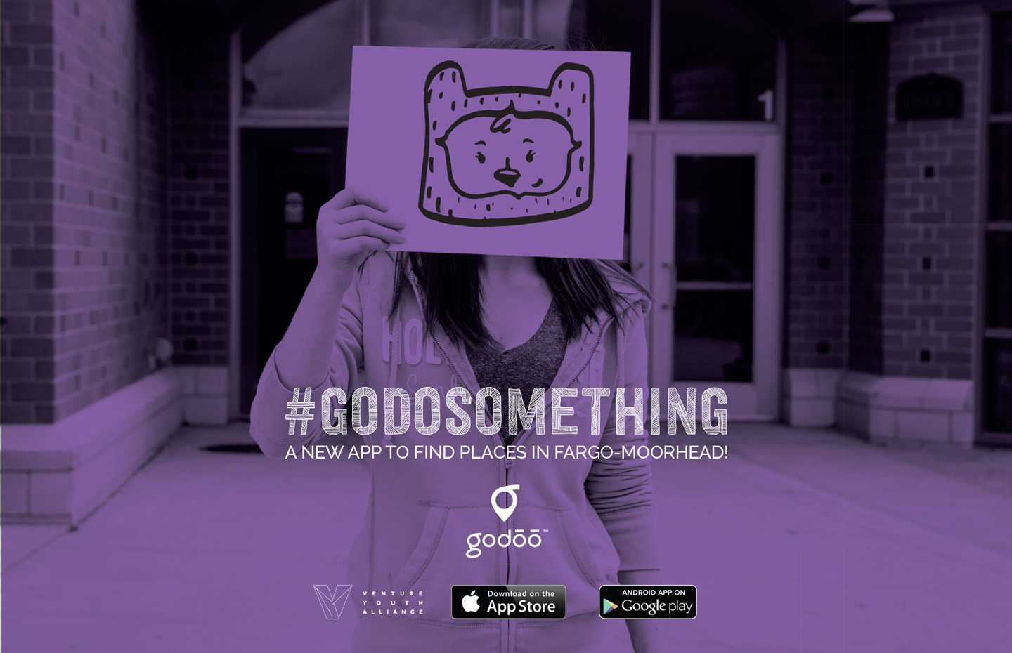
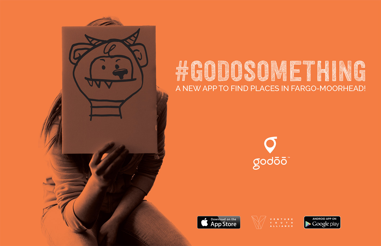
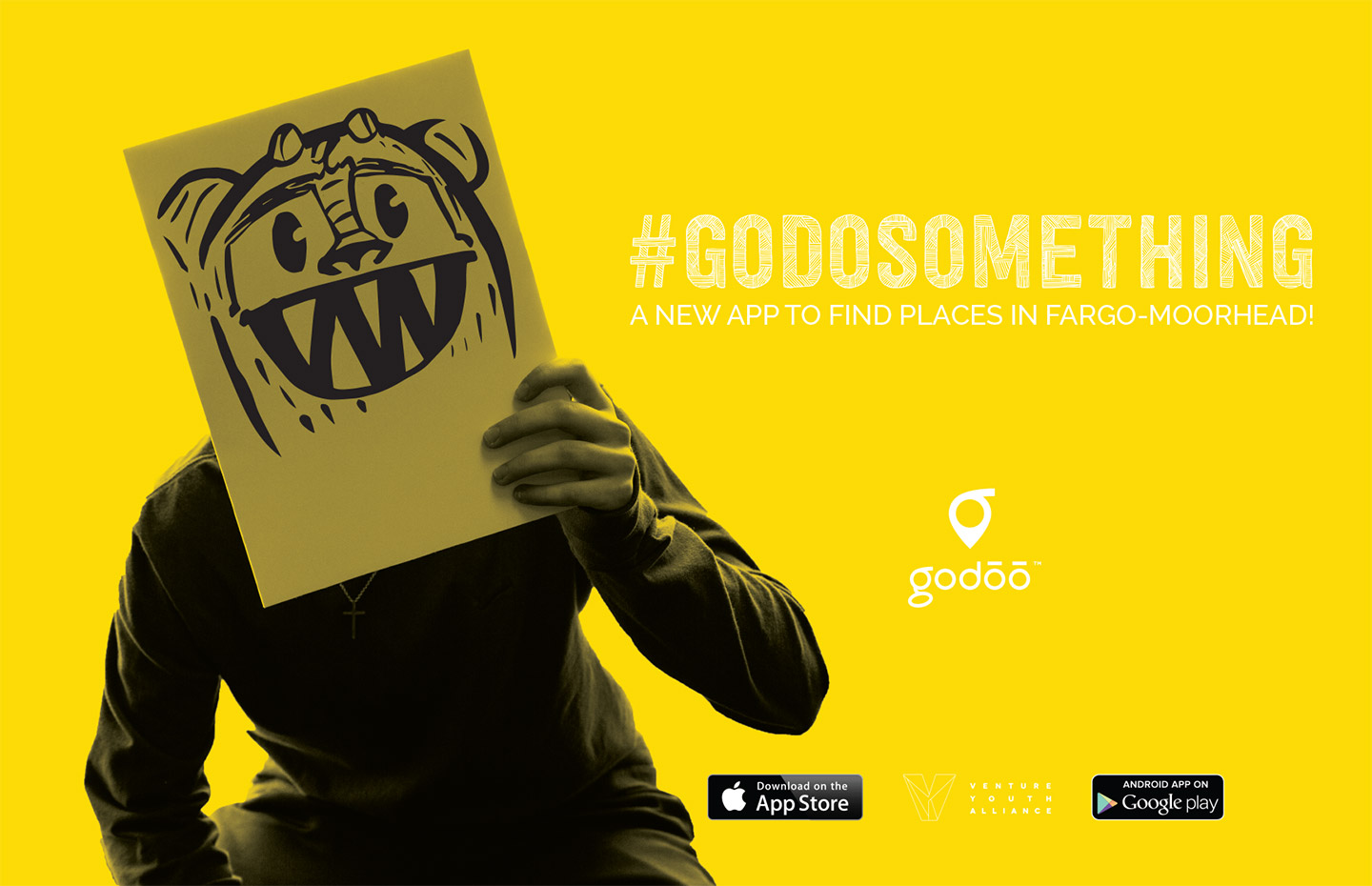
Using local youth to reflect our community

Godoo icon and cute monster in a tennis court with text #godosomething a new app to find places in Fargo-Moorhead
Post-it notes on a board next to a mockup of the Godoo app on an iPad, iMac, and iPhone
Screen capture of Godoo website
Newspaper article about Godoo app

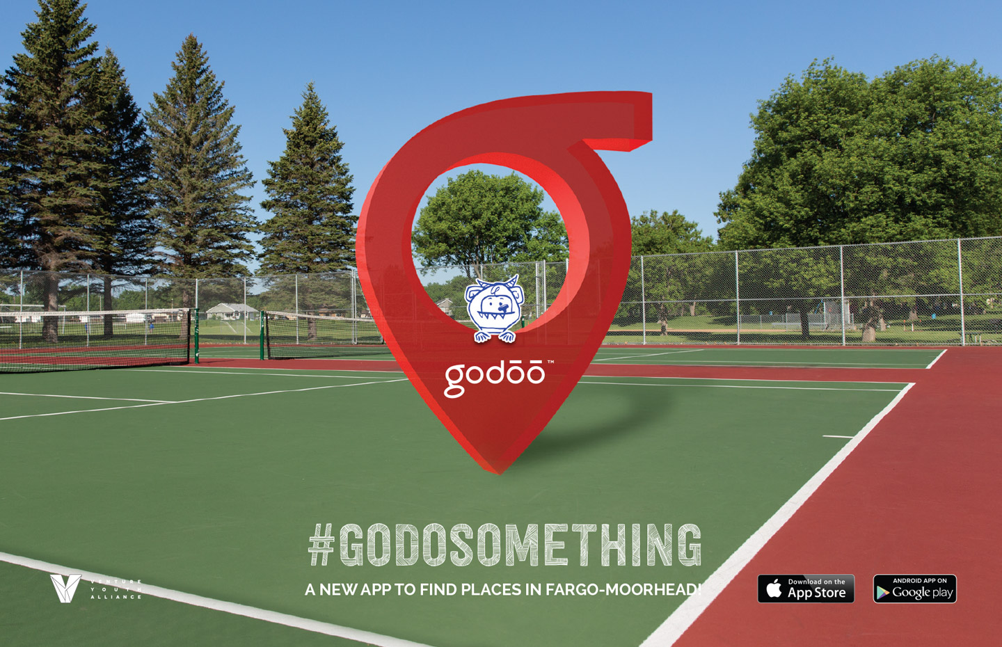
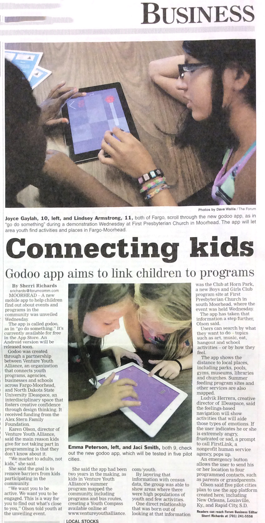
The app making the news

Gray, yellow, and blue letterhead, postcards, business, cards, and colored post-it notes atop a white surface

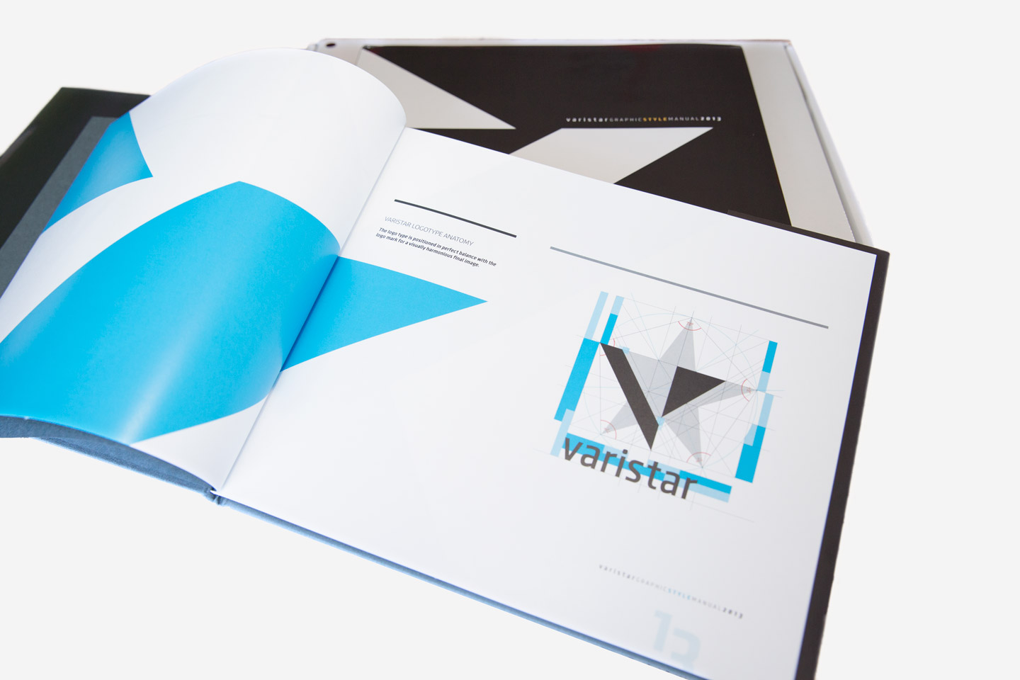
With the re-launch of a portfolio company for Otter Tail Corporation, a large company with operations in utilities and manufacturing, Nupolitan was tasked with the creation of a design system composed of several elements to be created and launched within a few months. The message was clear and simple: excellence. Nupolitan created an elegant and timeless brand which was followed by a full system of print materials, stationery, promotional video, and website.

Many sheets of white letter paper displaying brand attributes taped to a wall

Examining over 25 attributes to create a synergetic and concise brand

Sketchbook pages displaying hand-drawn logo concepts for Varistar
Close-up of Varistar logo concept sketches
Man working on designing on a laptop

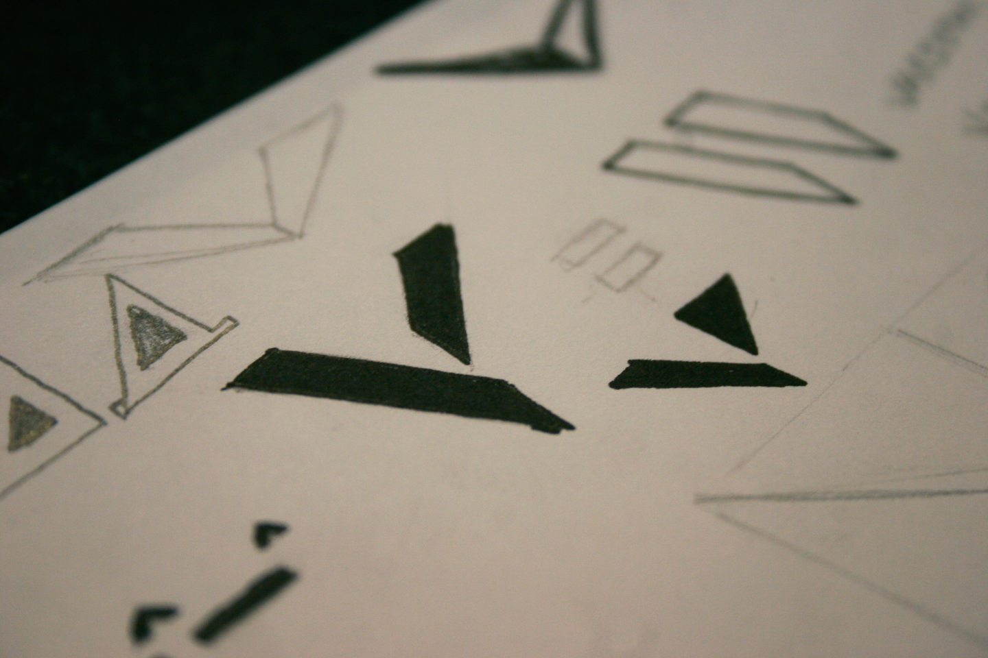
Sketching with intentional excellence as the focus

Tools of measurement
Varistar logomark star and triangle elements set on scale
Construction of Varistar logo set on a grid
Explanation of use of V and negative space to create Varistar logomark
Varistar logo in black on a white background

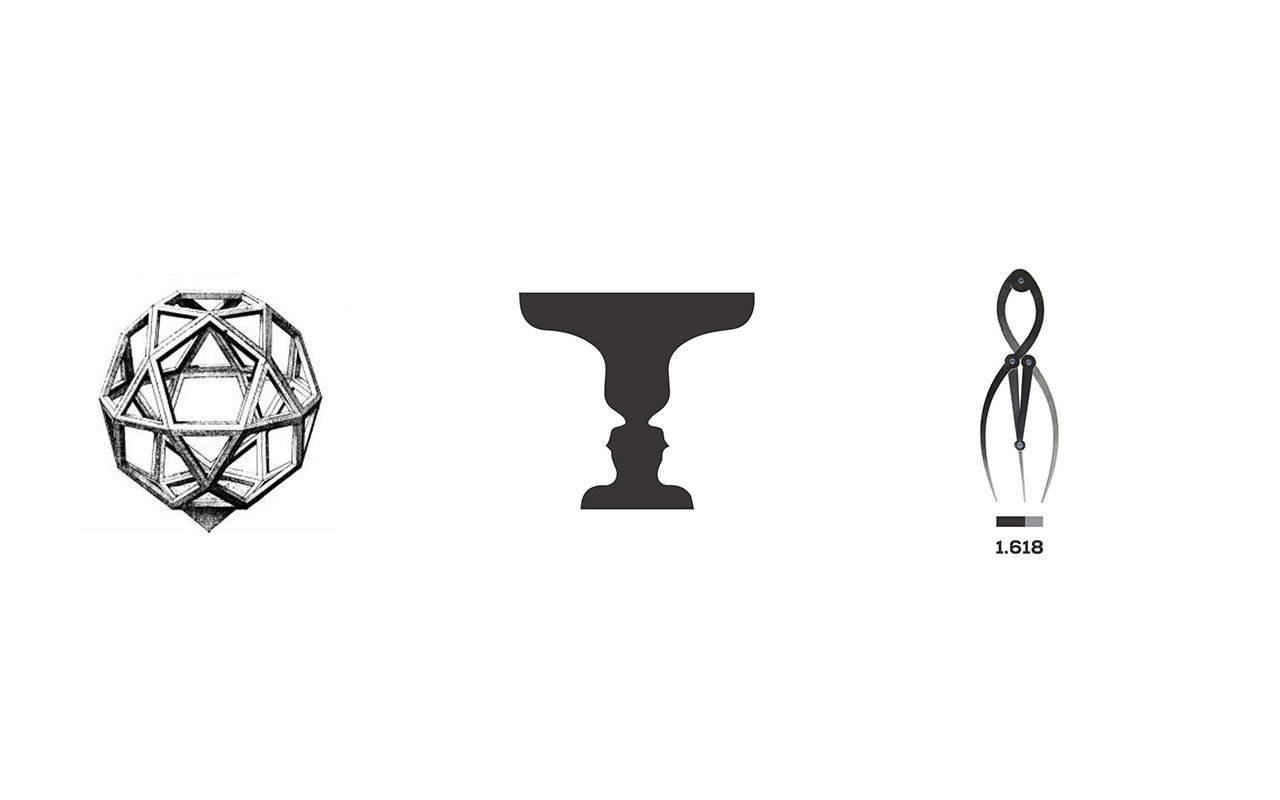
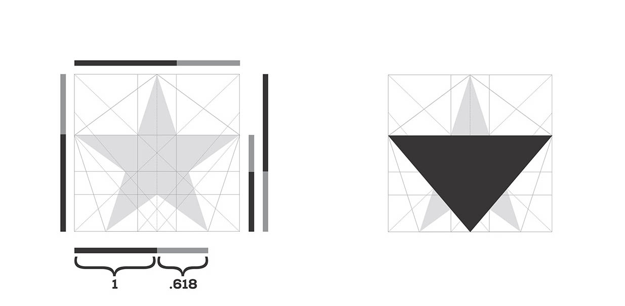
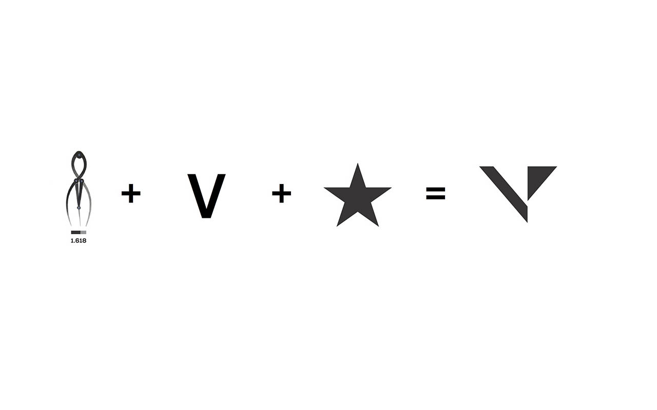
Elements of geometry and the golden ratio work together to form the brand mark

A computer screen displaying project tasks
Varistar brand guideline manual open to a page showing the logo in blue and black

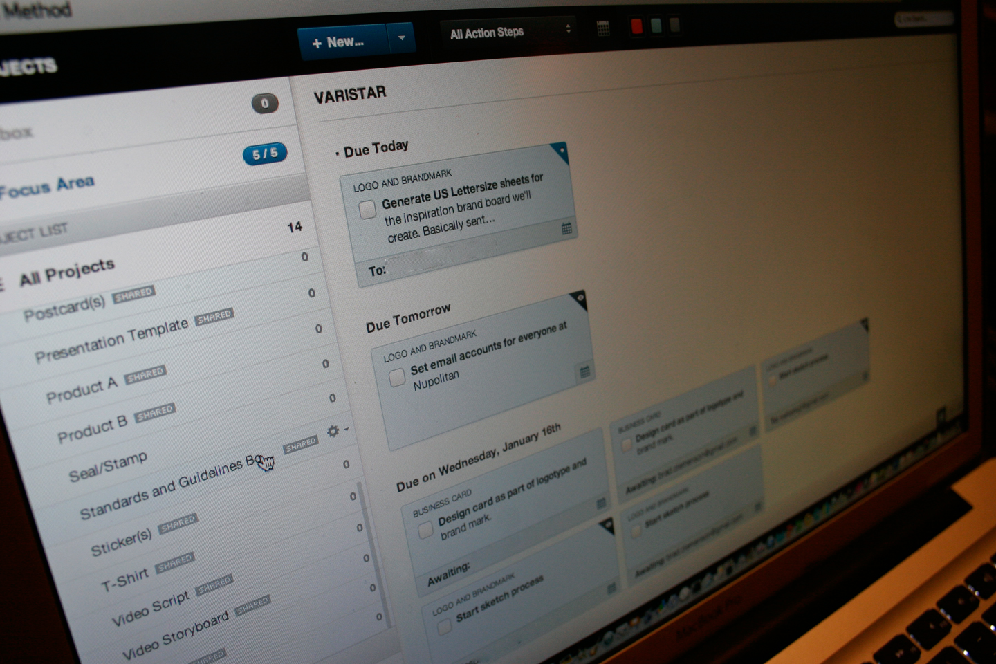
Organization of deploying a design system

Varistar dark gray pantone color information
Varistar yellow pantone color information

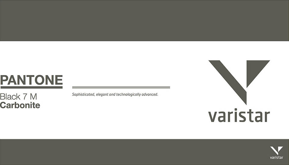
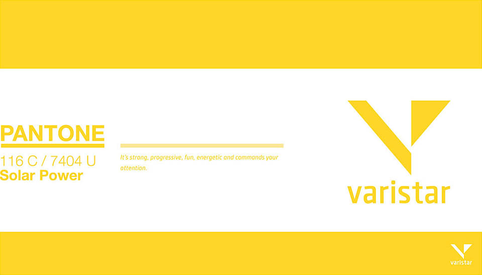
Strong and modern color palette

Three framed Varistar posters displaying the logomark and blue and white sparks on a black background

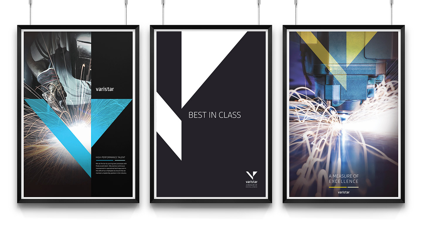
Posters designed with a simple, yet powerful message

A mockup of the Varistar website on an iPad, iPhone, laptop, and desktop computer
Sketch of Varistar website structure
Sketch of the construction of the brand box for Varistar
Gray, yellow, and blue letterhead, postcards, business, cards, silver portfolio, and colored post-it notes atop a white surface

Conceptualization through sketches
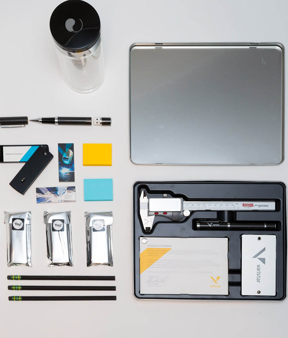
Gray, yellow, and blue letterhead, postcards, business, cards, and colored post-it notes atop a white surface

Full design system

Magazine open to photo of woman wearing newspaper dress and hat on top of other open magazines

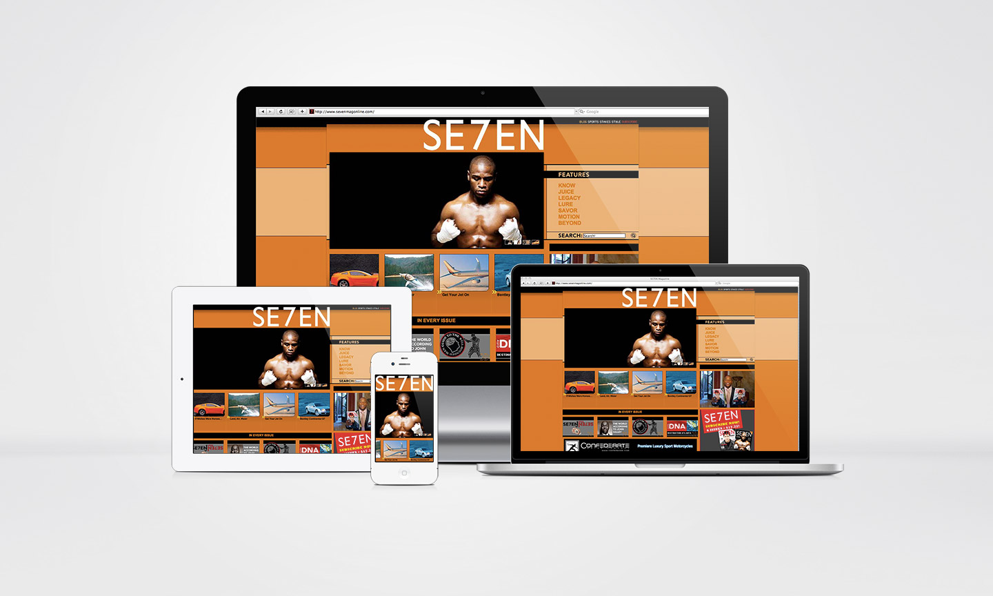
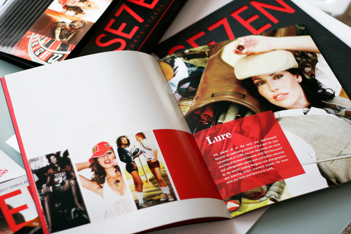
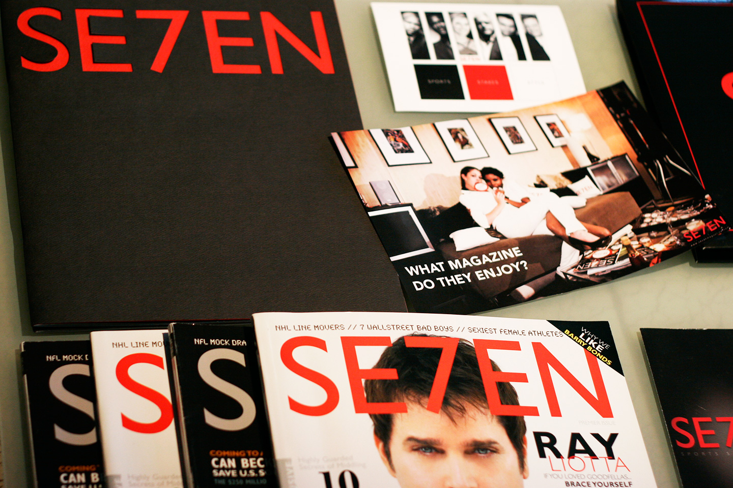
By combining many years of knowledge in interactive and print design fields and publications, we worked to create strong messaging in niche magazine markets. This led to the design of exciting pieces of promotional and marketing materials and the procurement of several clients with the goal being reached in two short months.

Photo of dark sheets of newspaper

Our focus: newsprint

Grid of poster and postcards featuring women dressed in clothing made of newspaper
Grid of postcards featuring women dressed in clothing made of newspaper

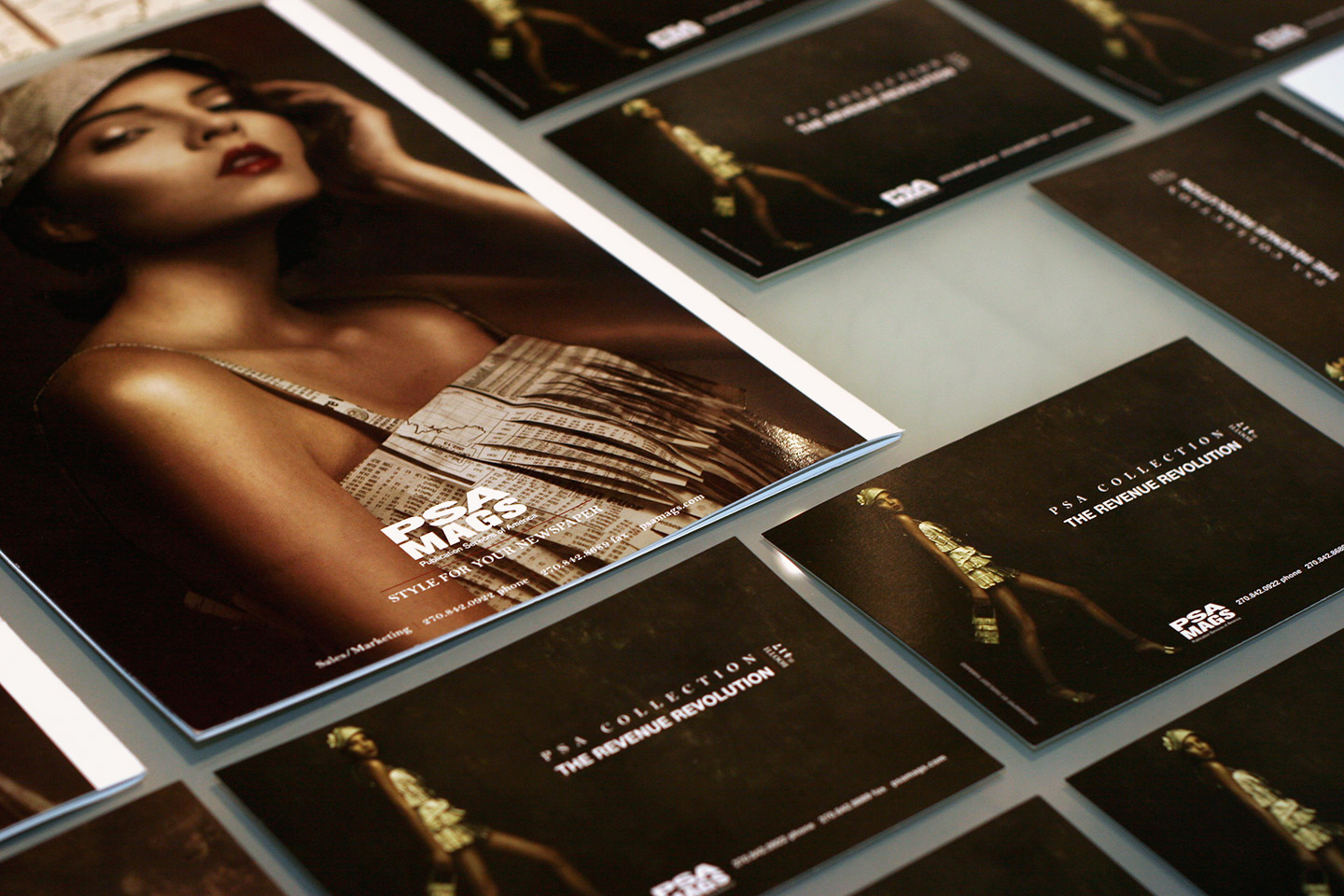
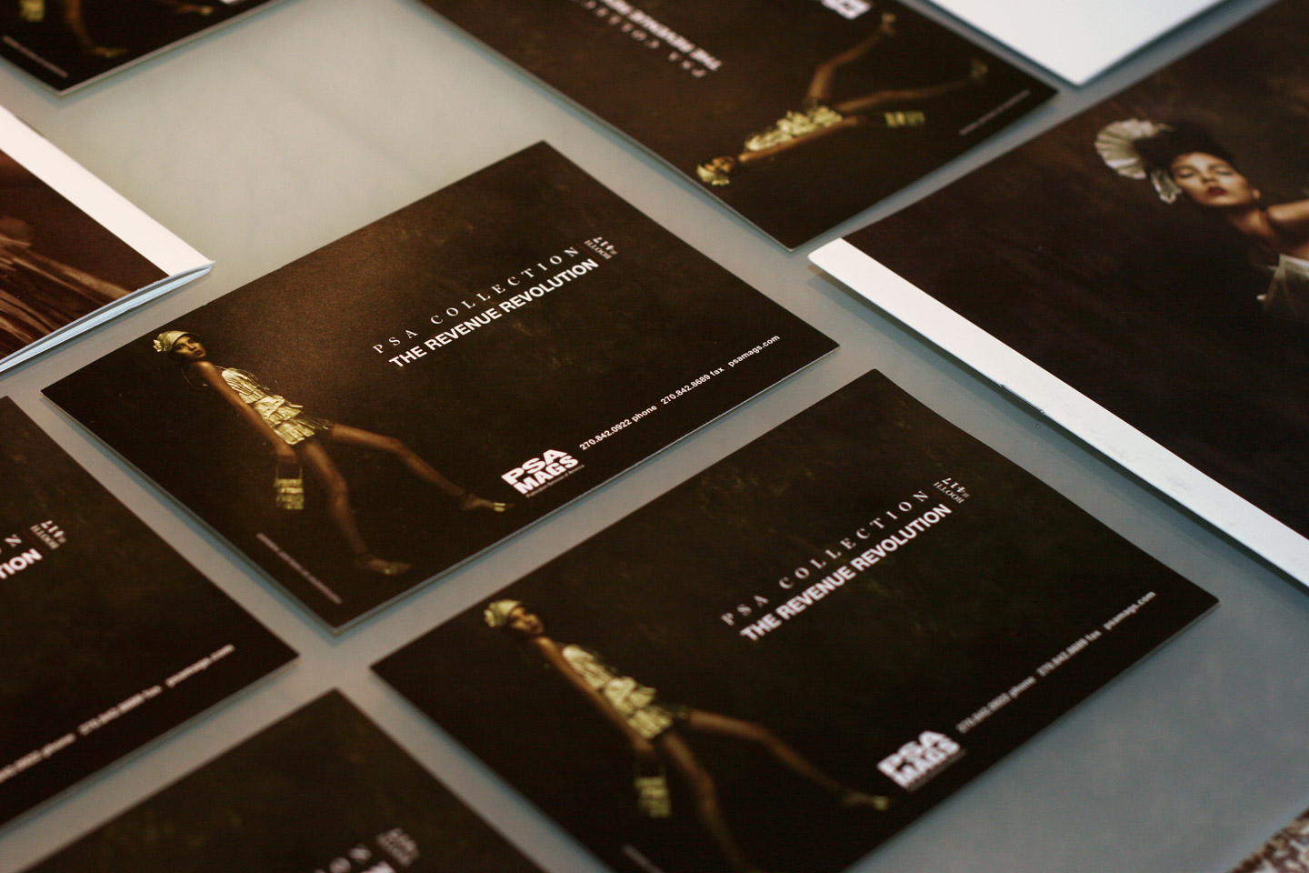
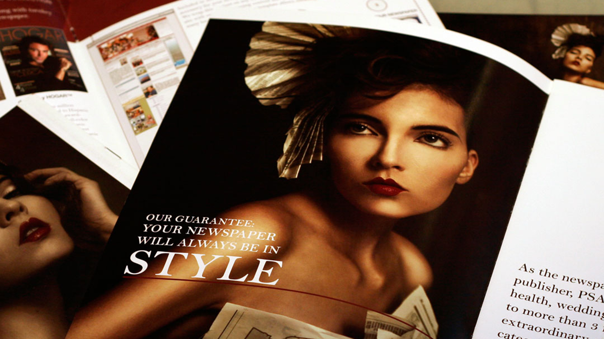
Complex fashion with a simple message

Maroon and white magazine spread
Two posters of women dressed in high-fashion dresses made of newspaper
The corner of a magazine featuring the word Style on top of another magazine featuring a photo of a woman's shoulder
Three posters of women dressed in high-fashion dresses made of newspaper

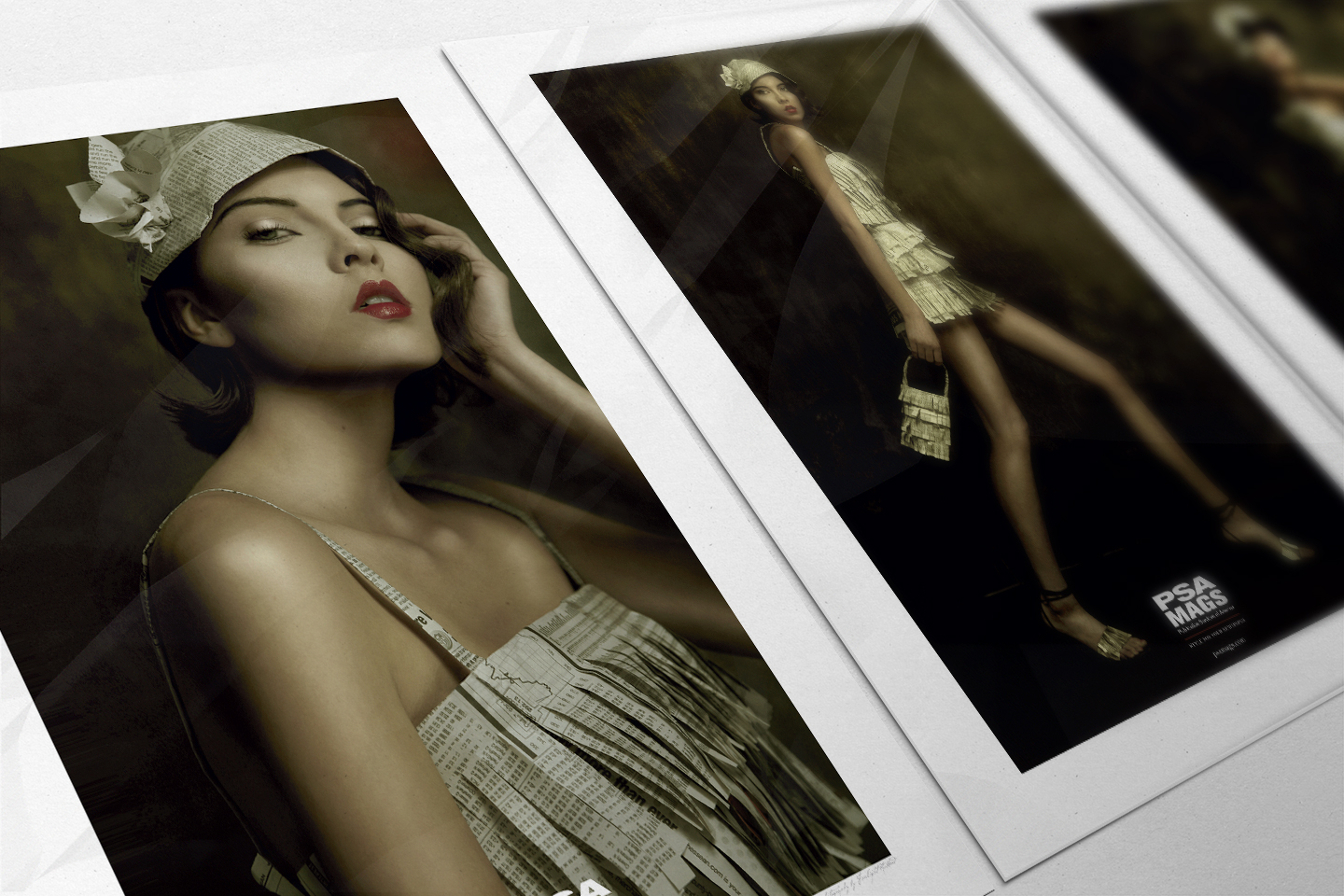
Limited edition posters

A single, framed poster of a woman dressed in a high-fashion dress made of newspaper
Light reflecting through a cutout of the word SE7EN on black cover of magazine with red interior

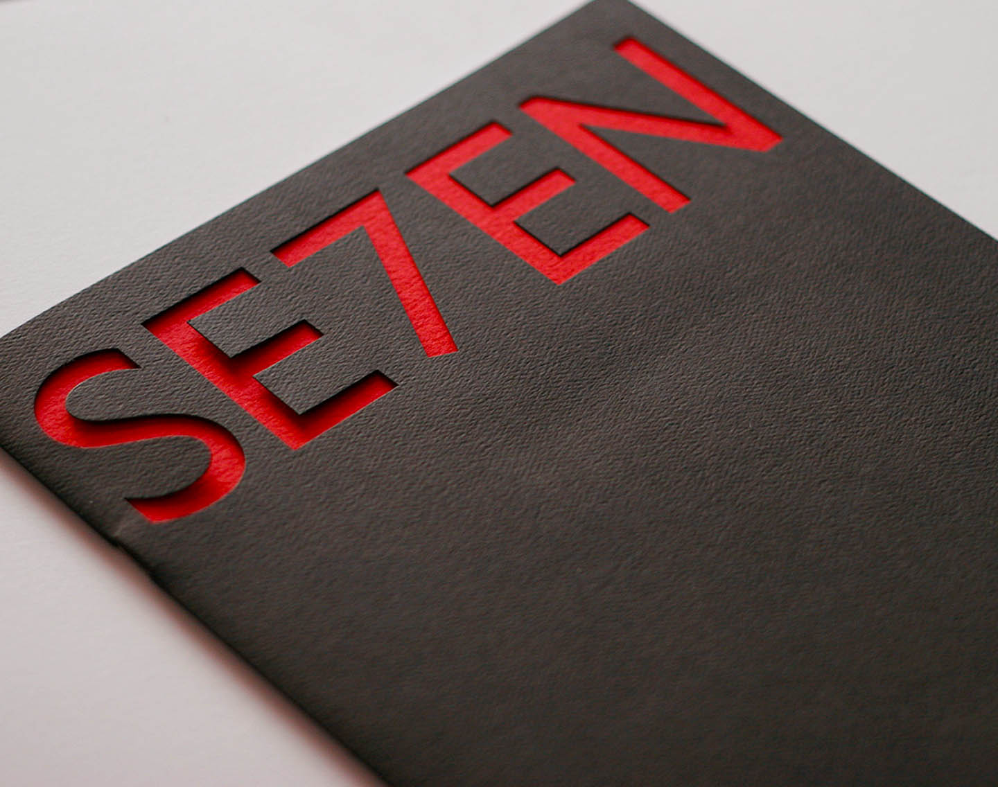
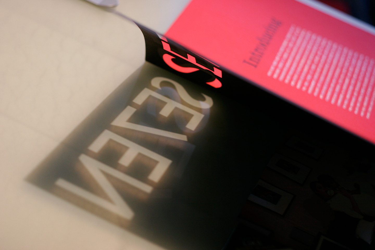
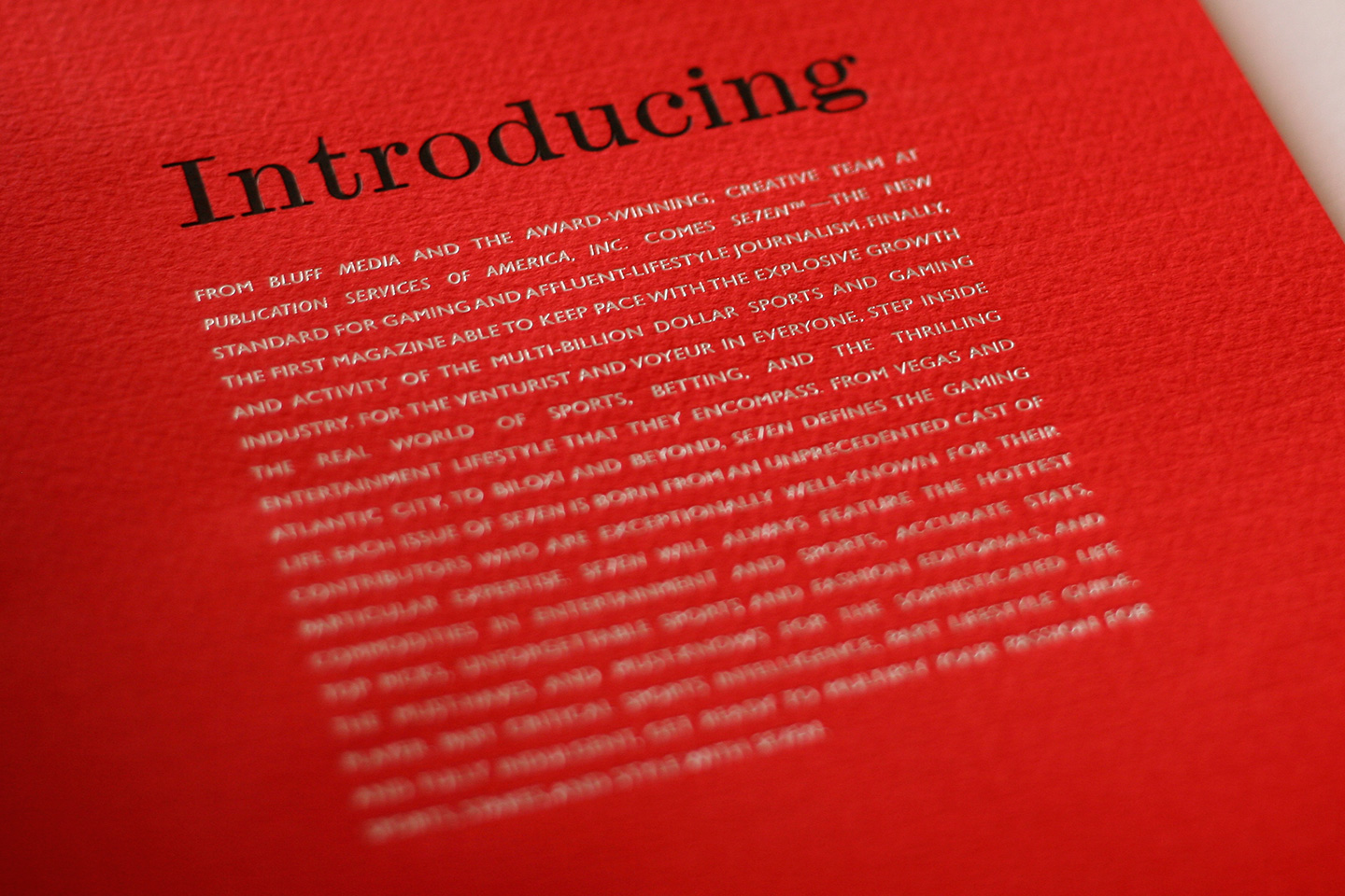
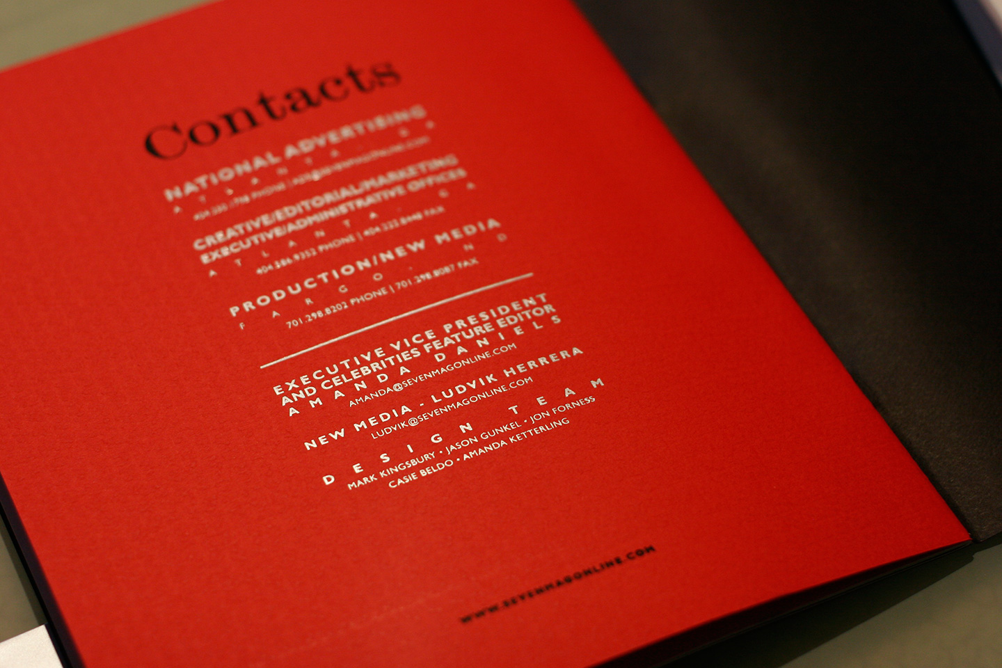
Developing media kits for publications in the publishing sector has many challenges. Selling a publication to publishing professionals lies in understanding what will attract the attention of professionals that are continuously bombarded by publications and visual impact.

We designed a brand system and several other materials for the promotion of a luxury lifestyle magazine whose mission was selling luxury and high-cost, high-reward style. The media kit, as well as the brand identity, created an elegant and sophisticated image and experience.

Red text reading SE7EN on a black background

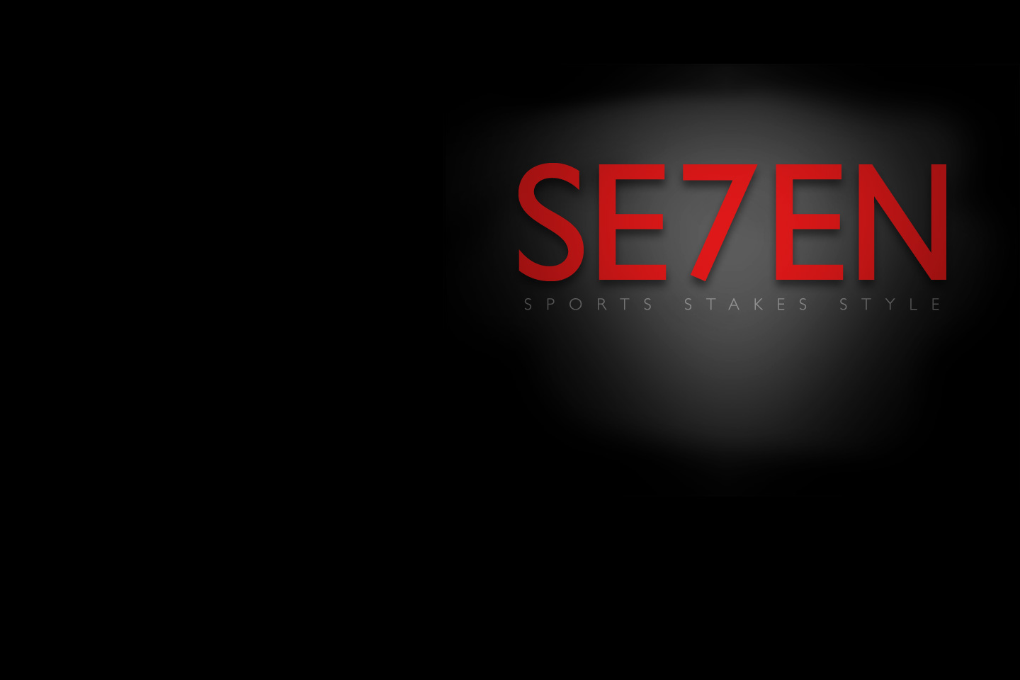
Three words to convey the brand

A cutout of the word SE7EN on black cover of magazine with red interior
Light reflecting through a cutout of the word SE7EN on black cover of magazine with red interior
Red page of a magazine with black and white text

Texture and foil add an elegant touch

Open magazine spread in black and red
Stack of SE7EN magazines in black and red
Magazine spread in black, red, and white
Stack of SE7EN magazines in black and red

Always high stakes

Four devices of differing sizes displaying the orange and black SE7EN website