
Over the course of 12 months of working with Impact Institute on a variety of projects spanning design for print and web, we built a robust design system and guidelines for the organization to utilize and to guide the future of the organization.
We refined their existing logo mark and more thoroughly defined rules for its usage. Although the organization had a loose color palette when we began working with them, we solidified the organization’s color scheme and strategy, expanding it to be comprehensive of print and web color codes.

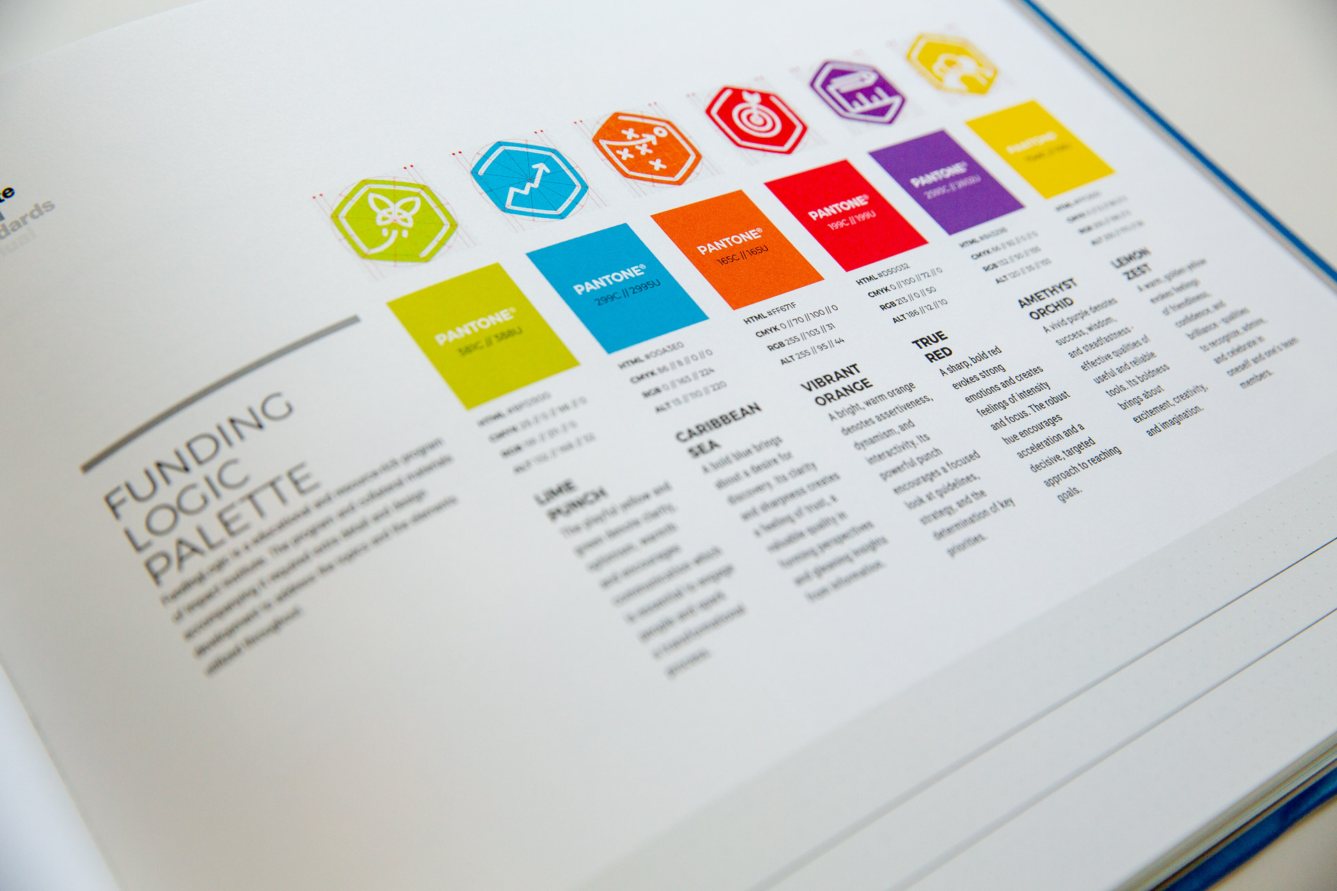
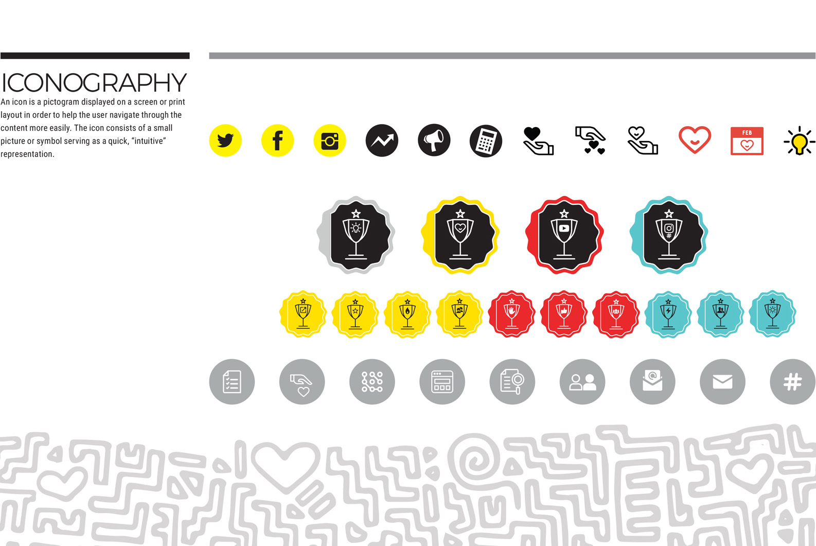
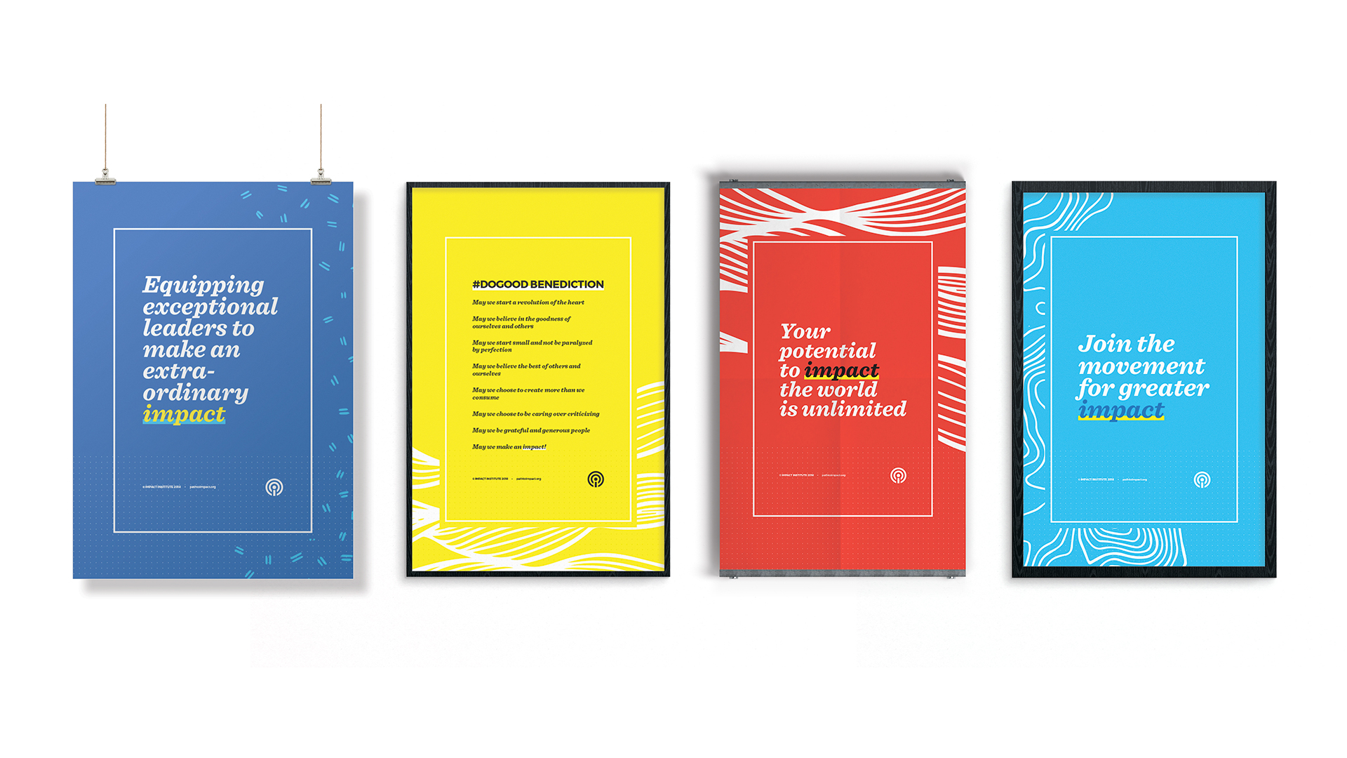
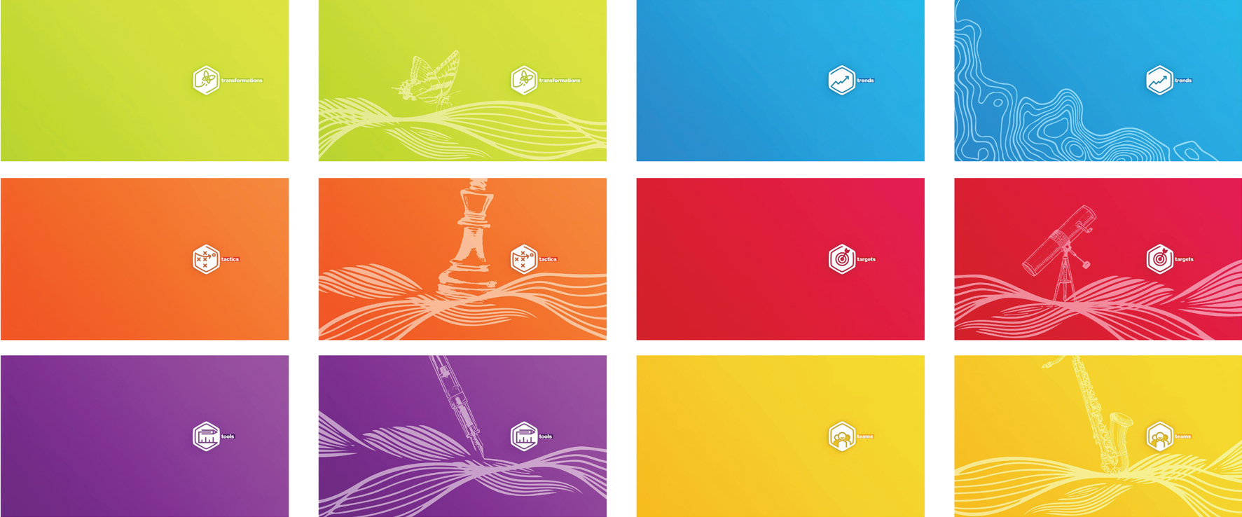
We designed a type strategy and layout grids for greater cohesion across all printed materials created for and distributed to Impact’s member organizations. Throughout the creation of various worksheets, articles, and printed packets, a library of iconography was created to reflect the organization’s activities and goals.
Hand-drawn illustrations and patterns bring a lightness and fun to the more traditional nature of their existing color palette.

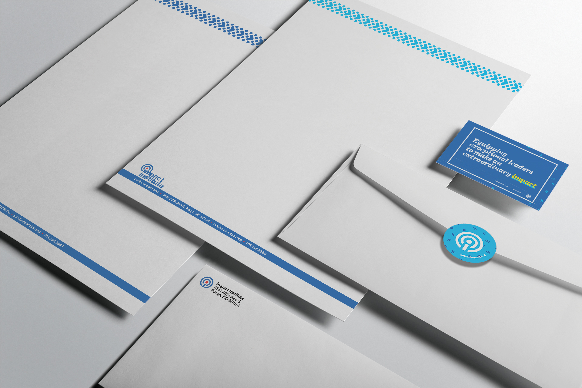
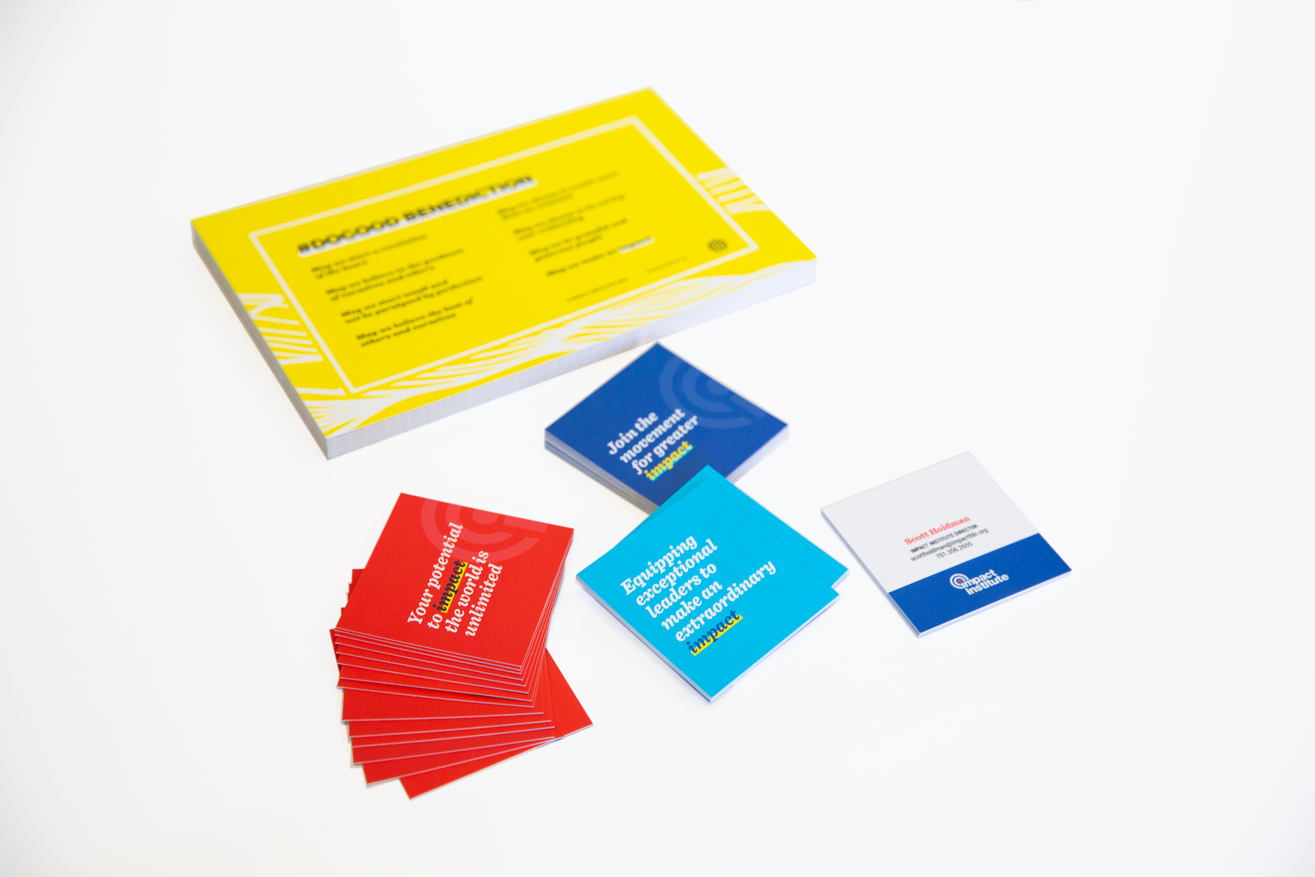
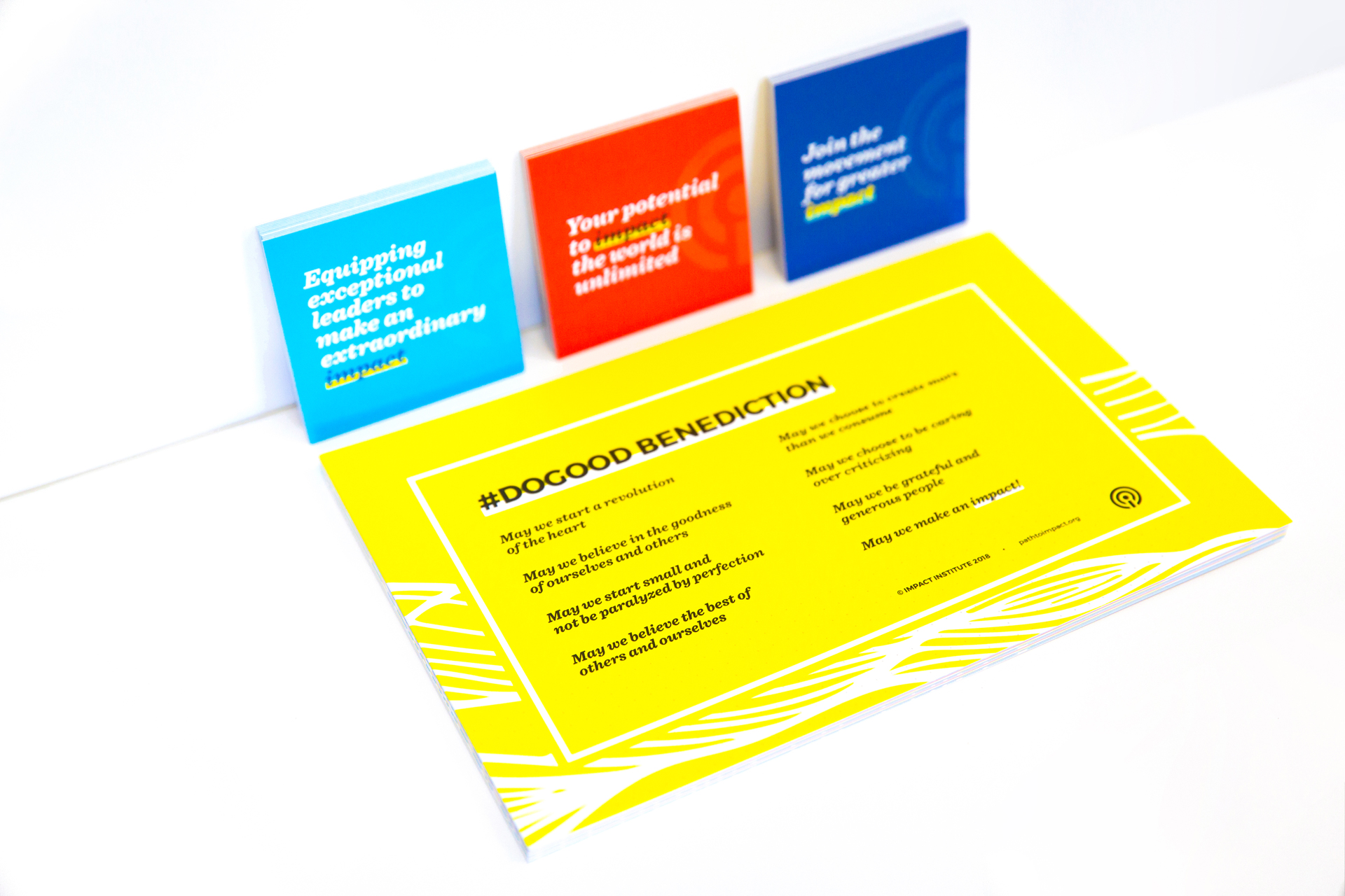
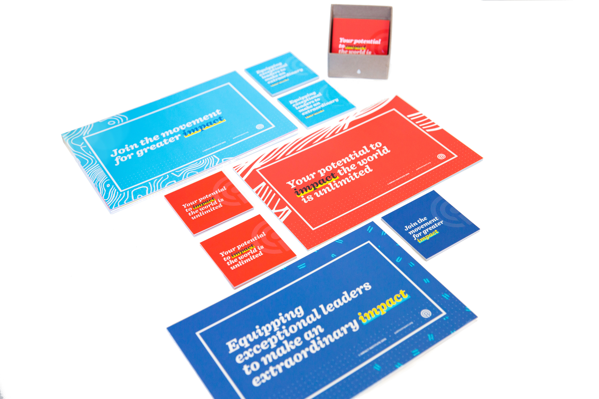
We designed bright and engaging business cards and letterhead as well as a series of postcards and posters featuring impactful and inspiring messaging written by the Institute.
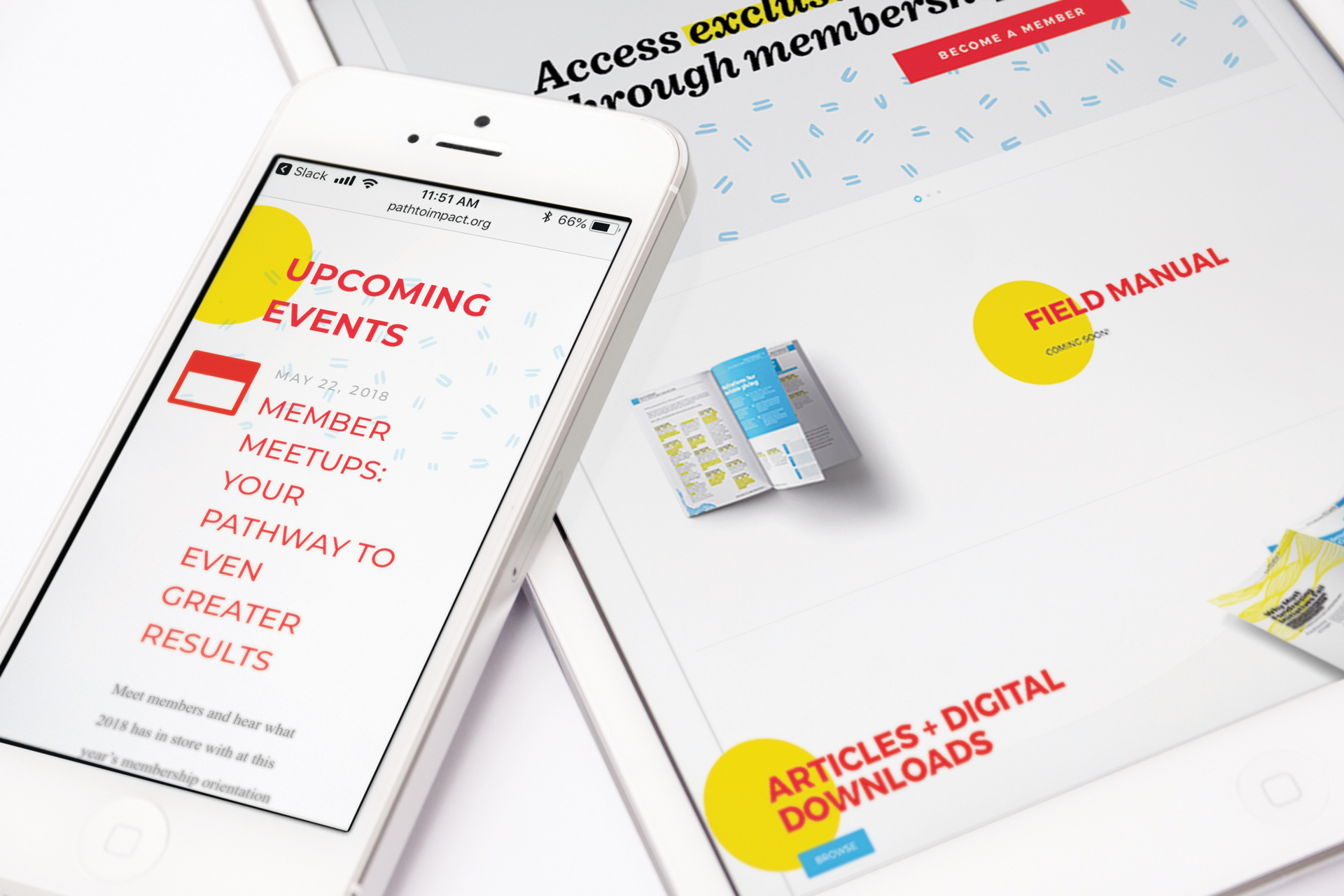
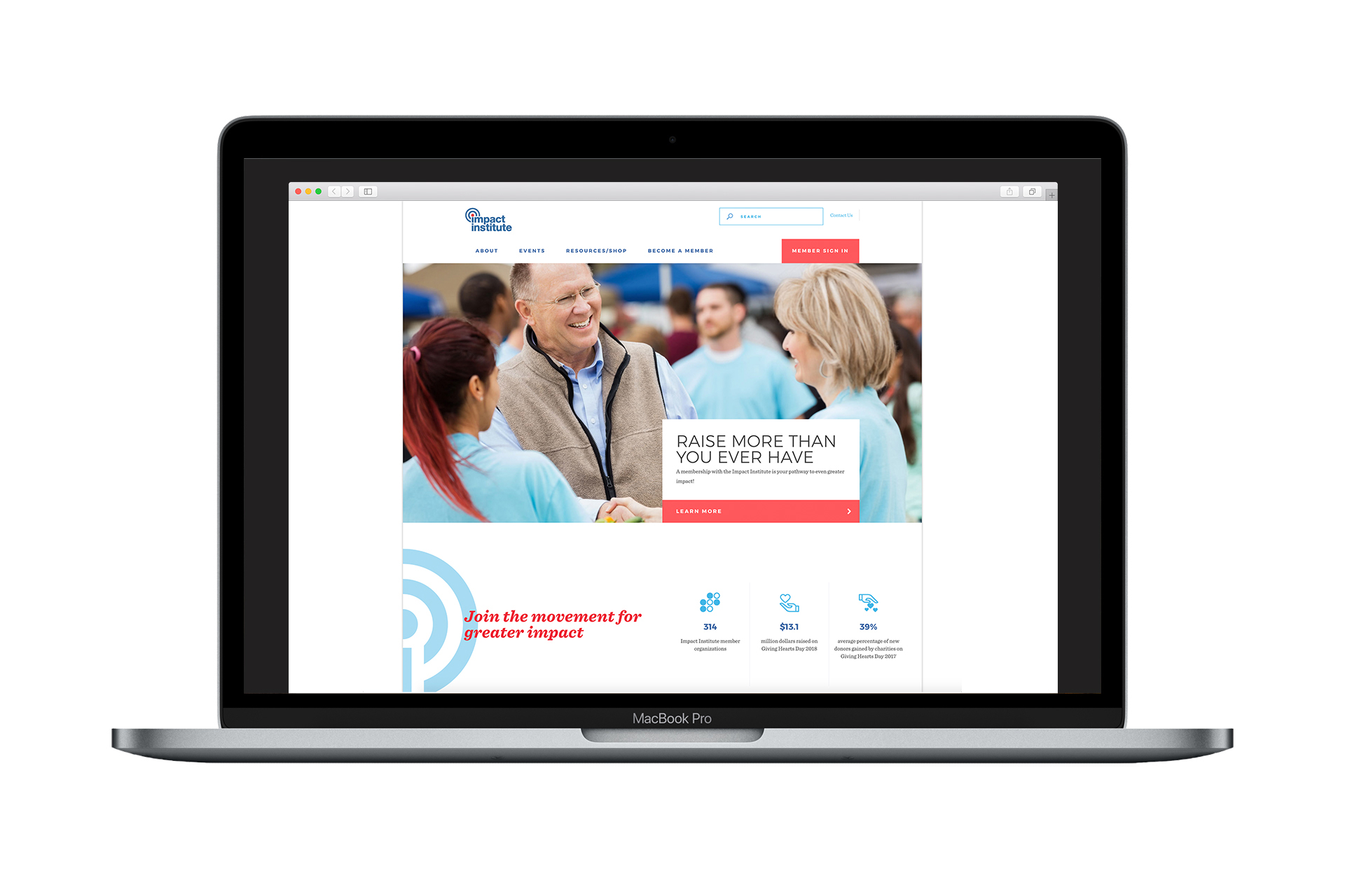
Illustrations and floods of color were integrated into a series of images and banners for use on social media and in a refresh of the organization’s existing Wordpress site.

The client described themselves as modern, refined, energetic, innovative, and welcoming. Based on the organization’s ethos and the project’s objectives, the supplementary materials, colors, typography choices, and stationery to accompany their existing logotype were created to be:
- Big
- Futuristic
- Vibrant
- Refined
- Simple
- Flexible
- Modern
- Methodical
- Elegant
- Timeless
And NOT
- Formal
- Traditional
- Serious