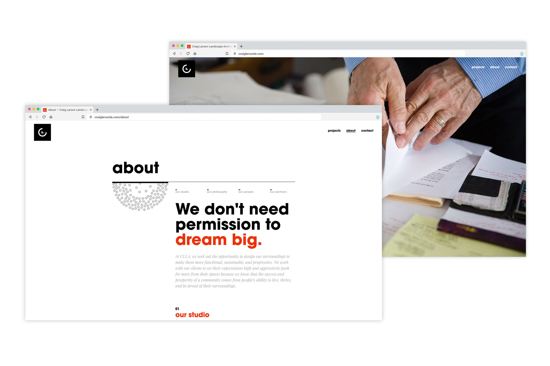
While Craig of Craig Landscape Architects (CLLA) has been practicing landscape architecture for decades, his brand, messaging, and efforts to market himself were in need of growth.
We worked with Craig to define and articulate his mission, values, and messaging—developing copy for his new website and accompanying collateral materials. In a series of conversations, we discovered the aspects of Craig’s work and approach that make him stand out in his field. The messaging we wrote and curated grew out of his focus on relationship building, out-of-the-box thinking, and dedication to the vocation.



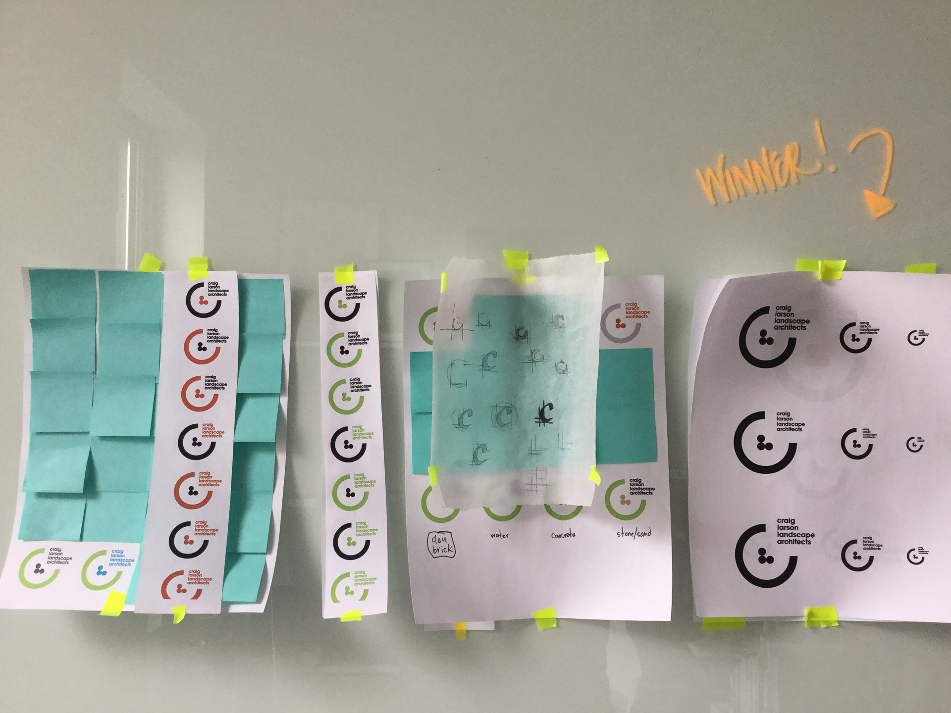
Craig came to us initially with a recycled logo from employment at a previous firm, wanting to take his brand in a more modern and flexible direction while maintaining the familiar “C” element. After exploration into his organization’s ethos, we created an atomic design system with as much flexibility and character as Craig brings to his work.

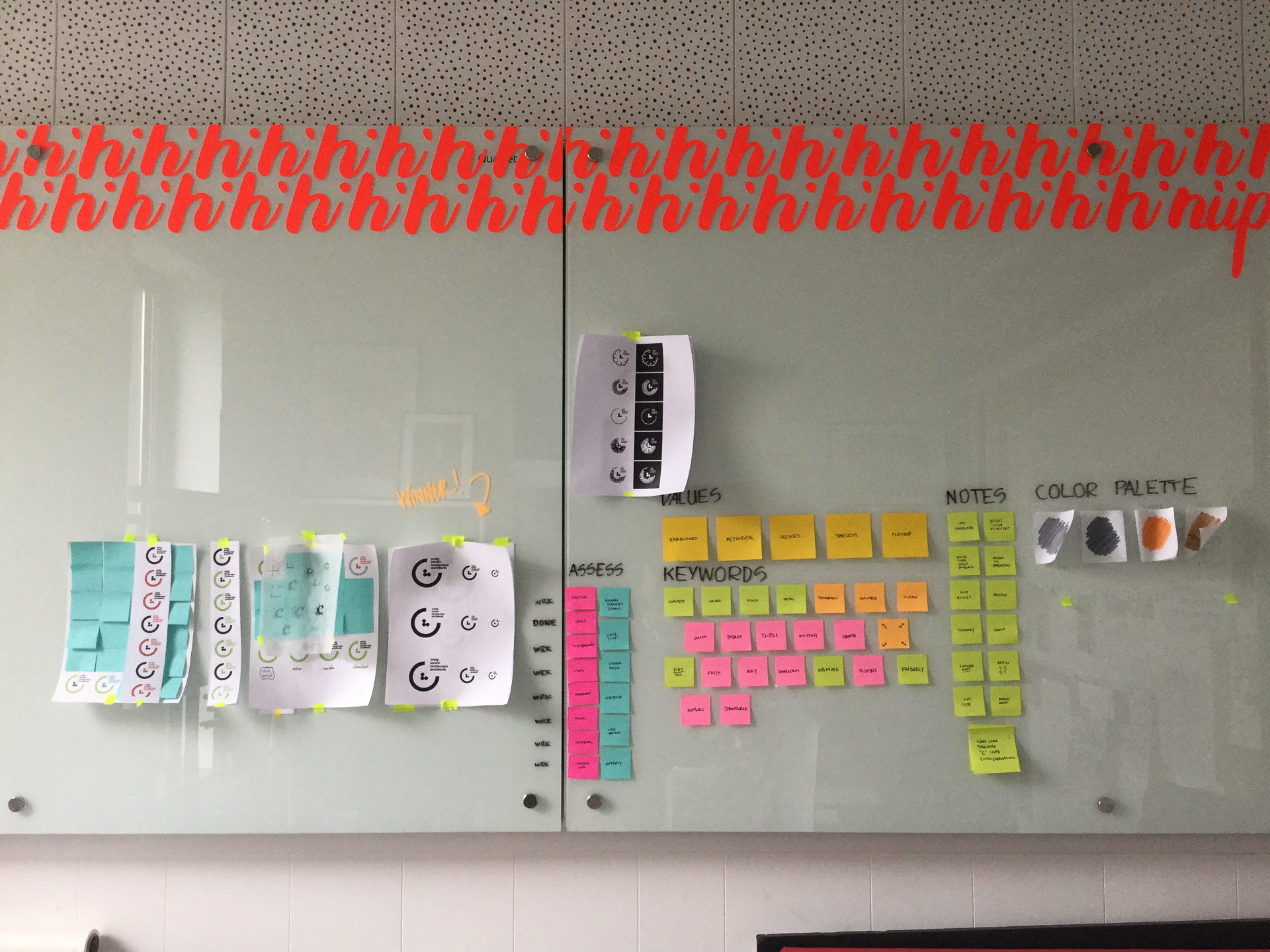

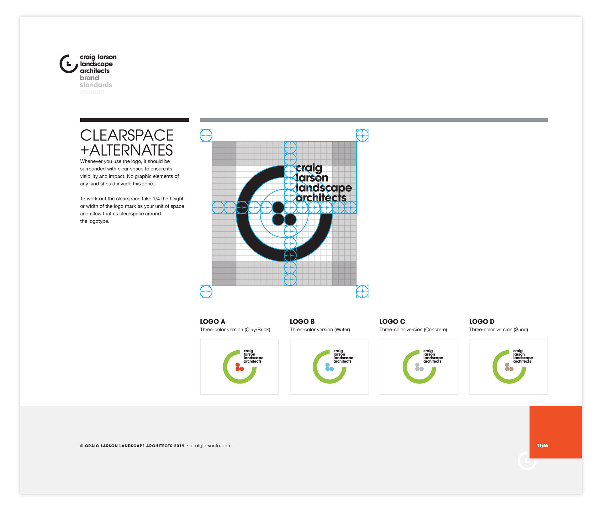
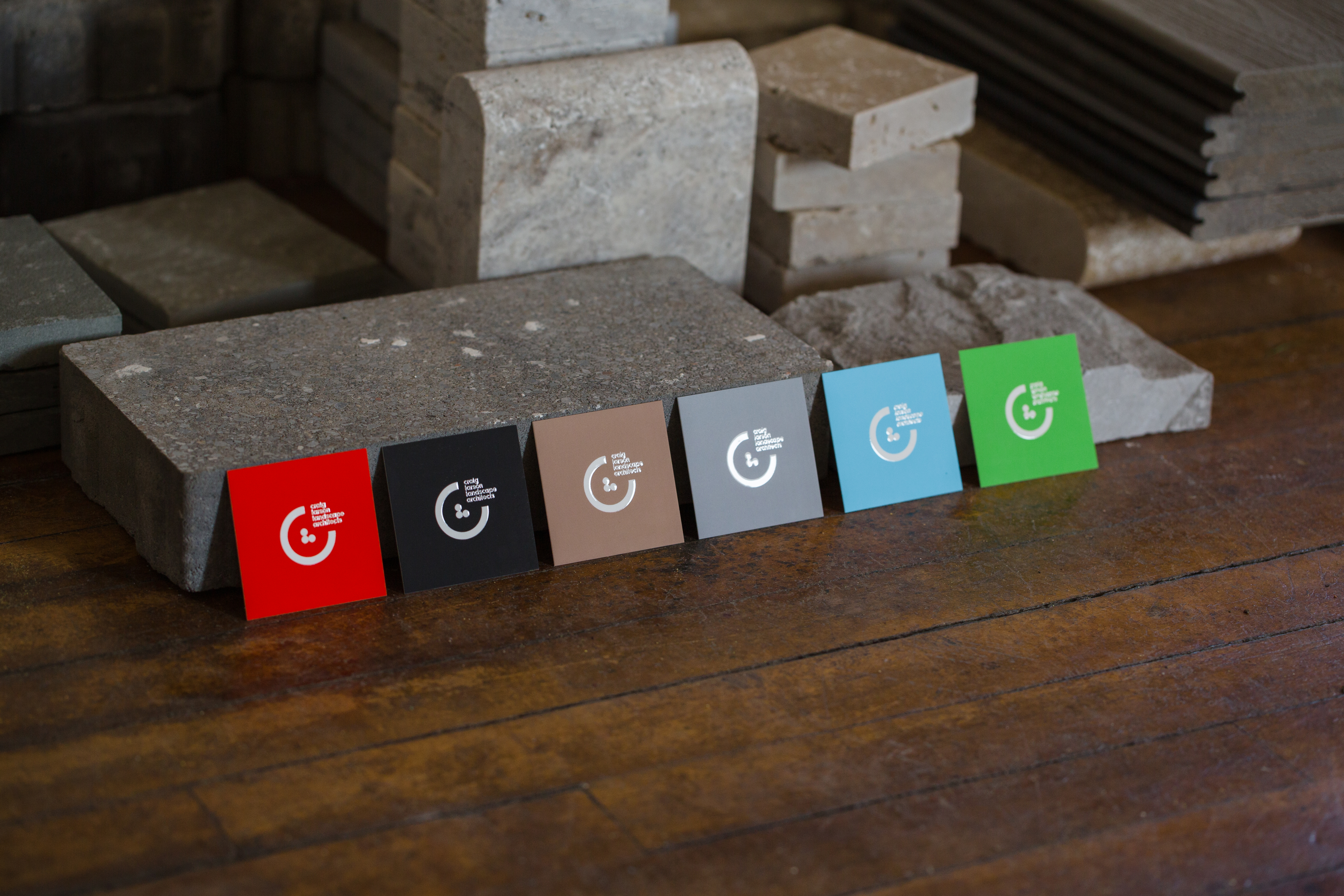

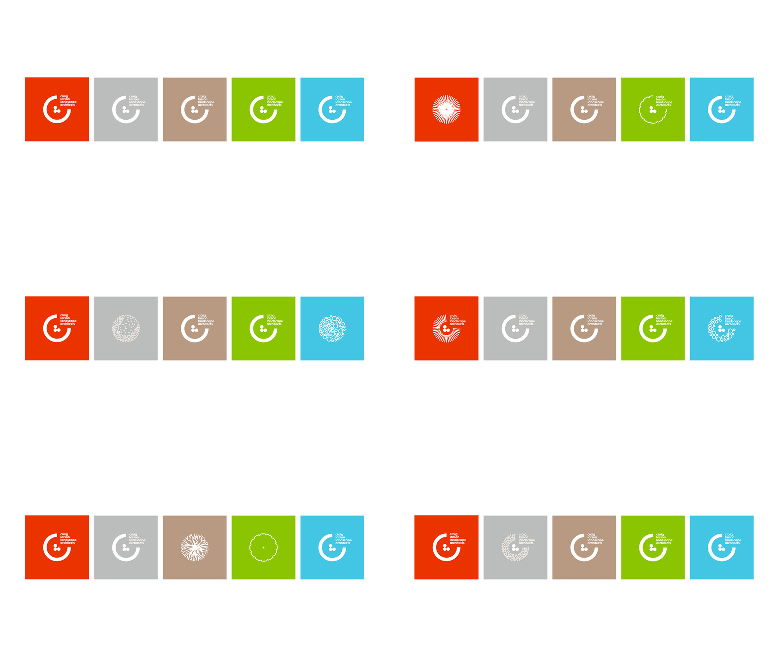
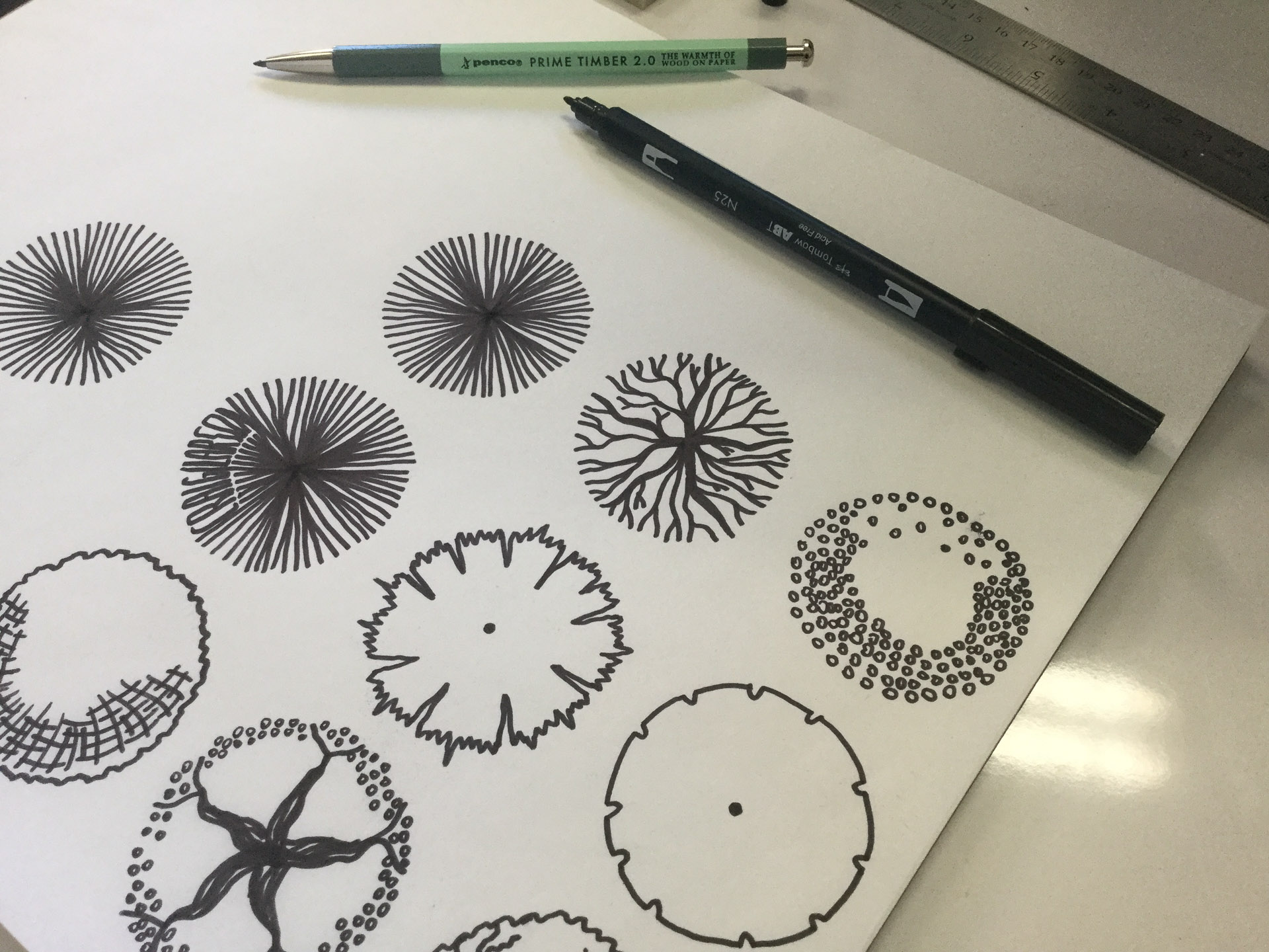
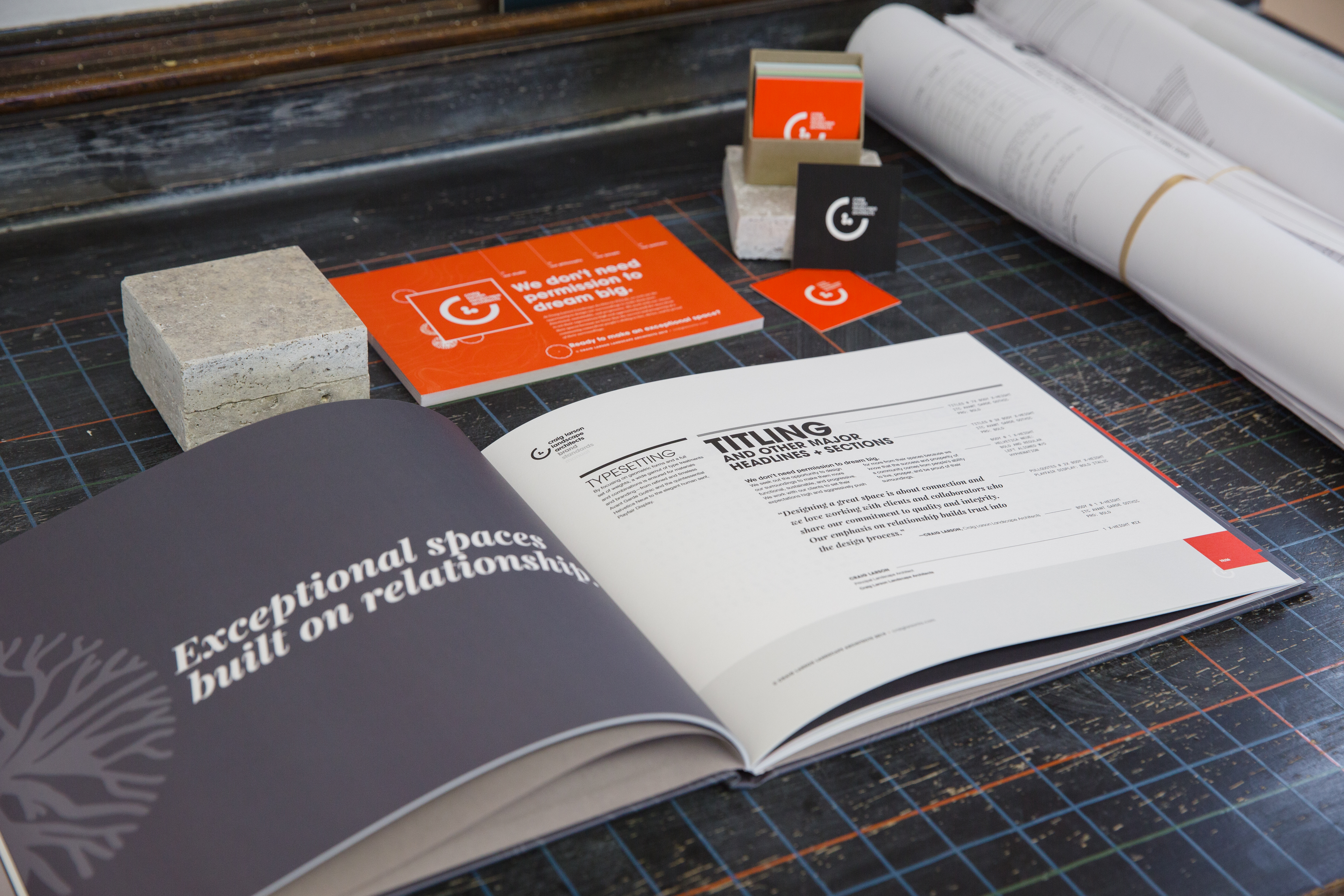
We built a color palette that pays homage to natural elements used in landscape architecture. The system also includes custom illustrations based on some of Craig’s drawings and plans.


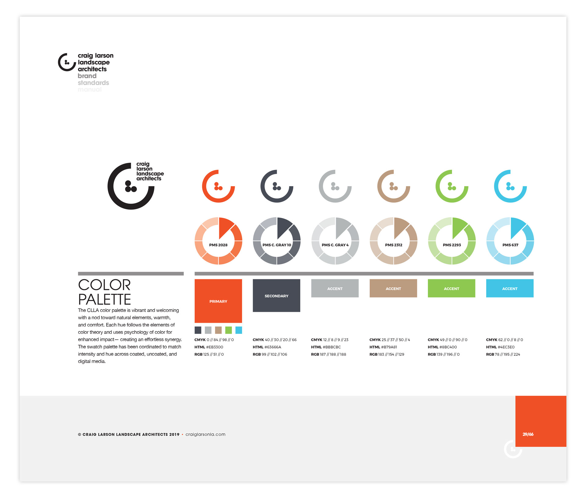
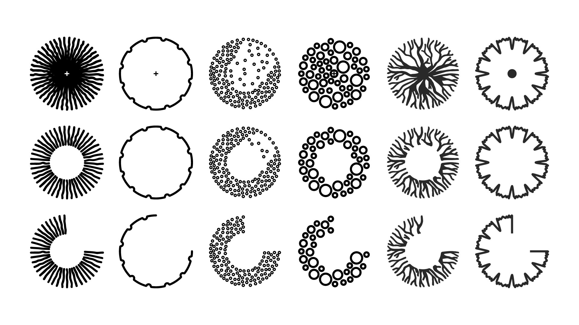

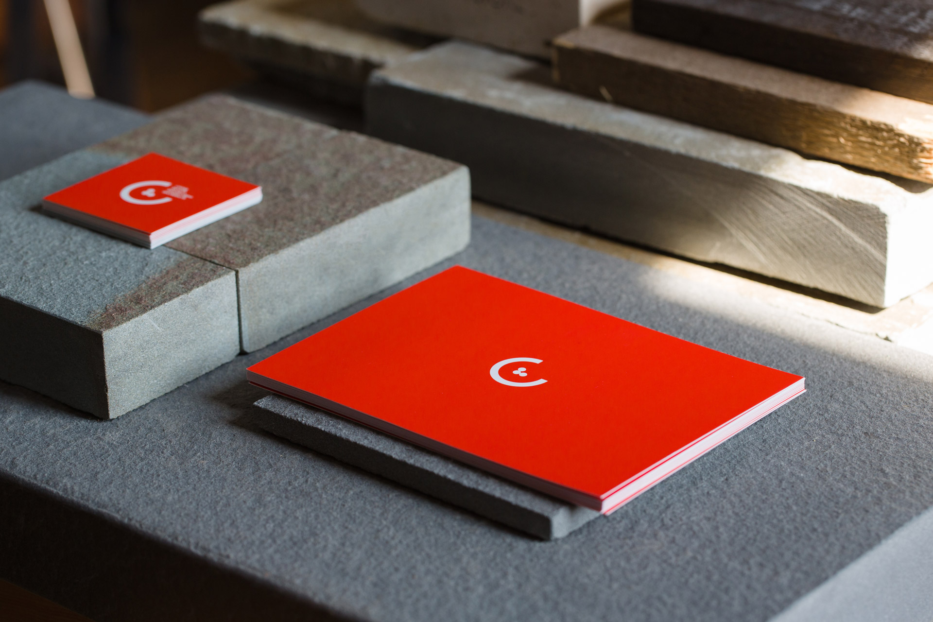
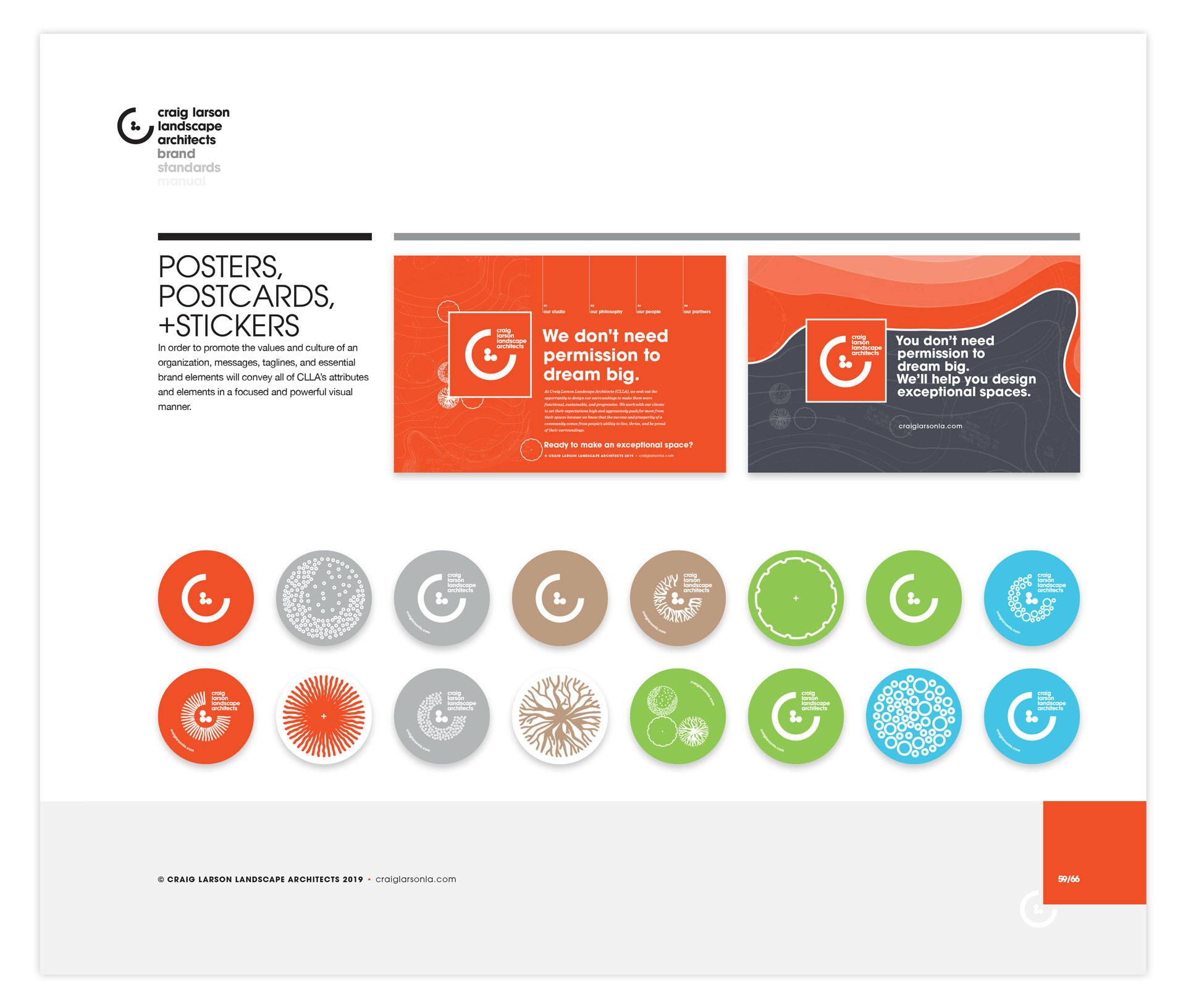
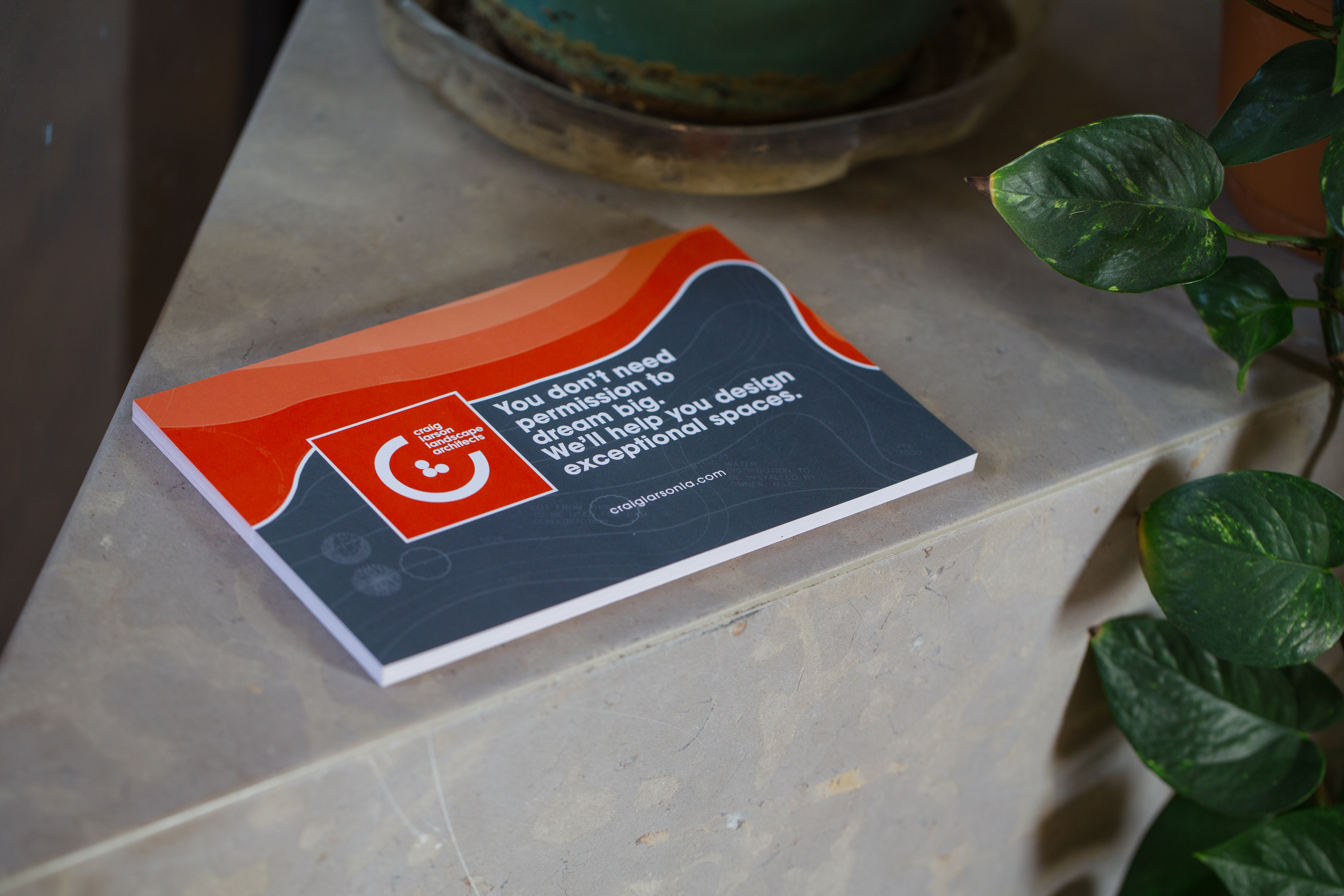
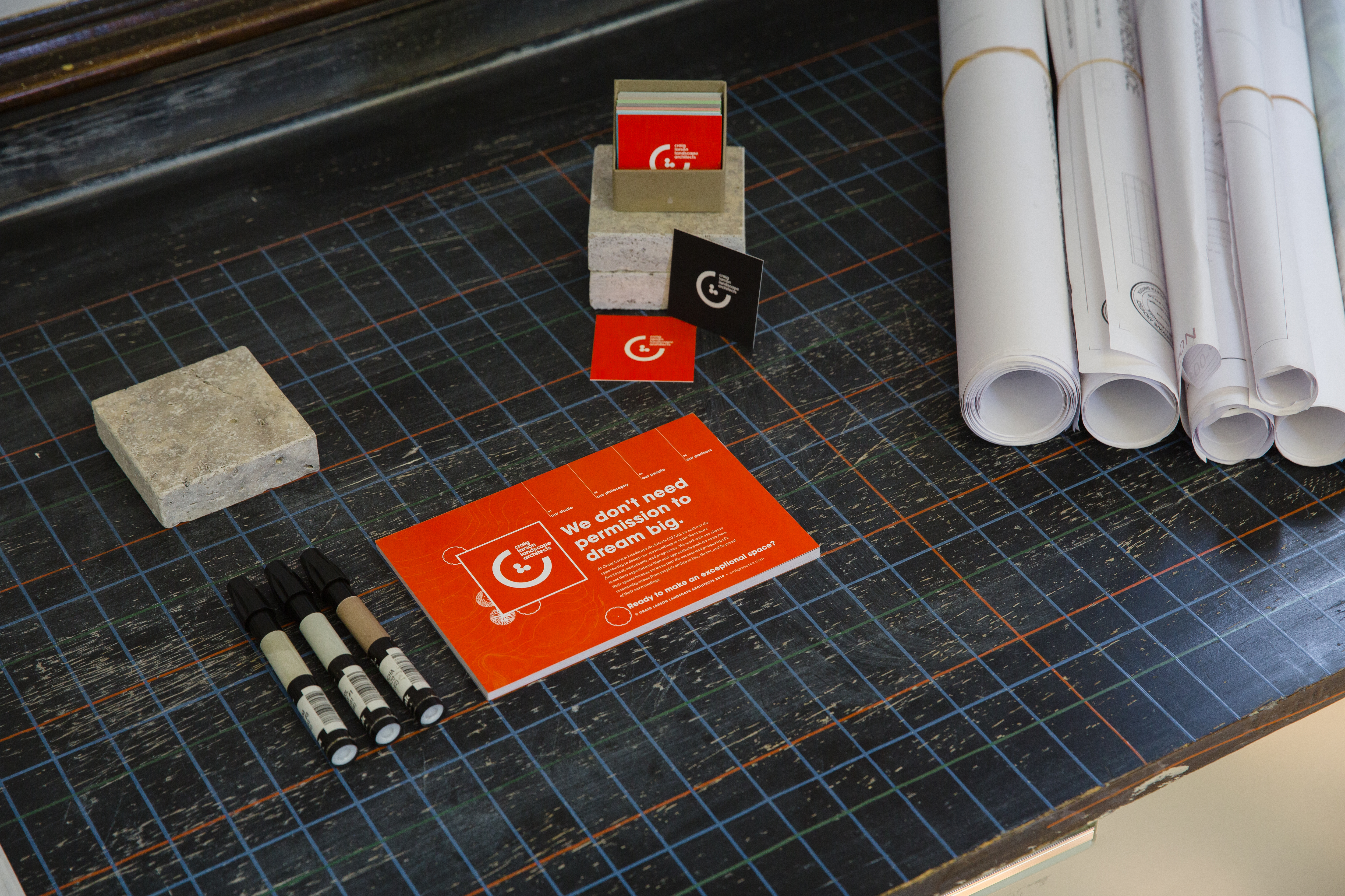
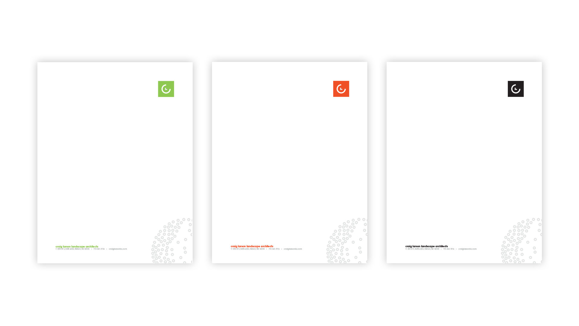
The CLLA logomark is designed for adaptation based on its usage - utilizing different colors and styles depending on the application and presentation. Collateral for promotion and custom stationery uses atoms of the CLLA design system to display a cohesive message.


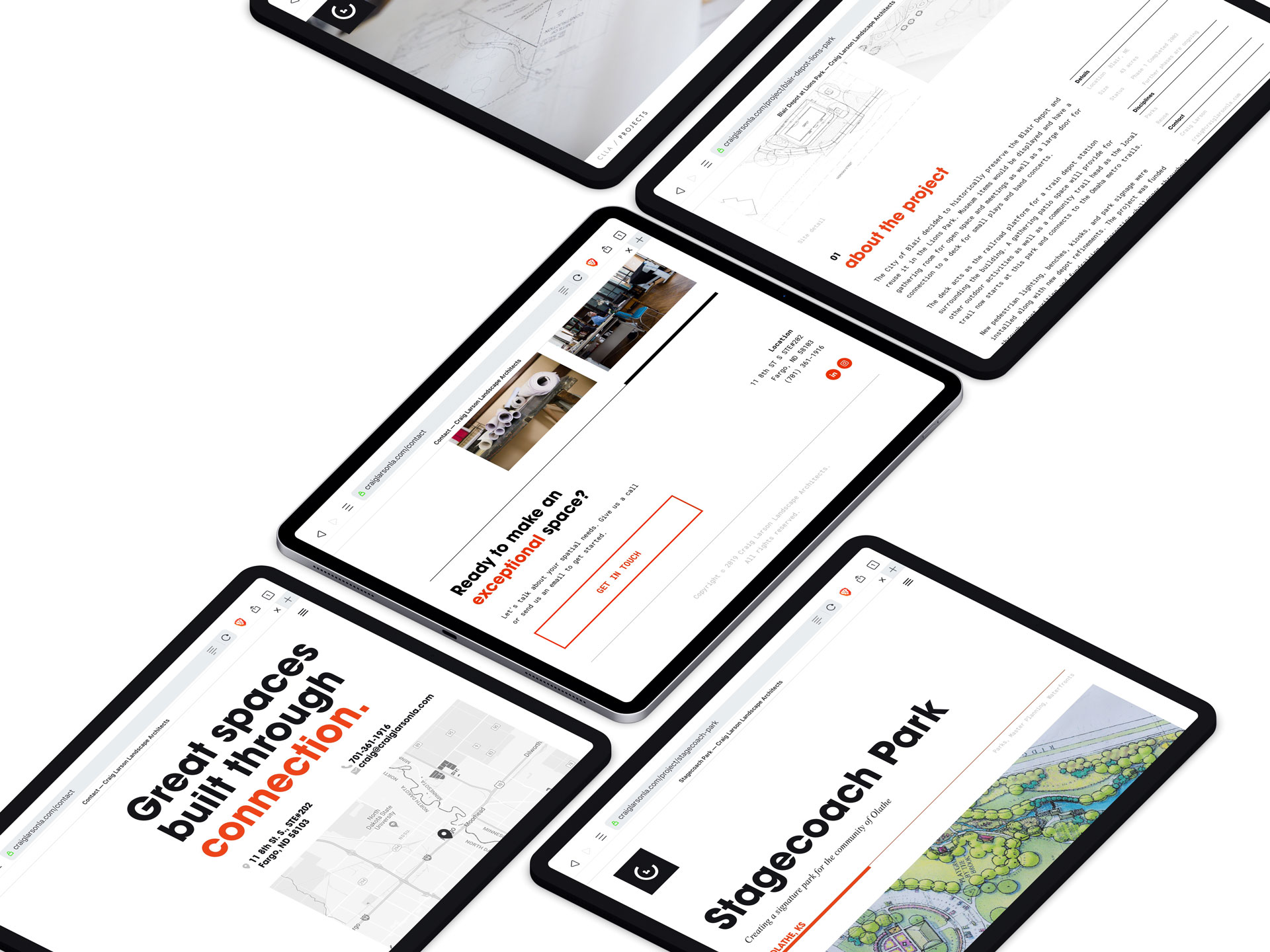
With no existing web presence, the CLLA website was created to give Craig a digital platform for information and promotion, highlighting some of his past projects and informing current and potential clients about his values and philosophy.
