Mockup of two pages of a printed article with blue highlights

Tasked to bring energy to a series of articles and integrate them into a cohesive field manual, we used a mixture of structured grids and hand-drawn elements to create nearly 40 unique article layouts built on an atomic design system.

Giving each category of articles its own set of elements and tools allowed us to make articles heavy with text come alive and entice readers to keep reading. An integration of dot grids throughout encourages readers to scribble notes in the margins. Colorful, accented key messages prompt further highlighting by the reader.
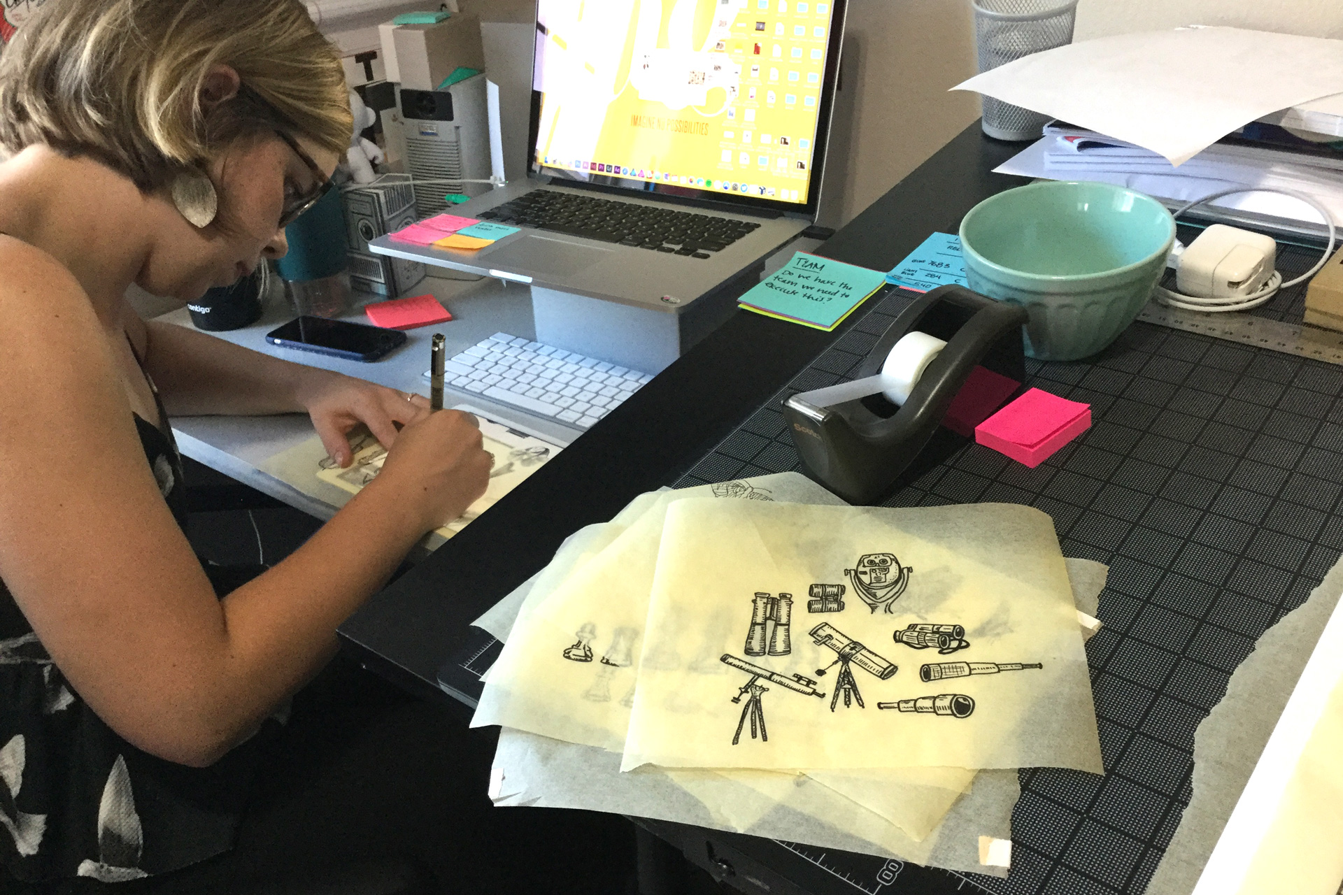
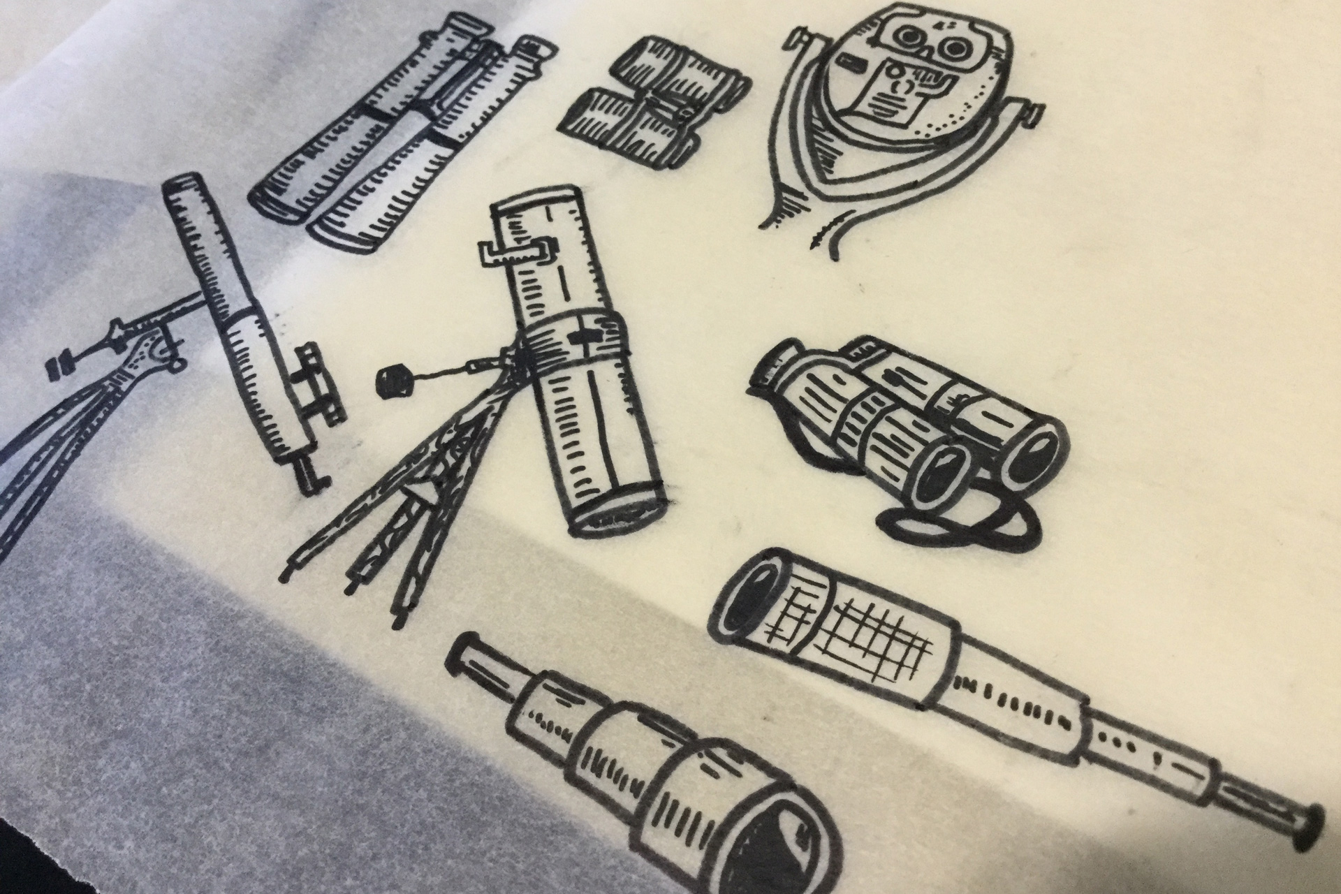
Woman drawing with pieces of tracing paper displaying illustrations of telescopes stacked beside her on a desk
Telescopes and binoculars hand-drawn on a sheet of tracing paper
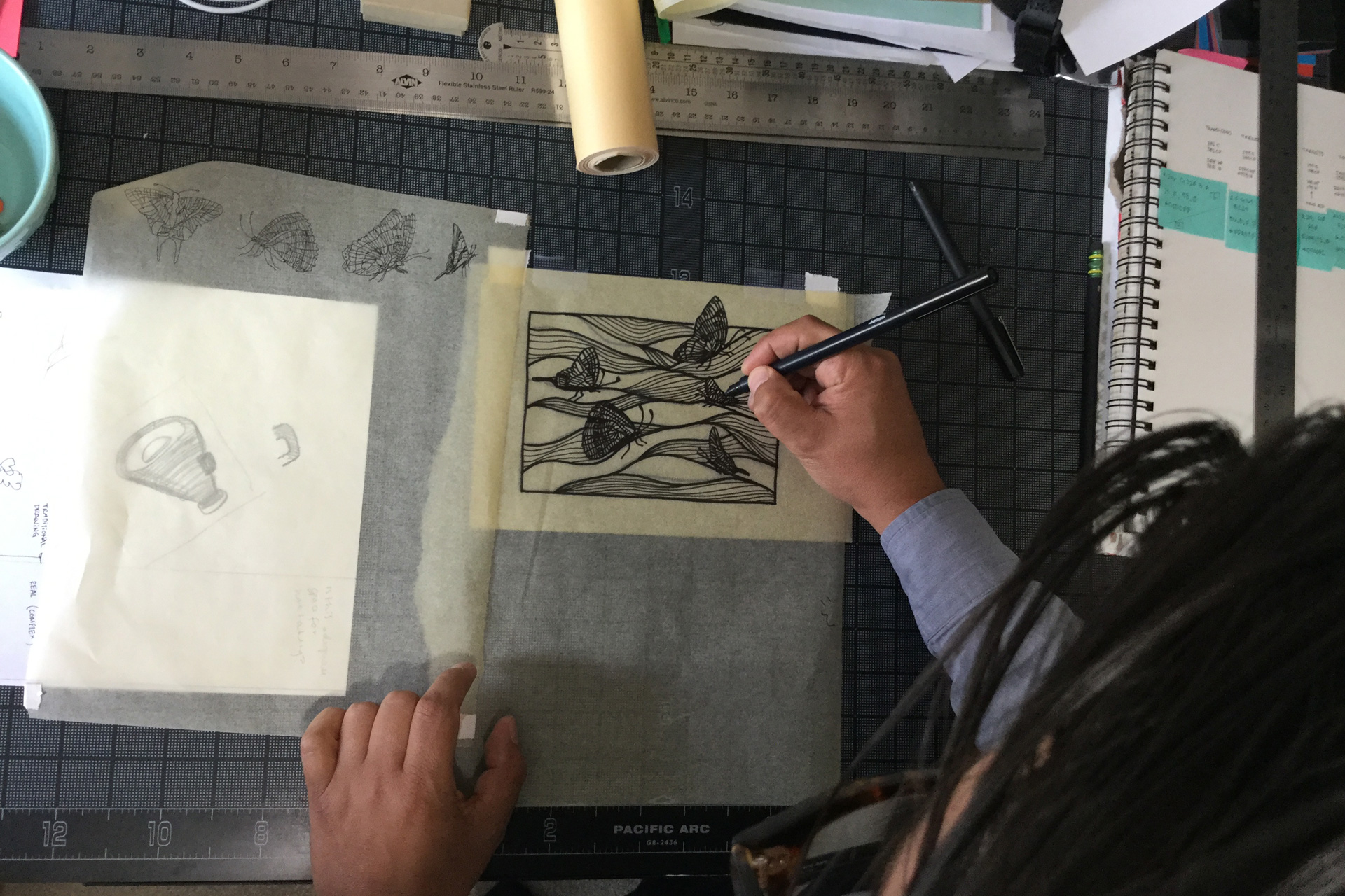
A man drawing waves and butterflies on a piece of tracing paper atop a black gridded mat
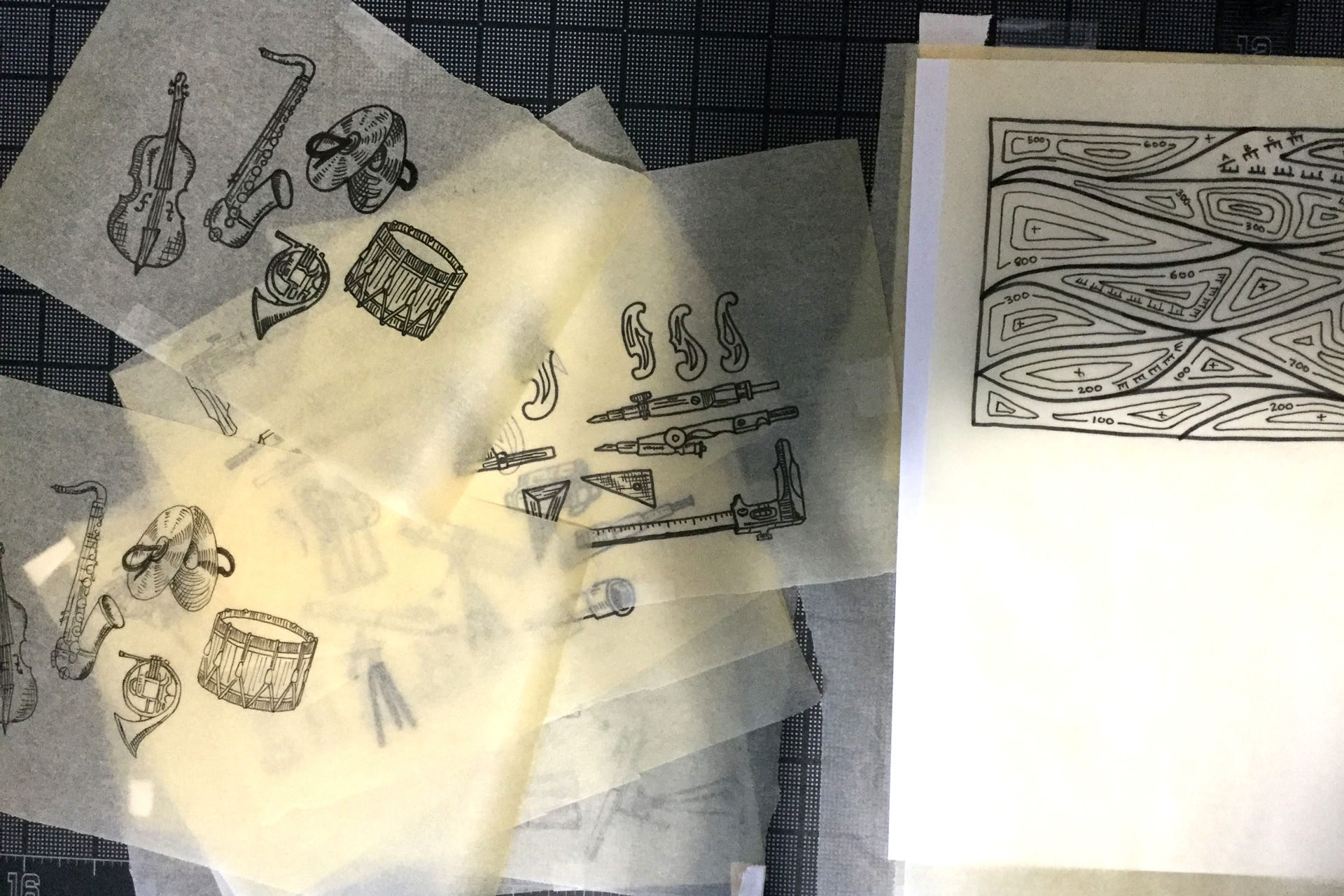
Sheets of tracing paper displaying illustrations of musical instruments
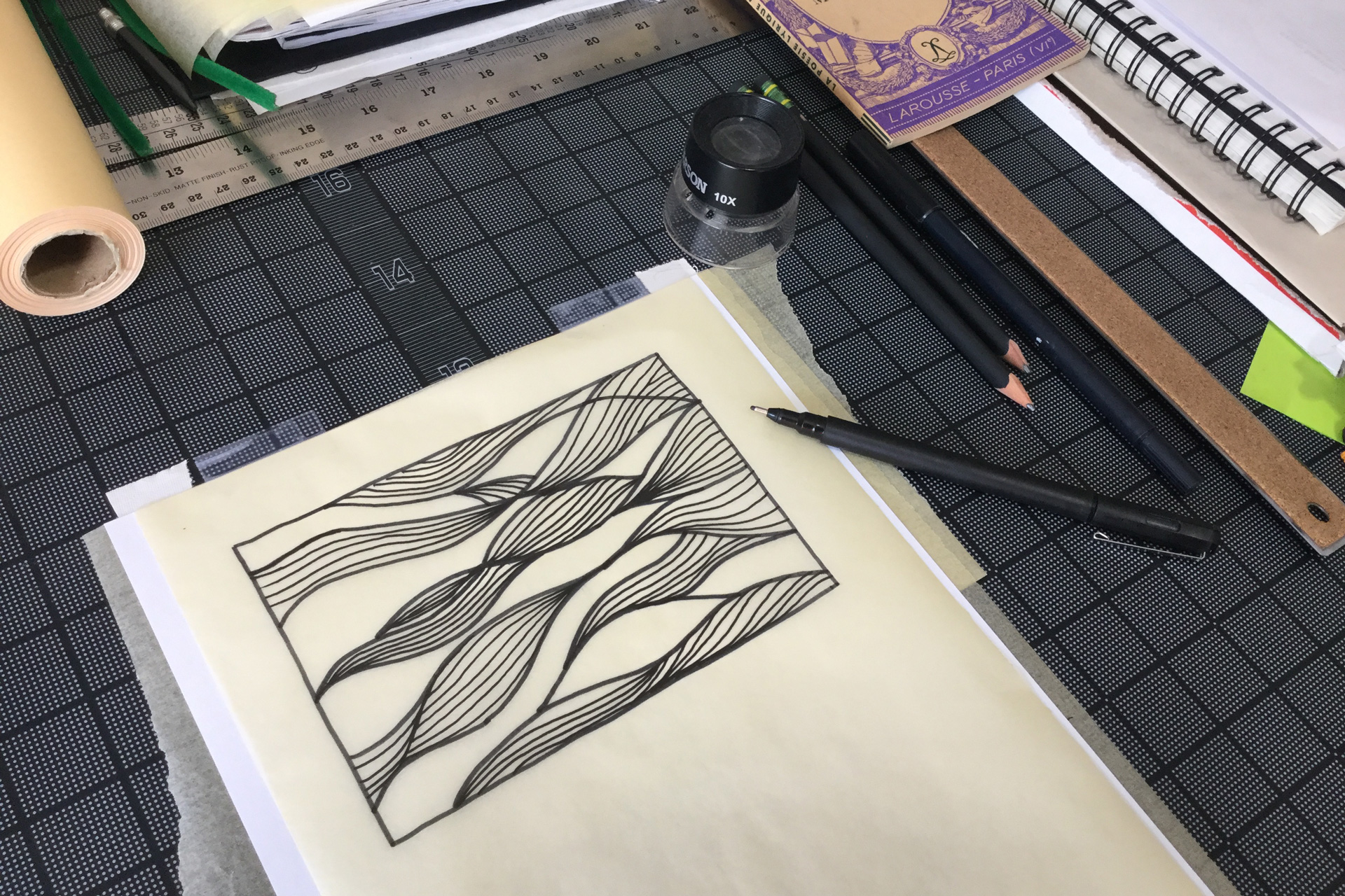
A wavy pattern hand-drawn on a sheet of tracing paper next to pens and notebooks atop a black gridded mat

Hand-drawn illustrations accompany each category of article
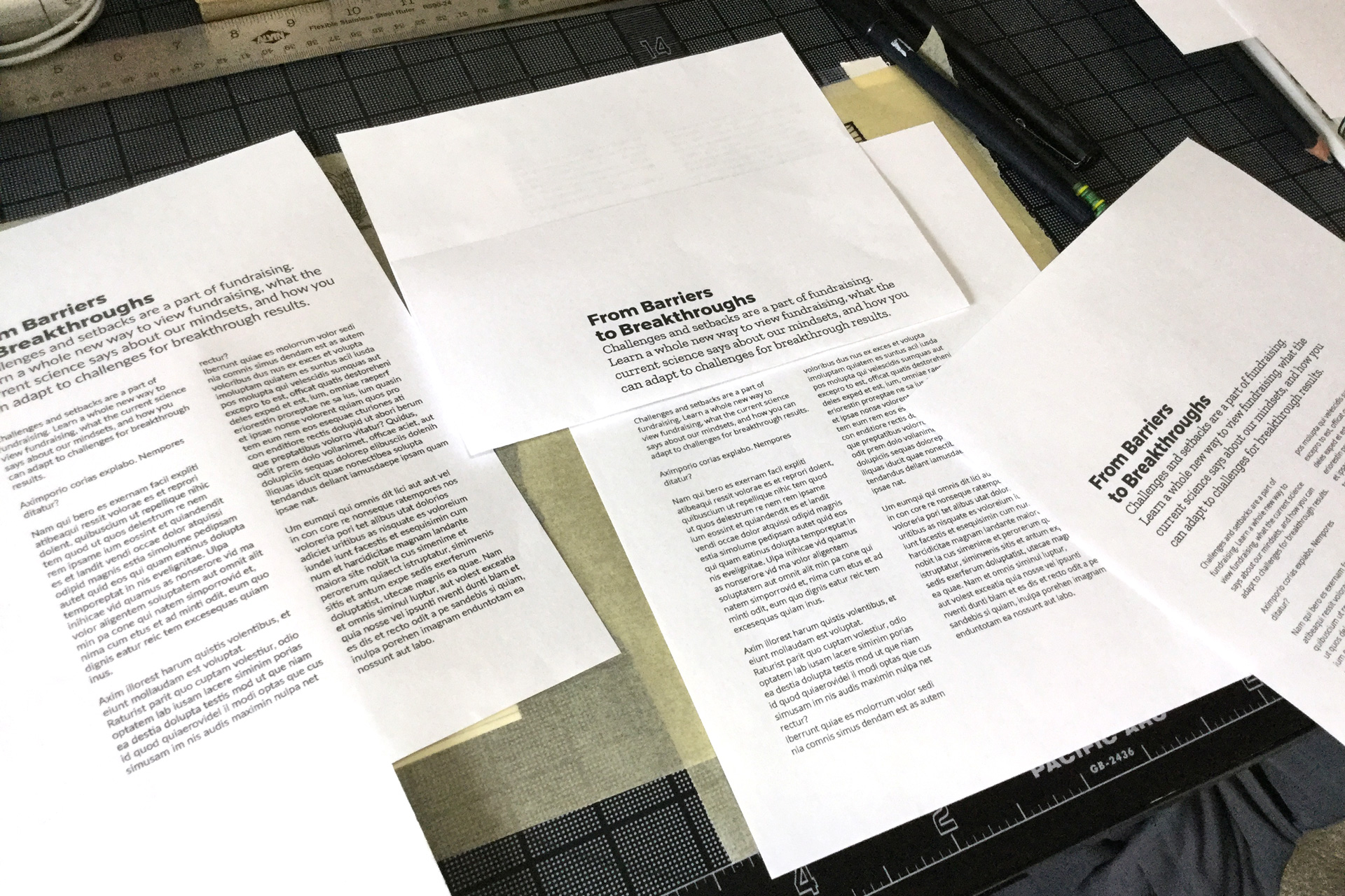
Pieces of white paper with typography samples on a black desk

Iterations of typography layouts
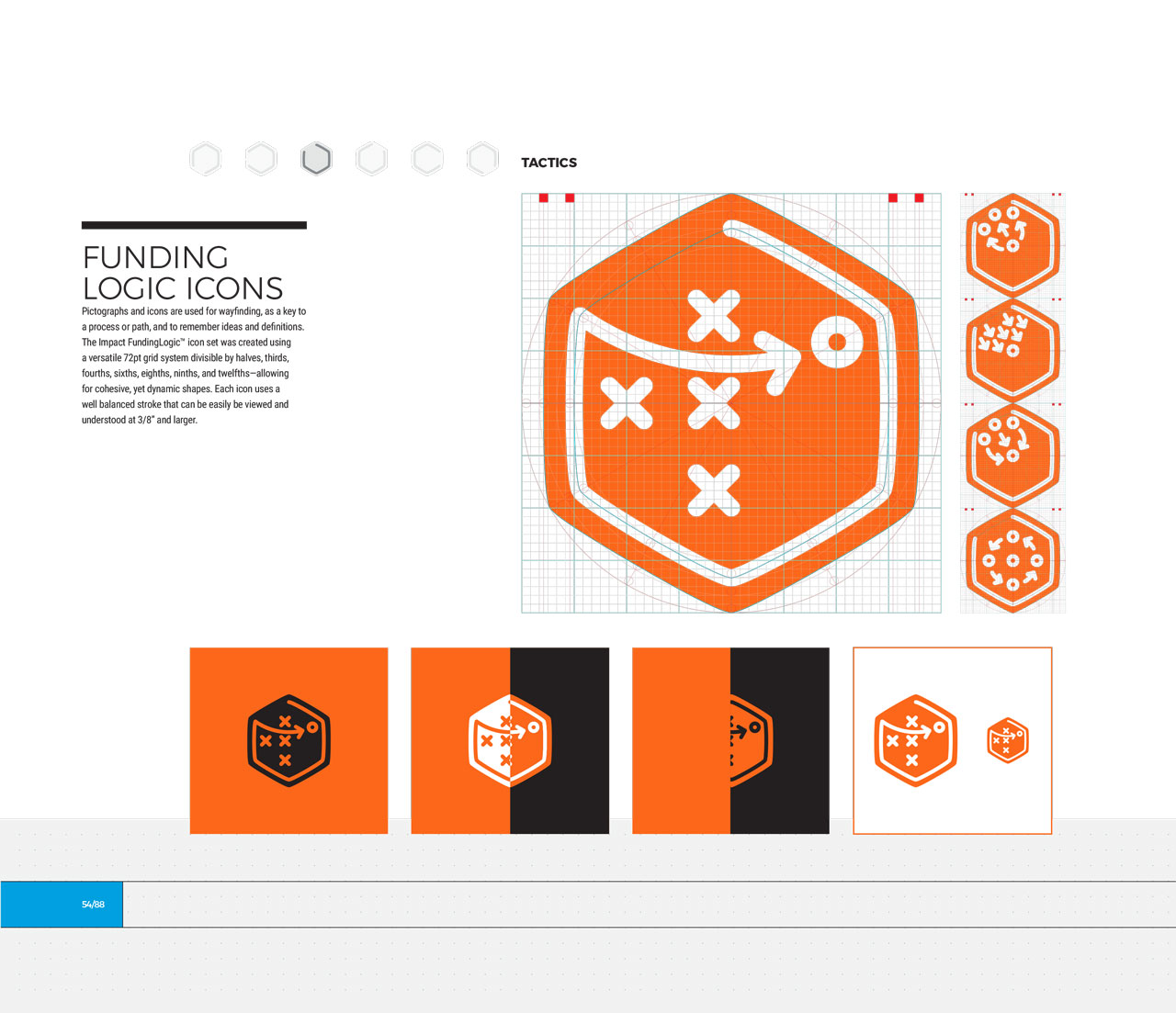
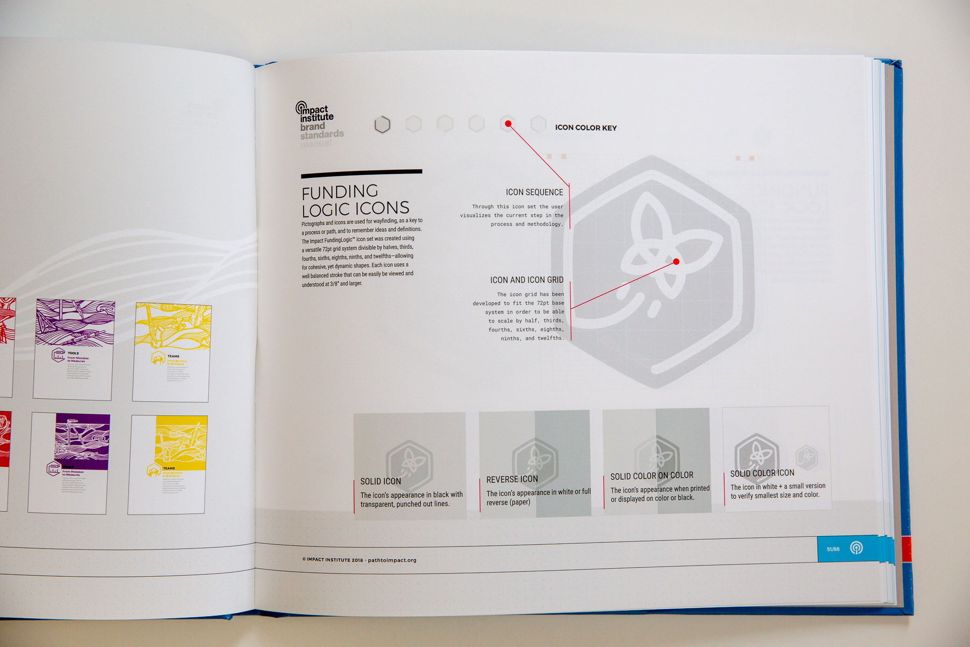
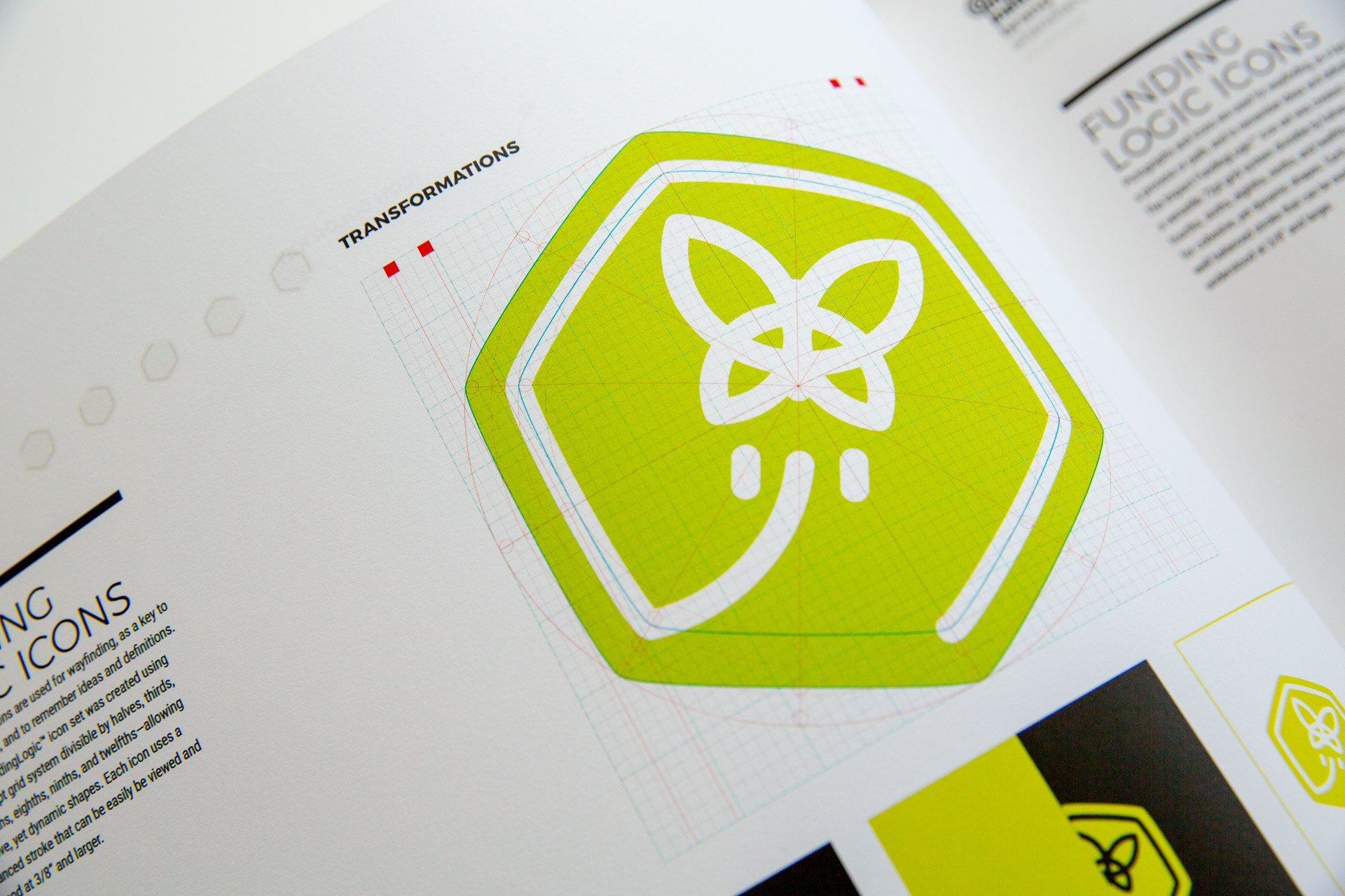
Impact brand guideline manual open to FundingLogic icon detail page
Green butterfly Transformations icon on white page of Impact brand guideline manual
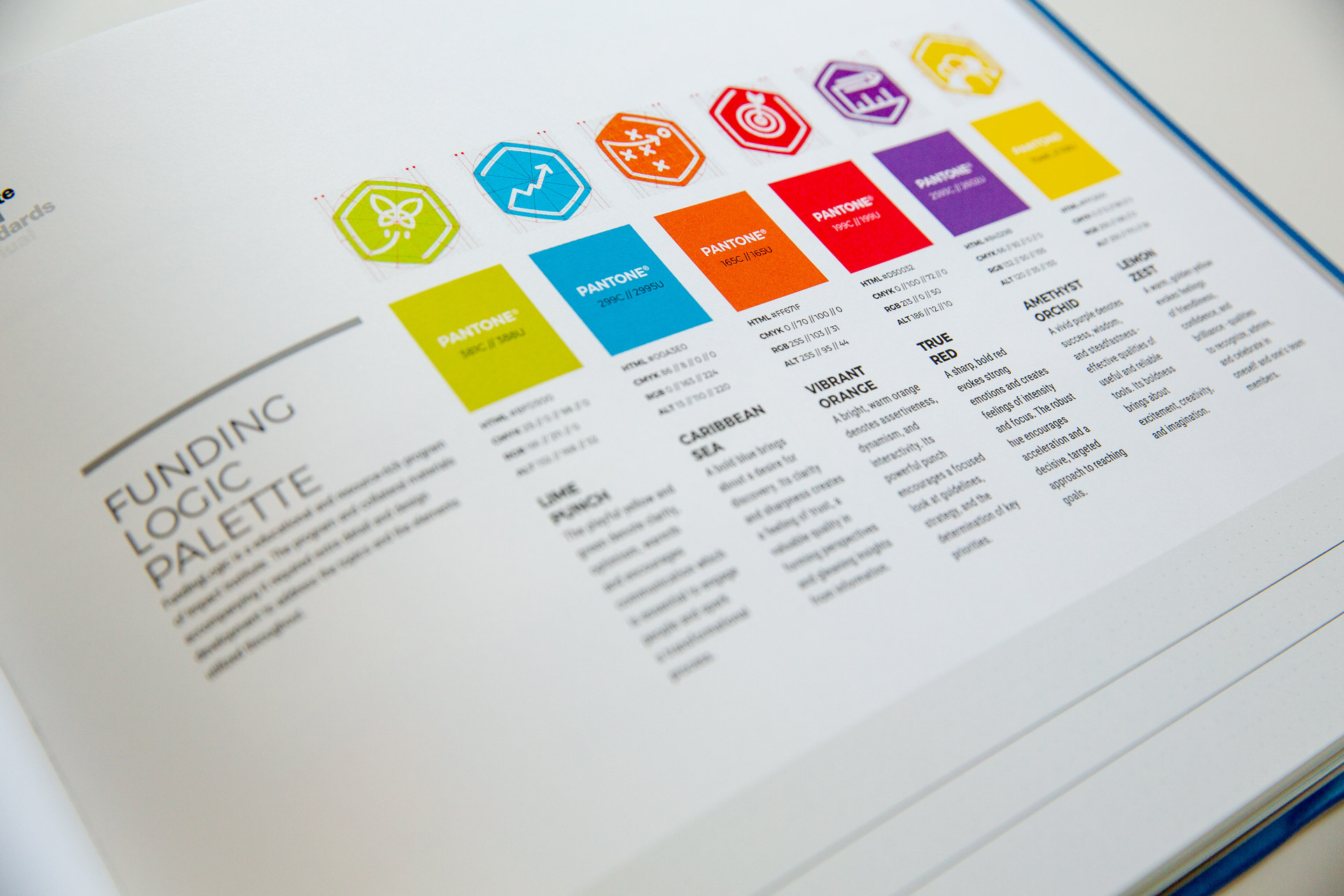
Impact brand guideline manual open to FundingLogic color scheme page
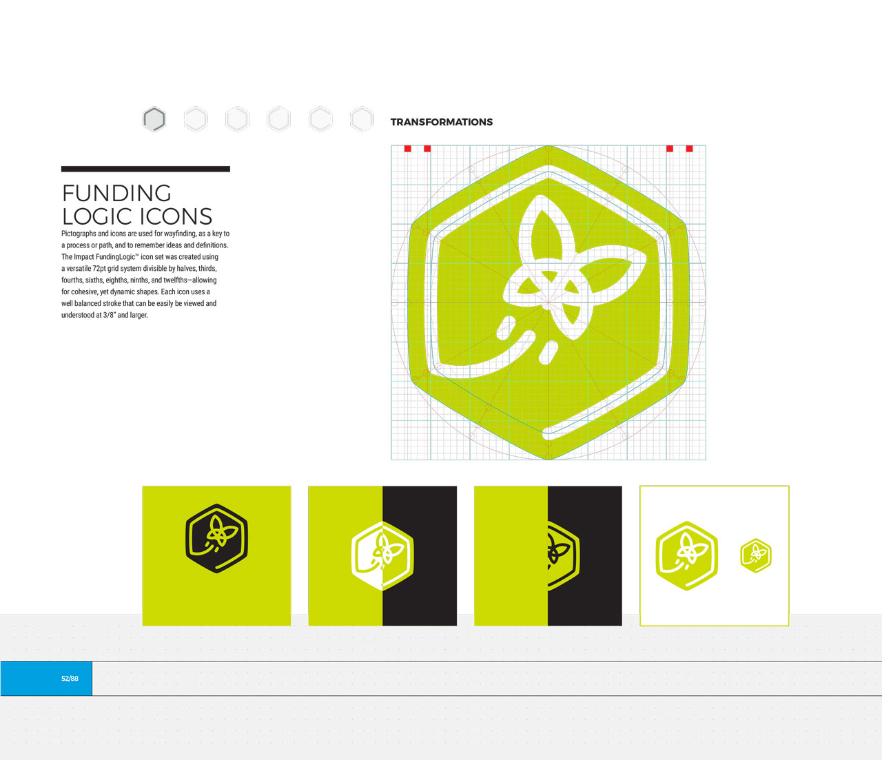
Single page from brand identity manual displaying green, hexagonal transformation icon
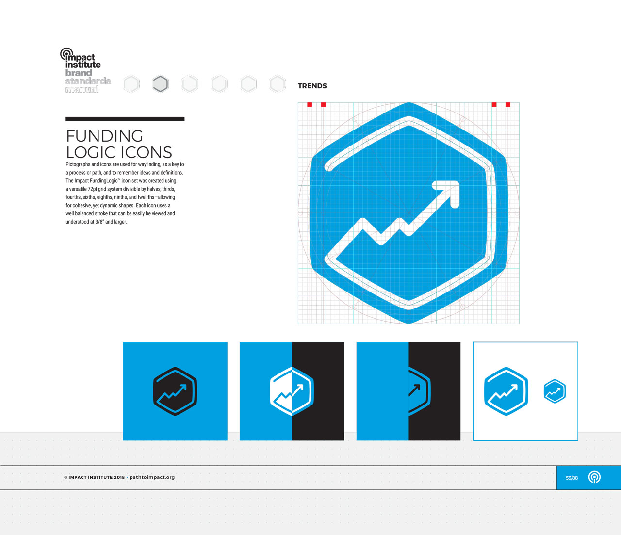
Single page from brand identity manual displaying blue, hexagonal trends icon
Single page from brand identity manual displaying orange, hexagonal tactics icon
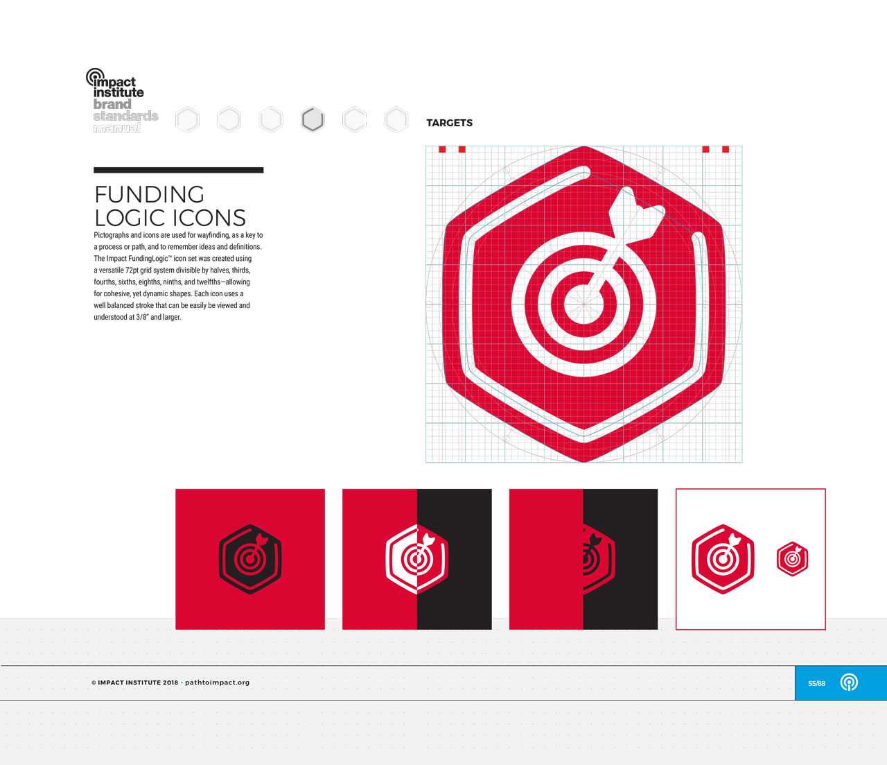
Single page from brand identity manual displaying red, hexagonal target icon
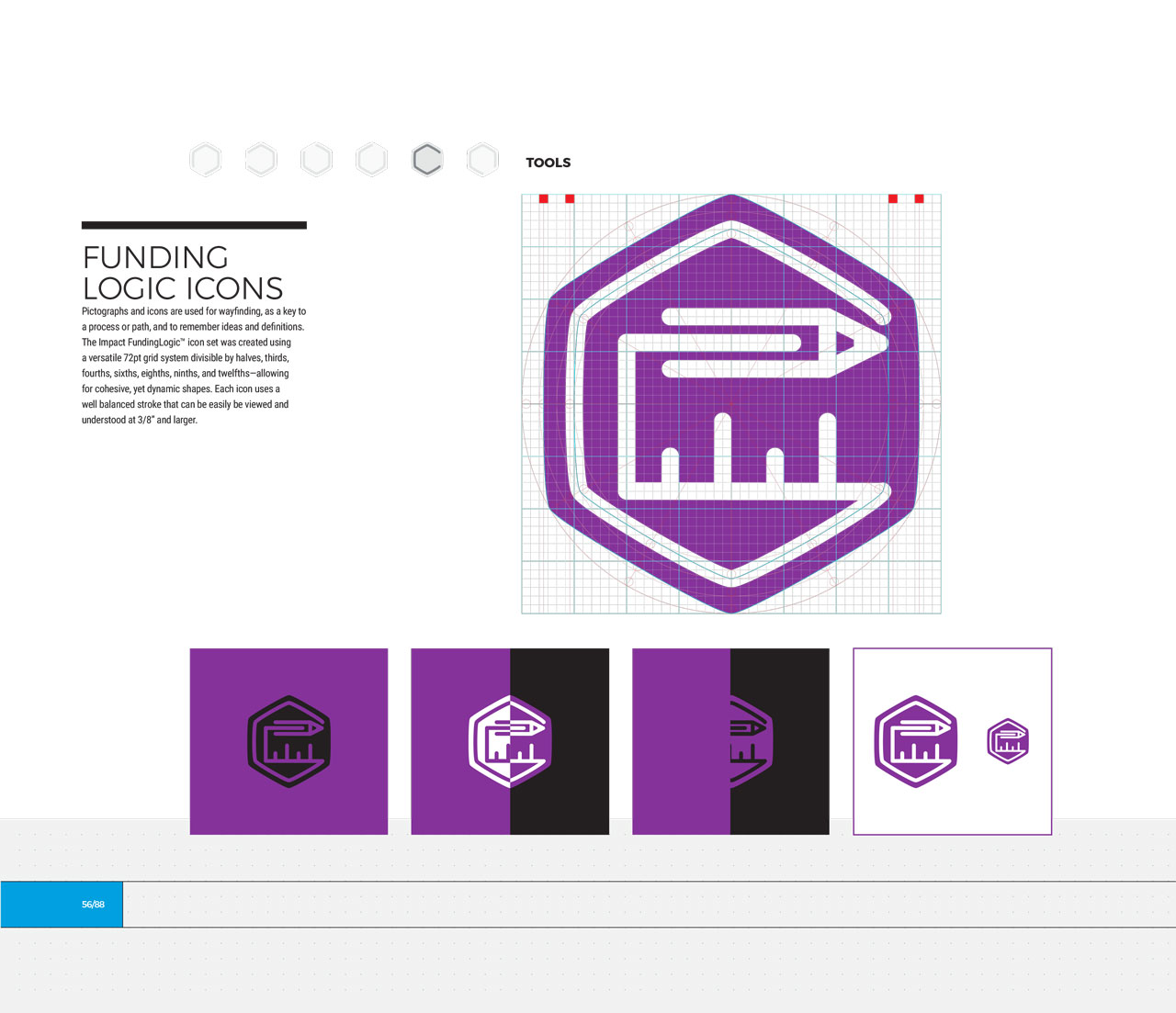
Single page from brand identity manual displaying purple, hexagonal tools icon
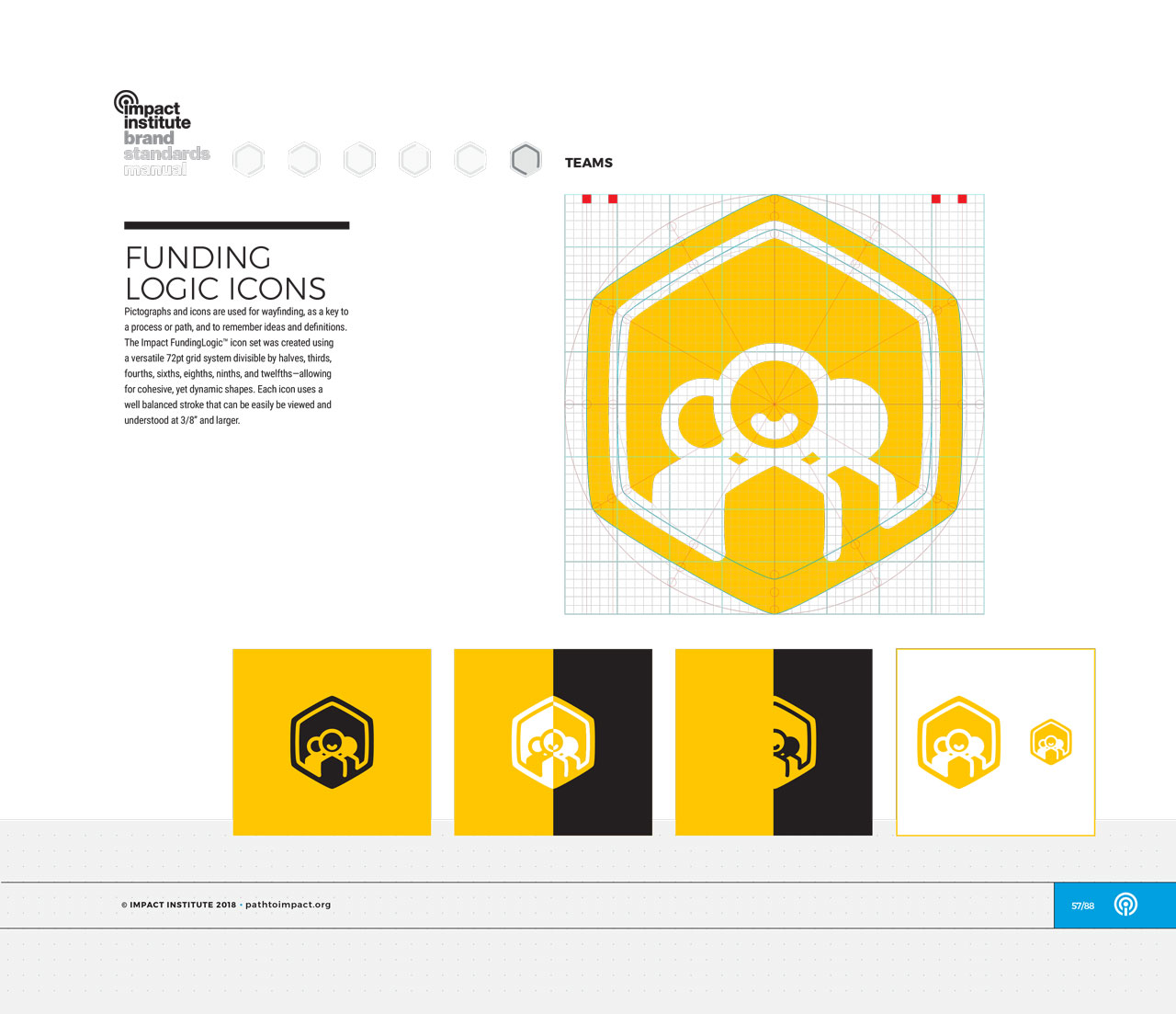
Single page from brand identity manual displaying yellow, hexagonal team icon

Custom icons and color-scheme for each step in the FundingLogic methodology
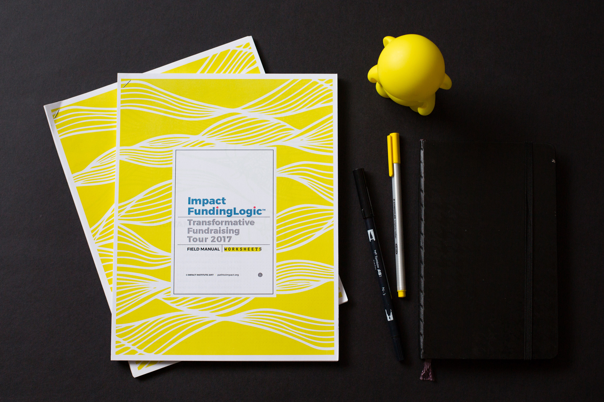
Printed Impact FundingLogic packet with yellow cover next to pens and a yellow munny figurine on a black background
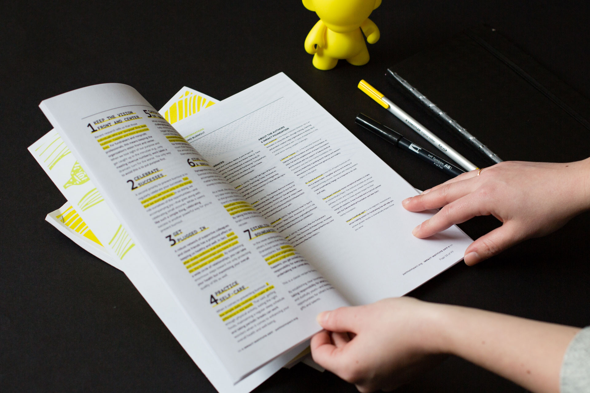
Two hands holding printed materials open next to pens and a yellow munny figurine on a black background
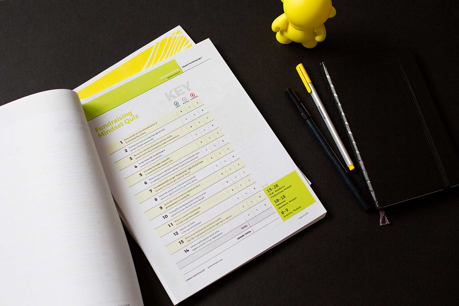
FundingLogic printed booklet open to a worksheet page next to pens and a yellow munny figurine on a black background

A printed booklet of a selection of articles from the manual was used at FundingLogic trainings for nonprofits

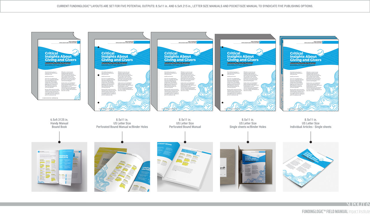
We knew the articles and subsequent handbook needed to be adaptable, flexible, and responsive. Designing each article with expandable margins allowed for a single page to adapt to the size needed, depending on the intended use of the materials at any given time. Each article is designed to fit a 9” x 6” field manual printed magazine style with an expanded version for articles printed individually at home or for use in workshops.
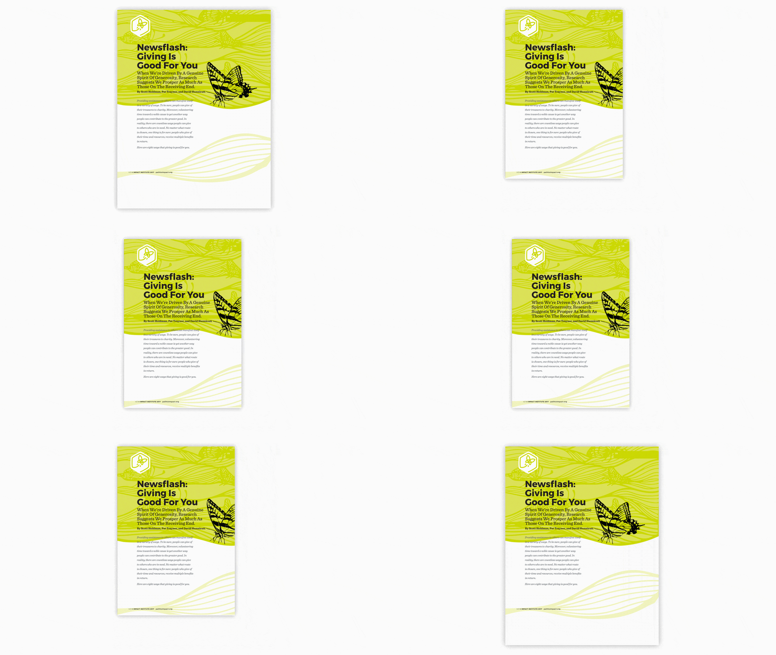
Mockup of single page of green, transformations article with a hand-drawn black butterfly
Examples of different page sizes the manual could be printed at
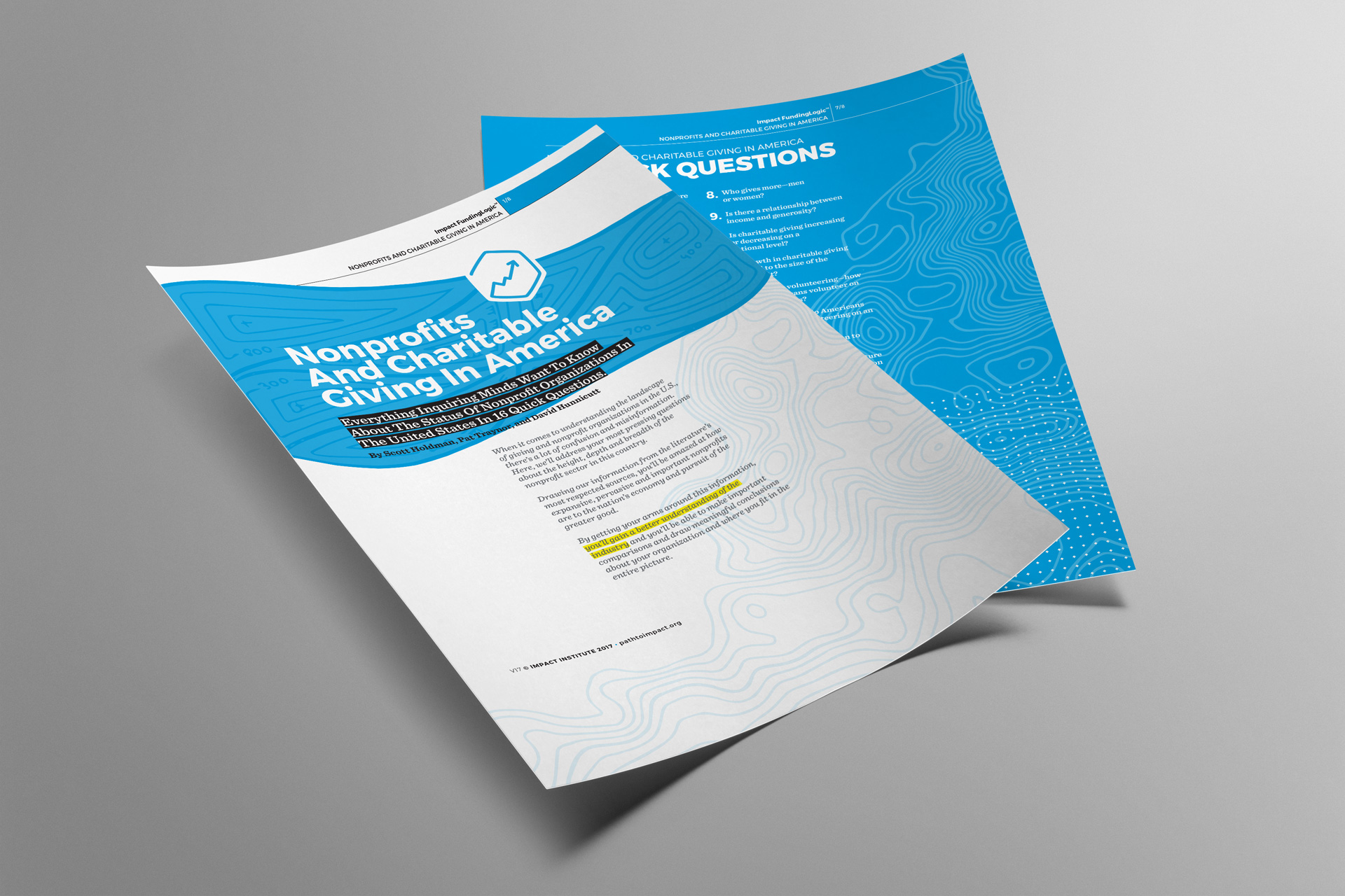
Mockup of two pages of a printed article with blue highlights
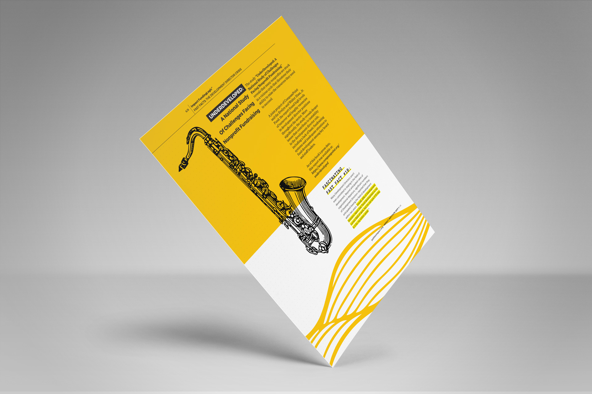
Mockup of a single page of a printed article with yellow accents and a black, hand-drawn saxophone on it
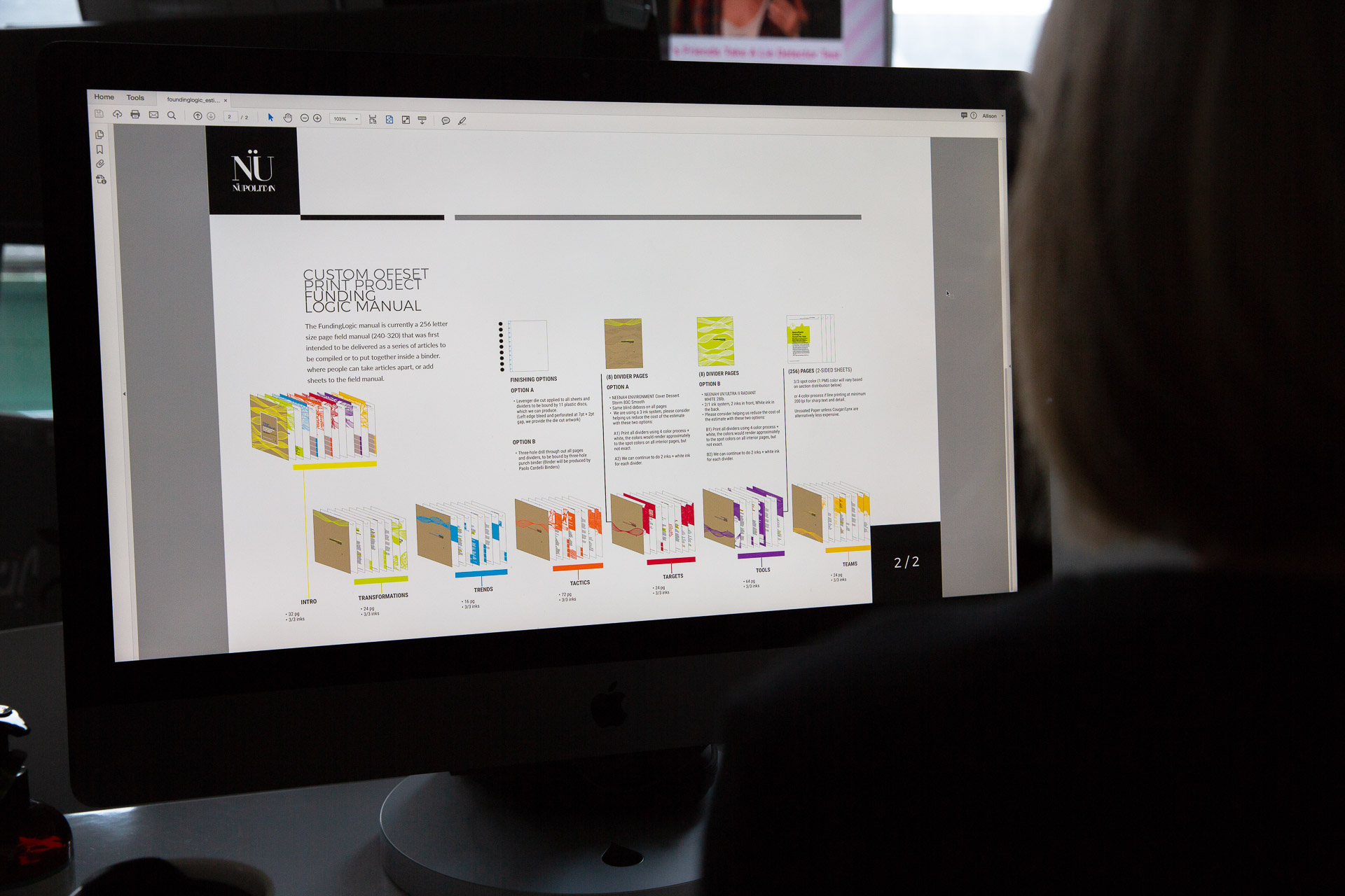
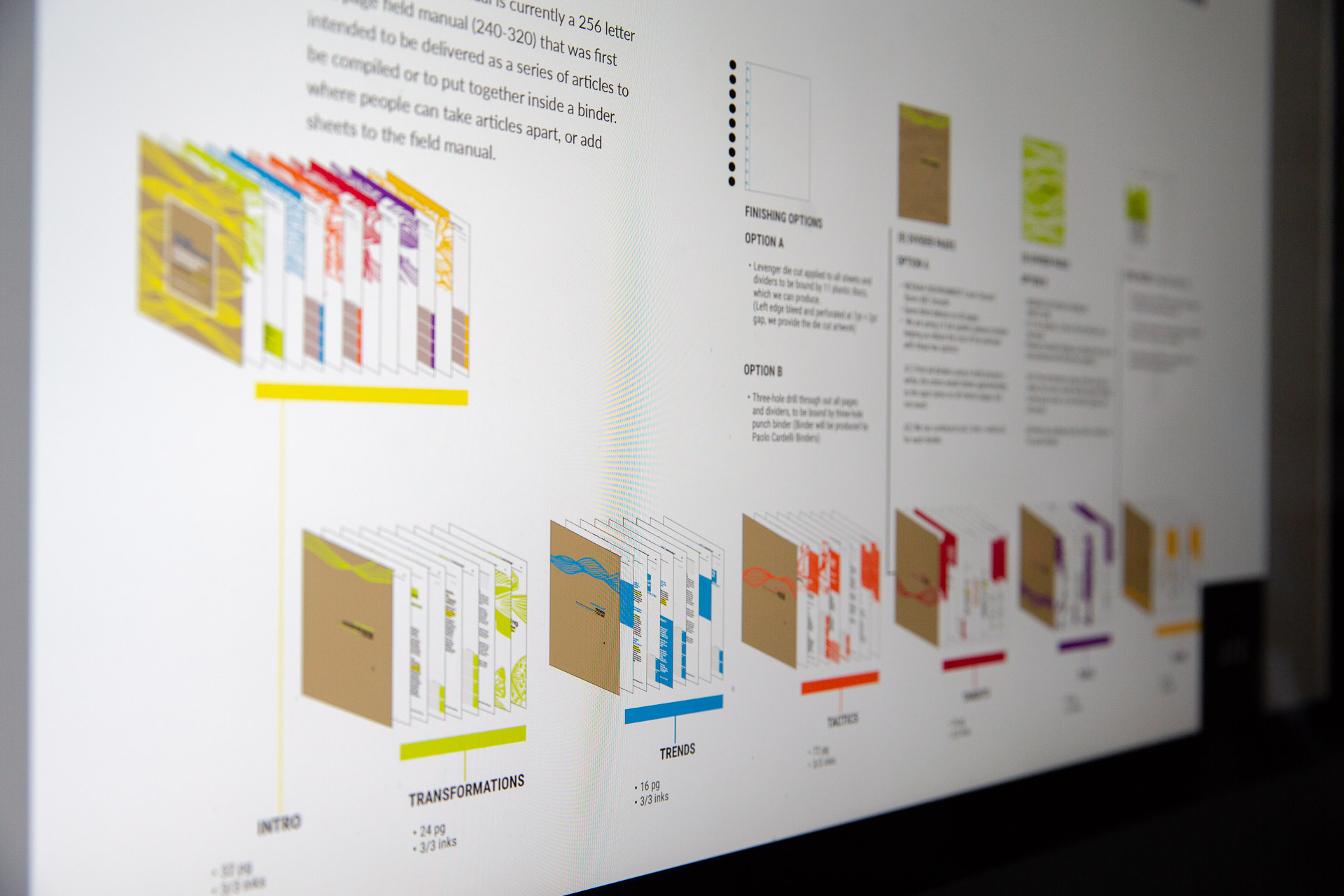
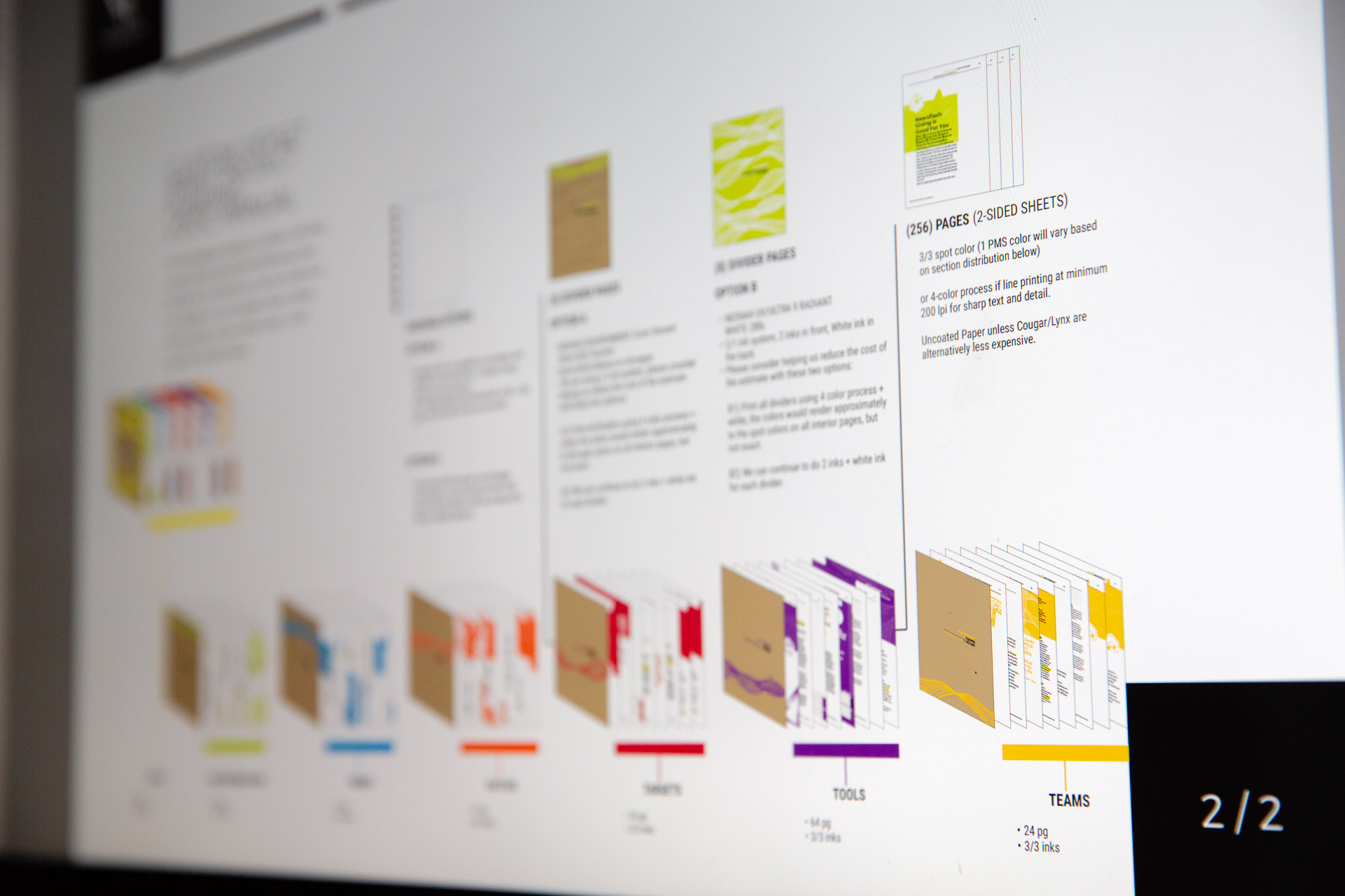
Man looking at computer with plan for binder assembly displayed on screen
Plan for binder assembly
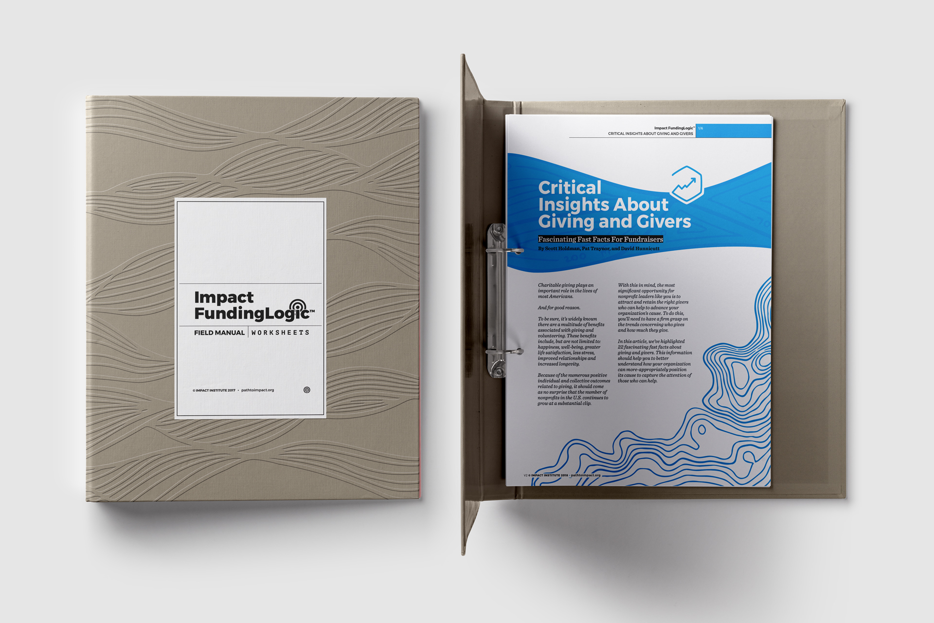
Mockup of closed binder next to binder open to first page of a printed article

A mockup of the proposed field guide

Attributes chosen by the client drove the illustration style and font choices incorporated into the final design of the articles individually and as a system. The client described themselves as modern, refined, energetic, innovative, and welcoming. Based on the organization’s ethos and the project’s objectives, the articles and field guide were designed to be:

  • Big
  • Futuristic
  • Vibrant
  • Refined
  • Simple
  • Flexible
  • Modern
  • Methodical
  • Elegant
  • Timeless

And NOT

  • Formal
  • Traditional
  • Serious